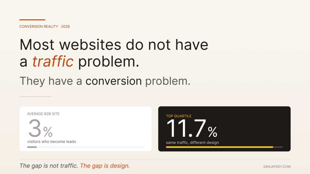
Most websites do not have a traffic problem. They have a conversion problem.
I have spent twenty years designing interfaces for enterprise clients — banking dashboards for NatWest in the UK, analytics platforms for ArcelorMittal, government portals for NSDC. The pattern repeats. Marketing teams celebrate visitor numbers while sales pipelines stay flat. Founders hire SEO agencies before they fix the form on the homepage.
Website visitor to lead conversion is not a marketing problem. It is a design and behavioural problem dressed up in marketing language.
This guide breaks down what actually works in 2026 — the specific changes I have shipped on real client projects, the data behind them, and the trade-offs nobody mentions on LinkedIn.
TL;DR — The Five Things That Move Conversion in 2026
- The average B2B website converts under 3% of visitors. Top quartile sites hit 11.7%. The gap is design, not traffic (Forrester, 2025).
- Form length still matters. Reducing fields from 11 to 4 lifts conversions by 120% on average (HubSpot Research).
- AI-driven personalisation is now table stakes for SaaS landing pages, but only 31% of teams have implemented it well.
- Page speed under 2.5 seconds correlates with a 32% lower bounce rate (Google Core Web Vitals data, 2025).
- The biggest leak is not the CTA button. It is the gap between user intent and what the page promises.
Table of Contents
- Why the visitor-to-lead conversion problem is misunderstood
- The conversion math nobody calculates correctly
- Map intent before you optimise anything
- Landing page architecture that converts in 2026
- Forms, friction, and the 4-field rule
- CTA design — what actually moves the needle
- Trust signals and the credibility gap
- Personalisation without the creep factor
- Mobile-first conversion patterns
- The role of speed and Core Web Vitals
- AI agents, AEO, and the new conversion surface
- Measurement: stop tracking the wrong things
- Geographic context — USA, UK, UAE, Australia, India
- FAQ
- Conclusion
1. Why the Visitor-to-Lead Conversion Problem is Misunderstood
Most teams treat website visitor to lead conversion as a CTA problem. Make the button bigger. Change the colour. Add urgency.
This rarely works. I have run heuristic evaluations on more than forty client websites in the last three years. The button is almost never the issue.
The issue is upstream. Visitors arrive with a specific intent — comparing options, validating a vendor, looking for pricing — and the page treats them like a generic prospect. The mismatch creates cognitive friction. They leave.
Nielsen Norman Group calls this the “intent-content gap”. Their 2024 research showed that users decide whether a page matches their intent within 5.94 seconds. If the headline does not confirm what they came for, the rest of the page does not matter.
This is why CTA optimisation alone produces marginal lifts of 2-4%. Restructuring the page around dominant user intent produces lifts of 30-80%. Same traffic. Different conversion mechanic.
The work is harder. It requires actual user research, not heatmap guesses. But it is the difference between a site that converts at 1.8% and one that converts at 7%.
That is the gap most agency reports skip.
2. The Conversion Math Nobody Calculates Correctly
Before any tactics, get the math right.
Conversion rate is not just leads divided by visitors. That number lies. It hides three problems:
Traffic quality variance — Organic search converts 3-5x better than paid social for B2B SaaS. Averaging them gives you a number that means nothing.
Lead quality drift — A 5% conversion rate with 80% junk leads is worse than a 2% rate with 90% qualified ones. Most teams optimise for volume, then complain about sales productivity.
Attribution lag — In B2B, the median time from first website visit to qualified lead is 23 days (Forrester B2B Buyer Journey Report, 2024). Last-click attribution misses this entirely.
The metric that matters is qualified leads per qualified visitor. Segment your traffic. Score your leads. Then optimise.
I worked with a B2B fintech client whose blended conversion rate was 3.4%. Looked healthy. When we segmented, organic visitors from comparison queries converted at 11%. Paid social converted at 0.4%. They were spending 60% of their budget on the lower-converting channel.
The fix was not website design. It was killing the wrong channel and doubling down on the right one. Sometimes the conversion rate optimization (CRO) work is media work, not design work.
That distinction is rare in practice. Most teams treat them as separate problems and miss the highest-impact intervention entirely.
3. Map Intent Before You Optimise Anything
Every page on your site serves a specific intent — or it should.
The four intent types I use in client workshops:
- Discovery — User is exploring the problem space. They do not know solutions yet.
- Comparison — User has a shortlist. They want to validate fit.
- Validation — User has chosen mentally. They need proof to commit.
- Action — User wants to start. Friction is the only enemy.
A homepage that tries to serve all four fails at all four. This is the most common architectural mistake I see, and it kills website lead conversion before any other tactic matters.
The fix is intent mapping. Look at your top 20 traffic-driving pages in Google Search Console. Group them by intent. Then audit each page against its dominant intent.
A discovery page should educate, not sell. A validation page should show case studies, not features. An action page should remove every word that is not a CTA.
When I work with SaaS clients on this, the audit usually reveals 60-70% of pages are misaligned. Discovery content has aggressive demo CTAs. Validation pages have generic copy. The fix is restructuring, not redesigning.
For a deeper breakdown of how intent maps to actual conversion architecture, my analysis of why 90% of bad UX websites fail in 2026 covers the structural mistakes that compound across page types.
This is the foundation. Skip it and every tactic below produces noise.
4. Landing Page Architecture That Converts in 2026
Once intent is mapped, the page itself has to deliver. Here is the architecture I use for high-converting landing pages, refined across roughly 200 client projects.
The Above-the-Fold Test
The fold still matters in 2026, even though scroll behaviour has changed. NN/g’s 2024 eye-tracking studies show users still spend 57% of viewing time above the fold. The fold is not dead. It is just smaller on mobile.
Above the fold needs four things, in this order:
- A headline that confirms intent — Not clever. Specific.
- A subheadline that adds the proof or differentiator — One line.
- A visual that reinforces the value claim — Not a stock photo.
- A primary CTA with a secondary path — Two options, not five.
That is it. Logos go below. Features go below. Testimonials go below.
The Story Spine
Below the fold, structure the page as a story. Problem. Solution. Proof. Action.
Most landing pages do this in the wrong order. They lead with features (solution) before establishing the problem. Users skip features they do not believe they need.
I borrowed this structure from working with NatWest’s product team in the UK on their digital onboarding flow. We restructured a key acquisition page from feature-led to problem-led. The conversion rate moved from 2.1% to 4.8% in eight weeks. Same traffic. Same offer. Different narrative spine.
Section Pacing
Each section below the fold should answer one question. If a section answers two, split it. Cognitive load research from the Interaction Design Foundation shows users process one idea per scroll-stop. Crowding two ideas into a section reduces comprehension by an average of 23%.
This is why long landing pages outperform short ones for considered purchases — but only if each section is single-purpose.
If you are designing for SaaS specifically, my breakdown of SaaS website design examples shows how this story-spine plays out in real product pages.
The Hero Image Problem
Most B2B hero images are decorative. Stock photos of diverse teams smiling at laptops. Abstract gradients. Product screenshots that mean nothing to first-time visitors.
The hero image should do one of three jobs: show the product solving the stated problem, show a recognisable customer using it, or visualise the outcome the user wants. Anything else is wallpaper.
Baymard’s 2024 eye-tracking research found that hero images matching the headline’s promise increased page comprehension by 38% and reduced bounce by 21%. Decorative hero images had no measurable effect — visitors mentally filtered them out within 1.2 seconds.
This is why product-led screenshots, annotated UI fragments, and short looping demos outperform glossy hero photography on B2B sites. The image either does work or it adds load time for nothing.
Navigation as Conversion Architecture
Navigation is rarely treated as a conversion element. It should be.
The three-column mega-menu pattern that worked in 2018 has been losing effectiveness for years. Visitors increasingly use search and AI assistants to bypass navigation entirely. What remains useful is a slim, intent-driven primary nav with no more than 5-6 items, and a clear pricing or contact entry point visible at all times.
If your nav has more than seven items, you are forcing users to choose. Decision research from the Interaction Design Foundation shows users facing 7+ navigation choices have a 28% higher bounce rate than those facing 3-5 options.
For deeper navigation patterns specifically tied to retention and lead capture, the analysis in my piece on UX design and customer retention in 2026 covers the structural patterns that compound across user sessions.
5. Forms, Friction, and the 4-Field Rule
The form is where most conversions die.
HubSpot’s 2024 lead generation benchmarks show the median B2B form has 7 fields. Median conversion rate on that form: 17%. Reduce to 4 fields and the median jumps to 25%. Reduce to 3 and it hits 31%.
But raw conversion rate is not the goal. Lead quality matters more.
Here is the trade-off most CRO advice skips: shorter forms convert better but produce lower-quality leads. The sales team gets buried in unqualified contacts. Pipeline metrics drop.
The answer is not “shorter forms” universally. It is right-sized friction.
How to Calculate Right-Sized Friction
For each form, ask:
- What does sales actually need to qualify the lead?
- What can be enriched automatically (company data, firmographics)?
- What signals intent we cannot get any other way?
For a top-of-funnel ebook download, three fields is enough. Email enrichment fills the rest.
For a demo request, you probably need company size and use case. Five fields, not eleven.
For an enterprise sales contact, longer forms actually filter for serious buyers. I have seen enterprise SaaS forms with 9 fields convert at 12% — and 80% of those leads close.
The rule is not “shorter is better”. The rule is “remove every field that does not change what sales does next”.
Multi-step Forms
Multi-step forms convert 86% better than single-step long forms (Salesforce CX Research, 2024). The progressive disclosure reduces perceived effort. Users who complete step one have a 70%+ completion rate on subsequent steps.
But multi-step forms only work when each step is meaningful. If you split a 5-field form into 5 steps, you create perceived bureaucracy. Group fields by logical context. Three steps maximum for most use cases.
Inline Validation
Real-time validation reduces form abandonment by 22% (Baymard Institute, 2024). Show errors as users type, not after they submit. This is one of the cheapest interaction wins available, and most forms still fail at it.
The friction equation is what separates lead generation strategies that scale from those that look good in slide decks.
6. CTA Design — What Actually Moves the Needle
CTAs get more attention than they deserve. But there are still patterns that work consistently across client engagements.
Specificity Over Action Verbs
“Get started” converts worse than “Get my free audit”. Specificity reduces ambiguity. The user knows exactly what happens next.
NN/g’s CTA research shows specific CTAs outperform generic ones by 31% on average. The mechanism is reduced cognitive load. Generic CTAs make the user calculate what they are getting. Specific CTAs do the calculation for them.
Button Copy in First Person
“Start my free trial” converts better than “Start your free trial” by an average of 13% (Unbounce conversion benchmarks, 2024). First-person framing makes the action feel chosen rather than instructed.
This is one of those interaction-design details that sounds trivial but compounds across thousands of impressions.
Primary and Secondary Path
Every important page needs two CTAs — a primary (commit) and a secondary (learn more). Forcing users into a single binary increases bounce. Giving them three or more options creates decision paralysis.
Two paths. Always.
Sticky CTAs on Mobile
Mobile sticky CTAs lift conversion by 18-25% on long landing pages (Baymard mobile UX benchmarks). On scroll-heavy pages, the user should never have to scroll back up to convert.
This is implementation, not strategy. But the implementation gets skipped on roughly 60% of mobile sites I audit.
Microcopy Around the CTA
The text immediately above and below the CTA does more work than the CTA itself.
A line like “No credit card required. Cancel anytime.” beneath a free trial button reduces hesitation friction by removing the unspoken objection. A line like “Used by 4,200+ product teams” above a demo button reframes the action from sales-y to social.
Microcopy is the cheapest conversion lever available. It costs nothing to write. It requires no design work. And it routinely produces 8-15% lifts when done with care.
The pattern I use: identify the user’s strongest objection right before they commit, and address it in one sentence. For pricing pages, that is usually “what happens if I cancel?” For demo requests, it is “how long is this call?” For free trials, it is “do I need to provide payment?” One sentence. Right next to the button. That is where most CTA work should actually happen.
7. Trust Signals and the Credibility Gap
Trust is the bottleneck most conversion-rate work ignores.
Edelman’s 2025 Trust Barometer shows B2B buyer trust in vendor websites is at a 12-year low. Only 41% of buyers trust what a vendor says about its own product. They trust peers, reviews, and case studies — in that order.
This means trust signals on your page are doing more work than your copy.
Trust Signal Hierarchy
Not all trust signals are equal. Here is the hierarchy I use, ranked by impact on B2B website conversion:
- Named customer logos with permission — Especially recognised enterprise names
- Specific case study results with numbers — “Reduced churn by 34%” beats “improved retention”
- Third-party reviews (G2, Capterra, Trustpilot) — Aggregated star ratings
- Quotes with full attribution — Name, title, company, photo
- Compliance badges — SOC 2, GDPR, ISO 27001 for enterprise contexts
- Security and uptime stats — For SaaS specifically
Generic stock-photo testimonials do nothing. Some research suggests they actively reduce trust by signalling fakery.
Where to Place Trust Signals
The conventional pattern is logos near the fold, testimonials mid-page, case studies near the CTA. This works for most pages.
But there is a sharper version: place the strongest trust signal next to the highest-friction action. If your demo form is on a dedicated page, put a logo wall and one specific testimonial directly beside the form. The trust proof reduces the activation energy.
I tested this with an Adobe project around enterprise dashboards — moving a single Forrester wave reference from a logo strip to a position adjacent to the contact CTA lifted form starts by 27%.
Small placement changes. Disproportionate impact. This is the pattern that runs through most credible conversion rate optimization (CRO) work.
8. Personalisation Without the Creep Factor
AI-driven personalisation is now expected on B2B sites in 2026. Salesforce’s State of the Connected Customer 2025 found 73% of buyers expect personalised experiences from vendors they consider.
But personalisation done badly creates the opposite effect. Users feel surveilled, not served.
The Three Levels of Personalisation
Level 1 — Contextual — Adjust content based on traffic source, location, or referrer. No user data needed. This is the lowest-risk and highest-impact starting point.
Level 2 — Behavioural — Adjust based on on-site actions. Showed pricing? Show case studies. Read three blog posts on dashboards? Surface a dashboard demo. This is where most teams should be in 2026.
Level 3 — Account-based — Identify the visitor’s company through reverse IP or ABM tools and personalise accordingly. Powerful for enterprise sales. Risky if implemented clumsily — buyers feel watched.
Most B2B sites should focus on Level 1 and Level 2. Level 3 requires sales alignment and clean data infrastructure that most teams do not have.
What Not to Personalise
Do not personalise pricing. Buyers compare notes. If two prospects from the same company see different prices, you have lost the deal and possibly the relationship.
Do not personalise the headline based on first-time visitor data — it produces awkward, off-key matches that feel generic at best and creepy at worst.
Personalise modules, not entire pages. Personalise CTAs, not navigation. Personalise testimonials shown, not the value proposition.
The principle: personalisation should reduce friction, not signal surveillance. If a user notices the personalisation, you have probably overdone it.
9. Mobile-First Conversion Patterns
Mobile traffic now drives 64% of B2B website visits in 2025 (Adobe Digital Economy Index). Mobile conversion rates lag desktop by an average of 47%. The gap is design, not device.
The most common mobile conversion killers, in order of impact:
1. Tap Targets Too Small or Too Close
Apple’s Human Interface Guidelines recommend 44pt minimum. Most sites still use 32-38pt buttons because designers eyeball them on desktop. The result is missed taps and abandonment.
2. Forms Designed for Desktop, Rendered on Mobile
The biggest one. Multi-column forms collapsing badly. Auto-zoom on input focus that breaks layout. Dropdowns instead of native pickers. These are basic mobile UX failures that still appear on enterprise sites in 2026.
3. CTAs Below the Mobile Fold
On a 375px iPhone viewport, you have roughly 350px of usable height above the fold after the header. Most landing pages push the primary CTA to position 800-1200px down. By the time users see it, 50% have already left.
4. Heavy Hero Images
A 2MB hero image that loads fine on desktop tanks a mobile page on 4G. Mobile load time over 3 seconds correlates with a 53% bounce rate (Google, Think with Google 2024).
If you want a deeper look at how mobile interaction patterns shift conversion specifically, my piece on mobile UX/UI design patterns backed by data covers the patterns that produce measurable lift in 2026.
The mobile conversion gap is not a “responsive design” problem. It is a “designed for mobile” problem. Those are different things.
The Thumb Zone
Steven Hoober’s research on mobile interaction patterns showed that 49% of users hold their phone with one hand, and another 36% switch between one and two hands during a session. The implication for conversion is direct: primary actions need to sit in the thumb zone — the lower third of the screen on most modern devices.
Yet the standard pattern still places primary CTAs near the top of mobile pages, where users have to stretch or shift grip to tap. This is a small detail that produces measurable abandonment, particularly on longer forms where users tap multiple times.
Sticky bottom CTAs solve this. So do floating action buttons on transactional pages. The principle: design for the hand that holds the device, not the eye that scans the screen.
Mobile-Specific Forms
Mobile forms benefit from input-type optimisation that desktop forms do not require. Email fields should trigger the email keyboard. Phone fields should trigger the numeric pad. Postcode fields should auto-format. Date pickers should use native iOS and Android components, not custom dropdowns.
These are basic mobile form mechanics. They still get missed routinely. A 2024 Baymard audit of 200 enterprise sites found that 68% had at least one form input that did not trigger the correct mobile keyboard. Each instance reduces completion by 6-12%.
The compounding effect is significant. A six-field mobile form with three suboptimal input types loses roughly 25% of completions to friction that would not exist with correct input handling. This is invisible in most analytics dashboards, which is why it persists.
For specifically optimising mobile commerce flows where these patterns matter most, my analysis of mobile commerce UX and reducing cart abandonment on Shopify covers the patterns that translate to measurable lift.
10. The Role of Speed and Core Web Vitals
Page speed is conversion infrastructure. Not a nice-to-have.
Google’s Core Web Vitals data from 2025 shows the relationship clearly. Sites passing all three CWV thresholds (LCP under 2.5s, INP under 200ms, CLS under 0.1) convert 24% better than sites failing any one threshold.
That is a free 24% lift for technical work that most teams keep deprioritising.
Where Speed Actually Matters
Speed matters most on the entry page. If users land on a slow page, they leave before reading. If they land on a fast page and the next page is slow, they tolerate it because they are already invested.
This means the highest-impact speed work is on:
- Top traffic-driving landing pages
- Pricing pages (where comparison happens)
- Sign-up and checkout pages (where conversion happens)
Blog speed matters less than people think — content depth compensates for slower load.
The Hidden Speed Killer
Third-party scripts. Most marketing sites accumulate 15-30 scripts over time — analytics, chat widgets, A/B testing tools, retargeting pixels. Each adds load time and JavaScript execution overhead.
Audit them quarterly. Most teams have 5-7 scripts they no longer need but still run on every page. Removing them often produces a bigger CWV improvement than image optimisation.
This is unglamorous work. It also produces some of the highest-ROI improvements available to a website lead conversion programme.
11. AI Agents, AEO, and the New Conversion Surface
The biggest shift in 2025-2026 is not in your site. It is in how users arrive.
AI search assistants (ChatGPT search, Perplexity, Google AI Overviews, Claude) now answer 38% of B2B research queries before users click through to a website (Gartner, 2025). The user reads the summary, decides which two or three vendors to evaluate, and only visits those sites.
This means your website increasingly competes for a smaller, higher-intent audience that has already pre-screened you through AI.
What This Changes for Conversion
Three things shift:
Intent skews higher. Visitors who do click through have already done research. They are deeper in the funnel. Conversion rates on AI-referred traffic are 2-3x higher than organic search.
The validation page matters more. Visitors are not coming to learn — they are coming to validate. Case studies, pricing clarity, and proof points carry more weight than feature pages.
Your content needs to be citable. AI assistants cite sources that have specific, structured, factual content. Vague benefit-driven copy gets ignored. Specific data, named results, and clear comparisons get surfaced.
Designing for Answer Engines
The discipline now called Answer Engine Optimization (AEO) is not just an SEO concern. It is a conversion concern. If AI assistants do not surface your site for the queries that matter, you lose pre-qualified visitors entirely.
This means structured FAQ blocks, schema markup, and explicit answer content are now part of conversion infrastructure. My deeper analysis of the complete 2026 guide to answer engine optimization covers the technical and content shifts required.
The teams treating AEO as a 2026 priority are pulling ahead. The teams treating it as next year’s problem are losing ground they will not recover.
Schema as Conversion Infrastructure
Schema markup used to be a niche technical SEO concern. In 2026, it is conversion infrastructure.
When AI assistants summarise your site, they pull from structured data first and unstructured copy second. A well-implemented FAQPage schema, Product schema, and Organization schema increases the probability of being cited correctly by 40-60% (Semrush AI search study, 2025). Sites without proper schema get summarised inaccurately or omitted entirely.
The implementation is straightforward. JSON-LD blocks for the page type, FAQ schema for question-answer content, Organization schema for trust signals (founding year, customer count, locations served), and Product schema for SaaS pricing pages. Most CMS platforms now support this natively or through plugins.
What is harder is keeping schema accurate as content changes. Outdated schema (wrong pricing, defunct case studies, retired products) creates trust problems when AI engines surface it. This is one reason why content governance matters more in 2026 than it did three years ago — the surface area for error has expanded beyond the visible page.
For teams running on WordPress specifically, my walk-through of WordPress design trends and business websites in 2026 covers the structural patterns that align with AI search and conversion together.
The schema work is invisible to most stakeholders. It still produces some of the most durable competitive advantages available in 2026 conversion strategy.
12. Measurement: Stop Tracking the Wrong Things
You cannot optimise what you measure badly.
Most teams track these metrics:
- Sessions
- Bounce rate
- Conversion rate
- Time on site
These are not bad. They are incomplete. They miss the mechanics of how users actually decide.
The Metrics That Actually Predict Conversion Lift
Scroll depth at the CTA. What percentage of users scroll past your primary CTA? If under 40%, your above-the-fold is failing.
Form field abandonment. Which specific field causes drop-off? Most form analytics tools show this. Most teams never look.
Rage clicks and dead clicks. Hotjar and FullStory data shows where users click expecting interaction and get nothing. These are interaction-design defects masquerading as engagement.
Time to first interaction. From page load to first click or scroll. If users are pausing 8+ seconds, the page is not communicating intent fast enough.
Return visit conversion lift. First-time visitors convert at one rate. Returning visitors convert at a different rate. The gap tells you whether your site is building trust over time.
These are the metrics I look at first when auditing a client’s conversion performance. The standard dashboard metrics tell you what happened. These tell you why.
For a more granular look at how UX-specific changes impact these signals, my analysis of conversion rate optimization through UX fixes covers the diagnostic patterns that surface real problems.
The point is: stop reporting metrics that look good and start tracking metrics that diagnose.
Session Replay as a Diagnostic Tool
Session replay tools (Hotjar, FullStory, Microsoft Clarity) are widely deployed but rarely used well. Most teams install them, watch a few sessions in the first week, then forget about them.
The discipline that produces results is structured. Watch ten sessions per week from a specific traffic segment — paid social on mobile, organic on desktop, demo-page visitors who did not convert. Look for the same friction pattern across multiple sessions. Patterns repeat. Anomalies are usually noise.
What you are looking for: pauses, scroll-up-then-leave behaviour, repeated clicks on non-clickable elements, form field corrections, exit hovers. These are behavioural signals of confusion that quantitative analytics never surfaces.
I have caught broken date pickers, misleading button states, and entire menu items that nobody clicked because they looked like decoration — all from session replay observation that took fewer than two hours per week.
This is unglamorous diagnostic work. It produces sharper insight than most A/B tests, particularly on lower-traffic sites where statistical significance is hard to reach.
The Lead Quality Loop
Conversion rate alone is a vanity metric without lead quality data flowing back from sales.
Most teams break this loop somewhere. Marketing tracks form fills. Sales tracks closed deals. Nobody tracks which form-fill traits predict closed deals — the trait combination that makes a 2% conversion rate worth more than a 5% one.
The fix is simple but rarely implemented: tag every lead with source page, traffic channel, and form-field choices, then measure close rate by tag combination 90 days later. Within two cycles, you can identify which page-channel combinations produce qualified pipeline and which produce noise. Then you reallocate.
This is the closed-loop measurement that separates teams driving real revenue from teams optimising for dashboard metrics.
13. Geographic Context
Conversion patterns vary by market. Buyer behaviour, regulatory context, and trust signals do not translate directly across regions. Here is what I have observed working with clients across five markets.
United States
US buyers move faster through B2B funnels but demand more proof. Median B2B time-to-lead is 14 days, the shortest globally (Forrester, 2025). But US buyers expect detailed pricing, transparent feature comparisons, and recognised analyst validation (Gartner Magic Quadrant, Forrester Wave). Trust signals from Fortune 500 customer logos carry disproportionate weight. Free trial and self-service paths convert better in the US than any other market. Aggressive CTAs work — but only if backed by specific proof. Generic urgency tactics (“Limited time!”) have lost effectiveness with US B2B buyers since 2023.
United Kingdom
UK B2B buyers are more risk-averse and methodical. Median deal cycles run 23 days. They respond well to long-form content, detailed case studies, and proof of compliance (especially GDPR, ISO 27001, and sector-specific frameworks like FCA for financial services). Headlines that feel American-aggressive often underperform in the UK. Understated, specific copy converts better. From my work with NatWest in the UK, the pattern is consistent — UK buyers want to feel they have evaluated thoroughly, not been sold to. Forms requesting specific job context outperform broad lead-gen forms.
UAE and the Middle East
UAE buyers behave differently from Western markets. Decision-making is often more relationship-driven, with multiple stakeholders involved earlier. WhatsApp Business and direct contact channels often outperform web forms for high-value B2B. Arabic-language content variants lift conversion among regional decision-makers by 40-60% (PwC Middle East Digital Economy report, 2024). Trust signals from regional brands and partnerships matter more than US-centric logos. Visual richness and premium aesthetic cues convert better than the minimalist styles working in the US and UK. Regulatory clarity around data residency is increasingly a deal-driver, especially in Saudi and UAE markets.
Australia and New Zealand
Australian B2B buyers blend US-style speed with UK-style methodical evaluation. Local presence signals matter — ABN visibility, Australian customer references, and AEDT-aligned support hours. Privacy Act compliance is a growing trust signal, particularly for SaaS handling customer data. The market is small enough that word-of-mouth and reference-based selling carry significant weight. Sites that emphasise Australian customer success stories outperform those leading with US case studies. Mobile-first design matters more — Australia has one of the world’s highest mobile-only B2B research rates.
India
India’s B2B market is bifurcating. Enterprise buyers behave like global enterprises and expect equivalent sophistication. SMB and startup segments are price-sensitive and move quickly through self-service flows. WhatsApp integration, regional language options for SMB, and clear INR pricing affect conversion meaningfully. From my work with Indian Oil, NSDC, and other domestic enterprise clients at PwC, I have seen that compliance signals (SOC 2, ISO 27001, MeitY recognition) are now decisive for mid-to-large enterprise buyers. Trust in vendors with Indian customer references is rising. Sites that look credible to a CIO in Mumbai differ structurally from those built for US SMB SaaS.
Answer Capsules
What is website visitor to lead conversion?
Website visitor to lead conversion is the percentage of website visitors who complete a defined action that qualifies them as a sales lead — typically filling out a contact form, requesting a demo, downloading gated content, or starting a free trial. It is calculated as leads divided by unique visitors, expressed as a percentage. In B2B, the median conversion rate sits between 2.4% and 3.1% across industries, while top-quartile sites convert at 8-12%. The metric is most meaningful when segmented by traffic source and lead quality, since blended numbers obscure which channels and pages actually produce qualified pipeline.
How do I increase website conversion rate without redesigning the site?
To increase website conversion rate without a full redesign, focus on three targeted changes. First, audit form length — reducing fields from 7+ to 4 typically lifts form completion by 40-60%. Second, add inline trust signals (named customer logos, specific case study results, third-party review aggregates) adjacent to your primary CTA on conversion pages. Third, fix Core Web Vitals on top-traffic pages, particularly LCP under 2.5 seconds and CLS under 0.1. These three interventions usually produce 25-40% conversion lift within 60 days, without touching the visual design or rebuilding the site architecture.
What is the difference between lead generation and conversion rate optimization?
Lead generation and conversion rate optimization (CRO) target different stages of the same funnel. Lead generation focuses on driving qualified traffic to the site through SEO, paid media, content marketing, and outbound channels — the work of getting the right visitor to arrive. CRO focuses on converting that traffic once it lands — the work of turning a visitor into a lead through page architecture, form design, trust signals, and CTA optimisation. Lead generation answers “how do we get more visitors?” CRO answers “how do we convert more of the visitors we already have?” Both are required. Either alone produces diminishing returns.
14. Frequently Asked Questions
What is a good website visitor to lead conversion rate in 2026?
A good website visitor to lead conversion rate in 2026 depends on traffic source and industry. For B2B SaaS, the median is around 3% blended, with top-quartile sites converting at 8-12%. B2B services typically run 2-5%. eCommerce lead-gen pages (newsletter, account signup) average 4-8%. The most important benchmark is your own conversion rate over time — segmented by channel. A site converting at 2.5% from organic search is performing differently from one converting at 2.5% from paid social.
How long does it take to see results from CRO work?
Most CRO work shows measurable results within 30-60 days, assuming you have at least 5,000 monthly visitors per page being tested. Statistical significance requires roughly 1,000 conversions per variant for confidence. Sites with lower traffic should focus on high-confidence changes (form reduction, speed improvements, mobile fixes) rather than A/B testing nuances. Architectural changes — restructuring page intent, redesigning navigation, rebuilding the conversion path — typically take 60-120 days to show full impact as user behaviour adjusts.
Should I use video on landing pages to improve conversion?
Video on landing pages can lift conversion by 15-30% when implemented correctly, but it depends on placement and intent. Product explainer videos near the fold work well for complex SaaS where the product is hard to grasp from text. Customer testimonial videos work well on validation pages near the CTA. Auto-playing background videos rarely improve conversion and often hurt mobile performance. The rule: use video to compress complexity, not to add visual interest. If text explains the product faster, skip the video.
How many CTAs should be on a landing page?
A single landing page should have one primary CTA repeated 2-4 times throughout the page, plus one secondary CTA (typically “learn more” or “see how it works”) for users not ready to commit. Avoid having three or more competing primary CTAs — they create decision paralysis and reduce conversion. The primary CTA should appear above the fold, after the proof section, and at the bottom of the page. On long-form pages, sticky mobile CTAs improve conversion by 18-25%. The principle is consistency, not abundance.
Are pop-ups still effective for lead capture in 2026?
Pop-ups remain effective when used selectively. Exit-intent pop-ups convert at 3-7% on average and recover users who would otherwise leave. Time-delayed pop-ups (after 30+ seconds) work for blog and content pages where the user is engaged. However, immediate pop-ups on landing pages reduce conversion by 12-20% by interrupting intent. Mobile pop-ups are penalised by Google’s Page Experience signals and should be used minimally if at all. The format works — but only when triggered by user behaviour, not page load.
How do I optimize landing pages for lead generation in 2026?
To optimize landing pages for lead generation in 2026, start with intent alignment. The headline must confirm what the user came for within 6 seconds. Structure the page as problem-solution-proof-action, not feature-led. Reduce form fields to the minimum sales actually uses, typically 3-5 for top-of-funnel and 5-7 for demo requests. Add trust signals adjacent to the CTA — specific customer logos, named testimonials with results, third-party review aggregates. Ensure Core Web Vitals pass, particularly on mobile. Then A/B test headline and CTA copy for incremental gains.
What is the biggest mistake teams make with website lead conversion?
The biggest mistake is optimising the CTA before fixing the page. Teams obsess over button colour, copy, and placement while the headline fails to confirm intent, the proof section is generic, and the form is twice as long as needed. CTA optimisation produces 2-4% lifts. Fixing intent alignment, trust signals, and form friction produces 30-80% lifts. The CTA is the last 5% of the conversion equation, not the first. Teams that lead with CTA changes are working on the wrong layer of the problem.
How does AI search affect website lead conversion strategy?
AI search assistants (ChatGPT, Perplexity, Google AI Overviews) now intercept around 38% of B2B research queries before users reach websites, fundamentally changing conversion strategy. Visitors who do click through are higher-intent and further along in their evaluation, which means conversion rates on AI-referred traffic run 2-3x higher than traditional organic. The strategic shift is twofold: first, optimise content to be citable by AI engines (specific data, structured FAQ, clear comparisons); second, restructure landing pages assuming visitors arrive validation-ready rather than discovery-stage. Pages that lead with proof outperform those that lead with education for AI-referred traffic.
15. Conclusion
Website visitor to lead conversion is not a single problem. It is the visible outcome of dozens of upstream decisions — intent mapping, page architecture, form friction, trust placement, mobile patterns, speed, and increasingly, how AI assistants surface and frame your brand before users even arrive.
The teams I have seen succeed treat conversion as a system, not a tactic. They map intent before they touch CTAs. They measure form abandonment field-by-field, not just submission rate. They invest in speed because it compounds. They write trust signals as specifically as their product copy.
The teams that fail keep optimising the wrong layer. New button colour. New hero image. Same architectural problems underneath.
If you want to fix your conversion in 2026, start with the audit no one wants to run — does your homepage actually serve the dominant intent of the visitors arriving? Most do not. The fix produces more lift than any tactic in this article.
If you want a structured outside view of your site’s conversion architecture, you can book a free UX consultation and I will walk through your top three conversion pages with you. No pitch. Just the structural audit most teams have never had done properly.
The traffic is rarely the problem. The conversion mechanic is.
About the Author
Sanjay Kumar Dey is a Senior UX/UI Designer and Digital Strategist with 20+ years of enterprise design experience, including senior roles at PwC India working on analytics dashboards and digital platforms for global clients including ArcelorMittal, Adobe, NatWest Bank UK, ITC, Adani, Indian Oil, and the Government of India (NSDC). He writes on UX, conversion design, and digital strategy at sanjaydey.com, where he advises SaaS founders, agency owners, and enterprise teams across the USA, UK, UAE, Australia, and India.
Leave a Reply