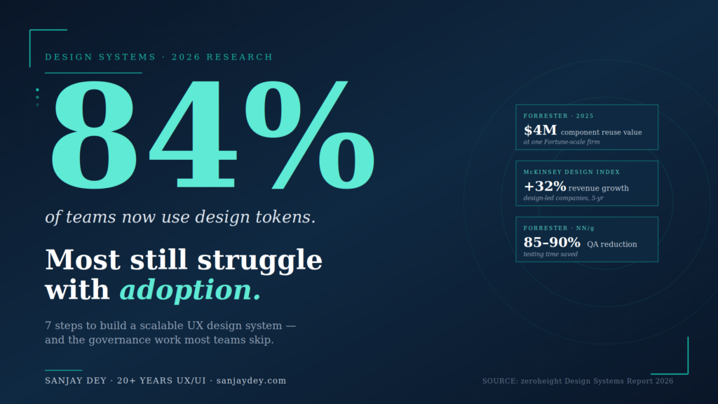
Quick Answer: A scalable UX design system is built in seven sequential steps — audit existing UI patterns, define design tokens, build atomic components, establish governance, document everything, integrate with developer workflows, and measure adoption. The 2026 zeroheight Design Systems Report shows 84% of teams now use design tokens, while Forrester research links design system adoption with $4M in measurable component reuse value and 85–90% reductions in QA testing time at one financial services firm. Industry data from Nielsen Norman Group and Forrester confirms design team productivity gains of 34–38% and developer productivity gains of 30–31% when systems are properly implemented. The hard part is not the components. It is the governance, naming, and adoption work that most teams underestimate. This guide walks through each step with the trade-offs that determine whether a design system scales — or quietly dies in a Figma file no one opens. The steps that follow draw on 20+ years of building component libraries for enterprise clients across banking, manufacturing, and SaaS.
Table of Contents
- Why Scalable Design Systems Matter in 2026
- Step 1: Audit Your Existing UI
- Step 2: Define Design Tokens First
- Step 3: Build the Component Library Atomically
- Step 4: Establish Governance Before You Need It
- Step 5: Document for Adoption, Not Archive
- Step 6: Connect Design and Development Pipelines
- Step 7: Measure Adoption and ROI
- Common Pitfalls That Kill Design Systems
- Tools and Resources for Building a Scalable Design System
- A Practical Roadmap: Your First 90 Days
- Geographic Relevance: Five Markets
- Frequently Asked Questions
- Conclusion and Next Steps
Why Scalable Design Systems Matter in 2026
I’ve seen what happens when a design system is treated as a side project. A banking client I worked with had 47 button variants across four product lines. Eleven of them were near-identical. Each variant had its own developer ticket history, its own QA cycle, its own accessibility audit. The cost of inconsistency was buried in sprints — but it was real money.
The 2026 zeroheight Design Systems Report surveyed 147 practitioners and reported that 3 in 5 design system teams are understaffed, with adoption listed as the top challenge for the fifth consecutive year. Tools exist. Governance does not. That gap is where scalability dies.
[ALT: Diagram showing the seven-step process for building a scalable UX design system, from audit to measurement]Key Statistics: Design Systems in 2025–2026
- 84% of design teams now use design tokens to codify color and spacing values (zeroheight Design Systems Report 2025)
- 3 in 5 design system teams report being understaffed in 2026 (zeroheight 2026)
- 34–38% designer productivity gains in mature design systems (Forrester / NN/g)
- 30–31% developer productivity gains in mature design systems (Forrester / NN/g)
- 85–90% QA testing time reduction at one financial services firm using Figma Dev Mode (Forrester TEI, 2025)
- $4M in measurable component reuse value at one Fortune-scale organization, with $10M+ projected (Forrester / Figma, 2025)
- 30–50% faster product launch time-to-market with mature design systems (DesignDNA, 2026)
- 40% of enterprise apps will feature task-specific AI agents by end of 2026, up from <5% in 2025 (Gartner)
- 3.7% of top 1 million websites meet full WCAG 2.1 AA compliance (WebAIM Million 2026)
- 4,600+ ADA-related accessibility lawsuits in the US in 2025, up 14% YoY (UsableNet)
What Is a Scalable UX Design System?
A scalable UX design system is a managed set of design tokens, reusable components, documentation, and governance rules that lets multiple teams build consistent products without duplicating work. Nielsen Norman Group defines it as a complete set of standards for managing design at scale. The “scalable” qualifier means the system accommodates new products, new platforms, and new teams without requiring foundational rebuilds. Tokens scale infinitely. Components compose from atoms upward. Governance keeps contributions consistent. Documentation makes adoption possible. Without all four, a design system is a Figma file with stars instead of an operational asset.
Why Design Systems Pay Back Investment
The business case for design systems is settled. Forrester’s 2025 study of Figma Dev Mode reported one organization measured $4M in component reuse value with more than $10M expected by year-end 2025, all driven by making the design system easier to use (Figma Blog, 2025). A Chief Design Officer at a financial services firm in the same study cited testing savings of 85–90%. McKinsey’s Design Index research found top-quartile design-led companies posted 32% higher revenue growth and 56% higher total returns to shareholders over five years (McKinsey, The Business Value of Design).
What changed in 2026 is the pressure. Gartner’s 2025 Hype Cycle now positions design systems sliding from the “Peak of Inflated Expectations” into the “Trough of Disillusionment” — early enthusiasm hitting the wall of maintenance and adoption. Practitioners know the systems are essential infrastructure. Many are struggling to keep them resourced.
That’s the context for this guide. The seven steps below are not new, but how you sequence them — and the trade-offs you accept at each one — determines whether you build a system that scales or one that becomes design debt. I’ll walk through each step the way I’d brief a client at the start of a real engagement — with the trade-offs that determine outcomes, not the textbook version.
Step 1: Audit Your Existing UI
Before you build anything, count what you already have.
A scalable UX design system starts with brutal inventory work. Open every product surface. Screenshot every button, input, modal, table, alert, and empty state. I run this as a card sort exercise with the design team — physical or digital, doesn’t matter — and I include developers and product managers in the room.
The output is a single document I call the UI Census. Three columns: component name, where it lives, and visual variants. For one enterprise dashboard project, the census revealed 128 distinct UI patterns across what was supposed to be a single product. After the audit, we collapsed it to 41. That’s design debt becoming visible.
What to audit
Focus on these categories first because they account for roughly 70% of UI variance in most products:
- Buttons (every state, every size, every color)
- Form inputs and validation states
- Navigation patterns (primary, secondary, mobile)
- Cards and list items
- Data tables and grids
- Alerts, banners, and toast notifications
- Empty states and loading states
For dashboards specifically — which I work on frequently for clients like ArcelorMittal and NatWest — also document chart components, KPI tiles, and filter patterns. These break the most often when teams ship in parallel.
The trade-off most guides skip
A complete audit takes 2–3 weeks for a mid-sized product. Some teams skip this because the components feel obvious. They are not. Without an audit, you build a system that codifies your current inconsistencies instead of fixing them. The Nielsen Norman Group’s research on design patterns makes this point: patterns must be observed in context, not assumed.
The audit also surfaces something more useful than the component list — it shows you which teams are reinventing the same things. That’s where governance starts.
What you do with the inventory next determines whether the system scales or stalls.
Step 2: Define Design Tokens First
Components without tokens are decoration. Tokens are the architecture.
Design tokens are name-value pairs — colors, spacing, typography, border radii, motion durations — stored in a platform-agnostic format like JSON. The W3C Design Tokens Format Module is now the working standard. The 2025 Design Systems Report from zeroheight reports 84% of teams now use design tokens to codify color and spacing values.
The three-tier token structure
I build tokens in three layers. This is not optional for scale.
Tier 1 — Primitive tokens. Raw values. color-blue-500, space-16, font-size-14. These are the source. Designers should never reference these directly in product files.
Tier 2 — Semantic tokens. Intent-based aliases. color-action-primary, color-text-default, space-component-padding-md. These reference primitive tokens and describe purpose, not appearance.
Tier 3 — Component tokens. Component-specific overrides when you need them. button-primary-background-default. Use these sparingly. Nate Baldwin’s analysis of component-level tokens flags the bloat risk — every component-level token you add is one more thing to maintain.
Why this matters for scale
When the brand color changes — and it always changes — you update one primitive token. Every semantic alias inherits the change. Every component using those aliases updates automatically across web, iOS, and Android.
A token-driven pipeline reduces design QA problems by over 50% across distributed teams (Materialui.co, 2025). For a multi-product organization, that’s the difference between rebranding in two weeks and rebranding in two quarters.
The naming trap
Token naming kills more design systems than tooling does. If your team can’t remember whether the value is bg-color-surface-1 or surface-bg-color-01, they’ll create a new one. Netguru’s research on token naming calls this a governance risk, not a usability one.
I use a four-part convention: category-property-variant-state. So: color-text-link-hover. Boring is good. Predictable is better.
If you’re starting from scratch, I’ve documented my approach to building the design-development link with tokens on my site. The naming convention you commit to in week one becomes irreversible by week twelve.
The token layer determines what’s possible. The component layer determines what’s used.
Step 3: Build the Component Library Atomically
Atomic design — Brad Frost’s framework — still works. I’ve used it on enterprise systems for clients across banking, manufacturing, and government, and it scales because it forces hierarchy.
The breakdown:
- Atoms — buttons, inputs, labels, icons
- Molecules — form fields with labels, search bars, card headers
- Organisms — navigation menus, data tables, dashboards widgets
- Templates — page-level layouts
- Pages — specific instances
I cover this approach in detail in my post on atomic design systems and how it connects to UI design within design systems.
Where teams break atomic design
Three places.
They build atoms last. Designers love organisms because they look like products. But if your atoms are wrong, every organism inherits the problem. Build atoms first. Test them. Then move up the hierarchy.
They skip molecules. Molecules are the connective tissue. Without them, organisms become custom every time. I’ve seen teams build 14 different table-row patterns because they had table atoms but no row molecules.
They confuse templates with pages. Templates have placeholder content. Pages have real content. Mixing them means designers can’t reuse templates because they’re polluted with one product’s data.
Component states are not optional
Every component needs five states minimum: default, hover, focus, active, disabled. Forms need two more: error and success. Nielsen Norman Group’s work on button states (April 2025) makes the case that minor visual differences between these five states are what separate usable interfaces from confusing ones.
For dashboards — where I do most of my enterprise work — I add three more states: loading, empty, and error. Empty states get neglected. They shouldn’t. The zero-state UX work I’ve documented shows empty states are often the first thing new users see.
Accessibility from the start
Build WCAG 2.2 AA compliance into every atom. The WebAIM Million 2026 report shows only 3.7% of top 1 million websites meet full WCAG 2.1 AA compliance, with low color contrast affecting 83% of homepages and missing alt text affecting 58% (Searchlab UX Statistics 2026). Retrofitting accessibility into a finished component library is roughly four times more expensive than building it in.
ADA-related lawsuits in the US reached a record 4,600+ in 2025, a 14% increase year-over-year. For US-targeted products, accessibility is no longer optional — it’s litigation risk. I’ve covered accessibility-first design under WCAG 2.2 for teams who want a working checklist.
Components don’t fail because they lack features. They fail because nobody owns them.
Step 4: Establish Governance Before You Need It
This is the step most teams skip — and the one that determines whether the system survives the first product launch after it ships.
Governance answers four questions:
- Who decides what goes in the system?
- How do new components get proposed and approved?
- How are changes versioned and communicated?
- What happens when a product team needs something the system doesn’t have?
The contribution model
I use a three-tier contribution model on most enterprise systems:
Tier 1 — Core team builds. New components, breaking changes, and shared patterns. The core team has final authority. They also have the maintenance burden.
Tier 2 — Federated contribution. Product teams propose new components. They submit a Figma file plus a use case. The core team reviews against criteria: is this used by 2+ products, does it follow tokens, does it meet WCAG, is it documented? If yes, it goes into the system. If no, it stays in the product.
Tier 3 — Product-local extensions. Components used by only one product live in that product’s library, not the shared system. This prevents bloat.
The 2026 zeroheight report shows year-over-year growth in dedicated design system teams, with a 5% jump in 2026, but 71% of companies under 100 employees still operate with dedicated resource. The point: small teams need governance just as much as large ones, even if it’s lighter.
Versioning matters more than people think
Treat your design system like software. Use semantic versioning. Major versions for breaking changes. Minor for additions. Patches for fixes. Communicate changes through a changelog every product team reads.
Without versioning, every update breaks something downstream. Product teams stop updating. The system fragments. This is how design systems die — quietly, through neglect, not through dramatic failures.
The trade-off nobody talks about
Strong governance slows individual teams down in the short term. Loose governance accelerates teams in the short term but creates compound debt. I tell clients this directly: pick which problem you want to have. There is no version where you avoid both.
The Forrester 2025 Total Economic Impact study commissioned by UserTesting reported that organizations with mature governance saw payback periods under six months and $9.4M in three-year benefits (UserTesting Forrester TEI, 2025). Governance is not paperwork. It’s the mechanism that makes ROI real.
A system without governance is just a Figma library. What separates them is the rule book.
Step 5: Document for Adoption, Not Archive
The 2026 zeroheight report names documentation as both the biggest pain point and the clearest opportunity in design systems. That tracks with my experience. Most documentation is written by people who already understand the system, for people who already understand the system. That’s why nobody reads it.
What documentation actually needs
For each component, document seven things:
- What it is — one-sentence definition
- When to use it — three to five clear use cases
- When NOT to use it — at least two anti-patterns
- Anatomy — labeled diagram of all sub-elements
- States and variants — visual examples of each
- Accessibility notes — WCAG considerations and keyboard behavior
- Code examples — copy-pasteable snippets for each framework
The “when not to use it” section is the one teams skip. It’s also the most useful. The Interaction Design Foundation’s blog has solid material on this — usage guidance prevents misuse better than usage permission grants it.
[ALT: Component documentation page showing anatomy diagram, states, and code examples]Tools that work in 2026
Figma’s dominance in design tooling is near-total — adoption rates above 95% across surveyed teams (zeroheight Design Systems Report 2026). For documentation, the landscape is varied:
- Storybook — strong for developer-facing component documentation, especially if your team lives in code
- zeroheight — bridges design and development; better for organizations that need broader audience access
- Supernova — strong on token management, integrates with Figma variables
- Knapsack — enterprise-grade governance plus documentation in one platform
I usually recommend Storybook plus Figma comments for smaller teams, and zeroheight or Supernova for organizations with 50+ designers.
Write for the new hire
The clearest test of design system documentation: can a new hire build a feature using only the docs in their first week? If no, the docs aren’t doing their job. New hires need clear guidance — a well-documented design system functions as a training tool, showing how components work and why specific choices were made (Parallel HQ, 2026).
I tested this on one client project by giving a junior designer access to the Figma library and the documentation only — no Slack help, no team check-ins — and asked her to assemble three screens. The screens she struggled with revealed exactly which components had documentation gaps. That’s a faster audit method than any review meeting.
What you document determines what gets used. What doesn’t get used disappears.
Step 6: Connect Design and Development Pipelines
A design system that lives only in Figma is half a system.
The connection between design and code is where most design systems fail to deliver ROI. Figma files have buttons. Production code has its own buttons. Designers update the Figma file. Developers don’t update the code. Three months later, the system is decorative.
The token bridge
This is why tokens matter so much. Tokens are the only artifact that can live in both Figma and code simultaneously. When a designer changes color-action-primary in the token source file, the change propagates to:
- Figma variables (via plugin or sync tool)
- iOS asset catalogs (via Style Dictionary or similar)
- Android XML resources
- Web CSS variables or Tailwind config
This is not theoretical. The Forrester 2025 TEI study on Figma Dev Mode reported one organization’s testing savings of 85–90% specifically because design tokens enforced single-source-of-truth between design and engineering (Figma Blog, 2025).
Code Connect and component parity
Figma’s Code Connect feature — broadly adopted in 2025 — links Figma components directly to their code counterparts. When developers inspect a button in Dev Mode, they see the actual import statement and props from the production codebase, not abstracted CSS.
For teams without Code Connect, the alternative is strict component parity. Every Figma component has a code counterpart with the same name, same props, same variants. Drift between the two is treated as a bug.
GitHub research shows AI coding assistants now generate 46% of code on the platform, with Gartner projecting this will reach 60% of all new code by end of 2026. AI tools work better when component names are consistent across design and code — they pattern-match what they see. A messy system makes AI tools messier.
Workflow integration
Beyond tooling, the design and development teams need shared rituals:
- Component review meetings every two weeks where designers and developers approve new additions
- Office hours where product teams can get help using the system
- Slack/Teams channel dedicated to system questions, with response SLAs
- Quarterly health check auditing what’s used, what’s ignored, and what’s missing
Nielsen Norman Group’s work on the designer-developer relationship (September 2025) reframes the dynamic: design and development should approach collaboration as co-owners of the product experience, not as handoff partners. That distinction changes how you structure the system.
The pipeline determines whether the work survives the next sprint.
Step 7: Measure Adoption and ROI
What gets measured gets resourced. What doesn’t get measured gets cut.
Adoption metrics
Three core metrics tell you whether the system is working:
Component usage rate. What percentage of UI in production uses system components versus custom code? Tools like Omlet, Figma Library Analytics, and custom telemetry can track this. Below 60% adoption, your system is not working. Above 80%, it’s healthy.
Token coverage. What percentage of color, spacing, and typography values in production come from tokens? Below 70%, you have token sprawl problems.
Time-to-launch for new screens. Teams using a mature design system should ship new screens 30–50% faster than teams without one (DesignDNA Conference, January 2026).
ROI metrics that move budgets
The CFO doesn’t care about token coverage. They care about money. Translate the design system metrics into business outcomes:
- Designer productivity — Forrester and Nielsen Norman Group data shows 34–38% gains for design teams using mature systems
- Developer productivity — 30–31% gains for engineering teams (DesignDNA, 2026)
- QA reduction — up to 85–90% in Forrester’s Figma Dev Mode study
- Time-to-market — 30–50% faster product launches
Forrester’s research on UX investment broadly shows every $1 invested returns up to $100 — a 9,900% ROI (Eficode/Forrester). Design systems are a subset of that ROI, but the multipliers are real for organizations that follow through.
What to do with the data
Report it quarterly. Tie it to the business cycle, not the design cycle. When budget conversations happen, the design system team needs a one-page document that shows: components shipped, adoption rate, hours saved, products launched, accessibility lawsuits avoided.
I help clients build stakeholder buy-in for UX ROI using exactly this framework. The system pays for itself within 18 months in most enterprise contexts. The data should be visible, not buried.
The measurement step is also the feedback loop. What you learn here goes back into Step 1 — and the audit starts again, smaller and more focused, every quarter.
Common Pitfalls That Kill Design Systems
After 20+ years building UX for enterprise clients, I’ve seen design systems fail in remarkably similar ways. The components are rarely the problem. The patterns of failure are.
Pitfall 1: Building the system without a sponsor
The most expensive failure is the one where leadership never owned the system in the first place. Design teams build the library. Engineering grudgingly aligns. Product teams ignore both. Six months later, the system is a Figma file with 200 stars and zero adoption.
Every successful design system I’ve worked on has a named executive sponsor. Not “leadership generally” — a specific person whose budget pays for it and whose calendar makes time for it. Without that, the system has no political weight when it competes against feature work.
The 2026 zeroheight report data on under-resourced teams reflects this directly: 3 in 5 teams are understaffed, and the comments from practitioners describe layoffs framed as “the design system is done, why do we need all these people?” Sponsorship is the protection against that question. I’ve documented how to build UX ROI cases for stakeholder buy-in — the same logic applies to design system funding.
Pitfall 2: Designing for the design team, not the product teams
Design systems built by design teams in isolation almost always include components the design team finds elegant — and excludes components product teams actually need. I’ve audited libraries with 14 button variants but no data table component. The data table is the component that ships in dashboards every week. The buttons are the components designers polish in their portfolios.
Run user research on your design system. The users are the product designers, developers, and PMs who consume it. Watch them work. Ask what slows them down. The patterns you’ll find are different from the patterns you’d assume.
Pitfall 3: Ignoring the dark mode and theming question
In 2026, dark mode is not optional. iOS users expect it. Enterprise SaaS users expect it. If your design system was built without theming as a foundational requirement, retrofitting it costs roughly 2–3x what building it in would have cost.
The fix is structural. Every color token must be semantic — color-text-default, not color-grey-900. The actual hex value lives one layer deeper, swapped based on theme. If you have any token whose name describes its appearance instead of its purpose, you have a theming problem waiting to happen.
Pitfall 4: Versioning without communication
Some teams version their design system properly — semantic versions, changelogs, the works — but never tell anyone. Updates ship into the void. Product teams don’t know what changed. They keep using the old version. Drift accelerates.
Communication needs structure: a Slack/Teams channel for design system updates, a monthly newsletter or office hour where major changes are walked through, and direct outreach to product teams for breaking changes. The communication burden is not on the consumers. It’s on the system team.
Pitfall 5: Optimizing for completeness over usefulness
I’ve seen teams delay launching their design system because “we’re missing the date picker” or “we haven’t finalized the table component.” Months later, the system still hasn’t shipped. Meanwhile, every product team is solving these problems independently in custom code.
Ship the system at 60% completeness. Document what’s missing. Tell teams to build the missing components in product code following the system’s tokens and patterns. Promote those product-built components into the system later. This is how systems mature — through feeding from product reality, not through library teams predicting every future need.
The 2026 zeroheight report reinforces this: documentation is both the biggest pain point and the clearest opportunity. The systems that ship with imperfect docs and improve them iteratively beat the systems that wait for perfection.
Pitfall 6: Treating the system as finished
A design system is never done. Products change. Design trends shift. New platforms emerge. The system that worked perfectly for web in 2024 is now incomplete because the same product ships on iOS, Android, watchOS, and increasingly conversational and voice surfaces.
I work with clients on quarterly design system health checks — what’s used, what’s broken, what’s missing, what should be deprecated. Without that rhythm, the system calcifies. Calcified systems get replaced. Replacements are 3–5x more expensive than maintenance.
The pitfalls above are predictable. The teams that ship successful design systems are the ones that have explicitly planned to avoid each one.
Tools and Resources for Building a Scalable Design System
The 2026 design system tooling landscape has matured. Here’s what works at each layer of the stack — based on what I’ve seen ship in production environments across enterprise and SaaS clients.
Design and prototyping
Figma dominates with 95%+ adoption among surveyed design system teams. Variables, modes, and Code Connect are now table-stakes features. If your team is on a different tool — Adobe XD, Sketch, Penpot — the migration cost to Figma is real but pays back within a year on most enterprise systems.
Tokens Studio for Figma handles W3C-format token export. Useful for teams that need round-trip sync between Figma and code.
Token management
Style Dictionary (Amazon) is the open-source standard for transforming token JSON into platform-specific outputs — CSS variables, iOS, Android, React Native. Free, mature, well-documented.
Supernova offers AI-assisted token naming and management starting at $35 per seat per month (annual billing) as of late 2025. Strong for mid-to-large enterprises managing multiple brands.
Specify focuses on automated token sync between Figma and code. Reduces manual update overhead.
Component libraries and code
Storybook remains the developer-facing standard for component documentation. Storybook 8+ supports Figma integration, accessibility addons, and visual regression testing.
Chromatic (from the Storybook team) handles visual regression testing and team review. Cuts QA time substantially when integrated properly.
Bit offers component-level versioning if your team needs granular control over which products use which component versions.
Documentation platforms
zeroheight is the de-facto choice for design system documentation that needs to serve audiences beyond developers. PMs, content designers, brand teams, and external partners all benefit.
Knapsack is enterprise-grade — strong governance, permissioning, and real-time collaboration features. Higher cost but suited for organizations with 100+ designers.
Supernova also provides documentation alongside its token features, useful if you want a unified platform.
Measurement and adoption
Omlet is built specifically for design system adoption tracking — what components are used, where, and how often.
Figma Library Analytics gives basic adoption metrics inside Figma itself.
Custom telemetry is what I recommend for serious enterprise systems. Instrument your component library to emit usage data on render. The data is more accurate and integrates with your existing analytics.
AI-assisted tooling
The 2026 zeroheight report finds practitioners are pragmatic — excited about AI for documentation generation and process automation, skeptical about AI-generated design. Tools to consider:
- Galileo AI for component generation drafts
- Visily for AI-driven wireframing
- GitHub Copilot for component code generation
These accelerate boilerplate work. They don’t replace design judgment. The same caveats from my post on AI-powered UX research in 2026 apply here: AI tools are accelerants, not architects.
What I avoid recommending
Proprietary internal tools built from scratch are almost always a mistake unless you have unusual constraints (defense, regulated finance, or scale beyond ~10,000 designers). The existing ecosystem is mature and integration-friendly. Building your own design system platform is a project that consumes years and rarely produces tools as good as what’s already on the market.
The tooling stack matters less than the discipline of using it. Teams with mature processes ship great systems on basic tools. Teams without process struggle even with premium platforms.
A Practical Roadmap: Your First 90 Days
If you’re starting a design system from scratch, here’s how I’d sequence the first 90 days based on what’s worked across enterprise engagements.
Days 1–14: Audit and stakeholder alignment
Run the UI census. Identify your executive sponsor. Get budget commitment. Set up the team — at minimum, one design system lead, one engineer, and one product representative. Smaller systems can run with a single person, but the work is real and continuous.
Map the products that will consume the system. List the platforms (web, iOS, Android, others). Identify the constraints — accessibility requirements, theming needs, internationalization needs, performance budgets.
Output: a single-page brief signed off by the sponsor that defines scope, success metrics, and timeline.
Days 15–35: Foundations
Build the token architecture. Three tiers: primitives, semantic, component. Establish naming conventions. Set up the token source-of-truth — typically a Git repository — and the export pipeline to Figma and to your code targets.
Pick the documentation platform. Set up the Figma library structure. Define your contribution process and put it in writing.
Output: a working token pipeline, a documentation skeleton, and a contribution process document.
Days 36–70: Atoms and molecules
Build 12–15 atomic components. Buttons, inputs, labels, icons, typography, dividers, badges, alerts, modals, dropdowns, checkboxes, radio buttons. Each component needs all states, accessibility specifications, code examples, and usage documentation. This is the bulk of the work.
Build 8–10 molecules. Form fields, search bars, cards, list items, navigation links. Test each in real product contexts — pull a product team into a session and watch them try to use the component for an actual feature.
Output: a working component library with 20+ documented components.
Days 71–90: Pilot and measure
Roll out to one product team as a pilot. Don’t roll out broadly yet. Measure adoption — what gets used, what doesn’t, what gets requested. Iterate based on the data.
Set up the measurement dashboards. Define your three core metrics (adoption rate, token coverage, time-to-launch). Schedule the first quarterly health check.
Output: a piloted system with adoption data, a measurement framework, and a clear roadmap for the next 90 days.
This sequence is conservative on purpose. Faster timelines exist — I’ve shipped MVP design systems in 6 weeks for smaller products — but for enterprise scale, the 90-day arc gives you the foundations without the corner-cutting that creates debt.
The same principles I cover in the UX strategy framework apply to design system strategy: scope down, sequence right, measure continuously.
Geographic Relevance: Five Markets
Design systems travel differently across markets. The same components face different regulatory, behavioral, and infrastructural constraints depending on where the product ships.
United States
US-based product teams face two pressures in 2026: ADA compliance and AI-readiness. ADA-related accessibility lawsuits hit a record 4,600+ in 2025, up 14% year-over-year (Searchlab, 2026). For US-shipping products, WCAG 2.2 AA compliance is no longer a best practice — it’s a litigation hedge. Beyond accessibility, US enterprise buyers expect design systems to integrate with AI-driven workflows. Gartner predicts that by 2026, 40% of enterprise apps will feature task-specific AI agents, up from less than 5% in 2025. Design systems that don’t accommodate AI-generated UI states, conversational interfaces, and agent-driven flows will feel dated by 2027.
United Kingdom
UK design systems carry the weight of GOV.UK as a reference standard. Public sector procurement explicitly references GOV.UK Design System patterns, and private-sector buyers benchmark against it. The Equality Act 2010 and the Public Sector Bodies Accessibility Regulations 2018 keep accessibility enforcement strong, and Ofcom’s digital regulation work continues to expand. For banking clients I’ve worked with — including NatWest — the FCA’s Consumer Duty rules in force since 2023 have pushed design systems to include explicit clarity, fairness, and outcome documentation for every customer-facing component.
UAE and Middle East
The UAE market is design-system-positive but RTL-complex. Arabic is a right-to-left language, which means every component needs RTL variants — not just translated copy. Bidirectional text handling, mirrored icon directionality, and culturally appropriate imagery patterns are baseline expectations. The UAE Vision 2031 and Saudi Vision 2030 digital agendas have accelerated enterprise UX investment. The Middle East SaaS market is projected to add $20–25 billion in opportunity over five years (NASSCOM, Riding the SaaS Storm). Design systems built for Western markets need RTL retrofitting — and retrofitting is harder than building it in.
Australia and New Zealand
Australia’s Digital Service Standard mirrors GOV.UK in spirit, and the Australian Government Digital Experience Policy (2024 update) raised the bar for accessibility and inclusivity in public services. Private sector enterprise buyers in financial services and healthcare follow similar patterns. The Australian market also has high mobile penetration with a strong preference for performance — Core Web Vitals matter more in markets where regional latency adds delay. Design systems that don’t optimize for performance budgets get filtered out.
India
India’s design system maturity is rising fast. The 2026 Zinnov-NASSCOM Tech Startup Report notes India’s tech startup ecosystem reached an inflection point in 2025, with AI-driven SaaS products now competing globally. Indian SaaS companies — Zoho, Freshworks, and the next wave — increasingly run mature design systems built for global scale, not local optimization. The challenge in India is multi-script support: products often need Devanagari, Tamil, Bengali, and English in the same interface, which puts pressure on typography tokens and line-height systems. For Indian enterprise clients I’ve worked with — ITC, Adani, Indian Oil, NSDC — design systems also need to handle low-bandwidth contexts. Performance is a design system requirement, not a development afterthought.
Frequently Asked Questions
What is a scalable UX design system?
A scalable UX design system is a managed set of design tokens, reusable components, documentation, and governance rules that lets multiple teams build consistent products without duplicating work. Nielsen Norman Group defines it as a complete set of standards for managing design at scale through reusable components and patterns. A system is “scalable” when adding a new product or platform does not require rebuilding the foundations — the tokens, components, and rules already accommodate growth. The 2026 zeroheight report shows 84% of teams now use design tokens, the technical core of scalable systems.
How long does it take to build a scalable UX design system?
A working version-one design system takes 12–16 weeks for a mid-sized organization. The first 4 weeks cover audit and tokens. The next 6 weeks cover atomic components and documentation. The last 4–6 weeks cover governance, integration, and measurement setup. Full maturity — meaning 80%+ adoption across all products — typically takes 12–18 months. Industry research from Nielsen Norman Group and Forrester shows organizations that invest the full implementation time recover the cost within 18 months through 30–31% developer productivity gains and 34–38% designer productivity gains.
What’s the difference between a style guide and a design system?
A style guide vs a design system — the key difference is scope. A style guide documents visual standards: colors, typography, logo usage, basic UI patterns. It’s static. A design system includes everything in a style guide plus reusable code components, design tokens, governance rules, contribution models, and measurement frameworks. It’s operational. Style guides describe what good design looks like. Design systems make good design happen by default. NN/g’s Design Systems 101 makes the same distinction — a system manages design at scale; a guide just documents it.
How many components do I need to launch a design system?
Start with 12–15 atomic components. Buttons, inputs, labels, links, icons, dividers, badges, alerts, modals, dropdowns, checkboxes, radio buttons, form fields, navigation primitives, and headings cover roughly 70% of common UI needs. To launch a working design system, you need foundational tokens plus these atoms, basic documentation, and a contribution process. You add molecules and organisms in the second phase, after the foundation is being used. Launching with 60+ components delays adoption — the system feels intimidating and unfinished simultaneously.
How do I get product teams to adopt the design system?
To get teams to adopt the system, you need three things in place: the system must be easier to use than building custom (faster, better-documented, accessible by default); leadership must visibly back it (budget, headcount, executive references); and governance must be lightweight enough that contribution feels possible. The 2026 zeroheight report names adoption as the #1 challenge for the fifth consecutive year. Teams adopt systems when using the system saves them time on the next sprint — not when leadership mandates it.
What tools should I use to build a design system in 2026?
The 2026 stack is converging. For design, Figma dominates with 95%+ adoption among design system teams. For tokens, Figma Variables paired with Style Dictionary or Tokens Studio handles most workflows. For documentation, Storybook serves developer-heavy teams; zeroheight and Supernova serve broader audiences. For governance, GitHub or GitLab handles versioning and contribution. For measurement, Omlet, Figma Library Analytics, or custom telemetry tracks adoption. Avoid building proprietary tools unless you have unusual constraints — the existing ecosystem is mature and integration-friendly.
Can AI build my design system for me?
No, but it can help. The 2026 zeroheight report finds practitioners are pragmatic about AI: enthusiasm is highest for documentation generation and process automation, lowest for AI-generated design. Gartner notes that “a codified design system will be essential to enable GenAI” — meaning AI tools work better when they have a structured design system to reference. AI can speed up token generation, documentation drafting, and component scaffolding. It cannot replace the design judgment, accessibility decisions, and governance work that make a system actually scale. Treat AI as accelerant, not architect.
How do I handle design system versioning across multiple products?
Use semantic versioning — major.minor.patch — and treat the design system like any other software dependency. Major versions for breaking changes (renamed tokens, removed components, changed APIs). Minor versions for additions (new components, new variants, new tokens). Patches for fixes. Each product team chooses when to upgrade, but breaking changes should ship with a clear migration guide and a deprecation window — typically 6 months. Communicate every release through a changelog, a Slack/Teams channel, and direct outreach for breaking changes. Without versioning discipline, multi-product systems fragment within 18 months.
What’s the typical ROI timeline for a design system investment?
The typical ROI timeline for a design system investment is 12–18 months for full payback in mid-to-large enterprise contexts. Initial build costs — team time, tooling, infrastructure — are front-loaded across the first 4–6 months. ROI begins accruing once adoption crosses 60% in the first product team, typically around month 6. Forrester’s 2025 Total Economic Impact research and Nielsen Norman Group’s design system productivity data both place full payback at 12–18 months, driven by 30–31% developer productivity gains, 34–38% designer productivity gains, and 30–50% faster time-to-market for new screens. Smaller organizations may see faster payback because the system covers more of their UI surface area immediately.
Conclusion and Next Steps
A scalable UX design system is not a Figma library. It’s a working agreement between design, engineering, product, and leadership about how the organization builds digital products at scale.
The seven steps here — audit, tokens, components, governance, documentation, pipeline integration, measurement — work in sequence. Skip one and the next becomes harder. Skip two and the system fragments within a year. The data from Forrester, Nielsen Norman Group, McKinsey, and the 2026 zeroheight report all converge on the same finding: organizations that invest fully in design system infrastructure see 30–38% productivity gains, 85–90% reductions in QA cycles, and time-to-market improvements of 30–50%. The ROI is documented. The hard part is the execution.
If you’re building a design system from scratch — or rebuilding one that fragmented — the place to start is the audit. Count what you have before you design what you want. Then build tokens before components, governance before launch, and measurement before the first version-two cycle.
For teams who want a second pair of eyes on their system architecture, you can book a free UX consultation directly with me. I work with SaaS teams, enterprise product groups, and agencies across the US, UK, UAE, Australia, and India on scaling design systems that survive their first major product launch — and the ten that follow.
The system you build in the next 90 days determines what your product team can ship in the next three years. That’s the timeline that matters.
About the Author
Sanjay Kumar Dey is a Senior UX/UI Designer and Digital Strategist with 20+ years of enterprise experience. He has designed UX/UI and design systems for global clients including ArcelorMittal, Adobe, NatWest Bank UK, ITC, Adani, Indian Oil, and NSDC (Government of India). He writes about design systems, SaaS UX, and conversion-focused product design at sanjaydey.com, where he also takes on consulting and design engagements with US, UK, UAE, Australian, and Indian clients.
Sources and Further Reading
Industry Research and Reports
- Forrester Consulting, Total Economic Impact of Figma Dev Mode (2025) — figma.com/blog/forrester-analyzes-the-roi-of-dev-mode
- zeroheight, Design Systems Report 2026 — report.zeroheight.com
- Forrester Consulting / UserTesting, Total Economic Impact of UserTesting (August 2025) — usertesting.com
- McKinsey & Company, The Business Value of Design — mckinsey.com
- Gartner, Top Strategic Technology Trends for 2026 — gartner.com
- WebAIM Million 2026 Annual Accessibility Report — webaim.org/projects/million
- NASSCOM, India Tech Startup Report 2025 — community.nasscom.in
UX and Design Authority
- Nielsen Norman Group, Design Systems 101 — nngroup.com/articles/design-systems-101
- Nielsen Norman Group, Empathy Mapping — nngroup.com/articles/empathy-mapping
- Interaction Design Foundation Blog — interaction-design.org/blog
- W3C Design Tokens Format Module — designtokens.org
- Baymard Institute UX Research — baymard.com
Practitioner Resources
- Searchlab, UX & UI Design Statistics 2026 — searchlab.nl
- DesignDNA Conference, How to Measure Design System ROI (January 2026) — designdnaconf.com
- Materialui.co, Design Tokens & Theming: Scalable UI Systems in 2025 — materialui.co
Leave a Reply