The 5-Minute Brief
- SaaS dashboard design fails when teams confuse “more data” with “more value.” Users want answers, not 47 widgets.
- The best dashboards in 2026 are built around a single primary task per screen, with progressive disclosure for everything else.
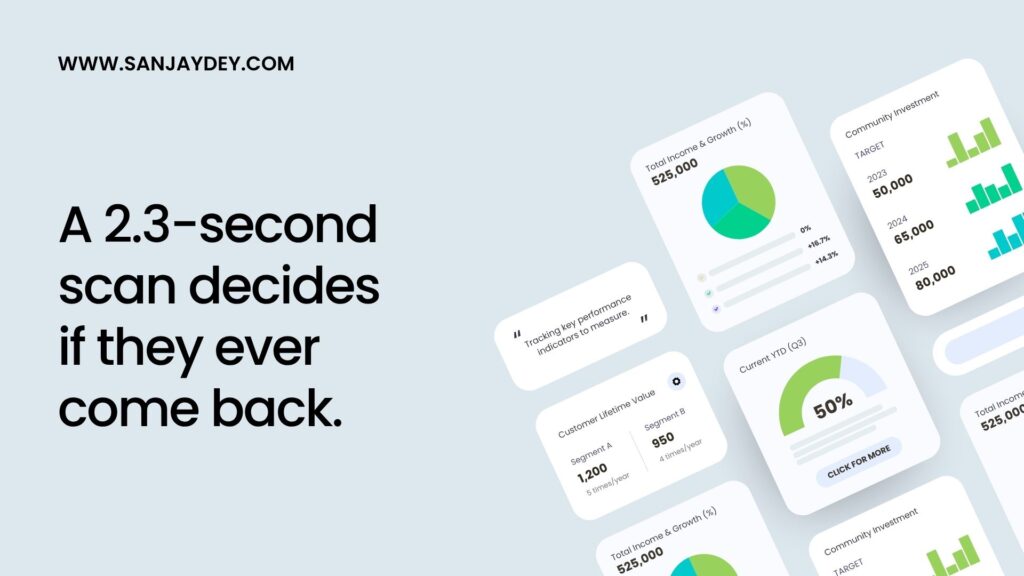
- A 2024 NN/g study found that decision-makers spend 2.3 seconds scanning a dashboard before deciding to engage or close it.
- Information architecture, not visual style, separates dashboards users return to from dashboards users abandon.
- Dashboards that drive retention follow five principles: clear hierarchy, contextual KPIs, low cognitive load, fast load times, and built-in narrative.
Table of Contents
- Why Most SaaS Dashboards Fail (Even Beautiful Ones)
- What “User-Friendly SaaS Dashboard” Actually Means in 2026
- The Five Principles of SaaS Dashboard Design That Drive Retention
- Information Architecture: The Foundation Most Teams Skip
- Data Visualization Design — Choosing the Right Chart for the Right Job
- Interactive Dashboard UI Patterns That Actually Work
- Dashboard Usability Principles — How to Reduce Cognitive Load
- Designing for Different User Roles in the Same SaaS Product
- Performance, Speed, and the Hidden UX Killer
- Mobile and Responsive Considerations for SaaS Analytics Dashboards
- SaaS Dashboard Design Process — A 7-Step Framework I Use With Clients
- Common SaaS UX Mistakes That Kill Dashboard Adoption
- Geographic Relevance — How Dashboard Expectations Differ by Market
- SaaS Dashboard Design Tools and Resources
- FAQ — SaaS Dashboard Design Questions Answered
- Conclusion and Next Steps
Introduction
I’ve spent more than two decades designing analytics dashboards. Banking platforms. Steel manufacturing operations. Government skill-development portals. Healthcare apps. The patterns repeat.
Most SaaS dashboards are built backwards. Teams start with the data they have. They argue about which charts look impressive. They ship something that wins design reviews but loses users.
The dashboards users actually love look almost boring at first glance. They answer one question fast. They make the next action obvious. They respect attention as a finite resource.
This guide is the working playbook I use when I sit with product teams to fix broken dashboards or design new ones. It pulls from research by Nielsen Norman Group, Baymard Institute, and Forrester, and from projects across enterprise SaaS, banking, and government platforms. If you build SaaS products in 2026 — or commission them — this is what separates dashboards users tolerate from dashboards users return to every morning before coffee.
The work I describe overlaps closely with the broader patterns covered in my analysis of SaaS UX for revenue growth, but here I want to focus narrowly on the dashboard surface itself — the screen where SaaS products either earn or lose their daily-active-user metric.
1. Why Most SaaS Dashboards Fail (Even Beautiful Ones)
Walk into any SaaS product review. You’ll see dashboards that look like NASA control rooms. Eight tiles above the fold. Three filter dropdowns. A timeline picker. Two charts you don’t understand.
This is not a design problem. It’s a thinking problem.
Most SaaS dashboards fail because they answer the wrong question. The team asks: “What data should we show?” The right question is: “What decision does this user need to make in the next 30 seconds?”
When I audited a banking analytics platform for a UK client, the dashboard had 23 metrics on the landing screen. We tracked usage. Eleven of those metrics were never clicked. Four drove 80% of all sessions. The other 19 were noise — added because someone in a steering committee thought they were “important to track.”
We removed 17 metrics. Adoption rose 41% in six weeks.
The Four Failure Patterns I See Repeatedly
Pattern 1: Dashboard as data dumping ground. The team mistakes comprehensiveness for value. Every stakeholder gets a tile. Nobody finds what they need.
Pattern 2: Dashboard with no primary task. Users land. They look at six charts. They have no idea what to do next. They close the tab.
Pattern 3: Dashboard that hides insights behind filters. The default view is empty or generic. Users have to configure something before they see anything useful. Most users never configure anything.
Pattern 4: Dashboard that looks beautiful but loads slowly. A 2.3-second delay on first paint can drop engagement by 32% (Google Core Web Vitals data, 2024). Animations and gradient cards do not save a slow dashboard.
The connection to broader product issues is real. Many of these failure patterns are the same ones that cause bad UX websites to lose 90% of their users in 2026. Dashboards are simply the most data-dense version of the same problem.
From the field: On one enterprise project for a Fortune 500 manufacturer, the analytics dashboard had a 47-second average time-to-first-insight. After redesign — same data, different hierarchy — that dropped to 9 seconds. Nothing changed about the underlying queries. We just stopped making the user do our information architecture work for them.
The best test for any SaaS dashboard is brutally simple. Show it to a target user for five seconds. Hide it. Ask: “What’s the one thing you’d do next?” If they can’t answer, the design has failed — no matter how clean the typography looks.
2. What “User-Friendly SaaS Dashboard” Actually Means in 2026
The phrase “user-friendly” has been hollowed out by a decade of bad marketing copy. Let me give it back some weight.
A user-friendly SaaS dashboard does four things, in order:
- Tells the user what’s normal — at a glance, in under three seconds.
- Flags what’s not normal — without forcing the user to find it.
- Makes the next action obvious — one primary CTA per anomaly or insight.
- Lets the curious user dig deeper — without punishing the casual user with complexity.
Most dashboards stop at step one. The really good ones get to step three. The exceptional ones — Stripe, Linear, Mixpanel — handle all four naturally.
The Three User Types Every SaaS Dashboard Serves
Every SaaS dashboard has three user types. They visit at different frequencies. They have different needs. Designing for one wrecks the experience for the other two.
The Glancer logs in once a day. They want a 10-second status check. Nothing more. If your dashboard takes 30 seconds to scan, you’ve lost them.
The Investigator comes when something feels off. They need to drill from a high-level number into the underlying behaviour. If your dashboard treats this as an afterthought, they’ll switch to your competitor’s product the next time they need answers fast.
The Analyst lives in the dashboard. They build views, export data, and run experiments. They are 5% of users but 50% of feature requests. Designing entirely for them creates a product the other 95% can’t use.
The mistake I see most often is teams designing for the Analyst because the Analyst gives the loudest feedback. Then they wonder why their NPS scores collapse.
[ALT: SaaS dashboard showing three user-type panels — Glancer, Investigator, Analyst — with different default views]3. The Five Principles of SaaS Dashboard Design That Drive Retention
After 20 years of designing dashboards across banking, healthcare, manufacturing, and government, I’ve narrowed the principles to five. They sound obvious. Almost no one applies all five.
Principle 1: One Primary Task Per Screen
Every dashboard screen should have one job. Not two. Not “an overview plus drill-down.” One.
If your dashboard tries to be both a status report and an investigation tool on the same screen, neither task gets done well. Split them. Use a master-detail pattern. Use a default view and an explorer view.
Principle 2: Defaults Are Decisions
The default view of a dashboard is the most important design decision in the entire product. 78% of users never change default settings (NN/g, 2023). What they see on day one is what they think your product is.
Spend more time on defaults than on customisation features. Get the defaults right and most users will never need customisation.
Principle 3: Show Change, Not Just State
A number alone is meaningless. “Revenue: $48,200” tells me nothing. “Revenue: $48,200, up 12% from last week” tells me everything.
Every metric on a dashboard should answer three questions in one glance:
- What is the current value?
- How does it compare to a meaningful baseline?
- Is this good or bad?
The third question is the one most dashboards skip. Use colour, icons, or simple text to signal direction. Don’t make users do mental math to know if a number is good news.
Principle 4: Reduce, Then Reduce Again
Cognitive load is the silent killer of dashboard usability. The average enterprise user makes 12 work-related decisions per hour (McKinsey, 2023). Your dashboard is competing for cognitive bandwidth with email, Slack, and three other tabs.
Cut anything that doesn’t directly support the primary task. Remove redundant labels. Combine related metrics. Use whitespace as a feature, not a missing element. The deeper application of these ideas is something I’ve covered in designing for cognitive load — the principles transfer directly to dashboard work.
Principle 5: Speed Is a Design Decision
Users perceive a dashboard as “broken” if it takes more than 1 second to load (Google, 2024). After 3 seconds, 53% will close the tab. Performance is not an engineering problem to solve after the design is done. It’s a constraint that shapes the design from the first sketch.
If your dashboard depends on heavy queries, design for asynchronous loading. Show skeleton screens. Load the most-used metrics first. Treat load time as a UX metric — because it is.
4. Information Architecture: The Foundation Most Teams Skip
If you remember nothing else from this guide, remember this: information architecture is 80% of dashboard quality. Visual design is 20%.
I’ve watched teams spend six weeks polishing chart aesthetics on a dashboard whose IA was broken from the first sketch. The polish doesn’t help. Users still can’t find anything.
Good dashboard IA answers three questions before any pixel is placed:
- What is the user’s mental model of their data? Not your data model. Their mental model.
- What sequence of questions does the user ask? Most dashboards collapse this into a flat layout. They shouldn’t.
- What can be shown at the same time without creating noise? Two metrics that always move together can share space. Two that compete for attention should not.
The Card-Sort Method I Use With SaaS Clients
When I run a dashboard project, the first working session is a card sort. I write every potential metric on a card. The client team sorts them into groups. Then they sort the groups by frequency of use.
The output looks something like this:
| Frequency | Group | Action |
|---|---|---|
| Daily | Core KPIs (3-5 metrics) | Above the fold, always visible |
| Weekly | Trend analysis | Second screen or expandable section |
| Monthly | Strategic reports | Separate page, accessed from main nav |
| Rarely | Compliance, audit | Separate area, not on main dashboard |
This single exercise prevents 80% of dashboard bloat. It forces the team to admit that “important to track” and “needs to be on the main screen” are different things.
Hierarchy in Three Layers
Every well-designed dashboard has three layers of IA:
Layer 1 — Status: What’s happening right now? (3-5 KPIs) Layer 2 — Context: Why is it happening? (Trends, comparisons, segments) Layer 3 — Detail: What can I do about it? (Drill-down tables, action panels)
Most dashboards merge all three layers onto one screen. The result is visual chaos. Separate them. Use progressive disclosure. Make the user choose to go deeper rather than forcing them to wade through detail to find the headline.
The same hierarchical thinking applies broadly across SaaS interfaces — it’s a pattern I unpack in more depth in SaaS dashboard design and information architecture, which goes deeper into the cognitive overload side of the problem.
5. Data Visualization Design — Choosing the Right Chart for the Right Job
Most dashboards have too many chart types. Pie charts where bar charts would work. Line charts with seven overlapping series no one can read. Donut charts that look pretty but communicate nothing.
The rules for chart selection are not subjective. They come from decades of perceptual research.
A Practical Chart-Selection Framework
| Question the User Is Asking | Best Chart Type | Avoid |
|---|---|---|
| What is the value right now? | Big number with delta | Single-data-point charts |
| How has this changed over time? | Line chart | Bar chart with many time periods |
| How do categories compare? | Horizontal bar chart | Pie chart with more than 4 slices |
| What’s the distribution? | Histogram or box plot | Pie chart |
| What’s the relationship between two variables? | Scatter plot | Stacked bar chart |
| What’s the breakdown of a whole? | 100% stacked bar | Pie chart with many slices |
| What’s the geographic pattern? | Choropleth map | Bar chart with country names |
Notice how often “pie chart” appears in the avoid column. Pie charts are over-used and under-effective. Bar charts almost always communicate the same information faster.
The Five Rules of Honest Data Visualization
I tell every team I work with: dashboards that mislead users — even unintentionally — destroy trust. And trust is the hardest UX metric to recover.
- Always start bar charts at zero. Truncated axes exaggerate small differences and lie to the user.
- Use colour with intention, not decoration. Three or four colours maximum. Each one means something.
- Avoid 3D charts. They distort proportions. They look dated. They harm readability.
- Label directly when possible. A legend forces eye-bouncing. Direct labels do not.
- Show the data, not the design. If your chart needs explaining, redesign the chart.
The best data visualization design feels almost invisible. The user sees the answer, not the chart. That’s the goal. The same design philosophy carries across Power BI dashboard UX work, which I’ve documented in detail elsewhere — the principles transfer to any data-heavy interface.
[ALT: Side-by-side comparison of a cluttered SaaS dashboard versus a redesigned minimal version showing same data]6. Interactive Dashboard UI Patterns That Actually Work
Interactivity is where most dashboards either earn loyalty or lose it. The difference is whether the interactions feel useful or feel like a maze.
Filter Patterns That Don’t Annoy Users
Pattern: Persistent filter context. When a user filters to “EMEA region, Q3 2026,” that filter should follow them across screens. Resetting filters between views is one of the most common — and most frustrating — UX failures in SaaS dashboards.
Pattern: Filter visibility. Active filters must be visible at all times. Use chips or pills near the top of the screen. Make removing them a one-click action.
Pattern: Smart defaults over empty states. A dashboard that shows “Select a date range to see data” on first load is broken. Pick a sensible default (last 30 days is usually right). Let users change it. Never force configuration before showing value.
Drill-Down Patterns
The single most-requested feature on any SaaS dashboard is drill-down. The implementation is where teams go wrong.
Wrong: Click a chart, get a new full-screen page with no clear path back. Right: Click a chart, see an expandable panel with the underlying detail. Close the panel, return to where you were.
The mental model matters. A drill-down should feel like opening a folder, not navigating to a new website. Users should always know where they are and how to get back.
Hover, Tooltip, and Click Hierarchy
Different actions deserve different interactions. A consistent hierarchy looks like this:
- Hover: Show preview detail. Don’t trigger navigation.
- Click: Drill into detail in place.
- Right-click or context menu: Open advanced actions.
- Double-click: Avoid. It’s not discoverable.
Most dashboards make hover behave like click. Users hover by accident — they panic. Don’t do this.
Customisation Patterns Worth the Engineering Cost
I have a strong opinion here, formed over 20 years: most dashboard customisation features are wasted engineering time.
The data is consistent. Most users don’t customise. They use defaults. They want the team to make good decisions for them.
Build customisation only after defaults are excellent. If you add it earlier, you’re solving the wrong problem. The path to dashboards users actually love is through better defaults, not more knobs.
7. Dashboard Usability Principles — How to Reduce Cognitive Load
Cognitive load is the amount of mental effort required to use an interface. SaaS dashboards routinely overload users — and users routinely abandon them as a result.
The Nielsen Norman Group has published extensive research on this. Their finding: the average enterprise user can hold 4-7 pieces of information in working memory at once. Dashboards that require holding more than 7 will produce errors, frustration, and abandonment.
Six Tactics That Cut Cognitive Load Without Cutting Functionality
1. Group related metrics visually. Use proximity, alignment, and shared backgrounds to signal “these belong together.” The Gestalt principles work because they’re how human perception actually operates.
2. Anchor metrics with context. A number alone forces the user to remember what it means. A number with a label, a baseline, and a trend arrow does the cognitive work for them.
3. Use progressive disclosure aggressively. Show the headline. Hide the detail. Let the user pull the detail when they want it. The shape of this pattern is what I covered in zero-state UX design — but it applies equally to dense states.
4. Standardise units and time periods. If one chart shows revenue in dollars and another in thousands, users will misread both. Pick one convention. Apply it everywhere.
5. Use language users already know. Internal jargon belongs in internal tools, not customer-facing dashboards. “MRR” is fine if your users are SaaS founders. “Net Promoter Composite Index” is not fine for anyone.
6. Eliminate visual noise. Borders, shadows, gradients, drop shadows — every visual element costs attention. If it doesn’t earn its space, remove it.
The “Five-Second Rule” Test
Before shipping any dashboard, run this test:
- Show the dashboard to a target user for exactly five seconds.
- Hide it.
- Ask three questions:
- What’s the most important number?
- What’s changing?
- What would you do next?
If they can’t answer all three, the design needs more work. This test catches more usability problems in 15 minutes than a week of A/B testing will.
Why “Reduce Cognitive Load” Is Not the Same as “Make It Simple”
There’s a misconception worth dismantling. Reducing cognitive load doesn’t mean stripping a dashboard down to three numbers. It means doing the cognitive work for the user — pre-computing the comparisons, surfacing the anomalies, structuring the information so the brain doesn’t have to.
A dense dashboard can have low cognitive load if it’s structured well. A sparse dashboard can have high cognitive load if every metric requires interpretation. Density is not the enemy. Disorganisation is.
The best example I’ve seen recently was a logistics SaaS dashboard tracking 18 KPIs. By any measure it should have been overwhelming. The team had grouped related metrics into four visual zones, anchored each metric with a clear baseline, and used a single colour-coding scheme consistently. Users called it “the simplest dashboard they’d ever used.” It wasn’t simple. It was well-organised.
That distinction sits at the heart of dashboard usability principles. Simplicity is a feeling. Organisation is the cause.
8. Designing for Different User Roles in the Same SaaS Product
A B2B SaaS product typically serves four user roles: end users, team leads, executives, and admins. Most dashboards try to serve all four with one screen. Most fail.
The fix is role-based dashboards — but done with restraint.
The Right Way to Build Role-Based Views
Start with the default view per role. An executive’s default should be different from an analyst’s default. A customer support manager’s default should be different from a CRO’s default. Build these defaults based on actual job-to-be-done research, not guesses.
Then add a shared layer that everyone sees. Critical alerts. System status. Account-wide metrics that affect everyone.
Avoid building 14 different role views. Three to five well-tuned defaults serve 90% of users. Beyond that, you’re building complexity that the team has to maintain forever.
Permissions Are a UX Problem, Not a Security Problem
When a user clicks a metric and gets “You don’t have permission to view this,” your dashboard has failed. Either don’t show metrics the user can’t access, or show them as locked with a clear path to request access.
Showing-then-blocking is one of the most common — and most frustrating — UX failures in enterprise SaaS. Many of these are the same patterns I see in UX mistakes that kill conversion rates — the underlying problem is identical: presenting friction without context.
9. Performance, Speed, and the Hidden UX Killer
Speed is a UX feature. I’ll say it again because most teams don’t believe it: speed is a UX feature.
A 2024 Google study found that for every 1-second delay in dashboard load time, user engagement dropped by 7%. After 3 seconds, 53% of users abandoned the session. After 5 seconds, the dashboard was effectively dead.
This is not theoretical. I’ve watched SaaS products lose 30% of their daily active users to a dashboard that took 4 seconds to render the first useful screen.
Performance Patterns That Work
Skeleton screens over spinners. A skeleton screen — placeholder boxes where content will appear — feels faster than a spinning loader, even when load times are identical.
Optimistic UI for actions. When the user clicks “Save filter,” show success immediately. Resolve the actual save in the background. Roll back only if it fails.
Lazy-load below the fold. Render the top of the dashboard first. Load secondary metrics as the user scrolls. Most users never scroll past the first screen anyway.
Cache aggressively. A dashboard that re-queries every metric on every page load is wasting both server time and user attention.
Progressive data loading. Show the most-recent data point immediately. Stream historical data in. Don’t wait for everything before showing anything.
What “Fast Enough” Means in 2026
The benchmark from Google Core Web Vitals:
- Largest Contentful Paint (LCP): under 2.5 seconds
- First Input Delay (FID): under 100ms
- Cumulative Layout Shift (CLS): under 0.1
If your SaaS dashboard misses any of these, users feel it — even if they can’t articulate why. The dashboard “feels slow.” That feeling translates into churn.
10. Mobile and Responsive Considerations for SaaS Analytics Dashboards
Most SaaS dashboards are designed desktop-first. Most users now check them on mobile at least once a day. The disconnect is significant.
A 2024 Statista study found 41% of B2B software users access dashboards from mobile at least once weekly. The number is rising. Mobile is no longer optional.
What Mobile Dashboard Design Actually Means
Mobile is not a smaller desktop. It’s a different mental context.
- Sessions are shorter. Average mobile dashboard session: 47 seconds. Desktop: 4 minutes.
- Tasks are different. Mobile users check status. Desktop users analyse.
- Screen real estate is different. A 3-column desktop dashboard does not become a useful mobile dashboard by stacking columns.
The right approach is to build a mobile-specific dashboard view — not a responsive squish of the desktop view. Show the 3 metrics that matter most on mobile. Hide everything else behind a “View detailed dashboard” link that opens a desktop-optimised view.
Touch Targets and Gesture Patterns
Every interactive element on mobile must be at least 44×44 pixels (Apple HIG). Most dashboard charts violate this on mobile. Tooltips that work on hover with a mouse don’t work on touch.
The fix: tap-to-reveal patterns. The first tap shows detail. The second tap drills in. Long-press opens context actions.
The deeper exploration of these patterns sits in mobile UX/UI design patterns — the principles I outline there apply directly to mobile dashboard design.
11. SaaS Dashboard Design Process — A 7-Step Framework I Use With Clients
This is the working process I run when designing or redesigning a SaaS dashboard. It takes 6 to 12 weeks for a typical project. The first three weeks are research and IA. Most teams skip those. Don’t.
Step 1 — Stakeholder Interviews and Job-to-Be-Done Mapping
Talk to 8-12 actual users across the three role types (Glancer, Investigator, Analyst). Ask: “What decision do you make from this dashboard?” Most teams skip this and design for assumed needs.
Step 2 — Metric Audit
List every metric currently on the dashboard. Score each on usage frequency and decision impact. Cut anything in the bottom-right quadrant (low usage, low impact). Most dashboards lose 40% of their metrics in this exercise.
Step 3 — Card Sort and IA Mapping
Run a card sort with 5-8 users. Group metrics by mental model. Map the IA hierarchy across the three layers (status, context, detail).
Step 4 — Wireframes and Hierarchy Validation
Build low-fidelity wireframes. Test them with 5 users using a tree-test method. Iterate the IA before any visual design happens.
Step 5 — Visual Design and Component System
Now design. Use existing component libraries where possible. Build a small set of chart components. Document them. The visual design phase should be the shortest phase, not the longest.
Step 6 — Prototype and Usability Test
Build a clickable prototype. Test with 5-7 users using moderated usability sessions. Measure task completion time, error rate, and SUS score. Iterate based on findings.
Step 7 — Phased Rollout and Telemetry
Don’t ship the whole thing at once. Roll it out to 10% of users. Watch the telemetry. Watch session recordings. Fix obvious issues. Then expand.
This process maps closely to the broader UX design process I document elsewhere — but with the dashboard-specific adaptations above.
[ALT: Diagram showing the 7-step SaaS dashboard design process from stakeholder interviews to phased rollout]12. Common SaaS UX Mistakes That Kill Dashboard Adoption
I keep a running list of dashboard mistakes I see across client projects. These are the most damaging — and the most common.
Mistake 1: Designing for the Demo, Not the Daily User
Teams polish the screenshot that goes on the marketing page. Real users see a different version — half-loaded, with empty states, with realistic messy data. The demo dashboard and the daily dashboard are different products. Design for the daily one.
Mistake 2: Adding Features Instead of Removing Them
Every quarter, someone adds a tile. No one removes one. Three years in, the dashboard has 34 widgets and no one can find anything. Set a rule: every new metric requires removing an old one. This is hard. Do it anyway.
Mistake 3: Burying the Most Important Metric
The metric that 80% of users care about is in the third row, hidden behind a filter. The metric that 5% of stakeholders care about is in the hero position because that stakeholder shouted loudest. Fix this with usage data, not opinions.
Mistake 4: Treating Errors as Edge Cases
Empty states. Loading states. Permission errors. These are not edge cases. They’re the user’s first impression on day one and their daily reality on weeks two through fifty-two. Design them with the same care as the happy path.
Mistake 5: Skipping the Mobile View
“We’ll do mobile later” turns into “We never did mobile.” Build mobile from day one — even if it’s just a simplified view. Users expect it.
Mistake 6: No Empty State Design
A dashboard with no data should not show a blank screen. It should explain what data will appear, why it’s not there yet, and what action will populate it. Most SaaS dashboards fail catastrophically at this.
Mistake 7: Ignoring Accessibility
Colour-only signalling fails for the 8% of male users who are colour-blind. Tiny font sizes fail for users over 45. Low contrast fails everyone in bright office lighting. Accessibility is not a compliance checkbox. It’s basic respect for users.
I’ve detailed accessibility patterns in accessibility-first design with WCAG 2.2 — these patterns apply directly to dashboards and should be part of every design review.
Mistake 8: Treating Onboarding as a Separate Problem
A dashboard’s first-run experience is part of the dashboard. Most teams treat onboarding as a tour modal — a 5-step popup that explains what each tile means. Users dismiss it. They forget what was said. The dashboard remains opaque.
Better: design the dashboard so it explains itself. Use empty states that show what data will appear. Use micro-tooltips that activate on first hover. Use a small “what does this mean?” link next to each KPI rather than a once-off tour.
The dashboard should teach the user every time it’s used, not once during onboarding.
Mistake 9: Stale Data Without Indication
A dashboard that shows numbers as if they’re current — when they were last updated 6 hours ago — is a trust killer. Every metric should display its freshness: “Updated 3 minutes ago” or “Last refreshed at 09:42.” Without this, users will eventually catch a stale number, lose confidence, and start exporting raw data to Excel instead.
Once that switch happens, the dashboard is dead even if it stays live in the product.
Mistake 10: Over-Notifying
Some teams confuse “drawing attention” with “good UX.” They surface every change, every threshold, every anomaly with a red badge or a notification dot. Within two weeks, users mentally filter out every alert.
The fix: set strict rules for what earns visual urgency. Critical issues get red. Important changes get neutral indicators. Everything else gets nothing. If everything is urgent, nothing is urgent.
13. Geographic Relevance — How Dashboard Expectations Differ by Market
I’ve designed dashboards for clients in five major markets. The fundamentals don’t change. The cultural expectations and regulatory contexts do.
United States
US SaaS users expect speed and decisiveness. The dashboard should surface insights, not just data. Compliance with WCAG 2.1 AA is increasingly a contractual requirement, especially for federal contractors and any product serving healthcare. Dashboards that ignore accessibility lose enterprise deals. Average B2B SaaS spend per business in the US grew 18% YoY in 2024 (Gartner) — meaning users have higher expectations and more switching options than ever.
United Kingdom
UK enterprise users — particularly in financial services and government — value precision over polish. Data lineage matters. Where the number came from, when it was last updated, and which source system produced it should be visible without clicking. GDPR-aware data handling and clear consent flows are non-negotiable. UK users are also notably less tolerant of marketing-style language inside dashboards. Plain English wins.
UAE / Middle East
The UAE and broader Gulf market is one of the fastest-growing SaaS adoption regions globally. Dashboards designed for this market should support both English and Arabic — including right-to-left layouts that are properly mirrored, not just translated. Local regulatory frameworks like the UAE Personal Data Protection Law (Federal Decree-Law No. 45 of 2021) shape consent and audit-trail requirements. Visual design preferences lean toward more decorative polish than US or UK markets — restraint is still essential, but the absolute minimalism that works in the Bay Area may feel sparse to Dubai-based users.
Australia and New Zealand
Australian B2B users tend to be pragmatic and outcome-focused. Dashboards that emphasise actionable insights over feature richness perform better. The Australian Privacy Principles (APP) framework and the upcoming reforms to the Privacy Act shape data display requirements. Mobile-first usage is high — many decision-makers in mid-sized businesses check dashboards primarily on mobile devices. Plan accordingly.
India
The Indian SaaS market is unique. Users span wildly different digital maturity levels. The same dashboard may be used by a CTO in Bangalore with a 4K monitor and a regional manager in Indore on a 5-year-old Android phone. Design for the lower end of this spectrum and the higher end will be fine — never the other way around. Bandwidth-aware design — lazy loading, progressive enhancement, graceful degradation — is not optional. The Digital Personal Data Protection Act (DPDPA) 2023 is now reshaping how SaaS products handle user data display and consent — dashboards that show personal data must support clear consent indicators.
14. SaaS Dashboard Design Tools and Resources
The tools matter less than the thinking. But the right tools speed the thinking up.
Design and Prototyping
- Figma — Industry standard for SaaS dashboard design. Component libraries, auto-layout, and team collaboration are best in class.
- Adobe XD — Still used in some enterprise environments, particularly where Adobe Creative Cloud is standardised.
- Axure RP — Best for highly interactive prototypes with conditional logic and dynamic data.
Research and Testing
- Maze — Remote unmoderated usability testing.
- UserTesting — Moderated and unmoderated tests with paid participant panels.
- Hotjar / Microsoft Clarity — Session recordings and heatmaps for live dashboards.
- Optimal Workshop — Card sorts and tree tests for IA validation.
Component Libraries Worth Using
- Tailwind UI — Excellent baseline for SaaS dashboards.
- Material Design 3 — Mature system with strong dashboard patterns.
- Carbon Design System (IBM) — Enterprise-grade dashboard patterns.
- Ant Design — Strong for data-dense interfaces, especially admin dashboards.
Data Visualization Libraries
- Recharts — React-friendly, good defaults.
- D3.js — Maximum flexibility, steep learning curve.
- Apache ECharts — Excellent for complex enterprise visualisations.
- Tremor — Newer, designed specifically for SaaS dashboards.
Reading I Recommend
- Nielsen Norman Group articles on dashboards and analytics UX
- Stephen Few’s books on information dashboards
- Edward Tufte’s work on data visualisation
- Baymard Institute’s research on enterprise UX patterns
For the strategic side of SaaS UX work, my analysis of UX design for SaaS conversions covers the upstream questions of how dashboard design affects activation and retention metrics.
15. FAQ — SaaS Dashboard Design Questions Answered
What is SaaS dashboard design?
SaaS dashboard design is the practice of designing the primary data interface inside a software-as-a-service product. It combines information architecture, data visualisation, interaction design, and performance engineering. The goal is to help users understand the state of their data, identify what needs attention, and take the right next action — usually in under 30 seconds. Good SaaS dashboard design directly affects retention, activation, and feature adoption metrics, making it one of the highest-leverage design surfaces in any SaaS product.
How do you design a SaaS dashboard that users love?
To design a SaaS dashboard users love, you need to start with the decision the user makes — not the data you have. Begin with stakeholder interviews to identify the primary task per user role. Audit existing metrics and remove anything with low usage and low decision impact. Build the information architecture in three layers (status, context, detail) and use progressive disclosure to keep cognitive load low. Test wireframes with real users before any visual polish. Performance, mobile responsiveness, and accessibility should be design constraints, not afterthoughts.
What are the best UX practices for SaaS dashboards in 2026?
The best UX practices for SaaS dashboards in 2026 centre on five principles: one primary task per screen, defaults that match the most common use case, visualisations that show change rather than just state, aggressive cognitive load reduction, and load times under 2.5 seconds. Role-based default views beat universal dashboards. Mobile-specific designs beat responsive squishing. Honest data visualisation — bar charts starting at zero, no 3D effects, direct labels — beats decorative chart choices. Accessibility (WCAG 2.2 AA) is now standard, not optional.
SaaS dashboard design vs. business intelligence dashboard — what’s the key difference?
The key difference between SaaS dashboard design and a business intelligence dashboard is the user. SaaS dashboards are designed for product end users — typically non-technical, time-pressed, and focused on a specific job. They prioritise speed, simplicity, and clear next actions. BI dashboards are designed for analysts and data professionals who explore data, run queries, and build reports. They prioritise flexibility, depth, and customisation. Designing a SaaS dashboard like a BI tool is one of the most common — and damaging — mistakes I see across product teams.
How long does it take to design a SaaS dashboard properly?
A properly designed SaaS dashboard typically takes 6 to 12 weeks from research to launch. The first 2-3 weeks are stakeholder interviews, metric audits, and information architecture work. Weeks 4-6 are wireframing and IA validation through tree tests and card sorts. Weeks 7-9 are visual design and prototyping. Weeks 10-12 are usability testing, accessibility review, and phased rollout. Compressed timelines almost always cut the IA work, which is why most rushed dashboards fail. The work is not the visual design — it’s the thinking that comes before it.
How do you reduce cognitive load on a complex dashboard?
To reduce cognitive load on a complex dashboard, you need to apply seven tactics consistently. Group related metrics with proximity and alignment. Anchor every number with a baseline and trend indicator. Use progressive disclosure to hide detail until the user requests it. Standardise units, time periods, and date formats across the entire dashboard. Replace internal jargon with plain language. Eliminate visual noise — borders, gradients, unnecessary icons. Test the dashboard with the five-second rule: can a target user identify the most important metric and the next action within five seconds? If not, simplify further.
What metrics should be on a SaaS analytics dashboard?
A SaaS analytics dashboard should display 3-5 core KPIs at the top level, never more. The exact metrics depend on the user role and product type, but generally include one activation or engagement metric, one revenue or conversion metric, one retention or churn metric, and one operational health metric. Below the fold, the dashboard can show context — trends, segment comparisons, and drill-down tables. The mistake most teams make is showing every available metric on the main view. Prioritisation is the work. If everything is important, nothing is.
How important is mobile design for SaaS dashboards?
Mobile design is critical for SaaS dashboards in 2026. Approximately 41% of B2B SaaS users access dashboards from mobile devices at least weekly, with the proportion rising every year. Mobile users have different needs than desktop users — shorter sessions, status-checking rather than analysis, and different interaction patterns. The right approach is a mobile-specific dashboard view showing 3-5 critical metrics, not a responsive squish of the desktop view. Touch targets must be at least 44×44 pixels. Hover-based interactions must be replaced with tap-to-reveal patterns.
16. Conclusion and Next Steps
The dashboards users love are not the dashboards that win design awards. They’re the ones that answer questions fast, surface what needs attention, and make the next action obvious.
If you take three things from this guide:
- Information architecture is 80% of dashboard quality. Visual design is the polish you put on a foundation that’s already right. Spend more time on IA. Spend less time on shadows and gradients.
- Defaults are the most important design decision in your product. Most users never customise. What they see on day one is what your product is, in their minds, forever. Make defaults excellent.
- Speed is a UX feature. A 2.3-second LCP is not a backend problem. It’s a design constraint that shapes every decision from sketch to ship.
The teams I’ve seen build dashboards users love share one trait: they treat the dashboard as a product in itself, not as a feature inside a larger product. They invest in research. They test with real users. They cut features as ruthlessly as they add them. They measure adoption, not just shipment.
If you’re building or redesigning a SaaS dashboard and want a second pair of eyes — or a complete UX audit and redesign — that’s exactly the kind of work I do. You can book a free consultation to walk through your current dashboard, identify the top three issues, and outline a redesign path. No sales pitch. Just a working session.
The dashboards users love are not built by accident. They’re built by teams who decided to take the work seriously.
About the Author
Sanjay Kumar Dey is a Senior UX/UI Designer and Digital Strategist with over 20 years of experience designing enterprise dashboards, SaaS products, and web platforms for global clients including ArcelorMittal, Adobe, NatWest Bank UK, ITC, Adani, Indian Oil, and Government of India initiatives. He writes about practical UX, dashboard design, and design strategy at sanjaydey.com, where he also offers UX consulting and design services to companies in the USA, UK, UAE, Australia, and India.
Leave a Reply