
When you’re tasked with designing a website from scratch, where do you start? Most people jump straight into visual design or start browsing inspiration galleries. This approach often leads to websites that look good but don’t actually work for users.
The challenge isn’t just about making something visually appealing. You need to balance user experience, interface design, and business goals while ensuring the site actually helps people accomplish their tasks. For many designers, especially those new to web projects, this feels overwhelming.
I’ve been designing websites for clients and organizations for several years now. Over time, I’ve developed a method that consistently produces sites that both look professional and deliver results for the people who use them.
The approach I’ll share focuses on understanding users first, then building systematically toward a final product. This isn’t about following design trends or copying what competitors do—it’s about creating websites that solve real problems for real people.
You’ll learn how to research effectively, map user needs, create wireframes that actually work, and test your ideas before investing in development. Each step builds on the previous one, giving you confidence that your design decisions are based on evidence rather than assumptions.
Start with User and Market Research
“Build for everyone, with everyone.” — Marcy Sutton, Web accessibility specialist and developer
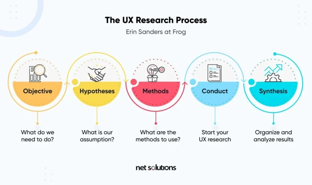
Image Source: Net Solutions
Before you sketch a single wireframe or choose your first color, you need to understand who you’re designing for and what already exists in the market. This research phase often feels like it slows down the project, but it’s actually what separates websites that work from those that don’t.
I’ve seen too many projects skip this step and jump straight into design. The result? Beautiful websites that nobody uses because they don’t address real user needs or stand out from the competition.
Interview stakeholders and users
Stakeholder interviews give you the business context you need to make informed design decisions. These conversations reveal not just what stakeholders want, but why they want it and what constraints you’re working within.
When I conduct stakeholder interviews, I focus on four essential questions:
- What does success look like for this project? This helps you understand how your work will be measured.
- What user needs must be addressed? This reveals priorities and helps you focus your efforts.
- What has worked or failed previously? This saves you from repeating past mistakes.
- How should stakeholders stay informed throughout the process? This prevents communication breakdowns later.
Plan for 30-45 minutes per interview, and record them if possible. The insights you gather here will guide decisions throughout the entire project.
User interviews serve a different purpose—they reveal what people actually do versus what stakeholders think they do. The key is asking the right questions and following up when you hear something interesting. As one expert notes, “It’s our responsibility to drive the user to their actual problems”.
Analyze competitor websites
Studying your competition isn’t about copying what they do—it’s about understanding the landscape you’re entering and finding opportunities to do something better.
Look at competitor websites with these questions in mind:
- How do they structure their homepage and navigation?
- What tone and messaging do they use?
- Where do they seem to be investing the most effort?
- What complaints do users have in reviews or feedback?
This analysis reveals both industry standards you might need to follow and gaps you can exploit. Pay attention to areas where competitors invest heavily—these sections likely drive significant value. Conversely, identifying weaknesses in their user experience shows you where you can gain an advantage.
Define user personas
A user persona transforms your research data into a specific person you can design for. Instead of designing for “users” in general, you’re designing for Sarah, the busy marketing manager, or David, the first-time online shopper.
Effective personas include:
- Basic demographics and a photo
- Professional context and environment
- Goals, motivations, and frustrations
- Quotes that capture their perspective
Personas work because designers connect better with individual people than with abstract statistics. As one expert explains, “A persona doesn’t need to document every aspect of the imaginary individual’s life, but rather should focus on characteristics that impact what is being designed”.
Create personas early in your process and base them on real research, not assumptions. This ensures your design addresses genuine user needs rather than what you think people want.
Map Out the User Journey
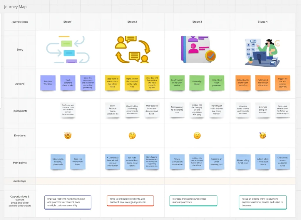
Image Source: ProjectSkills Mentor
Your research has given you valuable insights about users and their needs. Now you need to translate that knowledge into a clear picture of how people will actually move through your website to accomplish their goals.
User journey mapping transforms research data into visual representations that guide design decisions. Think of it as creating a roadmap that shows not just where users go, but why they go there and what they need along the way.
Create user flows
User flows are diagrams that show the specific paths users take to complete tasks on your website. They help you visualize the experience from start to finish, ensuring you don’t miss critical steps.
When creating user flows, follow these steps:
1. Start with user entry points – where do people first encounter your site?
2. Map the core pathway – what’s the most direct route to task completion?
3. Account for decision points – where might users branch off or need to make choices?
4. Define the end state – what does successful task completion look like?
Use consistent shapes throughout your flows: rectangles for pages, circles for actions, and diamonds for decision points. Keep each step essential to the task—extra complexity only creates confusion later.
User flows work best when created early in the process. They help you spot potential problems before you start designing interfaces, saving time and reducing the need for major revisions.
Identify key touchpoints
Touchpoints are the specific moments when users interact with your website. Mapping these interactions helps you create consistency across the entire experience.
Focus on three main categories when identifying touchpoints:
Before users arrive: SEO-optimized pages, social media content, and referral sources that bring people to your site
During active use: Navigation elements, content pages, forms, and interactive features that help users accomplish their goals
After task completion: Confirmation pages, follow-up communications, and support resources that extend the relationship
Each touchpoint should feel connected to the others. When users move from one interaction to the next, they shouldn’t feel like they’ve landed on a completely different website.
Align design with user goals
The most effective websites balance what users want to accomplish with what the business needs to achieve. This alignment happens when you design flows that naturally guide people toward mutual value.
Start by mapping how each user persona will move through your site to reach their goals. Then identify moments where business objectives naturally intersect with user needs. These intersection points often become your most important design opportunities.
For websites serving multiple user types, create separate journey maps for each group. A healthcare website might have distinct flows for patients scheduling appointments and doctors accessing patient records. Each path should feel tailored to its specific user’s needs and context.
The goal isn’t just to document how users move through your site—it’s to identify friction points and opportunities for improvement. Regular testing will show you where your maps match reality and where they need adjustment.
Sketch and Wireframe Your Ideas
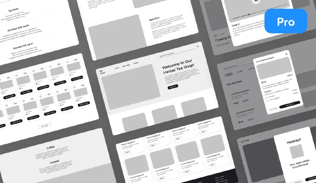
Image Source: Uizard
Once you understand how users will move through your site, you need to give those pathways visual structure. Wireframing bridges the gap between user research and actual design—it’s where abstract concepts become concrete layouts you can actually build.
Draw low-fidelity wireframes
Low-fidelity wireframes focus on structure and functionality rather than visual polish. Think boxes, lines, and placeholder text that show where everything goes without getting distracted by colors or fonts.
When creating low-fidelity wireframes:
- Focus on functionality rather than aesthetics
- Use simple shapes to represent images, buttons, and content blocks
- Create basic navigation elements
- Outline content hierarchy and placement
The power of low-fidelity wireframes lies in their speed. You can sketch multiple layout concepts in the time it would take to create one polished design. This makes them perfect for exploring different approaches and getting early feedback from stakeholders.
As one design expert puts it: “Think of wireframes as the architectural blueprints of web design, providing a strategic foundation for your digital presence.”
Design mobile and desktop versions
Here’s something many designers get wrong: they start with desktop layouts and then try to squeeze everything onto mobile screens. This approach usually creates cramped, difficult-to-use mobile experiences.
For effective multi-device wireframing:
- Start with mobile layouts first (the mobile-first approach)
- Consider how elements will reflow on different screen sizes
- Identify which elements are essential for the mobile experience
- Use standard wireframe sizes: 1080px × 1920px for mobile and 768px × 1366px for desktop
Remember that people scan web content in an F-shaped pattern, starting at the upper left and moving across before scanning down the left side. This behavior affects your layout decisions across all screen sizes.
Creating site flow maps alongside your wireframes helps clarify how users navigate between pages. This prevents you from designing beautiful individual pages that don’t connect logically.
Review and revise based on feedback
Wireframes are collaboration tools, not final products. They give you an opportunity to gather feedback before investing time in detailed visual design.
When reviewing wireframes, focus on:
- Overall structure and layout effectiveness
- Functionality and user flow logic
- Content hierarchy and organization
- Presence of all necessary elements
Avoid getting pulled into discussions about colors, fonts, or imagery at this stage. Those decisions come later. Instead, ask whether the wireframe solves the problems you identified in your research.
Low-fidelity wireframes make iteration fast and cheap. You can test multiple concepts, gather feedback, and make changes without significant time investment. This approach prevents costly revisions during later design phases when changes become more expensive and time-consuming.
Design High-Fidelity Mockups
“The visual design needs to tell the story.” — Jared Spool, User experience expert and founder of User Interface Engineering
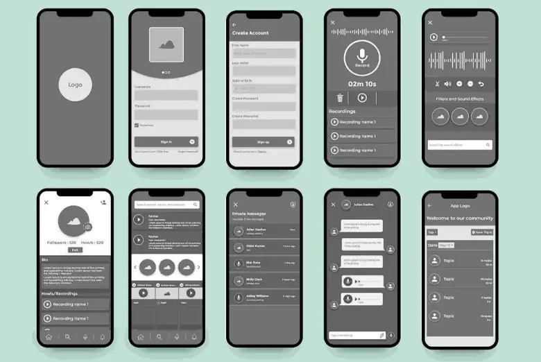
Image Source: And Academy
Your wireframes establish the structure, but high-fidelity mockups bring your website to life visually. This phase transforms basic layouts into polished designs that closely represent the final product.
Apply branding and visual elements
Color choices guide user attention more than most designers realize. Your palette should work strategically—neutral colors form the foundation, primary colors direct focus, and accent colors highlight critical actions. The 60% neutral, 30% primary, 10% accent rule creates visual balance without overwhelming users.
Typography establishes clear information hierarchy. Choose fonts that reflect your brand personality while remaining highly readable across devices. Base your sizing system on 16-pixel text for optimal legibility, then build consistent scale relationships from there.
Every visual element needs to feel cohesive. Icons, imagery, and interface components should share consistent styling that reinforces brand recognition. When users encounter familiar visual patterns, they navigate more confidently and complete tasks more efficiently.
Use UI design tools effectively
Modern design tools like Figma enable teams to maintain consistency through shared component libraries. Everyone accesses the same approved elements, reducing design discrepancies and speeding up the design process.
When selecting design tools, evaluate these factors:
- Cost structure: Per-user licensing versus flat-rate pricing
- Collaboration features: Real-time editing and commenting capabilities
- Workflow integration: Compatibility with existing team processes
- Development handoff: Built-in specs and asset export features
Choose tools that support your entire process from wireframes through developer handoff. Switching between multiple applications creates unnecessary friction and potential errors.
Create a design system for consistency
Design systems document reusable components, visual styles, and usage guidelines that maintain consistency across your website. They typically include style guides covering colors and typography, component libraries with UI elements, and pattern libraries showing layout templates.
Design systems prevent teams from recreating common elements repeatedly. Instead of building each button or form field from scratch, designers select from pre-approved components that align with brand standards. This approach ensures visual consistency while dramatically reducing design and development time.
Well-documented design systems help stakeholders understand exactly how the final website will look and function before development begins. This clarity prevents costly revisions during later stages and keeps projects on schedule.
Prototype, Test, and Iterate
!Diagram illustrating the UX design process steps: empathize, define, ideate, prototype, test, and refine.
Image Source: VLink Inc.
Once your high-fidelity mockups are approved, you need to validate whether your design actually works for real users. Creating interactive prototypes and testing them reveals problems that static designs can’t show you.
Build interactive prototypes
Interactive prototypes bridge the gap between static mockups and functional websites. They let you simulate user interactions without writing code, giving stakeholders and users a realistic preview of the final experience.
Essential prototype features include:
- Clickable navigation: Links between pages and sections work as expected
- Form interactions: Users can input data and see responses
- Hover states: Buttons and interactive elements respond to user actions
- Scroll behavior: Content flows naturally on longer pages
Tools like Figma make this process straightforward. You can define interactions between frames, add transitions, and even include conditional logic for more complex user flows. The goal is creating something that feels real enough to generate honest feedback.
“When developers see it, it feels real. They know exactly how to begin developing,” notes Andrew Matthews, Design Director at YETI.
Conduct usability testing
Testing with actual users uncovers issues you’d never anticipate. I’ve seen designs that looked perfect in mockups completely confuse users during testing. The key is observing how people actually interact with your prototype rather than how you think they should.
For effective usability testing:
1. Define specific research goals before you start. What questions do you need answered?
2. Recruit participants who match your target users. Testing with the wrong people produces misleading results.
3. Create realistic tasks that reflect how people will actually use your site.
4. Observe without interrupting. Let users struggle—their confusion reveals design problems.
5. Focus on behavior, not opinions. What users do matters more than what they say they’d do.
Even with just five participants, you can uncover the majority of common usability problems in your design. Remember, you’re testing the design, not the users—make this clear so participants feel comfortable being honest about difficulties they encounter.
Refine based on user feedback
Testing reveals problems, but the real work happens when you decide how to fix them. Not every piece of feedback deserves equal attention. Focus on issues that prevent users from completing their primary tasks.
Prioritize changes based on:
- Frequency: How many users encountered this problem?
- Severity: Does it completely block task completion or just slow users down?
- Feasibility: Can you address this issue within your timeline and budget constraints?
After making changes, test again. This cycle of prototype-test-refine continues until your design consistently helps users accomplish their goals. Sometimes this means significant revisions to your original concept, but that’s better than launching something that doesn’t work.
The iterative approach takes patience, but it prevents expensive mistakes during development. Each round of testing brings you closer to a website that genuinely serves both user needs and business objectives.
Conclusion
The method I’ve shared gives you a systematic approach to website design that works. Each step builds on the previous one, creating a foundation that supports both user needs and business goals.
Starting with research prevents the common mistake of designing for yourself instead of your actual users. When you understand who you’re designing for and what they need to accomplish, every design decision becomes clearer. The time spent on stakeholder interviews and user research pays dividends later when you’re making layout and functionality choices.
Mapping user journeys keeps you focused on the paths people actually take through your site. This prevents you from creating beautiful designs that don’t help anyone accomplish their goals. User flows and wireframes let you test your thinking before investing in detailed visual design.
Testing with real users reveals problems you can’t anticipate on your own. I’ve seen too many websites launch without user testing, only to discover major usability issues after development is complete. The prototype-test-iterate cycle might feel slow, but it saves significant time and money compared to fixing problems after launch.
The approach works because it’s based on evidence rather than assumptions. Each step validates your decisions before moving to the next phase. This systematic progression reduces risk and increases your confidence that the final website will actually serve its intended purpose.
Remember that good website design balances what users need with what the business needs. Your job is to create that balance through thoughtful design decisions backed by research and testing. The method I’ve outlined helps you maintain that balance throughout the entire process.
You can start applying this approach to your next website project immediately. Begin with understanding your users, map their journeys, create wireframes that support their goals, and test your ideas with real people. Each project will teach you something new about the process and help you refine your approach.
FAQs
Q1. Do I need to use a CMS like WordPress to build a website from scratch?
No, you don’t need to use a CMS. You can build a website using just HTML, CSS, and JavaScript. However, a CMS can be helpful for managing content long-term, especially for larger sites.
Q2. What’s a good starting point for beginners learning web development?
A great starting point is to use a template from HTML5UP or similar resources. This allows you to study and modify existing code while learning HTML, CSS, and basic JavaScript. As you progress, you can create more custom designs.
Q3. How do I connect HTML, CSS, and JavaScript files in my website?
To connect these files, you’ll link your CSS and JavaScript files in the HTML file’s head section. Use a tag for CSS and a
Q4. What tools do I need to start building a website?
You’ll need a text editor like Visual Studio Code, a web browser, and optionally a local server environment like XAMPP. For more advanced development, you might use version control systems like Git and build tools like npm.
Q5. How can I make my website accessible online?
To make your website accessible online, you need to purchase a domain name and web hosting. Upload your files to the web server provided by your hosting company. Alternatively, for simple static sites, you can use free hosting services like GitHub Pages.
Leave a Reply