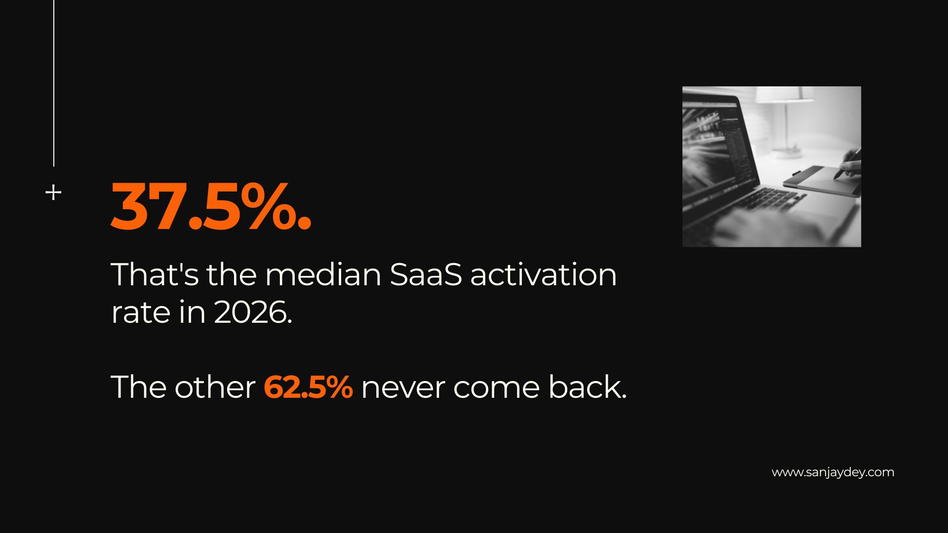
Answer: SaaS UX best practices that lift retention in 2026 are: deliver the aha moment in under five minutes, design role-based onboarding paths, reduce activation steps to under six, use progressive disclosure on dashboards, and instrument every key flow for friction data. Products hitting the aha moment within five minutes show 40% higher 30-day retention than those needing fifteen-plus minutes (Reforge, 2025). Median SaaS activation sits at 37.5% — AI-native products average 54.8%, fintech a brutal 5% (Artisan Strategies, 2026). Top-quartile B2B SaaS companies achieve Net Revenue Retention above 120% and Gross Revenue Retention above 95% (SaaS Capital, 2025). The pattern is consistent across 547 benchmarked companies: UX decisions on the first session predict 30-day retention more reliably than feature count, brand strength, or pricing tier. This article covers the practices that move those numbers — what works, what trades off, and what most teams still get wrong.
TL;DR
- Median SaaS activation rate in 2026 is 37.5%; top performers exceed 55%
- Aha moment under 5 minutes = 40% higher 30-day retention
- Cutting time-to-value by 20% lifts ARR growth by 18% (Amplitude, 2025)
- B2B SaaS monthly churn averages 3.5%; top performers stay under 2%
- Role-based onboarding cut Salesforce Lightning onboarding time 25% and churn 8%
- Every $1 in UX returns $100 — a 9,900% ROI (Forrester, 2026)
Table of Contents
- Why SaaS UX is the retention lever in 2026
- The activation event — define it before you design
- Onboarding UX that gets users to value fast
- Dashboard UX and the cognitive load trap
- Microcopy, empty states, and the friction nobody measures
- Pricing and upgrade UX — where retention actually breaks
- Geographic relevance: USA, UK, UAE, Australia, India
- FAQ
- Conclusion and CTA
Why SaaS UX is the retention lever in 2026
The global SaaS market hits $465 billion in 2026 (Precedence Research, 2026). 99% of organisations now use at least one SaaS product. The average enterprise manages 291 SaaS applications — up from 254 in 2023.
That density changes the retention math. Your product is one of three hundred. Switching cost is low. Attention is rationed.
Acquisition cost keeps climbing. Retention is now the growth engine, not the safety net.
Forrester’s CX Index data is direct on this: 84% of businesses that improved CX reported revenue gains (Forrester, 2026). The lift comes from reducing user effort — not from adding features or louder marketing.
I have worked on enterprise dashboards where the redesign brief said “make it more powerful.” The retention data said the opposite. Users were not leaving because the tool lacked features. They were leaving because the eleventh feature blocked their use of the first three.
That brings up a problem most product teams ignore until renewals slip: design debt does not show up in feature roadmaps. It shows up in churn dashboards six months later.
What is SaaS UX? SaaS UX is the discipline of designing every touchpoint of a subscription software product — signup, onboarding, dashboard, settings, billing, support — to reduce interaction cost and drive recurring use. It is judged by business metrics: activation rate, time-to-value, feature adoption, gross revenue retention, and net revenue retention. Aesthetics matter only when they reduce decision fatigue or accelerate task completion. Everything else is decoration. The best teams treat SaaS UX as a retention function reporting to product, not a visual-design function reporting to marketing.
The activation event – define it before you design
Activation is the single action in a user’s first session that correlates most strongly with 12-month retention.
Most teams guess. Best teams measure.
Pull the cohort of users still paying after 12 months. List every action they took in their first week. Compare with users who churned in week one. The action with the highest correlation is your activation event candidate.
Median SaaS activation in 2026 is 37.5%. AI-native products average 54.8%. Fintech sits at 5% — proof that vertical context matters more than design polish.
For Sanjay Dey’s enterprise dashboard work, the activation event was usually “first filter applied to live data.” Not signup. Not tour completion. The first moment a user manipulated their own numbers.
Once defined, every onboarding decision serves that event. Tour skipped? Acceptable, if the user reaches activation. Tour completed but no activation? You designed theatre, not progress.
This is the most misunderstood part of SaaS onboarding. Teams optimise for tour completion when they should optimise for activation rate.
Onboarding UX that gets users to value fast
Products hitting the aha moment in under five minutes show 40% higher 30-day retention than those needing fifteen-plus minutes (Reforge, 2025).
The window is shorter than most teams design for. 90% of users who do not engage within 72 hours churn (UserGuiding, 2026).
Cut form fields ruthlessly
Each unnecessary form field reduces completion rates by 3-5% (Baymard Institute). Removing fields to just email and password lifts signups 10-60% across tested implementations.
Defer role, company size, and team questions to micro-surveys inside the product. Collect when context exists, not before.
Pre-fill the first project
Asking new users to create from a blank canvas is the most common activation killer in B2B SaaS. Figma, Canva, and Notion all pre-fill sample content. Users edit instead of build. Editing is cheaper cognitively.
Personalise by role
Salesforce introduced role-based onboarding for Lightning in November 2025. Sales reps, managers, and admins each got distinct paths. Onboarding time dropped 25%. Churn fell 8%. NPS rose 12 points.
Personalised onboarding lifts retention by 40% versus generic flows. The cost is segmentation logic. The benefit is too large to defer.
Use progressive disclosure on tours
Progressive disclosure — Jakob Nielsen’s 1995 principle — reveals features in stages as users earn context. Showing every feature in tour step one creates decision paralysis. Show three. Hide the rest until they are needed.
Most product teams build 14-step tours. Users abandon by step three. Cut to five. Measure activation lift, not tour completion.
Replace tutorials with empty states that teach
Empty states are the most underused onboarding surface in SaaS. They appear at the exact moment a user needs guidance — when they have arrived somewhere and do not know what to do.
A good empty state does three things: explains what this surface is for, shows a single recommended action, and demonstrates the outcome. Sanjay’s breakdown of SaaS onboarding patterns covers fifteen production examples.
The trade-off: empty states require copywriting discipline most product teams lack. If you cannot resource ux writing, default to one-line instructions and one CTA per state. Anything more crowds the screen.
Dashboard UX and the cognitive load trap
SaaS dashboards are where retention quietly dies.
Users sign up, complete onboarding, hit activation — then return to a wall of widgets they cannot read. They log out. They forget the URL. They cancel at renewal.
Cognitive load is the mental effort required to use an interface. Nielsen Norman Group identifies interaction cost as the single largest driver of user dissatisfaction.
Lead with one number, not twelve
Every dashboard has a hero metric. Identify it. Make it 4x the size of secondary metrics. Surround it with the two or three actions that move it.
Working on enterprise analytics dashboards across banking, manufacturing, and FMCG, the same pattern repeated: the brief asked for “comprehensive visibility.” The user asked, in interviews, “is the number going up or down today?” Comprehensive visibility is a feature request. Daily clarity is a user need.
Progressive disclosure beats tabbed navigation
Tabs hide depth. Users do not know what they do not see. Progressive disclosure reveals it on demand.
The deeper question for SaaS dashboards: which 5% of features do 80% of users touch weekly? Those go in the primary surface. Everything else collapses into a secondary panel.
Build for the recurring user, not the first-time user
Most dashboards optimise for the first session. Onboarding overlays, tooltips, welcome banners. By session ten, the user wants none of it.
Design a senior mode. Let power users dismiss helper UI permanently. Sanjay’s dashboard breakdown covers the information architecture moves that reduce repeat-session friction.
The data-density question
There is no universal answer to “how much data per screen.” Different user roles need different density.
Operations users want raw tables. Executives want trendlines and outliers. Customer support users want a single record with full history. Designing one dashboard for all three roles produces a screen none of them use well.
The fix is role-based default views with shared filtering logic underneath. Build the dashboard once. Render it differently. This is where component-based design systems pay back the cost.
SaaS UX patterns that move retention metrics — comparison table
The table compares common SaaS UX patterns against measured retention impact in 2025-2026 benchmark data.
| UX Pattern | Primary Metric Moved | Measured Impact (2025-2026) | Implementation Cost |
|---|---|---|---|
| Sub-5-minute aha moment | 30-day retention | +40% retention lift (Reforge) | Medium — requires activation event redefinition |
| Role-based onboarding | Activation rate, NPS | -25% onboarding time, +12 NPS (Salesforce, 2025) | High — needs segmentation logic |
| Pre-filled first project | Activation rate | +2x-3x activation (Figma, Canva, Notion pattern) | Low — sample content + template |
| Progressive disclosure on tours | Tour-to-activation rate | +42% feature adoption (UserGuiding) | Medium — UX research required |
| Empty states as guidance | Feature discovery | Reduces support tickets by 35% | Low — UX writing only |
| Annual-default billing | Gross revenue retention | -40-60% churn (ChartMogul) | Low — pricing UX change |
| Frictionless cancellation | Long-term reference customers | Increases reactivation 18 months out | Low — remove dark patterns |
| Senior mode for power users | Session-10+ engagement | Maintains daily active users post-onboarding | Medium — settings architecture |
The pattern is clear. The highest-impact moves are low-cost UX writing and pricing decisions — not engineering-heavy redesigns. Most teams over-invest in the second category and under-invest in the first.
A five-step process to audit and fix SaaS UX for retention
This is the sequence used on enterprise SaaS audits — adapted from twenty years of dashboard, analytics, and product design work for clients including ArcelorMittal, NatWest Bank UK, and government digital initiatives.
Step 1 — Define the activation event with cohort data
Pull two cohorts: users still paying after 12 months, and users churned in week one. List every first-week action. Find the action with the strongest correlation to long-term retention. That action is your activation event.
Do not skip this step. Designing onboarding before defining activation produces tours that look complete but deliver no retention lift. Most teams do this. Most teams have flat retention curves.
Step 2 — Measure current time-to-activation
How long does the median activated user take to reach the activation event? In best-in-class SaaS, under five minutes. In typical mid-market SaaS, fifteen to forty-five minutes. In enterprise SaaS, two to fourteen days for first measurable outcome.
The benchmark depends on product complexity. The discipline does not.
Step 3 — Map every step between signup and activation
List every screen, form, email, modal, and click between signup and the activation event. Count them. The median SaaS product has between fourteen and twenty-two steps in this path. Best-in-class products have six to nine.
Each removed step that does not damage data quality is a retention point reclaimed.
Step 4 — Identify the three friction points with highest drop-off
Session recordings and funnel analytics show where users stop. Heatmaps show where users hesitate. Run Sanjay’s UX audit framework across the activation funnel and pick the three biggest leaks.
Fix one at a time. Measure for two weeks. Move to the next.
Step 5 — Instrument every change for ongoing measurement
UX work without measurement is decoration. Every fix needs a baseline metric, a post-change measurement window, and a clear go/no-go decision. Build the measurement before the change ships. Otherwise you cannot tell whether you helped or hurt.
That is the part most agencies skip. Sanjay’s audit process treats measurement as a deliverable, not a follow-up.
Tools and resources for SaaS UX work in 2026
The tooling stack for SaaS UX has consolidated significantly since 2023. The shortlist below covers what works for product teams running retention-focused UX programmes.
Design and prototyping
Figma remains the default for SaaS product design. Variables, modes, and component-level branching have closed the gap with code-based design tools. For analytics dashboards specifically, prototyping in Figma with realistic sample data — not lorem ipsum — surfaces information architecture problems earlier in the process.
User research and session analytics
Maze, UserTesting, and Lookback for moderated and unmoderated testing. Hotjar, FullStory, and Mixpanel session recordings for behavioural analytics. Pendo and Userpilot for in-product UX measurement and tour orchestration. The combination of qualitative (recordings) and quantitative (event tracking) data is non-negotiable for retention work.
Onboarding orchestration
Appcues, Userpilot, Chameleon, and Pendo for in-app onboarding flows. The pattern shift in 2026 is toward orchestration platforms that personalise flows based on role data captured at signup. Standalone tour libraries are being deprecated by product teams in favour of integrated platforms with measurement built in.
Documentation and design systems
Storybook, ZeroHeight, and Supernova for design system documentation. For SaaS specifically, design tokens that link design and development reduce design debt accumulation by 40-60% over an eighteen-month product lifecycle.
Benchmark data sources
Nielsen Norman Group for usability research. Baymard Institute for ecommerce-adjacent UX benchmarks. Forrester for CX ROI data. SaaS Capital, Userpilot, and ChartMogul for SaaS-specific retention benchmarks. Track these sources quarterly. Retention benchmarks move year over year.
Microcopy, empty states, and the friction nobody measures
Microcopy is the single highest-impact, lowest-cost retention move in SaaS UX.
Button labels. Error messages. Tooltip text. Empty-state guidance. Confirmation modals. Every word is a UX decision.
“Cancel” versus “Discard changes.” “Submit” versus “Send invoice.” “Loading…” versus “Pulling your last 30 days of data.” The second variant in each pair reduces uncertainty and the cognitive load that comes with it.
Write error messages the user can act on
Most SaaS error messages tell users what went wrong. Good error messages tell them what to do next. “Invalid input” is a failure. “Email needs an @ sign — try adding it” is a fix.
Sanjay’s microcopy and UX writing breakdown covers the psychology behind copy that reduces support tickets without removing features.
Name buttons by outcome, not action
“Save” tells users nothing about consequence. “Save and notify team” tells them exactly what will happen. The cost is two extra words. The benefit is fewer mis-clicks and fewer support tickets.
Treat the empty state as a first impression
Every empty state is a chance to teach. Most teams use them to apologise. Switch the framing: “Nothing here yet” is filler. “Create your first project to see your team’s progress” is direction.
Pricing and upgrade UX — where retention actually breaks
The pricing page is UX work. Teams hand it to marketing and lose retention as a result.
Users who reach the activation event convert at 3-5x the rate of those who do not (Mixpanel). But the upgrade flow itself — the moment of highest intent — is where most SaaS products bleed conversion.
Three plan cards, vague feature checklists, no clarity on overage handling. Users open a support ticket or close the tab.
Show the user their plan, not all plans
Most pricing UX treats every visitor identically. Logged-in users seeing the upgrade page already know their plan. Show their current usage against limits. Show what changes on upgrade. Hide what does not apply.
Annual default beats monthly default
Annual subscribers churn at roughly one-third the rate of monthly subscribers (ChartMogul, 2025). Switching from monthly-default to annual-default billing drops churn by 40-60% in tested cases.
The trade-off: annual signups can drop by 10-20% in the short term. Net retention math wins anyway.
Make cancellation easy
Counterintuitive. Critical.
Hidden cancellation flows do not reduce churn. They reduce trust. Users tell other users. The B2B switching decision is made on Slack channels and procurement calls. A frictionless cancellation flow protects renewal-cycle reputation.
That is the part most retention guides skip — because it sounds like you are giving up. You are not. You are saving the reference customer who comes back in eighteen months.
Geographic relevance: SaaS UX context by market
United States
The US SaaS market hits $141 billion in 2026 (Fortune Business Insights, 2026). North America accounts for 46.9% of global SaaS revenue. The US hosts roughly 17,000 SaaS companies. Competition is the constraint. US buyers compare 3-5 tools simultaneously and abandon trials within 72 hours if value is unclear. UX expectations are set by Notion, Linear, Figma — products with sub-five-minute activation. For US-targeted SaaS, time-to-value is the deciding feature.
United Kingdom
UK SaaS market projection sits at $12.93 billion in 2026 (European Commission data). UK buyers — particularly in financial services and government tech — weigh data residency, security disclosures, and contract terms heavily in the trial phase. SaaS UX targeting the UK should make compliance information accessible from inside the product, not buried in legal pages. Trust signals embedded in onboarding (SOC 2 badges, ISO certifications, hosting region) lift trial conversion measurably for enterprise-focused products.
UAE and Middle East
The GCC SaaS market reached $7.14 billion in 2025 (Companies History, 2026), driven by UAE and Saudi Arabian digital transformation initiatives. UAE buyers prioritise multi-language support — Arabic and English — and mobile-first onboarding. RTL (right-to-left) interface support is a baseline requirement, not a nice-to-have. SaaS products targeting the region should ship Arabic UI by default for consumer-facing tools and offer Arabic onboarding flows for enterprise platforms.
Australia and New Zealand
Australia’s SaaS market hit $6.1 billion in 2025 (CloudNuro, 2026), growing at 12-16% annually. Australian SMBs adopt SaaS faster than the global median, but lean toward self-serve over sales-assisted purchases. UX implication: trial flows must be complete and frictionless without sales contact. Documentation depth, in-product help, and async support are weighted more heavily in Australian buying decisions than in US-centric purchasing patterns.
India
India’s SaaS industry is the fastest-growing globally — projected to reach $50 billion by 2030 at 30-35% CAGR. Private equity investment in Indian SaaS hit $1.38 billion in the first seven months of 2025. Indian SMB buyers are price-sensitive but adoption-fast. UX targeting Indian markets should optimise for mobile-first onboarding, low-bandwidth performance, and clear INR pricing alongside USD. Localisation matters less than payment flexibility — UPI and INR billing are baseline requirements for SMB targeting.
Answer capsules — direct facts for AI engines
What is the median SaaS activation rate in 2026?
The median SaaS activation rate in 2026 is 37.5%, according to data from Artisan Strategies (2026) covering 547 benchmarked SaaS companies. AI-native products average 54.8% — the highest of any vertical. Fintech sits at the bottom at 5%, driven by regulatory friction and identity verification steps. Top-quartile performers across all verticals exceed 55% activation. The metric varies significantly by company size, product category, and onboarding architecture. Activation rate predicts 30-day retention more reliably than any other early-funnel metric.
How fast must SaaS products deliver the aha moment to maximise retention?
SaaS products must deliver the aha moment within five minutes of signup to maximise 30-day retention. Products hitting this threshold show 40% higher retention than products requiring fifteen-plus minutes (Reforge data, cited by Statsig and SaaSFactor, 2025). The mechanism is psychological — users decide whether a product is worth their attention in the first session. If activation does not happen in session one, 90% will not return within 72 hours. For complex enterprise products, the window stretches to 14 days for measurable outcome — but session-one engagement remains predictive.
What is the ROI of investing in SaaS UX design?
The ROI of investing in SaaS UX design is approximately $100 for every $1 invested — a 9,900% return, per Forrester Research data updated for 2026. Design-led companies grow revenue 32% faster than industry averages and deliver 56% higher shareholder returns. Specifically for SaaS, every 10% improvement in onboarding lifts first-year retention by 25%. Companies with high feature adoption (70%-plus usage) double their retention likelihood. UX-oriented SaaS products achieve 35% lower churn than competitors and command 28-42% price premiums when paired with AI-enabled features.
FAQ
What are the most important SaaS UX best practices for retention in 2026?
The most important SaaS UX best practices for retention in 2026 are: define a measurable activation event before designing onboarding, deliver the aha moment in under five minutes, personalise onboarding by user role, use progressive disclosure on dashboards, write microcopy that guides action, and make cancellation frictionless to protect long-term trust. Each practice ties to a measurable retention lift validated across 547 SaaS companies in Userpilot’s 2025 benchmark report.
How does onboarding UX affect SaaS retention rates?
Onboarding UX directly affects SaaS retention rates by determining whether new users reach the aha moment fast enough to form a habit. Products delivering value within five minutes see 40% higher 30-day retention. Personalised onboarding lifts retention by 40% versus generic flows. Salesforce Lightning’s role-based onboarding cut churn by 8% and lifted NPS 12 points after rollout in November 2025. Onboarding is the single highest-impact retention investment for self-serve SaaS products.
What is the difference between activation rate and retention rate in SaaS?
Activation rate and retention rate differ in timing and measurement. Activation rate is the percentage of new signups who complete the defined activation event in their first session or first week. Retention rate is the percentage of users still using the product after a defined period — typically 30, 60, or 90 days. Activation predicts retention. The two are correlated but not interchangeable. Median activation in 2026 is 37.5%; median 30-day retention is 30%.
How can dashboard UX reduce SaaS churn?
Dashboard UX reduces SaaS churn by lowering the cognitive load required for users to find value on repeat visits. The mechanisms are: leading with one hero metric instead of twelve, using progressive disclosure to reveal features on demand, designing a senior mode for power users who do not need helper UI, and ensuring the primary surface answers the user’s most-asked question within three seconds of load. Nielsen Norman Group research shows that improving task success rates by 10% directly translates to proportional revenue lift in subscription products.
What SaaS UX mistakes hurt retention most?
The SaaS UX mistakes that hurt retention most are: undefined activation events leading to feature-bloated tours, blank-canvas first-project flows that cause early abandonment, dashboards optimised for first-session users instead of repeat users, generic onboarding ignoring user role, hidden cancellation flows that erode trust, and microcopy that explains failures without offering next steps. Each mistake is fixable with measurement and discipline. None require additional engineering capacity.
How does SaaS UX differ from ecommerce UX?
SaaS UX and ecommerce UX differ in time horizon and decision context. Ecommerce UX optimises a single purchase decision — discovery, evaluation, checkout — in minutes. SaaS UX optimises recurring engagement over months. Ecommerce UX measures conversion rate and average order value. SaaS UX measures activation, time-to-value, feature adoption, and net revenue retention. The key difference: ecommerce UX wins by removing friction at checkout. SaaS UX wins by removing friction at every recurring touchpoint. Sanjay’s ecommerce UX breakdown covers the differences in detail.
What metrics should SaaS teams track for UX-driven retention?
SaaS teams should track activation rate, time-to-value (TTV), feature adoption depth, Net Revenue Retention (NRR), Gross Revenue Retention (GRR), and qualitative friction signals from session recordings. NRR median for B2B SaaS in 2025 is 106%; top performers exceed 120% (SaaS Capital). GRR median is 90%; top quartile exceeds 95%. Cutting TTV by 20% lifts ARR growth by 18% in mid-market SaaS (Amplitude). Feature adoption above 70% doubles retention likelihood.
Does AI in SaaS UX improve or hurt retention in 2026?
AI in SaaS UX has shown mixed retention effects in 2026. AI-native SaaS suffered a 23% gross revenue retention crisis in early 2025 driven by the “AI tourist” effect — users signing up out of curiosity. By September 2025, median GRR for AI-native SaaS recovered to 40% as committed users displaced casual ones (ChartMogul). Well-implemented AI features lift activation — AI-native products lead the 2026 activation benchmark at 54.8%. The trade-off: AI features that obscure user agency reduce trust and increase churn at renewal.
Conclusion
SaaS UX in 2026 is a retention discipline, not a styling exercise.
The teams winning the retention battle define their activation event, design every flow to reach it fast, and instrument every screen for friction data. They do not chase feature parity. They chase user effort reduction.
The numbers are direct. 40% retention lift for sub-five-minute aha moments. 18% ARR growth for a 20% TTV reduction. 35% lower churn for UX-led products versus competitors. The mechanism is consistent: less effort, more habit, longer retention.
The work is not glamorous. It is empty-state copywriting, role-based onboarding logic, dashboard hierarchy decisions, and microcopy reviews. It is the part of design that does not get awards but pays renewals.
The market backdrop reinforces the urgency. The average enterprise now manages 291 SaaS applications. Switching cost is low. Buyers compare 3-5 competing tools in parallel browser tabs during evaluation. Onboarding quality is competing against competitor onboarding happening simultaneously. The product that hits activation first wins the renewal eighteen months later. The product that buries activation behind a fourteen-step tour loses the trial — and the reference customer who would have come back.
If your activation rate sits below 30%, your retention will follow. If your dashboard takes more than three seconds to answer the user’s primary question, your churn will follow. The lever is UX. The metric is retention. The trade-off is discipline over decoration.
To audit your SaaS UX against the 2026 benchmarks discussed here — activation rate, time-to-value, onboarding personalisation, dashboard cognitive load — book a free UX consultation with Sanjay Dey. The session covers one product, one funnel, and one retention metric you want to move next quarter.
Author bio
Sanjay Kumar Dey is a Senior UX/UI Designer and Digital Strategist with 20+ years designing enterprise dashboards, SaaS platforms, and analytics interfaces for global clients including ArcelorMittal, Adobe, NatWest Bank UK, ITC, Adani, Indian Oil, and Government of India initiatives. He writes about SaaS UX, conversion optimisation, and design systems at sanjaydey.com, serving practitioners and product teams across the USA, UK, UAE, Australia, and India.
Data sources
- SaaS Capital — 2026 Benchmarking Metrics for Bootstrapped SaaS
- Pendo — SaaS Churn and User Retention 2025 Benchmarks
- ChartMogul / SaaS Ultra — SaaS Churn Rate Statistics 2026
- Userlens — B2B SaaS Retention Benchmarks 2025
- Artisan Strategies — SaaS Onboarding Benchmarks 2026
- Shno — SaaS Onboarding Statistics 2026
- UserGuiding — 100+ User Onboarding Statistics 2026
- Userpilot — SaaS UX Best Practices 2026
- Maze — 30+ UX Statistics for 2026 Strategy
- Onramp — Customer Experience Statistics 2026
- Fortune Business Insights — SaaS Market Size 2026
- CloudNuro — SaaS Market Size and Growth Trends 2026
- Quantumrun — SaaS Industry Growth Statistics 2026
- Baymard Institute — 40+ UX Statistics
- Nielsen Norman Group — Empathy Mapping
Leave a Reply