Executive Summary
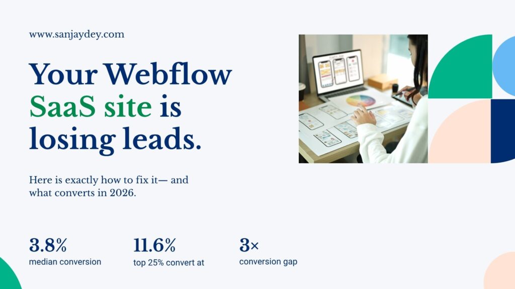
- The median SaaS landing page converts at 3.8%. The top 25% hit 11.6%. The gap is almost entirely explained by structure and UX decisions, not visual polish.
- Webflow is now the platform of choice for SaaS marketing sites — faster to ship, easier to iterate, and built for marketing team autonomy without engineering dependencies.
- A high-converting Webflow SaaS website needs five things: a clear value proposition in the hero, product-led social proof, frictionless trial or demo entry points, a pricing page that removes doubt, and Core Web Vitals scores that keep visitors on the page.
- This guide covers the full build process — from planning your information architecture to launching with schema markup — with specific decisions that affect revenue, not just aesthetics.
- Geography matters. SaaS buyer behaviour in the USA differs from the UK, India, and UAE in ways that directly affect page structure and trust signals.
Table of Contents
- Why Webflow Works for SaaS Marketing Sites
- Plan Your Information Architecture Before You Design
- Hero Section: Five Seconds to Communicate Value
- SaaS UI/UX Design Best Practices for Conversion
- Webflow Landing Page Design: CTA Structure That Works
- Pricing Page Design — Where SaaS Deals Are Won or Lost
- Social Proof: What Actually Moves SaaS Buyers
- Core Web Vitals and Performance in Webflow
- Webflow vs WordPress for SaaS Websites
- Geographic Context: SaaS Website Design by Market
- Webflow CMS for Scalable SaaS Content
- SaaS Onboarding UX: Connecting the Website to Product Experience
- FAQ: Webflow SaaS Website Design
- Conclusion
Why Webflow Works for SaaS Marketing Sites
Webflow’s revenue reached $213 million in 2024 — a 66% year-over-year increase. That growth is not happening in isolation. It is tied directly to a shift in how SaaS marketing teams operate.
SaaS teams are done waiting on engineers to ship a landing page. They need to test messaging on Monday and have a live variant by Thursday. WordPress with a page builder and a plugin stack cannot move that fast without breaking something. Webflow can.
When built correctly, Webflow sites consistently achieve Largest Contentful Paint (LCP) scores 30–50% faster than bloated CMS platforms. That speed is not cosmetic. Google’s Core Web Vitals data shows that pages loading beyond 3 seconds see bounce rates climb sharply — and for a SaaS trial sign-up page, every bounce is a lost acquisition.
The deeper advantage is structural. Webflow’s clean markup and predictable HTML output make it easier for AI search systems to extract and cite content — which matters increasingly as buyers research through tools like Perplexity and ChatGPT before landing on your site.
I have worked across enterprise web design for over 20 years, from analytics dashboards at PwC India to complex marketing sites for global financial clients. The pattern I see consistently: SaaS companies underinvest in their marketing site UX relative to their product UX. The marketing site is the first experience of the product. That is not a branding exercise — it is a conversion funnel with real revenue consequences.
If you are evaluating platforms or planning a redesign, start at sanjaydey.com where I cover the full spectrum of web and UX decisions that affect SaaS growth.
Plan Your Information Architecture Before You Design
Most SaaS Webflow projects fail before anyone opens Figma. They fail in the planning phase, when teams skip the information architecture step and jump directly to visual design.
Information architecture (IA) is the structural logic of your site. It defines which pages exist, how they connect, and what job each page does in the buyer journey.
For a SaaS marketing site, the minimum viable page set is:
- Homepage — Communicates what the product does, for whom, and why it is different.
- Features page — Breaks down specific capabilities with outcome-driven language.
- Pricing page — Transparent, structured, and built to reduce decision anxiety.
- About page — Builds credibility through team, mission, and funding signals.
- Blog / Resources — Drives organic acquisition and supports SEO.
- Case studies — Converts consideration-stage buyers with proof.
- Demo / Trial landing page — Dedicated conversion page, not a form buried in the footer.
Each page has a single primary job. When pages try to do multiple jobs simultaneously, cognitive load increases and conversion drops.
Answer capsule: What pages does a high-converting SaaS website need? A high-converting SaaS website needs at minimum: a homepage that explains the product in under five seconds, a features page with outcome-driven descriptions, a transparent pricing page, dedicated landing pages for trial or demo sign-up, and case studies that demonstrate results for buyers at the consideration stage. Each page should have one primary conversion goal. Spreading multiple goals across a single page increases cognitive load and reduces the probability that any single action gets taken.
Before planning your IA, map the user journey. Who arrives from paid search? Who comes from a G2 review? Who is a product-led growth user who signed up for free and is now evaluating upgrade? Each entry point implies a different page priority and a different CTA.
This is the discipline I apply in my UX design process — mapping task flows before touching visual design. It is the difference between a site that looks good and one that performs.
Hero Section: Five Seconds to Communicate Value
The hero section is the most expensive real estate on your site. It costs the same to serve regardless of conversion rate. Getting it wrong means you pay for every visitor twice — once to acquire them, once to lose them.
A high-converting SaaS hero section contains four elements:
- A headline that names the outcome — not the feature. “Hire 40% faster” beats “AI-Powered ATS Platform.”
- A sub-headline that explains the mechanism — one sentence on how the product delivers that outcome.
- A primary CTA with zero friction — “Start free trial” or “See a 2-minute demo” — no form fields visible.
- A proof element — a recognisable customer logo, a review badge, or a single quantified result.
The mistake most SaaS teams make is writing hero copy that describes the product from the inside out. “A powerful, flexible platform for modern teams” tells the visitor nothing. “Cut sprint planning from 3 hours to 20 minutes” tells them everything.
Nielsen Norman Group research shows that users decide whether to stay or leave a page within the first 10–20 seconds. For SaaS, that window is shorter — because buyers arrive with high intent and low patience. If the value is not clear in five seconds, they bounce.
The visual approach matters too. Product screenshots embedded in the hero outperform abstract illustration. Buyers want to see what they are buying. A UI screenshot — even a partial one — reduces the cognitive effort required to evaluate the product.
SaaS UI/UX Design Best Practices for Conversion
Conversion-focused SaaS UI/UX is not about visual taste. It is about reducing interaction cost at every step.
Interaction cost is the combined mental and physical effort a user expends to complete a task. Every form field, every navigation layer, every ambiguous label adds to that cost. When the cost exceeds the perceived value, users abandon.
Here are the SaaS UI/UX design best practices that consistently reduce interaction cost and improve conversion:
Progressive Disclosure
Do not show everything at once. Show users what they need, when they need it. Feature-heavy SaaS products fail here most often — they put 14 features on the homepage and overwhelm the visitor before they have processed the core value.
Progressive disclosure in practice: show one primary feature category in the hero, then reveal depth as users scroll or navigate. Accordion components for secondary features. Tooltip definitions for technical terms. This structure keeps cognitive load manageable without hiding information.
Navigation Clarity
Limit your primary navigation to five items maximum. SaaS sites with more than six nav items see users spend more time navigating and less time converting.
Use clear, functional labels. “Platform,” “Solutions,” and “Resources” are generic. “Features,” “Pricing,” “Customers,” and “Blog” are specific. Users should be able to predict what they will find before clicking.
Form Friction Reduction
Every additional field on a sign-up form reduces completion rates. Baymard Institute data shows that checkout forms with unnecessary fields have abandonment rates 20% higher than minimal forms. The same principle applies to SaaS trial sign-up.
Start with email only. Collect name, job title, and company size after the user has experienced value — not before. This is progressive profiling, and it works.
For more on UX principles that translate directly to conversion outcomes, see my article on UX practices that boost online sales in 2026.
Mobile Responsiveness
45% of SaaS research and 35% of trial sign-ups now happen on mobile devices. Yet most SaaS websites provide a poor mobile experience that reduces conversions by 40–60%. This is a fixable structural problem, not a technical constraint.
In Webflow, responsive design is handled through breakpoints and flexbox/grid layouts. Build mobile-first. Test on actual devices — not just browser resize. Your mobile hero copy should be shorter than your desktop copy. Your mobile CTA should be thumb-accessible, not tucked into a header.
Webflow Landing Page Design: CTA Structure That Works
A landing page is not a homepage. It exists for one purpose: to convert a specific visitor segment against a specific offer. Every element on the page should support that single goal.
The anatomy of a high-converting Webflow landing page for SaaS:
Above the fold:
- Headline focused on the specific offer or audience segment.
- Sub-headline with one supporting proof point.
- Primary CTA — visible without scrolling.
- Social proof element — logo bar or review count.
Middle section:
- Three to five feature benefits — outcome-oriented, not feature-listed.
- Product screenshot or short GIF showing the core workflow.
- One video testimonial from a recognisable customer.
Near the pricing or CTA section:
- Objection handling — FAQ or “How it works” strip.
- Secondary CTA — same action as the primary, not a different offer.
- Trust indicators — security badges, integration logos, GDPR or SOC2 certification.
Footer:
- Minimal navigation. Do not give users a reason to leave the page.
- Legal links only. Keep the attention focused.
The 2026 data on bento grid layouts is worth noting here. According to the 2026 Landdding UI Report, 67% of the top 100 SaaS websites on Product Hunt now use bento-style layouts — asymmetric rectangular content blocks that create visual hierarchy without relying on walls of text. These layouts report 47% higher dwell time and 38% higher click-through rates compared to traditional column grid layouts.
Webflow handles bento grid layouts natively through CSS Grid. You do not need custom code. The design flexibility that Webflow provides here is one of the reasons I recommend it over traditional CMS platforms for SaaS landing pages.
For deeper Webflow-specific design techniques, read Webflow designer techniques for high-converting sites in 2026.
Pricing Page Design — Where SaaS Deals Are Won or Lost
The pricing page is where most SaaS websites lose deals that were otherwise won. Buyers arrive with intent. Poor pricing page design introduces doubt, confusion, or anxiety — and those buyers leave to research competitors.
The most important pricing page decision: how many tiers?
Price Intelligently’s analysis of 512 SaaS companies found that three-tier structures produce 30% higher average revenue per user than four or more tiers. When Intercom consolidated from six plans to three, they saw an immediate 17% increase in conversion rates. More than four tiers creates decision paralysis through the paradox of choice.
Three tiers. Always anchor the middle option visually — larger card, highlighted border, “Most Popular” label. This leverages anchoring psychology: buyers default to the middle option when the extremes are clearly positioned.
Transparent pricing wins.
Transparent pricing increases conversion by approximately 20–30%. Forrester research shows it can reduce sales cycles by up to 30%. Hiding pricing behind a “Contact Sales” wall signals that the price is likely too high. Use it only if your product genuinely requires custom pricing for every buyer.
What to include on each pricing card:
- Plan name (functional, not cute — “Starter,” “Growth,” “Enterprise”)
- Monthly and annual price with the annual discount clearly shown
- The three to five specific features that differentiate this tier
- The one capability that buyers at this stage care about most
- A CTA specific to the plan — “Start free trial,” “Contact Sales”
What to include below the pricing cards:
- Feature comparison table — full detail for buyers doing deep evaluation
- FAQ strip addressing the four most common pricing objections
- Money-back guarantee or free trial terms — stated explicitly
Social Proof: What Actually Moves SaaS Buyers
Most SaaS websites treat social proof as decoration. A row of logos in the header, a few text testimonials near the footer. That approach leaves conversion on the table.
Social proof is a decision-support system. It reduces perceived risk at the moment a buyer is considering commitment. The positioning, format, and specificity of social proof all affect whether it does that job.
Video testimonials outperform text significantly. An analysis of 8,500 A/B tests found a 34% median conversion improvement from video testimonials, with the top quartile achieving gains exceeding 47%. Place them immediately below your pricing section — not at the bottom of the page.
Specific metric claims outperform vague endorsements. “Reduced onboarding time by 50%” converts better than “Great product, highly recommend.” Specificity signals credibility.
G2 and Capterra badges increase conversion by 15–22%. Displaying third-party review ratings in or near the hero section — not just on a dedicated testimonials page — gives buyers a quick, trusted signal without requiring them to navigate away.
The layered social proof architecture that works:
- A subtle star rating or review count in the hero
- Three to five recognisable customer logos immediately below the hero
- Detailed testimonials mid-page, adjacent to feature descriptions
- Video testimonials and case study links near the pricing section
- Compliance badges (SOC2, GDPR, ISO 27001) in the footer
For SaaS products targeting enterprise buyers, case studies with named clients and quantified results are more persuasive than any testimonial. A one-page PDF case study linked from your pricing page does more conversion work than a carousel of star ratings.
Explore my SaaS website design examples to see how these social proof structures are applied across different product categories.
Core Web Vitals and Performance in Webflow
A SaaS website that loads slowly is a website that converts poorly. That is not an opinion — it is measured behaviour.
Google’s own data shows that as page load time increases from 1 to 3 seconds, bounce rate increases by 32%. From 1 to 5 seconds, the increase is 90%. For a SaaS trial sign-up page receiving 10,000 monthly visitors, that 90% bounce rate difference represents thousands of lost qualified leads per month.
Webflow’s hosting infrastructure uses AWS with a global CDN, auto-minifying assets and lazy-loading images by default. For most SaaS marketing sites, this is sufficient. But there are specific performance decisions that require intentional design choices.
Webflow performance checklist for SaaS sites:
- Images: Use WebP format. Set explicit width and height attributes to prevent layout shift. Avoid hero images larger than 300KB.
- Animations: Webflow’s native interactions are GPU-accelerated. Avoid JavaScript-heavy third-party animation libraries that block the main thread.
- Fonts: Load one typeface maximum with two weights. Use
font-display: swapto prevent invisible text during load. - Third-party scripts: Each analytics, chat, or pixel script adds load time. Audit quarterly. Remove what you are not actively using.
- Video: Do not autoplay full-resolution video in the hero. Use a poster image with a play button — load the video only on interaction.
Webflow sites built correctly consistently achieve LCP scores of under 2.5 seconds. That puts them in Google’s “Good” category for Core Web Vitals. Combined with clean semantic HTML, this directly supports both organic search ranking and AI-driven search visibility.
Webflow vs WordPress for SaaS Websites
This comparison comes up in almost every SaaS website project I consult on. The answer is not absolute — it depends on team capability, content volume, and integration requirements. But for most SaaS marketing sites, the decision is clearer than teams expect.
| Factor | Webflow | WordPress |
|---|---|---|
| Design flexibility | High — pixel-level control | Medium — depends on theme and builder |
| Marketing team autonomy | High — no developer needed for page updates | Low to medium — requires developer for most structural changes |
| Performance out of the box | Strong — AWS CDN, optimised hosting | Variable — heavily plugin-dependent |
| Plugin/integration ecosystem | Growing — native integrations plus Zapier | Extensive — largest ecosystem available |
| Security | Managed by Webflow — no manual patching | Manual — plugin updates required |
| CMS scalability | Up to 1M items per collection | Unlimited with the right hosting |
| Cost (mid-tier SaaS) | $49–$212/month (Business/Enterprise plans) | Variable — hosting + plugins + maintenance |
| SEO capabilities | Built-in — meta, schema, sitemap, redirects | Requires plugins (Yoast, Rank Math) |
For 90% of SaaS marketing websites, Webflow wins. One SaaS company supported 100+ employees through eight redesigns in three years — with zero engineers touching the site. That is marketing autonomy at scale.
WordPress remains the right choice when: you need deep WooCommerce integration, your content volume exceeds 10,000 CMS items, or you have existing WordPress infrastructure that is functioning well.
For a detailed side-by-side analysis, read my comparison of Webflow vs WordPress for business websites in 2026.
Geographic Context: SaaS Website Design by Market
Answer capsule: How does SaaS website design differ by geography? SaaS buyer behaviour varies meaningfully by region. In the USA, buyers prioritise speed and self-serve access — they want a trial before a conversation. In the UK, enterprise buyers expect formal trust signals: named case studies, security certifications, and GDPR compliance statements. UAE buyers respond to localised Arabic-English interfaces and regional client references. Australian SaaS buyers are price-sensitive and comparison-driven, making transparent pricing tables critical. Indian enterprise buyers weigh vendor reputation and reference-ability heavily, making a credible “About” page and named client logos important conversion factors.
United States
US SaaS buyers move fast and self-qualify. Product-led growth (PLG) models — “Start free, upgrade when ready” — work well here because buyers want to experience value before committing to a sales conversation. Your Webflow site needs a frictionless free trial entry point, a clear upgrade path, and fast load times. Paid search competition is highest in this market, which means landing page quality directly affects your cost per acquisition. A/B testing infrastructure is expected — HubSpot reports that top US SaaS companies run 15–25 tests monthly.
United Kingdom
UK enterprise SaaS buyers are more deliberate. They evaluate security posture before evaluating features. Your Webflow site needs visible GDPR compliance documentation, named security certifications (ISO 27001, SOC2), and case studies with recognisable UK brands where possible. Ofcom data shows that UK broadband penetration is high, but mobile SaaS research is growing — optimise for both. UK buyers also respond to formal pricing structures. Hiding pricing is a higher-trust barrier in this market than in the US.
United Arab Emirates
SaaS adoption in the UAE is accelerating, particularly in fintech, logistics, and government-adjacent sectors. Buyers here are brand-conscious and respond to regional client references. Arabic-English bilingual interfaces signal local investment. If your SaaS targets UAE enterprise clients, your Webflow site should include regional case studies, references to compliance with UAE data residency requirements, and a contact path that does not require a credit card.
Australia
Australian SaaS buyers comparison-shop more aggressively than their US counterparts. Transparent pricing tables, feature comparison grids against named competitors, and clear refund or cancellation terms are conversion factors specific to this market. Australian businesses are also disproportionately SME-sized — your pricing tier structure should include a genuine entry-level option, not just a stripped-down “Starter” that forces an upgrade within 30 days.
India
India is the fastest-growing SaaS buyer market in Asia. Enterprise buyers in India weigh vendor credibility heavily — named clients, years in operation, and verifiable references matter. NASSCOM data shows that Indian enterprise SaaS adoption is accelerating in BFSI, healthcare, and manufacturing verticals. Your Webflow site should include an explicit “India” or “Asia” page if the market is a primary growth target. Local pricing in INR, available on the pricing page, removes a common friction point for Indian buyers.
Webflow CMS for Scalable SaaS Content
A SaaS website without a content strategy is a conversion asset that depreciates over time. SEO-driven content compounds. A blog post written today can generate qualified trial sign-ups for three years. That return is only possible if your CMS makes it easy to publish, organise, and update content without developer involvement.
Webflow’s CMS handles up to 1 million items per collection. For most SaaS companies, that ceiling is irrelevant — but the architecture matters. Webflow CMS uses a structured collection model: each content type (blog post, case study, integration page) is a collection with defined fields. This structure makes it easy to build programmatic pages at scale.
What to build in Webflow CMS for SaaS:
- Blog collection — Standard posts with author, category, date, and featured image fields.
- Case study collection — Client name, industry, result metric, and a rich text body field.
- Integration pages collection — One page per integration, generated from a CMS template.
- Changelog collection — Product updates published on the site without developer work.
- Comparison pages — “[Your product] vs [Competitor]” pages targeting high-intent buyers.
The comparison page category is worth prioritising. Buyers searching “Notion vs Coda” or “[Your product] vs [Competitor]” are close to a purchase decision. A well-structured comparison page in Webflow, built from a CMS collection, can rank for dozens of these queries with one content template.
For a deeper look at CMS architecture decisions, see Webflow CMS mastery for scalable content architecture.
[ALT: Webflow CMS collection structure showing SaaS blog, case study, and integration page templates]SaaS Onboarding UX: Connecting the Website to Product Experience
The website and the onboarding flow are two parts of the same conversion path. Most SaaS teams treat them as separate workstreams. That disconnect creates a jarring experience — a polished marketing site followed by a clunky sign-up flow — and kills trial-to-paid conversion rates.
The connection point is the sign-up page. If your Webflow site CTA lands users on a five-field sign-up form with a CAPTCHA, you have already created friction that contradicts the frictionless experience your site promised.
The sign-up page should inherit the visual design of your marketing site. Same typeface, same colour system, same component language. Users who feel the experience is continuous are more likely to complete the flow.
Beyond sign-up, the “aha moment” matters. This is the specific product interaction where a user first experiences the core value — and the speed at which they reach it determines trial-to-paid conversion. Research on SaaS onboarding shows that users who reach the aha moment within the first session are significantly more likely to convert to paid.
Your website’s job is to pre-load the aha moment. Use your feature descriptions, screenshots, and video demos to show users exactly what success looks like in the product before they sign up. By the time they enter the app, they should already know what to do first.
For more on SaaS onboarding design principles, read SaaS onboarding: getting users to the aha moment in 3 minutes.
Answer capsule: How do you improve SaaS website conversion rates in 2026? To improve SaaS website conversion rates, focus on three structural problems: clarity, proof, and friction. Clarity means your hero communicates the specific outcome your product delivers — not what it is or how it works. Proof means layered social evidence positioned at the moments of maximum doubt: near pricing, adjacent to feature descriptions, and in video format where possible. Friction means every unnecessary form field, navigation option, or load delay removed from the path to trial or demo sign-up. Successful SaaS companies run 15–25 A/B tests monthly across key conversion touchpoints, systematically building on results rather than testing in isolation.
FAQ: Webflow SaaS Website Design
What is a Webflow SaaS website? A Webflow SaaS website is a marketing and conversion site built on the Webflow no-code platform, designed to acquire, educate, and convert buyers for a software-as-a-service product. It differs from an app or product interface — its job is to communicate value, build trust, and drive trial sign-ups or demo bookings. Webflow is favoured for SaaS marketing sites because it gives marketing teams full control over design, content, and conversion testing without requiring developer involvement for each update.
How to build a SaaS website in Webflow step by step? To build a SaaS website in Webflow, start with an information architecture that maps every page to a specific buyer job. Design mobile-first, using Webflow’s responsive breakpoints. Build the homepage hero, pricing page, and trial landing page first — these are the highest-impact conversion pages. Set up Webflow CMS collections for blog, case studies, and integration pages. Configure meta titles, descriptions, and Open Graph tags for each page type. Connect your analytics, CRM, and form tools via Webflow’s native integrations or Zapier. Test Core Web Vitals before launch.
What is a good conversion rate for a SaaS website? A good conversion rate for a SaaS website ranges from 3% to 5% for the industry median. The top quartile of SaaS landing pages converts at 11.6%. The gap between median and top-quartile performance is primarily explained by structural UX decisions — hero clarity, pricing page transparency, social proof positioning, and friction in the sign-up flow — rather than visual design quality.
Webflow vs WordPress for SaaS websites — what is the key difference? Webflow vs WordPress for SaaS websites — the key difference is marketing team autonomy. Webflow allows non-technical marketing and design teams to build, update, and test pages without developer dependencies. WordPress requires developer involvement for most structural changes, and performance depends heavily on hosting configuration and plugin management. For SaaS teams that need to ship landing pages and run A/B tests on a weekly cycle, Webflow’s operational advantage is significant.
How to improve SaaS website conversion rates with UX design? To improve SaaS website conversion rates with UX design, reduce interaction cost at every stage of the buyer journey. Simplify navigation to five items or fewer. Cut sign-up form fields to the minimum required. Position social proof — video testimonials, review badges, named case studies — at the moments of maximum buyer doubt: near the pricing section and adjacent to your primary CTA. Ensure your mobile experience converts as well as desktop. Then test systematically — one variable at a time, with statistical confidence before acting on results.
What are the best Webflow templates for SaaS startups in 2026? The best Webflow templates for SaaS startups in 2026 prioritise conversion architecture over visual novelty. Look for templates that include a clear hero with a single CTA, a three-tier pricing section, a feature grid with outcome-oriented copy, a testimonials section positioned near pricing, and a blog CMS collection ready to use. Avoid templates with heavy JavaScript animations or third-party libraries that inflate load times. Build on a template as a structural starting point, then customise the copy and visual design to reflect your specific product and buyer.
Does Webflow support SaaS-specific integrations like CRM and analytics tools? Yes. Webflow supports integrations with major SaaS tools through native connections and third-party middleware. HubSpot, Salesforce, Mailchimp, and Klaviyo connect via Webflow’s form and embed tools. Google Analytics 4, Mixpanel, and Segment can be added through Webflow’s custom code embed fields. Intercom and Drift chat tools integrate via script tag. For more complex integrations — such as syncing Webflow CMS data with your product database — Zapier or Make (formerly Integromat) handle the middleware layer without custom code.
How does SaaS website design differ for enterprise buyers vs SMB buyers? SaaS website design for enterprise buyers requires deeper trust architecture: named case studies with quantified outcomes, visible security certifications (SOC2, ISO 27001), a dedicated Enterprise page with custom pricing signals, and a “Contact Sales” path that does not require self-serve sign-up. SMB-focused SaaS sites can prioritise PLG (product-led growth) flows — free trial access with no credit card, in-app upgrade prompts, and transparent pricing. The key structural difference is the balance between self-serve conversion and sales-assisted conversion paths.
Conclusion
A high-converting Webflow SaaS website is not the product of better visual design. It is the product of better structural thinking — applied consistently from information architecture through to onboarding handoff.
The data is consistent: the top 25% of SaaS landing pages convert at 11.6% while the median sits at 3.8%. That gap is not explained by brand budget or design talent. It is explained by clarity of value proposition, friction-free entry points, layered social proof at the right positions, and pricing pages that answer buyer objections rather than raising new ones.
Webflow gives SaaS teams the platform to move fast and test continuously. But the platform is only as effective as the design decisions behind it.
If you are building or redesigning a SaaS marketing site and want a practitioner’s perspective on what is actually driving conversion in 2026, I offer a free UX and web design consultation where we can work through your specific site challenges. No pitch. No obligation. Just a direct conversation about what needs to change.
Explore my work at sanjaydey.com to see how I approach web and UX strategy for SaaS and enterprise clients across the USA, UK, UAE, Australia, and India.
About the Author
Sanjay Kumar Dey is a Senior UX/UI Designer and Digital Strategist with over 20 years of experience designing web, mobile, and enterprise analytics solutions for global organisations. Most recently at PwC India, Sanjay led UX design for Fortune-level clients including ArcelorMittal, Adobe, NatWest Bank UK, ITC, Adani, and the Government of India. He holds certifications in UX Design from Google (Coursera) and the Interaction Design Foundation. He writes at sanjaydey.com on UX strategy, web design, and digital conversion — with a focus on outcomes over aesthetics.
Leave a Reply