UX design trends in 2025 is all about connecting with users on a deeper level. The most successful websites will create experiences that feel immersive, adapt to individual needs, and respond with genuine empathy to user behaviors. As designers, we’re seeing a significant shift toward interfaces that don’t just function well but truly resonate with people.
Businesses are taking notice too. With global spending on digital transformation projected to reach , companies are investing heavily in user experiences that build meaningful connections with their audience. This isn’t just about staying current—it’s about staying relevant.$3.9 trillion by 2027
One of the most striking changes I’ve noticed is how interactive 3D elements have become essential features of modern UI design. These elements don’t just look impressive; they create engagement through depth and tangibility that flat designs simply can’t achieve. At the same time, performance remains critical—over half of users now expect websites to load within two seconds of clicking a link.
The demand for thoughtful UX design continues to grow rapidly. Currently, are engaged in some form of digital initiative, and UX designers are now sought after well beyond the tech sector. Throughout this article, I’ll explore specific trends that will help your website stand out in 2025—from bento grids to AI-driven interfaces—all while meeting increasingly sophisticated user expectations. 91% of businesses
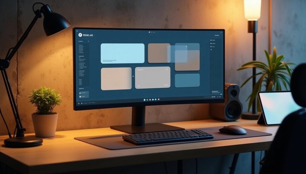
Bento Grids and Modular Layouts
Image Source: https://pixabay.com/
The way we organize digital interfaces is changing dramatically in 2025. Bento grids have emerged as one of the most effective UI/UX approaches, offering a fresh take on content organization. This Japanese-inspired layout system compartmentalizes content into distinct visual sections—like items in a traditional bento box—and is changing how designers structure information across screens of all sizes.
Why modular design is gaining popularity
We’re witnessing a fundamental shift in web design philosophy—moving away from rigid page templates toward flexible, reusable components. Modular design focuses on creating building blocks rather than complete pages, giving designers the ability to assemble interfaces dynamically based on content needs.
The advantages are compelling. First, there’s a significant reduction in development time. While creating the initial component library requires investment, organizations quickly recover this through . Content teams can create new pages without constantly involving designers and developers, allowing them to respond quickly to market insights.faster workflows and publishing times
Consistency across experiences is another major benefit. By using standardized components, brands maintain a uniform look and feel throughout their digital presence. Users recognize and rely on these consistent patterns, making navigation more intuitive across different sections and platforms.
Perhaps most importantly, modular design is essentially future-proof. As new requirements emerge, teams can simply add modules to their library rather than rebuilding entire pages. This scalability makes the approach particularly valuable for growing organizations whose digital needs will inevitably evolve over time.
How bento grids improve content clarity
Bento grid layouts specifically excel at enhancing visual clarity and reducing cognitive load. By dividing content into clear, visually distinct areas, these grids help users scan and process information more efficiently. Each content block has its own defined space, creating breathing room that makes complex information more digestible.
Research shows this compartmentalized approach significantly . Users can quickly identify and focus on relevant sections without feeling overwhelmed by competing information. The clear boundaries between content blocks create a natural visual hierarchy, guiding users through the interface in a logical sequence.improves content comprehension
At the same time, bento grids maintain an important balance between variety and unity. Each compartment may contain completely different content types—from images and text to interactive elements—yet the overall design preserves a cohesive look and feel. This harmonious organization is particularly valuable for content-heavy websites where information architecture is crucial to success.
Examples of effective bento grid usage
Apple stands out as a prominent adopter of bento grid layouts. They use this approach extensively in product presentations and marketing materials, compartmentalizing product features and specifications into clean, visually distinct areas that make technical information more accessible and engaging. This organized presentation has become a signature element of their design language.
Notion demonstrates how bento grids can enhance productivity tools. Their customizable dashboards let users arrange different content blocks—text, images, databases—according to personal workflow preferences. This flexibility empowers users while maintaining visual coherence across the workspace.
Pinterest’s interface shows bento grids at scale, organizing vast amounts of visual content into a browsable format. Each pin exists as a distinct card within the larger grid system, allowing users to easily scan and discover content that matches their interests.
For e-commerce sites, bento grids offer an ideal way to showcase product categories, highlight promotions, and feature customer reviews without overwhelming shoppers. These compartmentalized layouts create clear pathways to different sections of the shopping experience, improving both navigation and conversion rates.
Immersive 3D and Motion Elements
Image Source: https://pixabay.com/
When I look at websites in 2025, one thing is immediately clear: static interfaces are rapidly becoming a thing of the past. Today’s most compelling digital experiences use depth, dimension, and thoughtful movement to create interfaces that feel alive and responsive to user interactions.
Interactive 3D objects in modern UI design
3D elements have surged in popularity because they create truly immersive digital environments. Users don’t just view content—they engage with it on a deeper level. As a designer, I find this shift fascinating because these interactive elements add a dimension of depth and realism that 2D interfaces simply can’t match, creating stronger connections between users and digital content.
The practical applications are impressive. Furniture retailers now offer 3D product showcases [link_7] that let customers examine items from every angle before purchasing. Meanwhile, businesses with complex services use 3D visualization to explain intricate processes in intuitive ways. This approach works particularly well in industries where spatial understanding matters—gaming, architecture, and e-commerce come to mind.
Creating these 3D experiences has become more accessible with specialized tools for UI/UX professionals:
- Spline provides real-time collaboration features and intuitive controls for creating interactive 3D objects
- Vectary works like “Figma for 3D design,” making it easy to create photorealistic 3D objects that integrate with your design tools
- Blender offers a free, open-source option for more advanced 3D modeling needs
Subtle motion design for better engagement
Beyond static 3D elements, subtle motion design has become essential for guiding user attention and improving usability. These micro-interactions—small, almost imperceptible animations—bring interfaces to life. When I’m reviewing designs, I look specifically for these details because they make interfaces feel responsive and intuitive.
Motion design serves four key usability functions: meeting user expectations, maintaining continuity, supporting narrative flow, and establishing relationships between elements. When thoughtfully implemented, even basic UI components become sophisticated communicators of information and intent.
The impact is significant. Research shows websites with well-designed micro-animations see conversion rate improvements of up to 23% [link_8] compared to static interfaces. These subtle movements provide immediate feedback, reducing anxiety during interactions like form submissions or content downloads.
I’ve found motion design especially effective at simplifying complex information. Transitions between lengthy content sections create logical divisions that make information more digestible. As one designer puts it, “These small but impactful motions prevent users from feeling lost in limbo, enhancing trust in the site’s functionality”.
When to use 3D vs. flat design
The choice between 3D and flat design should reflect your brand’s goals and your users’ needs. 3D design creates captivating, lifelike visuals that work well for industries where realism matters—gaming, fashion, and automotive are prime examples. This sensory-rich experience typically leads to higher engagement and better information retention.
That said, 3D design comes with considerations I often discuss with clients. It requires more processing power, which can impact performance. Complex 3D animations might load slowly on older devices or slower connections, potentially frustrating users. Flat design, meanwhile, offers simplicity, clear communication, and optimized performance.
For most websites in 2025, I recommend a hybrid approach. As one expert explains, “3D elements don’t have to be all-encompassing—subtle three-dimensional touches can create as much impact”. This balanced strategy preserves performance while still delivering the engagement benefits of dimensional design.
Typography That Moves and Speaks
Typography has evolved far beyond static letters on a screen. In 2025, text doesn’t just sit there—it moves, transforms, and communicates with users in ways that static text simply cannot. As a designer, I find this shift fascinating because it turns words into active participants in the user experience.
Kinetic typography and animated text
Kinetic typography transforms words from passive elements into dynamic storytelling tools. This isn’t just about picking pretty fonts anymore—it’s about choreographing how text appears, moves, and interacts with users. Research shows these typographic visuals excel at connecting emotionally with audiences and conveying complex narratives.
I’ve seen kinetic typography appear in two main forms:
- Motion layout: Text elements that move in relation to each other in 2D or 3D space
- Fluid layout: Text that changes form while staying in roughly the same location
Beyond these basic approaches, designers now implement an impressive range of techniques—fade-ins, fade-outs, contortions, 3D movements, flipping, morphing, and sequential reveals. Each creates distinct user interactions that help establish visual hierarchy. When done well, these techniques make complex information more digestible and engaging.
Text transitions and emotional impact
What fascinates me most about animated typography is its psychological impact. Studies by Monotype and Neurons found that motion in text significantly influences how readers feel. In one particularly clever experiment at Carnegie Mellon University, researchers showed people four different animations of the neutral message “I am fine”—each designed to convey a different emotion. Even though the words expressed nothing emotional, viewers consistently perceived the exact feeling intended by each animation.
I love what legendary designer Saul Bass said about his work on Hitchcock film titles: “I saw the title as a way of conditioning the audience, so that when the film actually began, viewers would already have an emotional resonance with it”. The same principle applies to websites—thoughtful text animation creates an immediate emotional connection before users have read a single word.
Combining text with emojis for human touch
Text alone—even animated text—can still feel impersonal. That’s why many designers are integrating emojis with typography. What started in casual conversations has expanded to professional tools, messaging interfaces, and UI elements. These small symbols serve several important purposes:
- They break through language barriers with universal emotional signals
- They add emotional context that reduces text ambiguity
- They create visual breathing room in content-heavy sections
In our increasingly digital communication landscape, emojis help prevent misunderstandings by providing the non-verbal cues that plain text lacks. However, I’ve learned that implementation requires careful thought—emojis should enhance key messages rather than replace them. Designers must also consider cross-platform rendering differences and accessibility concerns.
When thoughtfully combined, animated typography and emojis create digital experiences that feel remarkably human. This isn’t just about making text prettier—it’s about making communication clearer, more engaging, and more emotionally resonant.
Low Light and Blur Effects for Comfort
When designing interfaces today, user comfort has become as important as functionality. As someone who spends hours in front of screens, I’ve watched with interest as low light interfaces and blur effects have evolved from simple features to essential components of user-friendly digital experiences. These techniques don’t just look sophisticated—they actively support user wellbeing during long periods of digital interaction.
The evolution from dark mode to low light
Dark mode has grown up. What started as basic color inversion has matured into something far more nuanced and effective. Today’s low light interfaces go beyond just swapping white for black, and there’s good reason for this evolution. Research shows dark backgrounds significantly reduce blue light emissions, which directly connects to reduced eye strain, fewer headaches, and better sleep patterns.
What’s particularly interesting is how designers now avoid pure black backgrounds. Instead, they opt for near-black alternatives with subtle color infusions—deep blues (1a1f2c), rich greens (212c1a), or elegant purples (161118). These choices create interfaces that feel less harsh while maintaining a sophisticated look. This approach reflects our growing understanding that both too much brightness and too little light can cause visual discomfort as our eyes constantly adjust to changing conditions.
Progressive blur and grain for depth
One of the most effective techniques I’ve seen emerge is progressive blur—a concept that takes inspiration from Apple’s design language but has spread across the digital landscape. Unlike traditional blur that applies the same effect everywhere, progressive blur increases intensity gradually across elements. The result? Natural depth perception that guides user attention without jarring visual transitions.
In practice, designers implement this through layered elements with varying blur intensities, often paired with subtle grain textures. These techniques serve dual purposes: they add visual interest while simultaneously reducing the mental effort required to process complex interfaces.
Designing for visual comfort and focus
The benefits of visual comfort extend beyond just feeling better while using an app or website. Optimal visual design actually increases vitamin B and D levels, helps synchronize natural body rhythms, improves sleep quality, and enhances concentration. This is why the best interfaces in 2025 prioritize:
- Context adaptability: Interfaces that sense and adjust based on ambient lighting conditions
- Reduced visual noise: Clean designs with strategic use of white space
- Balanced luminance: Careful control of brightness levels to prevent eye strain
This focus on comfort marks an important shift in our field—we’re finally recognizing that interfaces must support not only functionality but also wellbeing during extended periods of digital interaction. As designers, we’re acknowledging that the physical experience of using our products matters just as much as their feature sets.
AI-Driven and Adaptive Interfaces
Artificial intelligence isn’t just a buzzword in 2025’s UX landscape—it’s fundamentally changing how we create and experience digital interfaces. I’ve watched this shift happen gradually, from static, one-size-fits-all designs to dynamic experiences that recognize and adapt to individual users and their contexts.
AI-generated UI components
The tools available to designers today would have seemed like science fiction just a few years ago. Platforms like Uizard now allow us to generate multi-screen, editable prototypes in seconds using simple text prompts. This isn’t just incrementally faster—it’s a completely different approach to visualization.
As a designer, I’ve seen teams transform their workflows with these tools. Some designers report creating complete app mockups in just two minutes without prior design or coding knowledge. That’s not just impressive—it’s a genuine paradigm shift in how we work.
Tools like Visily and UXPin have extended these capabilities even further, enabling designers to:
- Transform screenshots into editable wireframes
- Convert hand-drawn sketches into digital designs
- Generate new themes instantly to change the style of entire projects
These AI-powered platforms don’t just help designers move faster—they bridge the crucial gap between idea and visualization, letting product managers and stakeholders communicate concepts more effectively. This is particularly valuable when working with teams that don’t share your design vocabulary.
Gradient cues for AI presence
As AI features become increasingly common across interfaces, we need visual languages that help users understand when they’re interacting with AI-powered elements. Purple gradients have emerged as the dominant color choice for signaling AI presence, creating an unofficial visual standard that spans platforms.
Beyond color choices, other subtle indicators have become part of this visual language:
- Sparkle icons that users now associate with AI features
- Text badges with short labels identifying AI-generated content
- Humanized microcopy that suggests conversation rather than traditional search
These visual cues serve an important purpose—they help users recognize when they’re interacting with AI-powered features, enhancing transparency and setting appropriate expectations. Without these indicators, users can become confused about the source of information or recommendations, potentially undermining trust in the interface.
Personalized layouts and content
Adaptive User Interfaces (AUIs) represent what I believe is the most profound UX design trend of 2025. These systems modify interfaces based on individual preferences, behaviors, and contextual factors. Through machine learning algorithms that analyze how users interact with digital products, AUIs create experiences that actually evolve over time.
The practical implementations of these personalized layouts include:
- Dynamic adjustments to navigation based on a user’s history
- Content recommendations tailored to individual preferences
- Layout modifications that respond to device capabilities and environmental contexts
This level of personalization leads to improved efficiency, better accessibility, and ultimately more intuitive experiences as interfaces learn from and adapt to user behavior. I’ve seen first-hand how users develop stronger connections to products that seem to understand their needs and preferences.
However, this power comes with responsibility. As designers implementing these adaptive systems, we must be thoughtful about transparency and user control. The best adaptive interfaces aren’t just smart—they’re respectful of user agency and privacy concerns.
Conclusion
As we move through 2025, UX design continues to evolve toward creating experiences that connect with users on a genuine, human level. The trends I’ve explored in this article aren’t just about visual appeal—they’re about building meaningful relationships between users and digital products.
Bento grids have changed how we organize content, making complex information more digestible while maintaining visual harmony. When I implement these layouts for clients, I’m consistently impressed by how quickly users can find exactly what they need without feeling overwhelmed.
The shift toward immersive 3D elements adds a dimension of engagement that flat designs simply can’t achieve. But remember—this isn’t about adding 3D for its own sake. It’s about using depth and dimension to enhance understanding and create more intuitive interactions.
Typography is no longer just about readability. Text that moves and communicates emotion has become a powerful storytelling tool, while low-light interfaces show our growing awareness that digital experiences must prioritize user comfort and wellbeing over extended periods.
Perhaps most significantly, AI-driven interfaces represent a fundamental break from one-size-fits-all design. We’re now creating websites and apps that adapt to individual users rather than forcing users to adapt to them. This shift feels particularly meaningful to me as a designer who has always believed that technology should serve people, not the other way around.
Despite all these technological advances, the core principles remain unchanged—accessibility, clarity, and user-centricity still guide effective design. As you consider implementing these trends, think first about your specific audience needs and business objectives.
The most successful websites of 2025 won’t simply follow trends for their own sake. They’ll thoughtfully integrate these elements to create meaningful connections. When refreshing your digital presence, focus on how these trends can enhance your users’ experience rather than just making your site look contemporary. After all, the true measure of outstanding UX design isn’t just visual appeal but how seamlessly it helps users accomplish their goals.
FAQs
Q1. What are the key UX design trends for 2025?
Key UX design trends for 2025 include bento grids for modular layouts, immersive 3D elements, kinetic typography, low light interfaces, and AI-driven adaptive experiences. These trends focus on creating more engaging, personalized, and visually comfortable digital interactions.
Q2. How are AI and machine learning impacting UX design?
AI and machine learning are revolutionizing UX design by enabling personalized layouts, AI-generated UI components, and adaptive interfaces. These technologies allow for rapid prototyping, dynamic content recommendations, and interfaces that evolve based on user behavior and preferences.
Q3. Why is visual comfort becoming increasingly important in UX design?
Visual comfort is crucial in UX design as users spend more time interacting with digital interfaces. Low light modes, progressive blur effects, and balanced luminance help reduce eye strain, improve concentration, and support overall user well-being during extended screen time.
Q4. How are 3D elements enhancing user engagement in modern interfaces?
3D elements are creating more immersive and interactive digital experiences. They add depth and realism to interfaces, allowing users to engage with content in new ways, such as examining products from all angles or visualizing complex processes, particularly in industries like e-commerce, gaming, and architecture.
Q5. What role does typography play in contemporary UX design?
Typography in modern UX design goes beyond static text, incorporating motion and emotion. Kinetic typography and animated text transitions help convey messages more effectively, establish visual hierarchies, and create emotional connections with users, enhancing overall engagement and information retention.
Leave a Reply