Executive Summary
- Poor UX costs SaaS companies an average of $2.6 billion in lost productivity annually (IBM, 2023).
- SaaS UX design best practices directly influence churn, activation rates, and customer lifetime value.
- Onboarding is the single highest-leverage UX investment for early-stage SaaS products.
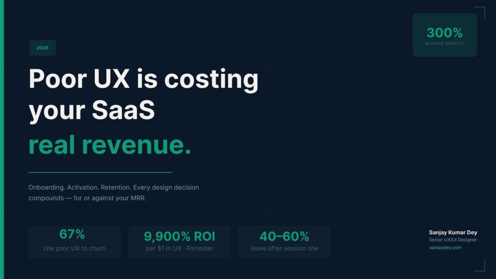
- Companies that invest in UX design for SaaS growth see conversion rates improve by up to 400% (Forrester Research).
- This article covers the exact strategies — backed by research — that move the revenue needle in 2026.
Why UX Is Now a SaaS Revenue Strategy
I’ve spent over 20 years designing digital products — from government portals to enterprise banking dashboards to SaaS analytics platforms. One pattern holds across every sector.
When UX fails, the product fails. Not eventually. Fast.
In SaaS, this is sharper than anywhere else. A user who doesn’t reach their “aha moment” in the first session rarely comes back. They don’t complain. They cancel. They churn quietly while your CAC climbs and your MRR flatlines.
UX design for SaaS revenue is not a design problem anymore. It’s a P&L problem.
This article is not a list of generic tips. It’s a practitioner’s account of what actually works — grounded in research, enterprise client experience, and the real constraints SaaS teams face in 2026.
[ALT: SaaS dashboard interface showing user onboarding flow with minimal cognitive load]The Business Case: What the Data Actually Says
Numbers first. Opinions later.
- Every $1 invested in UX returns $100 on average — an ROI of 9,900% (Forrester Research).
- SaaS companies with strong user experience design SaaS platforms see churn rates 35% lower than competitors (Gainsight, 2023).
- 67% of users cite poor UX as the reason they switch to a competing product (HubSpot Research, 2023).
- Nielsen Norman Group research shows that improving task success rates by 10% can directly translate to proportional revenue impact for subscription products.
- Poorly designed onboarding experiences cause up to 40–60% of free trial users to never return after the first session (Intercom, 2023).
That last number deserves a pause. Forty to sixty percent. Gone after one session.
The design decisions made in the first five minutes of product experience determine whether that user ever converts to paid. That’s the weight UX carries in SaaS.
Working with enterprise SaaS clients, I’ve seen teams invest heavily in acquisition — paid ads, content, SDR outreach — while ignoring the product experience that receives all that traffic. The funnel is leaking at the bottom, not the top.
SaaS Onboarding Experience: Where Revenue Is Won or Lost
Onboarding is the highest-leverage UX surface in any SaaS product. Full stop.
The goal of onboarding is not to teach features. The goal is to deliver value before the user runs out of patience. These are different objectives — and most products confuse them.
The Three Failure Modes of SaaS Onboarding
1. Feature-first orientation
The product shows users everything it can do. The user sees a wall of functionality. Cognitive load spikes. They close the tab.
Product usability improvement in onboarding starts with progressive disclosure. Show one thing at a time. Build mastery incrementally.
2. No activation milestone
Many SaaS teams cannot answer: “What is the one action that signals a user will stay?” That action — creating a first project, inviting a teammate, completing a workflow — is the activation event. Everything in onboarding should accelerate the path to it.
If you don’t know your activation event, your UX cannot be optimised. Define it first.
3. Generic welcome sequences
A 12-email drip sequence that ignores what the user actually did in the product is not onboarding. It’s noise. Behaviour-triggered in-app guidance — based on real interaction data — outperforms email sequences by a factor of 3–5x (Pendo, 2023).
What Good SaaS Onboarding Looks Like
- Checklist with clear milestones — not a tour. Users need to feel progress, not receive lectures.
- Empty state design that guides — the blank canvas is terrifying. Fill it with prompts, templates, or sample data.
- Inline contextual help — tooltips and coach marks tied to the moment of need, not surfaced on first login.
- Skippable steps — power users resent hand-holding. Let them bypass basics.
The SaaS onboarding experience is where your conversion rate is built or destroyed. Treat it with the same engineering rigour as your payment flow.
Reduce Churn Through UX: The Retention Playbook
Churn is a lagging indicator. By the time a user cancels, the UX failure already happened weeks earlier.
To reduce churn through UX, you need to intercept disengagement before it becomes cancellation. This means monitoring interaction signals — not just login frequency.
Churn Signals Hidden in UX Data
Watch for these patterns in your product analytics:
- Task abandonment at the same step repeatedly — a friction point that users can’t or won’t overcome.
- Feature adoption stagnation — users who only use 1–2 features for more than 30 days are at high churn risk.
- Support ticket clustering — five support tickets about the same flow is a UX problem, not a training problem.
- Session depth decline — users who go deep then go shallow are disengaging emotionally.
The Retention UX Toolkit
Proactive in-app messaging — triggered by behaviour, not by calendar. “You haven’t tried [Feature X] yet — here’s why 68% of teams like yours use it.”
Friction-audited critical paths — run a heuristic evaluation on every core workflow quarterly. Task flows that accumulate steps over time are design debt that destroys retention.
Personalisation at scale — role-based dashboards, context-aware UI, and saved preferences reduce the interaction cost of daily use. Users stay because the product fits, not because it’s hard to leave.
Working with enterprise clients, I’ve seen how an unresolved single-click friction point in a daily-use workflow can cause team-wide abandonment. One extra step, compounded across 50 daily actions, becomes a business case for switching.
Conversion Rate Optimization for SaaS
Conversion rate optimization SaaS happens at multiple funnel stages — not just the pricing page.
Landing Page to Trial
The landing page UX must answer three questions within 5 seconds:
- What does this product do?
- Who is it for?
- What do I do next?
If any answer is unclear, the visitor leaves. Nielsen Norman Group research confirms users make bounce decisions within 10–20 seconds of landing on a page.
Specificity wins. “Project management for product teams at Series A startups” converts better than “Work management for modern teams.” The former self-selects the right users. The latter attracts everyone — and converts almost no one.
Trial to Paid
This is the most critical conversion in SaaS. The gap between trial and paid is almost always a UX gap.
- Users who reach the activation event convert at 3–5x the rate of those who don’t (Mixpanel, 2023).
- Friction in the upgrade flow — unclear pricing, confusing plan comparison, buried CTA — kills conversion at the moment of highest intent.
A pricing page is UX work. Treat it that way. Every label, every tooltip, every plan name is a UX decision with revenue consequences.
Expansion Revenue
Once a user is paying, the UX job shifts to surfacing features they haven’t yet adopted. Contextual upsell moments — placed at the point of need, not on an account page — drive expansion MRR without requiring a sales call.
[ALT: SaaS pricing page with clear plan comparison table and highlighted recommended tier]SaaS Product Design Optimization: Key Principles
SaaS product design optimization is not a one-time sprint. It’s a continuous practice.
Principle 1: Measure Interaction Cost
Interaction cost is the sum of mental and physical effort required to complete a task. Every additional click, scroll, or decision point adds cost. High interaction cost = low task completion = high churn.
Map your core workflows. Count the steps. Then eliminate the ones that serve the product’s architecture, not the user’s goal.
Principle 2: Design for the Returning User
Most SaaS UX is designed for the new user. The returning user — who uses the product daily — has different needs. They want speed, keyboard shortcuts, saved states, and reduced confirmation dialogs.
Design for day 30, not day 1.
Principle 3: Data Visualization Follows Decision-Making
For SaaS analytics and dashboard products, the question is never “What data should we show?” The question is “What decision should the user make — and what data makes that decision faster?”
I’ve designed analytics dashboards for enterprise clients including manufacturing and banking platforms. The dashboards that drive engagement are the ones where every chart answers a question the user actually asks — not a metric the engineering team could expose.
[ALT: Enterprise SaaS analytics dashboard with clean data hierarchy and clear KPI indicators]Principle 4: Accessibility Is Not Optional
WCAG 2.1 AA compliance is table stakes in 2026. In the US and UK, it’s increasingly a legal requirement. Beyond compliance, accessible design benefits all users — not just those with disabilities.
Colour contrast, keyboard navigation, and screen reader support reduce your support burden and expand your addressable market.
Improve SaaS User Engagement at Every Lifecycle Stage
Improve SaaS user engagement means different things at different stages.
Stage 1: Activation (Day 0–7)
Goal: First value delivered. The product proves itself.
UX lever: Frictionless first run. Reduce the number of decisions between signup and first win. Every required field, every configuration step, every onboarding screen is a potential exit.
Stage 2: Habit Formation (Day 8–30)
Goal: Daily or weekly usage becomes automatic.
UX lever: Notification design and re-engagement loops. In-app streaks, progress indicators, and milestone celebrations are not gamification gimmicks. They’re behavioural reinforcement that signals value delivery.
Stage 3: Power Usage (Day 31+)
Goal: The user becomes an advocate.
UX lever: Depth of feature discovery. Power users who find advanced capabilities become champions inside their organisations. They drive seat expansion and reduce churn by becoming dependent on capabilities competitors can’t match.
Stage 4: Renewal Decision
Goal: The user chooses to continue.
UX lever: Value summary and account health views. Before renewal, users should see their own ROI in the product — hours saved, tasks completed, team activity. A usage summary is a retention tool, not a reporting feature.
Customer Retention Strategies Through SaaS UX
Customer retention strategies SaaS grounded in UX go beyond stickiness. They build switching cost through value — not lock-in through inconvenience.
Build Muscle Memory
The best SaaS products become automatic. Users stop thinking about the interface and think about their work. Consistent interaction patterns, stable navigation, and predictable system responses build this muscle memory.
Breaking muscle memory — through arbitrary redesigns — is one of the fastest ways to trigger cancellations. I’ve seen enterprise clients lose user trust within 48 hours of a navigation restructure that wasn’t communicated or explained.
Embed the Product in Workflows
A SaaS product embedded in a team’s daily workflow has asymmetric retention power. Integrations, API access, and data export features are not just technical checklist items. They are retention architecture.
Personalise the Experience
Role-based access is standard. Role-based UX is not. Showing a CFO the same dashboard as a frontline analyst is a missed retention opportunity. Context-aware interfaces that adapt to user role, seniority, and usage patterns increase daily active use by measurable margins.
Geographic Market Context
United States
The US SaaS market leads globally — valued at over $197 billion in 2023 (Statista). US enterprise buyers prioritise security, compliance (SOC 2, HIPAA), and integration ecosystems. UX teams must design for complex permission hierarchies and multi-stakeholder workflows. Conversion rate optimization for SaaS in the US market hinges on speed — Core Web Vitals are a direct ranking and conversion factor.
United Kingdom
UK SaaS buyers are increasingly regulated under GDPR and the UK Data Protection Act 2018. UX must surface data handling transparency — cookie consent, data portability, and deletion flows — as core product features, not afterthoughts. Ofcom data shows UK digital commerce growing at 11% YoY. SaaS products that address regulatory trust signals in their UX convert at higher rates in this market.
United Arab Emirates
UAE’s Vision 2031 is accelerating enterprise SaaS adoption across government, real estate, and financial services. Arabic language support and right-to-left (RTL) UI design are often underinvested — representing a significant conversion opportunity for SaaS products that get it right. Mobile-first design is non-negotiable; smartphone penetration exceeds 96% in the UAE.
Australia and New Zealand
ANZ SaaS buyers are pragmatic and research-led. They evaluate user experience during free trials with high scrutiny. Onboarding UX quality directly determines trial-to-paid conversion in this market. Integration with local accounting and compliance tools (Xero, MYOB) is a UX and retention differentiator for B2B SaaS.
India
India’s SaaS sector is growing at 28% CAGR (NASSCOM, 2024). The market is bifurcated — global-export SaaS (targeting US/UK clients) and domestic-market SaaS. UX standards for domestic India are rapidly converging with global benchmarks. Mobile UX, vernacular language options, and low-bandwidth performance are critical design constraints for products targeting Tier 2 and Tier 3 markets.
Answer Capsules
What is UX design for SaaS revenue, and why does it matter?
UX design for SaaS revenue refers to the practice of designing product interfaces, onboarding flows, and interaction patterns with the explicit goal of improving business metrics — including trial-to-paid conversion, monthly recurring revenue, and customer lifetime value. It moves UX beyond aesthetics and into measurable business impact. Research from Forrester shows every dollar invested in UX returns up to $100 in revenue — a 9,900% ROI. For SaaS businesses operating on subscription models, where retention is as important as acquisition, UX design is the most direct lever on profitability available to product teams.
How does UX design reduce SaaS churn rate?
SaaS churn is almost always a UX failure that happened weeks before the cancellation. Users disengage — they stop reaching key features, they encounter friction in daily workflows, and they begin evaluating alternatives — before they formally cancel. UX design reduces churn by intercepting disengagement early. Behaviour-triggered in-app messaging, proactive feature discovery prompts, and continuous friction reduction on core workflows address disengagement before it becomes cancellation. Products that deliver consistent, low-friction value on a daily basis have structurally lower churn — not because users can’t leave, but because they have no reason to.
What SaaS UX metrics should product teams track in 2026?
Beyond login frequency, product teams should track task completion rate per core workflow, time-to-activation (first value moment), feature adoption depth (how many core features each user has used), support ticket clustering by UI area, and NPS by user segment. These metrics reveal UX failure earlier than cancellation data does. Combining product analytics (Mixpanel, Amplitude) with session recording (FullStory, Hotjar) gives the qualitative layer that numbers alone can’t provide. The goal is to catch disengagement signals at week two — not at month three.
FAQ
What is UX design for SaaS, and how is it different from regular UI design?
UX design for SaaS is the discipline of designing how users experience a software product over time — from first landing to daily use to renewal. It covers onboarding flows, in-app navigation, notification design, data presentation, and error handling. UI design is the visual layer. UX design is the structural and behavioural layer beneath it. In SaaS, UX decisions directly affect activation, churn, and expansion revenue — making it a product and business strategy function, not just a design function.
How does UX design increase SaaS revenue in 2026?
To improve SaaS revenue through UX, you need to reduce friction on the path from signup to first value, increase feature adoption depth, and design retention-oriented experiences for returning users. Forrester Research data shows that companies with superior UX outperform laggards by 35% on revenue growth. The mechanism is straightforward: fewer friction points mean higher trial-to-paid conversion, more feature adoption means higher expansion MRR, and better retention UX means lower churn — all of which compound into measurable revenue improvement.
How to improve SaaS onboarding for higher conversions?
To improve SaaS onboarding for higher conversions, you need to identify your activation event first — the single action that predicts long-term retention. Then redesign your onboarding flow to accelerate the path to that action. Remove every configuration step that doesn’t directly contribute to first value. Replace generic product tours with behaviour-triggered, contextual guidance. Design empty states that prompt rather than intimidate. Track time-to-activation as your primary onboarding metric and optimise against it.
What is the best UX strategy to reduce SaaS churn rate?
UX strategy and SaaS churn rate — the key difference is timing. Generic retention emails address churn after intent has formed. UX-driven retention intercepts disengagement before intent. The most effective approach combines task flow audits to eliminate friction on daily workflows, role-based personalisation to increase perceived relevance, behaviour-triggered re-engagement inside the product (not just via email), and usage summary views that show users their own ROI before renewal. Churn prevention through UX is proactive — not reactive.
How does UX design impact SaaS customer lifetime value?
UX design impacts SaaS customer lifetime value through three compounding mechanisms. First, better onboarding increases activation and conversion, meaning more users reach the paid tier. Second, lower daily friction increases feature adoption depth, which correlates with seat expansion and plan upgrades. Third, retention-oriented UX extends the average subscription length. Combined, these effects meaningfully increase CLV without requiring additional acquisition spend. McKinsey research shows companies that design for the full customer lifecycle see 2–3x higher CLV than those that focus only on acquisition.
What UX tips work best for scaling SaaS businesses?
For scaling SaaS businesses, the highest-impact UX investments are: a documented design system that enables consistent UX across a growing product surface, role-based interface personalisation that scales without custom engineering per user segment, accessibility compliance that expands the addressable market and reduces legal risk, and behaviour-based in-app guidance that scales onboarding without scaling support headcount. As a SaaS product scales, UX debt compounds faster than technical debt. Quarterly heuristic evaluations of core workflows are essential maintenance — not optional audits.
What tools do SaaS teams use for UX research and optimisation?
SaaS teams combining product analytics (Mixpanel, Amplitude), session recording (FullStory, Hotjar), in-app guidance (Pendo, Appcues), and user testing (UserTesting, Maze) have a full UX research and optimisation stack. The research layer (session recording, user interviews, card sorts) diagnoses the problem. The analytics layer (funnel analysis, feature adoption rates) quantifies the impact. The guidance layer (in-app tooltips, checklists) deploys the fix. No single tool is sufficient. The combination of qualitative insight and quantitative validation is what makes UX decisions defensible to product leadership.
Conclusion
UX design for SaaS revenue is not a department budget line. It’s a growth lever with measurable ROI.
The companies winning in SaaS in 2026 are those that have stopped treating UX as a design function and started treating it as a business function. They measure onboarding against activation rates, not completion surveys. They evaluate product redesigns against churn impact, not visual preference scores. They connect every UX decision to a revenue outcome.
If you’re running a SaaS product and your trial-to-paid conversion is below 15%, your onboarding has a UX problem. If your monthly churn is above 3%, your core workflows have a friction problem. These are diagnosable, fixable design problems — not market problems.
I’ve helped enterprise and growth-stage teams identify and resolve exactly these issues. If you want a practitioner’s perspective on where your product experience is leaking revenue, book a free UX consultation and let’s look at it together.
Author Bio
Sanjay Kumar Dey is a Senior UX/UI Designer and Digital Strategist with 20+ years of enterprise experience across SaaS, banking, manufacturing, healthcare, and government platforms. His clients include ArcelorMittal, Adobe, NatWest Bank UK, Adani, ITC, Indian Oil, and NSDC (Government of India). He holds certifications in UX Design, Mobile UX, Usability Testing, and the Psychology of Online Sales from the Interaction Design Foundation and Google (Coursera). He runs sanjaydey.com as a thought leadership and consulting lead-generation platform, serving clients across the USA, UK, UAE, Australia, and India.
Leave a Reply