Executive Summary
- Patient-centered UX for healthcare apps directly affects clinical outcomes, not just user satisfaction scores.
- The healthcare mobile app market is projected to reach $1,070 billion by 2030 — poor UX is now a revenue and compliance risk, not just a design problem.
- HIPAA-compliant UX is achievable without sacrificing usability — but it requires designing security and consent flows from the wireframe stage, not as a retrofit.
- Cognitive load, plain-language content, and role-specific task flows are the three areas most healthcare app teams get wrong.
- This guide covers research methodology, interface architecture, accessibility, compliance integration, and market-specific considerations across the US, UK, UAE, Australia, and India.
Why Healthcare UX Is Fundamentally Different
I’ve spent two decades designing enterprise digital products. Dashboard UX for steel manufacturers. Transaction interfaces for UK banking clients. Procurement platforms for government bodies in India. Every engagement has one thing in common — there’s a consequence if users get confused.
Healthcare is that consequence at full volume.
When a patient misreads a medication dosage display, the outcome isn’t a failed form submission. It’s a clinical incident. When a nurse has to toggle between three systems to complete a single patient record, the cost isn’t a slight drop in task completion rate — it’s 34% of a physician’s working day spent on administrative data entry instead of patient care (American Medical Association, 2024).
This is why patient-centered UX for healthcare apps cannot be designed the same way you’d design a SaaS onboarding flow or a retail checkout experience. The mental models are different. The stakes are different. The regulatory environment is different. And most critically, the users are different.
Healthcare app users arrive stressed, often in pain, or managing a chronic condition. They may be elderly, digitally unfamiliar, or reading content in their second language. The interface has to absorb that complexity — not reflect it back at them.
The good news: the same UX discipline that drives conversions on commercial platforms — clear hierarchy, reduced interaction cost, progressive disclosure — applies directly to healthcare. The principles don’t change. The application does.
The Cost of Getting It Wrong
Let’s put numbers to the problem before discussing solutions.
The healthcare mobile app market was valued at $114.17 billion in 2024. Projections show it reaching $1,070 billion by 2030 — a compound annual growth rate of 45.2%. That’s not a niche sector. That’s a market where UX quality is now a commercial and legal differentiator.
Research published in the Journal of Medical Internet Research found that improving a healthcare app’s usability can increase patient satisfaction by up to 90%. The same research links poor usability to missed appointments, treatment plan abandonment, and medication non-adherence.
The data from Teladoc’s diabetes management program is even more specific: timely, personalized health nudges delivered through a well-designed interface produced a 3x increase in patient engagement and a measurable 0.4 reduction in A1c levels in diabetic patients. That’s not a UX metric. That’s a health outcome.
On the compliance side, the average cost of a healthcare data breach reached $10.93 million in 2024 — the highest of any industry. Healthcare has topped the IBM Cost of a Data Breach report for 14 consecutive years. A significant portion of breaches begin with poorly designed authentication flows, unclear consent pathways, and legacy interfaces that don’t enforce session security.
Poor UX in healthcare doesn’t just frustrate users. It creates legal exposure, drives up operational costs, and — at its worst — causes direct harm to patients.
The question isn’t whether to invest in patient-centered design. The question is how to do it correctly.
Start With the Right Research Methods
Most healthcare apps are designed for users, not with them. That distinction matters enormously.
Product teams often rely on internal stakeholders — clinicians, administrators, compliance officers — to define what patients need. This creates interfaces that serve institutional logic rather than human behavior. The result is software that passes a requirements checklist and fails a usability test.
Patient-centered UX begins with direct research with the people who will actually use the product.
Contextual Inquiry Over Remote Surveys
For healthcare interfaces, contextual inquiry — observing users in their actual environment — produces research that surveys cannot replicate. A patient managing insulin at home, a nurse triaging during a shift handover, a caregiver tracking a parent’s appointments: these are contexts where interruptions, lighting conditions, emotional state, and physical constraints all shape how the interface needs to perform.
The NN/g methodology for empathy mapping applies directly here. Capturing what users say, think, do, and feel across a care journey reveals gaps that no product brief will surface. A patient might say “I understand my care plan” while simultaneously abandoning the app every time they reach the medication section. The empathy map catches the contradiction. The survey doesn’t.
Moderated Usability Testing – Recruit Broadly
Standard SaaS usability testing often recruits tech-comfortable users in the 25–45 age bracket. Healthcare fails when you only test with that cohort.
A telehealth platform needs to work for a 71-year-old with mild cognitive impairment, a rural patient with 3G connectivity, and a diabetic in the middle of a blood sugar event. If your testing cohort doesn’t include these users, your product doesn’t actually work for them — you just don’t know yet.
Minimum sample: run moderated sessions with at least 5 participants per user role. For healthcare apps serving multiple roles (patient, caregiver, clinician), run separate sessions. The task flows are different. The mental models are different. The failure points are different.
This approach connects directly to how UX personas are built for real design decisions — the research stage is where the difference between a working interface and a broken one is determined.
Card Sorting for Information Architecture
Healthcare apps routinely fail at information architecture. Terms that clinicians use daily — “HbA1c”, “discharge summary”, “referral pathway” — are opaque to patients. Card sorting sessions with patient participants reveal how they actually categorize health information, which is often radically different from how clinical teams structure it.
Run open card sorts early in the design process, before wireframes. The results will reshape your navigation and labeling in ways that no stakeholder workshop will.
Designing for Cognitive Load in High-Stakes Interfaces
Cognitive load is the amount of mental effort required to use an interface. In healthcare, high cognitive load isn’t just a usability problem — it produces errors.
A patient managing a complex medication schedule cannot afford to spend mental bandwidth parsing a confusing interface. A clinician making a time-critical decision shouldn’t have to navigate three sub-menus to find the right data. Every unnecessary step, ambiguous label, and cluttered screen increases the error rate.
The principles that apply here are the same ones that govern SaaS dashboard design for information architecture — but the margin for error is narrower.
Principle 1: Progressive Disclosure
Don’t show patients everything at once. A new user opening a patient portal after a hospital discharge is already overwhelmed. They don’t need to see their full medical history, billing summary, prescription list, and appointment schedule on a single screen.
Lead with the single most relevant action — “Your discharge instructions” or “Your next appointment” — and let users access secondary information as they’re ready for it. Progressive disclosure reduces abandonment and increases task completion rates in high-complexity flows.
Principle 2: Plain Language – Non-Negotiable
The average reading level of healthcare app content is frequently set at a post-secondary level. The average reading level of patients in the US is Grade 7.
This isn’t a design judgment. The Institute of Medicine has documented that low health literacy affects approximately 90 million Americans and is directly linked to poor health outcomes. Every piece of content on a healthcare interface — labels, instructions, error messages, consent text — needs to be written at a Grade 6–8 reading level as a baseline.
That means “Your blood pressure is high” not “Hypertensive readings detected.” It means “Take 2 tablets every morning” not “Dosage: 2 units PO QAM.”
Principle 3: Chunked Information, Not Walls of Text
Clinical information is inherently complex. The UX job is to present it in digestible units.
For medication instructions: one medication per card. For lab results: one value per row, with a clear normal/abnormal indicator. For care plans: one goal per section, with measurable milestones. Chunking doesn’t reduce the complexity of the information — it makes the complexity manageable.
This connects to a principle I’ve written about in the context of designing for cognitive load in digital products — the principle holds across every domain, but healthcare is where it matters most.
Principle 4: Error Recovery, Not Just Error Prevention
Most UX guidance focuses on preventing errors. In healthcare, that’s necessary but insufficient. Patients will enter the wrong medication, clinicians will select the wrong patient record, caregivers will submit duplicate appointment requests.
The interface needs to make recovery from errors easy, low-stakes, and non-punitive. Confirmation dialogs before irreversible actions. Clear undo functionality where safe. Error messages that explain what happened and what to do next — not just “Error 403.”
Building HIPAA-Compliant UX Without Breaking the Experience
This is the section most healthcare UX guides get wrong.
The common assumption is that HIPAA compliance and good UX are in tension. That security requirements necessarily create friction. That consent flows and authentication steps are design constraints to be minimized.
That assumption produces two failure modes: either an app that is technically compliant but abandoned by users, or an app that has been “UX-optimized” in ways that create compliance gaps.
Both outcomes are expensive. The right approach is to design compliance into the user flow from the wireframe stage — not retrofit it at the end of development.
Role-Based Access That Feels Natural
HIPAA requires that users only access PHI (Protected Health Information) relevant to their role. The UX problem is that role-based access controls often produce jarring experiences — sudden permission errors, confusing content gaps, inconsistent navigation depending on who’s logged in.
The solution is to design separate task flows for each user role from the beginning. A patient flow, a clinician flow, an administrator flow. Each with navigation, content, and actions appropriate to that role. Users should never encounter a permission wall mid-task. The interface architecture should make permission boundaries invisible by showing only what each role needs.
Consent and Privacy – Design for Trust, Not Compliance Theater
Most healthcare apps present consent as a legal obligation — a screen full of dense text that users scroll past and tap “Agree” on without reading.
That approach satisfies the legal checkbox. It doesn’t build trust, and it doesn’t actually inform users about how their data is being used.
Better design: break consent into specific, contextual moments. When a patient first connects a wearable device, show a single, plain-language explanation of what data will be shared and with whom. When a care plan is shared with a specialist, confirm the sharing action with a clear summary. When session timeout is approaching, give users advance notice — not a sudden logout that loses entered data.
This approach is more HIPAA-aligned because consent is genuinely informed. It’s also better UX because users remain in control rather than feeling processed.
Authentication UX – Security Without Frustration
Multi-factor authentication is a HIPAA Security Rule requirement in most implementations. The UX challenge is that poorly designed MFA creates dropout rates of up to 30% at login — users simply abandon rather than complete the flow.
The solution is contextual authentication. Standard login for low-sensitivity actions (viewing appointment dates). Step-up authentication (biometric or OTP) for high-sensitivity actions (viewing lab results, authorizing prescription refills). Session memory on trusted devices, with transparent explanations of what “remember this device” means.
This keeps security robust where it matters and reduces friction where it doesn’t.
[ALT: Diagram showing tiered authentication UX flow for healthcare apps — from standard login to step-up verification for sensitive data access]Accessibility as a Clinical Requirement, Not a Checkbox
WCAG 2.2 AA is now the baseline accessibility standard for healthcare digital products in most major markets. The FDA and HHS in the US have issued guidance reinforcing that digital health tools must be accessible to all populations. In the UK, NHS digital services have mandated WCAG compliance since 2021.
But the real reason to design accessible healthcare interfaces isn’t regulatory compliance. It’s the user population.
Healthcare app users are disproportionately elderly, often managing conditions that affect vision (diabetic retinopathy), motor control (Parkinson’s), or cognition (early-stage dementia). These users need accessible interfaces not as an accommodation — they need them as a baseline requirement to use the product at all.
Key accessibility requirements for healthcare apps:
Visual: Minimum 4.5:1 contrast ratio for body text. 14pt minimum font size. No color-only indicators for clinical status (normal/abnormal, critical/stable). Every status must have both a color and a text/icon label.
Motor: Touch targets minimum 48x48px — no smaller. Swipe-only gestures must have tap alternatives. Forms must be completable without a mouse.
Cognitive: Session timeout warnings with minimum 20-second advance notice. Auto-save on all form inputs. No time-limited interactions for clinical actions.
Screen Reader Compatibility: Every interactive element must have a descriptive ARIA label. Error messages must be announced to assistive technology. Focus management must be logical and predictable.
I’ve written about how accessibility-first design using WCAG 2.2 standards should be integrated from the design system stage — not treated as a last-mile fix. Healthcare is the use case where that argument is most urgent.
Patient Journey Mapping: Moving Beyond Personas
Standard personas capture who a user is. Journey maps capture what they actually experience — including the parts that go wrong.
For patient-centered UX for healthcare apps, the journey map must extend well beyond the app itself. A patient’s digital health journey begins before they open the app — it begins when they receive a diagnosis, when they leave a hospital, when they get a call from their insurance provider. The app enters an already complex emotional context.
A journey map for a post-discharge patient managing a new chronic condition would capture:
- Pre-app phase: Confusion about discharge instructions, anxiety about medication, difficulty reaching their GP.
- App onboarding: Frustration with registration length, lack of clarity about what the app actually does, skepticism about data privacy.
- First active use: Relief if the interface is clear; abandonment if it isn’t. This is the critical session.
- Week 2–4: Drop-off in engagement if reminders are poorly timed or content is repetitive.
- Ongoing management: Satisfaction tied to whether the app reduces or increases the cognitive burden of managing their condition.
Designing from this map produces an entirely different product than designing from a feature list.
This type of research — advanced UX research using ethnographic and contextual inquiry methods — is the foundation of patient-centered design. Without it, you’re making assumptions about a population whose experience you haven’t directly observed.
Designing for Multiple User Roles in One System
Most healthcare apps don’t serve one type of user. They serve at least three: patients, clinicians, and administrators. Often more — caregivers, specialists, pharmacists, insurance coordinators.
The UX mistake most teams make is designing a single interface and trying to serve all roles from it. The result is an interface that partially serves everyone and fully serves no one.
Role-specific task flows are not a luxury in healthcare UX. They’re a structural requirement.
Patients Need Empowerment
Patient interfaces should reduce anxiety and increase agency. Clear action items (“Your next step: Schedule your follow-up”). Progress indicators for care plans. Lab results in plain language with context (“Your cholesterol is slightly above the normal range — here’s what that means”). The goal is an informed, engaged patient — not a passive recipient of clinical information.
Clinicians Need Speed and Precision
A clinician interface optimized for patient empowerment would fail immediately. Clinicians need fast access to dense clinical data. They need to complete documentation in the minimum number of steps. They need predictive inputs, smart defaults, and bulk action capabilities.
The cognitive load research here is clear: physicians who spend more than 2 hours per day on EHR data entry experience significantly higher rates of burnout (AMA, 2023). Every minute you save in a clinical task flow is a minute a clinician spends with a patient instead of a screen.
Administrators Need Oversight Without Noise
Administrator interfaces serve a monitoring and coordination function. They need visibility across patient populations, operational metrics, and workflow status. But they don’t need clinical data depth — they need operational clarity. Customizable dashboards, exception-based alerting, and clear escalation pathways.
The principle of task flows vs. user flows explains why these need to be designed separately from the beginning — different users, different goals, different completion criteria.
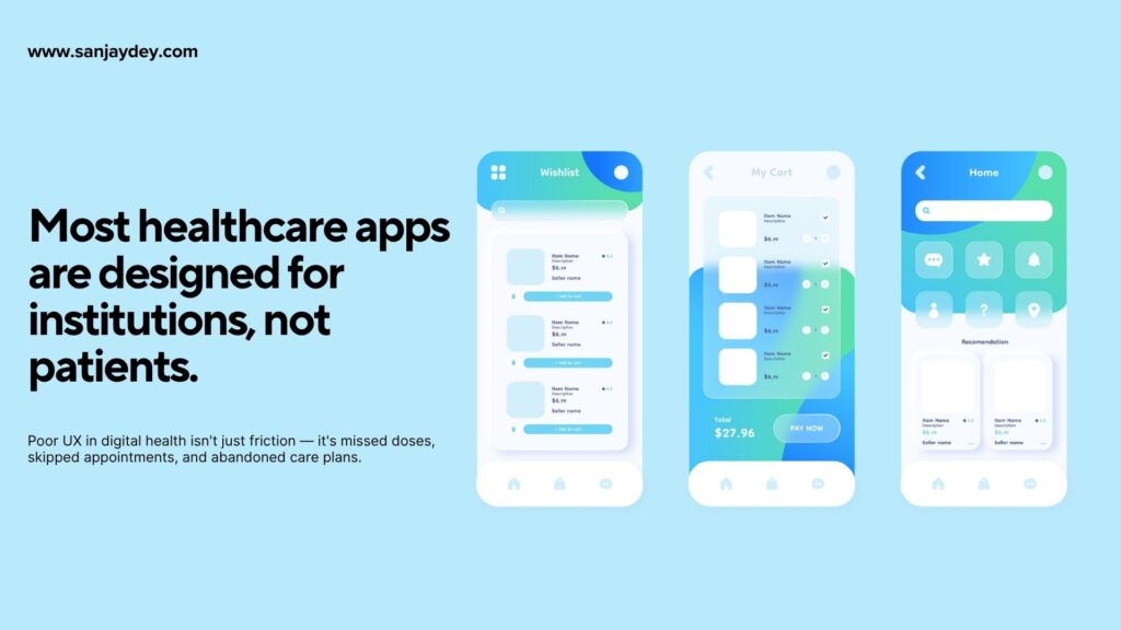
[ALT: Three-panel interface comparison showing patient, clinician, and administrator views of the same healthcare platform — different navigation depth and content density for each role]Mobile-First UX for Telemedicine and Remote Care
Telehealth revenue grew 83% between 2019 and 2021 according to McKinsey. That growth has continued. Over 70% of physicians now use smartphones or tablets as primary professional devices. Patients increasingly expect to manage their entire healthcare relationship through a mobile interface.
Mobile-first is no longer a design preference in healthcare. It’s where most users are.
But mobile healthcare UX has specific failure points that desktop-optimized thinking misses.
One-Handed Use in Context
A patient checking their blood sugar reading while preparing a meal. A caregiver updating medication records while their parent is in another room. A nurse updating patient notes between ward rounds.
Healthcare app interactions happen in fragmented, often physically occupied moments. Interfaces need to be operable with one hand, with large touch targets, and with the most critical actions reachable without scrolling.
Apply the same thinking as mobile micro-interactions that boost engagement — the feedback mechanisms that confirm an action has been taken are even more important in healthcare, where users need to be certain a medication has been logged or an appointment has been confirmed.
Connectivity and Offline States
Rural patients, patients in hospitals with patchy Wi-Fi, elderly users on limited data plans — these are real segments of the healthcare app user base. Mobile healthcare UX needs to handle connectivity loss gracefully.
That means offline data entry with sync on reconnection. Clear status indicators for connection state. No data loss when the connection drops mid-form. These aren’t edge cases — they’re the daily reality for a significant portion of users in markets like India, rural Australia, and lower-connectivity urban areas in the US.
Video Consultation UX
Telemedicine video consultations have specific UX requirements beyond standard video calling:
- Pre-call check: camera, microphone, and connection test before the consultation starts
- Waiting room experience: clear queue position, estimated wait time, option to reschedule
- In-consultation sidebar: access to relevant health data without leaving the video interface
- Post-consultation: immediate access to notes, prescriptions, and follow-up instructions — not three days later via email
Measuring What Actually Matters
Most healthcare UX teams measure session length, feature adoption, and daily active users. These are useful signals. They are not clinical outcomes.
The metrics that indicate patient-centered UX is working are downstream of the interface:
- Appointment adherence rate — Are patients showing up for scheduled consultations?
- Medication compliance rate — Are patients logging medication as taken at the correct times?
- Treatment plan progression — Are patients completing the steps in their care plans?
- Re-engagement after care gap — When a patient goes quiet, does the app bring them back?
- Task completion rate by user role — Are clinicians completing documentation? Are administrators resolving flagged items?
If your analytics setup isn’t tracking these outcomes — not just app usage — you’re measuring activity, not impact.
This is the discipline that separates healthcare UX from consumer UX. As one design researcher put it: “If the UX is doing its job, something measurable changes in the user’s health behavior.” That’s the standard to hold healthcare design to.
For the business case, the ROI of patient-centered UX connects directly to how UX design builds customer trust and retention — in healthcare, that retention has clinical consequences.
Geographic Context: Healthcare UX Across Five Markets
United States
The US healthcare UX environment is defined by HIPAA compliance, insurance integration complexity, and a highly fragmented care system. Apps serving US patients must account for insurance eligibility verification, out-of-pocket cost transparency, and the patient expectation of on-demand access. North America commands approximately 30.56% of the global healthcare app market. Mobile health adoption is high, but trust in data sharing remains a significant barrier — 61% of US patients say they would share health data with providers but not with third-party apps (Pew Research, 2023).
United Kingdom
NHS digital services operate under WCAG 2.2 mandates and strict data governance under GDPR and the NHS Data Security and Protection Toolkit. UX for NHS-connected apps must integrate with NHS login, NHS App standards, and GP Connect APIs. Patients expect NHS branding cues as trust indicators. Clinical terminology must align with NICE guidelines. The challenge is designing apps that work within NHS integration requirements while meeting the usability expectations set by consumer apps like Monzo and Spotify.
UAE / Middle East
Healthcare app UX in the UAE operates under the Dubai Health Authority (DHA) and Health Authority Abu Dhabi (HAAD) regulatory frameworks. Bilingual interfaces (Arabic and English) are not optional — they’re a regulatory and cultural requirement. RTL (right-to-left) layout support must be fully implemented, not a surface-level translation. Telemedicine adoption in the UAE has grown rapidly, with platforms like Okadoc and Vezeeta establishing patient expectations for on-demand appointment booking and video consultation.
Australia
The My Health Record system is the central digital health infrastructure in Australia, operated by the Australian Digital Health Agency. Apps integrating with My Health Record must comply with ADHA security and consent requirements. Australia’s rural and remote healthcare challenge — significant portions of the population are hours from hospital care — makes mobile-first telemedicine UX a priority. Accessibility for First Nations communities, who experience disproportionate chronic disease burden, requires culturally sensitive design approaches beyond standard WCAG compliance.
India
India’s National Digital Health Mission (NDHM) and Ayushman Bharat Digital Mission (ABDM) are building the infrastructure for a unified health ID system across 1.4 billion people. Healthcare apps targeting Indian users face extreme digital literacy variation — from tech-native urban users to first-time smartphone users in rural markets. Vernacular language support across 22 official languages is a genuine product requirement for national-scale apps. Connectivity constraints remain significant in Tier 2 and Tier 3 cities, making offline-first design and low-bandwidth optimization essential.
Answer Capsules – Quick Reference
What does patient-centered UX design mean in the context of healthcare apps?
Patient-centered UX for healthcare apps means designing every interface decision — navigation structure, content language, interaction flow, error handling — around the real needs and limitations of patients, not around clinical or institutional logic. It begins with direct research: contextual interviews, moderated usability testing with diverse patient cohorts, and empathy mapping. It results in apps where patients can complete health-critical tasks — logging medications, reading lab results, joining telehealth calls — without assistance, even during stressful or physically demanding moments. The measure of success isn’t app engagement. It’s whether patient health behavior changes as a result of using the app.
How does HIPAA compliance affect UX design for healthcare apps?
HIPAA compliance affects healthcare app UX in three primary areas: authentication flows, consent management, and data display. Authentication must meet HIPAA Security Rule requirements — which in practice means multi-factor authentication for PHI access — without creating dropout rates that prevent users from reaching critical health information. Consent flows must be genuinely informed, not buried in legal text. Data display must implement role-based access controls that feel invisible to users rather than jarring. The key design principle is to integrate compliance requirements into the UX architecture from the wireframe stage. Retrofitting compliance onto a completed design produces both security gaps and usability problems.
Why do most healthcare apps fail at usability despite large development budgets?
Most healthcare apps are designed by teams who extensively consult internal stakeholders — clinicians, compliance officers, product managers — and conduct minimal direct research with patients. The resulting interfaces reflect institutional logic rather than patient behavior. Menus organized by clinical department rather than patient need. Consent flows written for legal review rather than patient comprehension. Dashboards that display all available data rather than the single most relevant action. Large development budgets cannot compensate for research conducted with the wrong users. Patient-centered design requires patient research — conducted early, conducted broadly, and conducted with the full range of the actual user population.
FAQ: Patient-Centered UX for Healthcare Apps
What is patient-centered UX for healthcare apps?
Patient-centered UX for healthcare apps is a design approach that places patient needs, behaviors, and limitations at the center of every interface decision. It means conducting research with actual patients — not proxies or stakeholders — before designing. It means writing content at a Grade 6–8 reading level, designing for one-handed mobile use, and measuring success through clinical outcomes like medication adherence and appointment attendance, not just app engagement metrics.
How do you design HIPAA-compliant UX without sacrificing usability?
To design HIPAA-compliant UX that remains usable, integrate compliance requirements into the design architecture from the wireframe stage. Use contextual authentication — standard login for low-sensitivity actions, step-up MFA for PHI access. Break consent into specific, plain-language moments at the point of data collection rather than a single upfront legal screen. Design role-based access controls as distinct task flows for each user type, so users never encounter permission walls mid-task. Compliance and usability are not mutually exclusive — but they cannot be reconciled as a retrofit.
What is the biggest UX mistake healthcare app teams make?
The most damaging UX mistake in healthcare app design is using internal stakeholders — clinicians, administrators, product managers — as research proxies for patients. The resulting product reflects institutional logic rather than patient behavior. Menus organized by clinical department rather than patient goal. Content written at a clinical literacy level rather than a patient one. Interfaces that display comprehensive medical data rather than the single most relevant next action. Direct research with patients — including elderly users, low-literacy users, and users managing acute illness — is the only way to design an interface that actually serves them.
How does UX design affect patient engagement in healthcare apps?
Research from the Journal of Medical Internet Research shows that improving healthcare app usability can increase patient engagement by up to 60% and improve medication adherence by up to 40%. Teladoc’s research with a diabetes management program found that well-timed, personalized nudges delivered through an intuitive interface produced a 3x increase in engagement. The mechanism is direct: when patients can complete health-critical tasks without confusion or frustration, they continue using the app. When they cannot, they abandon it — with clinical consequences for their condition management.
What UX design principles matter most for telemedicine apps?
Telemedicine UX requires specific attention to three areas. First, pre-call preparation — a clear, brief technical check (camera, microphone, connection) before the consultation starts, with actionable recovery paths if something fails. Second, the waiting room experience — queue position, estimated wait time, and the option to reschedule without losing the appointment entirely. Third, post-consultation continuity — immediate, in-app access to consultation notes, prescriptions, and follow-up instructions. Most telemedicine platforms excel at the video call itself and fail at the before and after, which are where most patient frustration concentrates.
How should healthcare apps be designed for elderly users?
Healthcare apps for elderly users require minimum 14pt body font, 4.5:1 contrast ratios, touch targets of at least 48x48px, and session timeout warnings with at least 20-second advance notice. Navigation should use familiar patterns — no complex gesture-based controls, no auto-advancing carousels. Critical actions must have visible, labeled buttons rather than swipe controls or long-press interactions. Auto-save on all form inputs prevents data loss from accidental navigation. Onboarding should include an optional simplified mode with reduced feature density for users who self-identify as less tech-confident. Testing with elderly participants — not assumptions about elderly users — is the only reliable way to validate these decisions.
What is the difference between UX for patient-facing apps vs. clinician-facing tools?
The core difference is between empowerment design and efficiency design. Patient-facing apps should reduce anxiety, use plain language, present one clear next action at a time, and make health information feel manageable. Clinician-facing tools should minimize documentation time, provide fast access to dense clinical data, support predictive inputs and smart defaults, and allow bulk actions. The information architecture, content density, and interaction patterns appropriate for a patient interface would fail immediately in a clinical workflow context. These are different products sharing a data infrastructure — not the same product with a role filter applied.
Conclusion
Patient-centered UX for healthcare apps is not a design style or a product feature. It’s a discipline built on direct patient research, evidence-based design decisions, and a clear-eyed understanding of what the app needs to do — change health behavior, not just generate engagement metrics.
The healthcare app market is growing at a pace that will make UX quality a primary competitive differentiator within this decade. The teams that will build products that last are the ones investing in contextual research, building role-specific task flows, designing compliance into architecture rather than layering it on, and measuring outcomes that matter clinically.
The tools and methods exist. The evidence base is clear. What’s missing in most healthcare product teams is the discipline to conduct research before design, and the organizational support to act on what the research reveals.
If you’re building or scaling a healthcare digital platform — a patient portal, a telemedicine product, a chronic disease management app — and you need an experienced UX perspective on where your current design is creating friction, I work directly with product teams on UX audits and patient-centered design strategy.
Book a free UX consultation to discuss your specific product and where the highest-impact improvements are. Or explore my UX/UI design work and approach at sanjaydey.com to understand how I approach complex design challenges across healthcare, enterprise, and digital platforms.
Author Bio
Sanjay Kumar Dey is a Senior UX/UI Designer and Digital Strategist with over 20 years of experience designing web, mobile, and enterprise analytics interfaces for global clients. Most recently at PwC India, he has delivered UX strategy and interaction design for organizations including ArcelorMittal, Adobe, NatWest Bank UK, Adani, Indian Oil, and the Government of India. He holds certifications in UX Design from Google (Coursera) and the Interaction Design Foundation. He publishes practitioner-grade UX and design strategy content at sanjaydey.com and is available for consulting engagements across the US, UK, UAE, Australia, and India.
Leave a Reply