The short answer
UX design for SaaS companies wins more signups by cutting friction before the value lands. Most signups never become customers. The median B2B SaaS trial-to-paid rate sat at 18.5% in 2025, and 75% of new users churn in the first week (Exec, 2025). The fix is not a bigger funnel. It is a shorter path to first value, fewer form fields, and onboarding under 7 steps. Speed to value beats every other lever. Get a user to their “aha” inside 10 minutes and conversion follows.
Executive summary
- Median B2B SaaS trial-to-paid conversion was 18.5% in 2025; top quartile hit 35–45% (1Capture, 2025).
- 90% of users abandon a product if they do not grasp value in the first week (UserGuiding, 2025).
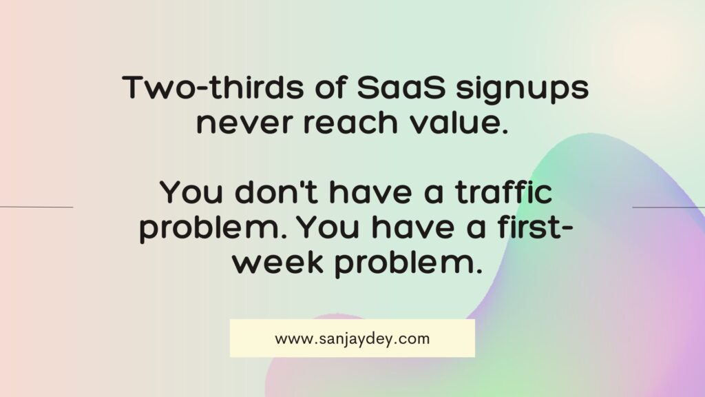
- Average user activation rate sits at 37.5% — two-thirds of signups never reach core value (Amplitude, 2025).
- Onboarding flows with 7 or fewer steps convert best; over 12 steps drops completion 30–50% (Pixxen, 2026).
- Reducing form fields from 4 to 3 lifted conversions 50% in HubSpot testing; 11 to 4 lifted them 120% (Imagescape).
Table of contents
- Why most SaaS signups never convert
- The signup form is where you bleed
- Onboarding decides retention in the first week
- Time to value: the metric that actually predicts revenue
- Reduce cognitive load on the first screen
- Trust signals that change submission rates
- A step-by-step UX process for more signups
- Comparison: opt-in vs opt-out trial UX
- Tools and resources
- Geographic relevance: USA, UK, UAE, Australia, India
- FAQ
- Conclusion
Why most SaaS signups never convert
Most signups fail because users never reach value, not because the product is weak. The average activation rate across SaaS and AI tools was 37.5% in 2025 (Amplitude, 2025). That means roughly two-thirds of people who sign up never do the one thing your product was built to do. They do not rage-quit. They drift away quietly.
I have spent 20+ years designing dashboards and product interfaces for enterprise clients. The pattern repeats everywhere. Teams obsess over top-of-funnel volume. They run ads, tune landing pages, celebrate signup counts. Then they ignore the 72 hours after signup, where the real loss happens.
The numbers are brutal. Users who do not engage within the first 3 days have a 90% chance of churning (UserGuiding, 2025). Over 98% of new users churn within two weeks when they never hit a value milestone (Amplitude, 2025). Sign-up volume is a vanity number. If trial-to-paid is broken, more signups make the bleed bigger.
This is the part most guides skip. More acquisition spend on a leaky funnel multiplies waste. The work that moves revenue happens after the form submits.
[ALT: Funnel diagram showing signup volume dropping sharply at the activation stage]That gap between signup and activation is the most expensive real estate in SaaS. Fix it and the rest of the math gets easier.
The signup form is where you bleed
Every form field you add costs conversions. Across 93 million tracked sessions, the average form completion rate was 51.7% in 2025 (Zuko, 2025). Half of everyone who starts your form leaves. The biggest driver is length, not steps.
HubSpot’s testing found that cutting form fields from 4 to 3 increased conversions by 50%. Imagescape went from 11 fields to 4 and saw conversions rise 120% (cited by AntForms, 2026). The pattern holds across industries. Each additional required field reduces completion by roughly 10–15%.
Field choice matters as much as field count. Password fields show a 10.5% mean abandonment rate — the highest of any common field (Zuko, 2025). Phone fields cause 6.3% drop-off, and 37% of users abandon a form that asks for a phone number unless it is optional (WPForms). Address fields take 7.4 seconds to complete on average, the slowest standard field.
Here is what I tell clients. Audit every field. For each one, ask: do I need this now, or can I ask later? Pre-fill defaults. Use autofill — forms with autofill complete 35% faster and see 75% lower abandonment (pdfFiller, 2026).
If you run a B2B SaaS, the temptation is to qualify hard at signup. Forms with more than 5 fields in B2B record a 30% average conversion drop versus shorter variants (MarketingSherpa, 2024). Capture the email. Qualify inside the product, where the user already has skin in the game.
[ALT: Side-by-side comparison of a long 8-field signup form and a clean 2-field signup form]For a deeper breakdown of where forms lose people, my guide on UX design mistakes killing conversions maps the common traps. The form is the gate. Most teams build it too tall.
Onboarding decides retention in the first week
Onboarding is the highest-risk interaction in the entire user lifecycle. Dropoff rates typically run 30–50% for SaaS and product-led growth companies (SaaSFactor, 2026). The first week is where the bleeding happens, and 75% of users churn there when onboarding fails (Exec, 2025).
The structure of your flow matters more than the polish. The best-performing onboarding flows have 7 or fewer steps in the critical path. Anything over 12 steps drops completion 30–50% (Pixxen, 2026). Before you add a tooltip, remove a step. Before you add an email, remove a form field.
Personalization compounds. Companies that implement personalized onboarding see 35–50% improvement in activation rates and 52% faster time-to-productivity (shno.co, 2025). Even basic role-based segmentation beats one-size-fits-all by a wide margin. A new marketer and a new developer should not see the same first screen.
Checklists work — when users finish them. But the average checklist completion rate across 188 companies was 19.2%, with a median of 10.1% (Userpilot, 2025). That means 80% of users never finish the thing you built to help them. Keep checklists short. Three meaningful items beat ten.
Milestone-based onboarding reduces Day 7 churn by 28% (BambooHR, 2025). Users who complete onboarding have a 21% higher adoption rate and are 12% less likely to churn in year one (Totango, 2025). My breakdown of SaaS onboarding that gets users to the aha moment shows the sequencing in detail.
[ALT: Onboarding flow with five numbered steps ending in a value milestone]A blank dashboard with no guidance is a churn surface. The empty state is your first teaching moment, not dead space — my notes on zero-state UX design for engagement cover how to fill it.
Time to value: the metric that actually predicts revenue
Time to value decides whether onboarding is an asset or a leak. Every 10-minute delay in time-to-value costs roughly 8% in conversion (1Capture, 2025). Speed is the single strongest lever you control.
Users who perform the “aha” action in their first session are three times more likely to renew than those who delay (Productfruits, 2025). The job is not to teach every feature. The job is to get one user to one outcome fast.
Define your activation event with data, not guesswork. Pull the cohort that retained 12+ months. Find the action they took in week one that the churned cohort did not. That action is your North Star. Count the steps between signup and that event, then cut everything that does not serve it.
Amplitude’s 2025 benchmark found that when at least 7% of a new cohort returns on day 7, the product lands in the top quartile for activation. Day 7 retention is a leading indicator. Track it weekly.
[ALT: Line chart showing conversion rate dropping as time-to-value increases]The teams that win treat time-to-value as a product KPI, not a UX nicety. Shave minutes off the path and the revenue curve bends.
Reduce cognitive load on the first screen
Cognitive load is the silent conversion killer. Feature overwhelm reduces conversion by 45%; progressive disclosure wins (1Capture, 2025). Showing everything at once does not signal power. It signals work.
Progressive disclosure means revealing complexity only as the user needs it. Start with one clear next action. Hide advanced settings behind a deliberate click. The first screen should answer one question: what do I do now?
This is where interaction cost matters. Every decision a user makes carries a mental price. A screen with twelve options costs more than a screen with two. Lower the cost and more users move forward.
My piece on designing for cognitive load covers the techniques in depth. The principle is simple. Defer everything that does not help the user reach value right now.
[ALT: Clean first-run screen with a single primary call to action highlighted]Most teams add to the first screen when they should subtract. Restraint converts.
Trust signals that change submission rates
Trust friction stops more signups than design friction. 29% of users abandon forms over security concerns — the top reason cited (Formisimo/Zuko, 2025). And 73% of Americans feel they have little control over how their data is used (pdfFiller, 2026).
The fix is not more badges. It is clarity of purpose. Tell users why you need each field and what you will do with it. A phone field marked “optional — we’ll only call if you request it” converts far better than a bare required field.
12% of users abandon checkout forms when trust badges are absent (WPForms). But badges alone do not build trust. Plain-language data handling, visible security context, and honest field labels do more than a wall of logos.
[ALT: Signup form with inline reassurance text next to a sensitive field]For SaaS serving regulated markets, transparency is not optional — it is the conversion mechanism. My guide on UX improvements that build customer trust goes further. State your intent and watch submission rates move.
A step-by-step UX process for more signups
To increase SaaS signups, fix the funnel in this order: define the activation event, cut form fields, shorten onboarding, measure time-to-value, then iterate weekly. Sequence matters. Skip the diagnosis and you optimize the wrong thing.
- Define the activation event. Pull your 12-month retained cohort. Identify the week-one action they shared. That is your target.
- Audit the signup form. Count every field. Remove anything you can ask later. Make phone and non-essential fields optional.
- Map the critical path. Count steps from signup to activation. Cut to 7 or fewer.
- Build the empty state. Replace blank dashboards with a suggested next action and a preview of the filled state.
- Personalize by role. Add a one-question welcome survey. Branch the first screen.
- Measure time-to-value. Track minutes from signup to first value. Track Day 7 return rate.
- Iterate weekly. A 2% weekly activation improvement compounds to a 100%+ annual gain (Stanford Persuasive Tech Lab).
This is the same diagnostic sequence I run in client workshops. It works because it starts with evidence, not opinion. My conversion rate optimization UX fixes guide expands each step.
[ALT: Seven-step process diagram from activation event definition to weekly iteration]The order is the strategy. Diagnose, then design.
Comparison: opt-in vs opt-out trial UX
Opt-in vs opt-out — the key difference is friction versus volume. Opt-out trials require a credit card and convert at 31.4% (ChartMogul, 2026). Opt-in trials need no card and convert at 8.9%. Opt-out produces nearly 3x more paying customers from the same traffic, but cuts signup volume 60–70%.
| Factor | Opt-in (no card) | Opt-out (card required) |
|---|---|---|
| Trial-to-paid rate (2026) | 8.9% | 31.4% |
| Signup volume | High | 60–70% lower |
| Friction at signup | Low | High |
| Best for | Viral, self-serve, sub-$20 | ACV $50+, complex workflows |
| Net paying customers | Lower | Nearly 3x higher |
Source: ChartMogul 2026, SaaSFactor 2026.
The right model depends on your product, not on a benchmark. If your value is obvious in minutes and your price is low, opt-in wins on volume. If your product needs setup and your ACV justifies it, opt-out wins on revenue per cohort. Test both. The benchmark is not the destination — your next cohort is.
[ALT: Comparison table contrasting opt-in and opt-out trial conversion outcomes]Most teams pick a model by habit. Pick it by economics instead.
Tools and resources
These are the tools I see deliver measurable signup and activation gains:
- Figma — design and prototype signup flows before building.
- Userpilot / Pendo — in-app onboarding, checklists, and activation analytics.
- Amplitude / Mixpanel — define and track activation events and Day 7 retention.
- Zuko / VWO Form Analysis — field-level form abandonment data.
- Hotjar / Microsoft Clarity — heatmaps and session recordings to find friction.
- Maze — moderated and unmoderated usability testing on signup flows.
For benchmarking, draw on named sources: Baymard Institute for form and checkout data, Nielsen Norman Group for usability research, and Amplitude or Userpilot for activation benchmarks. My AI UX tools list for 2026 covers newer additions.
[ALT: Grid of UX and analytics tool logos used for signup optimization]Pick tools that measure activation, not just acquisition. The right stack shows you where users actually drop.
Geographic relevance: market context by region
United States
US SaaS buyers expect self-serve trials and instant value. Average customer acquisition cost runs $650–$1,100 (Exec, 2025), so first-week churn is a direct revenue leak. Self-serve and product-led growth dominate, and 65% of PLG-focused SaaS used hybrid freemium-plus-trial models in 2026 (SaaSFactor, 2026). US users tolerate the least friction at signup. Card-required trials work for higher-ACV tools where buyers expect a sales touch. For most US self-serve products, low-friction opt-in signup plus fast time-to-value drives the strongest net revenue.
United Kingdom
UK SaaS faces sharper trust expectations. Roughly 77% of UK mobile orders go uncompleted (Statista), and UK GDPR raises the bar on data transparency at signup. UK buyers respond to clear, plain-language data handling more than to badge walls. WCAG 2.1 AA expectations are rising, especially for firms serving government or public-sector clients. For UK SaaS, accessible forms, honest field labels, and explicit consent language are conversion mechanisms, not compliance overhead. Make optional fields visibly optional and state retention purpose clearly.
UAE and Middle East
UAE SaaS adoption is climbing fast across government and enterprise digital programs. Bilingual UX matters — Arabic and English flows must both feel native, and right-to-left layouts change form and onboarding design. Trust and data residency questions weigh heavily for regional buyers, so visible security context lifts submission rates. Mobile-first design is essential given high smartphone penetration. For UAE SaaS, localized onboarding, RTL-aware forms, and clear data handling beat generic global flows. Region-specific reassurance at the signup point reduces hesitation.
Australia and New Zealand
Australian SaaS buyers behave much like US and UK self-serve users but with strong mobile usage and privacy sensitivity under the Privacy Act. Desktop still leads form completion — 47% desktop versus 42% mobile (Zuko, 2025) — so mobile signup flows need extra care. ANZ buyers value straightforward pricing and quick time-to-value. For Australian SaaS, mobile-optimized forms, transparent pricing, and fast activation convert best. Avoid long multi-step signups on mobile, where attention drops fastest and abandonment climbs.
India
India’s SaaS sector is among the fastest-growing globally, serving both domestic and global markets. Price sensitivity and mobile-first behavior shape signup UX, since most users arrive on mid-range Android devices over variable connections. Lightweight forms, fast-loading flows, and freemium models perform well. Vernacular and English support widens reach. For Indian SaaS, mobile performance, minimal form friction, and freemium-to-paid paths drive activation. Heavy desktop-first signup flows lose users on slower networks before value ever lands.
Frequently asked questions
What is UX design for SaaS companies?
UX design for SaaS companies is the practice of shaping every product interaction — signup, onboarding, first use, and ongoing engagement — to move users from registration to realized value. For SaaS, good UX directly affects trial-to-paid conversion, activation rate, and retention. It connects design decisions to revenue, not aesthetics, by reducing friction at each funnel stage.
What is a good SaaS free trial conversion rate in 2025?
The median B2B SaaS trial-to-paid conversion rate was 18.5% in 2025, with top quartile performers reaching 35–45% (1Capture, 2025). The number varies by trial type. Opt-in trials averaged 8.9% and credit-card-required trials 31.4% in 2026 (ChartMogul). A good rate depends on your pricing tier, ACV, and self-serve versus sales-assisted model, so compare against your own model.
How do I improve SaaS signup conversion rates with UX design?
To improve SaaS signup conversion, cut form fields to the minimum, shorten onboarding to 7 or fewer steps, and reduce time-to-value. Reducing form fields from 4 to 3 lifted conversions 50% in HubSpot testing. Define your activation event from your retained cohort, then remove every step that does not lead to it. Measure Day 7 return rate weekly.
Why do most SaaS signups never become customers?
Most signups fail because users never reach core value. The average activation rate was 37.5% in 2025, so two-thirds of signups never experience the product’s core outcome (Amplitude, 2025). Users who do not engage within 3 days have a 90% churn probability (UserGuiding, 2025). The loss happens after the form submits, not during acquisition.
How many fields should a SaaS signup form have?
A SaaS signup form should ask for the fewest fields needed to start — often just email, or email and password. Each additional required field reduces completion by roughly 10–15%. Going from 11 fields to 4 lifted conversions 120% in one case (Imagescape). Capture qualifying details inside the product after signup, where the user is already committed.
Opt-in vs opt-out trial — which converts better?
Opt-out trials (credit card required) convert at 31.4% versus 8.9% for opt-in trials in 2026 (ChartMogul). Opt-out produces nearly 3x more paying customers from the same traffic but cuts signup volume 60–70%. The key difference is friction versus volume. Opt-out suits higher-ACV products; opt-in suits viral, low-price, self-serve tools. Test both against your unit economics.
Conclusion
More SaaS signups do not come from a bigger funnel. They come from a shorter path to value. The data from 2025 and 2026 is consistent. Median trial-to-paid sits near 18.5%, two-thirds of users never activate, and 75% churn in the first week when onboarding fails. None of that is an acquisition problem. It is a UX problem.
Start where the loss is largest. Cut your signup form to the essentials. Shorten onboarding to under 7 steps. Define your activation event from real retention data. Then measure time-to-value and iterate weekly. Small, compounding gains beat redesigns.
If you want a second set of eyes on your signup and onboarding flow, book a free UX consultation. I help SaaS teams find the exact steps where users drop and rebuild the path to value. You can also explore my UX design for SaaS conversions work to see the approach applied.
About the author
Sanjay Kumar Dey is a Senior UX/UI Designer and Digital Strategist with 20+ years of experience designing web, mobile, and enterprise dashboard products for global clients including ArcelorMittal, Adobe, NatWest Bank UK, ITC, Adani, Indian Oil, and NSDC (Government of India). He writes on UX strategy, conversion optimization, and product design at sanjaydey.com, serving SaaS and enterprise teams across the USA, UK, UAE, Australia, and India.
Sources
- 1Capture — Free Trial Conversion Benchmarks 2025: https://www.1capture.io/blog/free-trial-conversion-benchmarks-2025
- ChartMogul / Pulseahead — Trial-to-Paid Benchmarks: https://www.pulseahead.com/blog/trial-to-paid-conversion-benchmarks-in-saas
- Amplitude / Digital Applied — Time to Value 2026: https://www.digitalapplied.com/blog/customer-onboarding-time-to-value-2026-saas-metrics-framework
- Userpilot — SaaS Average Conversion Rate: https://userpilot.com/blog/saas-average-conversion-rate/
- shno.co — SaaS Onboarding Statistics 2026: https://www.shno.co/marketing-statistics/saas-onboarding-statistics
- Pixxen — SaaS Onboarding UX 2026: https://pixxen.com/blog/saas-onboarding-ux/
- Loyalty.cx — SaaS Onboarding Optimization (UserGuiding, Exec, BambooHR data): https://loyalty.cx/saas-onboarding-optimization/
- Zuko — Conversion Rate Statistics 2025: https://www.zuko.io/blog/25-conversion-rate-statistics-you-need
- pdfFiller — Online Form Statistics 2026: https://blog.pdffiller.com/online-form-statistics/
- AntForms — Reduce Form Abandonment (HubSpot, Imagescape data): https://antforms.com/blog/reduce-form-abandonment-rate-strategies/
- First Page Sage — SaaS Free Trial Conversion Benchmarks: https://firstpagesage.com/seo-blog/saas-free-trial-conversion-rate-benchmarks/
- userTourKit — SaaS Onboarding Flow Analysis (Userpilot Benchmark): https://usertourkit.com/blog/saas-onboarding-flow-analysis
Leave a Reply