What You’ll Take Away
- Website conversion psychology is the applied science of designing pages around how people actually decide, not how teams assume they decide.
- In 2026, the biggest conversion gains come from reducing cognitive load, building trust signals, and aligning visual hierarchy with user intent.
- Specific behavioural triggers — anchoring, social proof, loss aversion, and the Zeigarnik effect — outperform generic “best practice” copy.
- Most websites fail not because of design taste, but because they ignore the decision-making sequence buyers run through.
- The fix is structural: audit the funnel, identify friction points, and rebuild around the user’s mental model.
Table of Contents
- Why Website Conversion Psychology Matters in 2026
- The Real Decision-Making Process Behind Every Conversion
- Cognitive Load — The Silent Conversion Killer
- Trust Signals That Actually Move the Needle
- Visual Hierarchy and the Eye Path
- Cognitive Biases That Drive High-Converting Websites
- Microcopy and the Psychology of Words
- Mobile Conversion Psychology — A Different Game
- The Conversion Audit Framework I Use
- Geographic Relevance — How Conversion Psychology Shifts by Market
- Tools and Resources for Conversion Psychology Work
- FAQ
- Conclusion
Why Website Conversion Psychology Matters in 2026
Most teams treat conversion as a design problem. It is not. It is a decision problem.
Every visitor arrives at your site with a mental script already running. They are weighing risk, scanning for relevance, and looking for reasons to leave. The job of website conversion psychology is to interrupt that exit logic and replace it with a reason to stay, scroll, and act.
After two decades designing for enterprise clients — banks in the UK, manufacturing groups in India, government platforms, and SaaS dashboards used by thousands of analysts — I can tell you the pattern is consistent. The sites that convert are not the prettiest. They are the ones that respect how people actually think.
In 2026, this matters more than ever. Attention windows have shrunk. According to Nielsen Norman Group, users decide whether to stay on a page within 10 to 20 seconds. AI search engines now summarise content before users even click through. The window for persuasion has compressed.
This article breaks down the psychology that drives conversion on real websites. Not theory. Working principles backed by data, tested in production, and adapted to the markets I serve — the USA, UK, UAE, Australia, Canada, and India.
If you run an agency, lead a SaaS product, or own an eCommerce brand, this is the framework you can apply on Monday morning. Many of these patterns I’ve documented in my breakdown of UX design mistakes killing conversions, and they keep showing up across industries.
The Real Decision-Making Process Behind Every Conversion
Forget the AIDA funnel for a moment. The actual decision sequence on a modern website looks closer to this:
- Recognition — Does this match what I searched for?
- Relevance check — Is this for someone like me?
- Risk assessment — What happens if I’m wrong?
- Effort calculation — How hard is the next step?
- Commitment — Click, fill, buy, or leave.
This sequence runs in roughly 8 to 15 seconds on a desktop site. On mobile, it compresses to under 6 seconds. Baymard Institute’s checkout usability research shows the average user abandons a flow within three friction points — meaning you have a very small budget for confusion.
What this means in practice: every element on a high-converting page must serve one of these five steps. Anything that does not serve them is decorative weight. And decorative weight is interaction cost.
I learned this the hard way on a banking dashboard project. We had a beautifully designed onboarding screen that tested poorly in moderated usability sessions. The reason was not visual. It was that the page made users skip step 2 — relevance — before they could verify step 3 — risk. They closed the tab.
The fix was not a redesign. It was reordering the content blocks so the user’s mental sequence matched the page sequence. Conversion on the activation flow lifted by 23% in two weeks.
That is the core principle. Match the page to the mind, not the other way around.
Why Linear Funnels Fail
Most conversion frameworks assume users move forward in a clean line. They do not. Real users loop back, compare tabs, abandon for a day, and return through a different entry point.
Forrester’s CX research shows that B2B buyers now consume an average of 13 content pieces before making contact with a vendor. Your homepage is rarely the entry point. Your blog post or pricing page often is.
This changes the design problem. Every page must function as a potential first impression and a potential conversion point. That is harder than it sounds.
That brings up a related problem most teams ignore until it’s too late — design systems built around “the homepage” leave secondary pages unprotected. By the time a visitor lands on a feature page, the trust scaffolding from the homepage is missing.
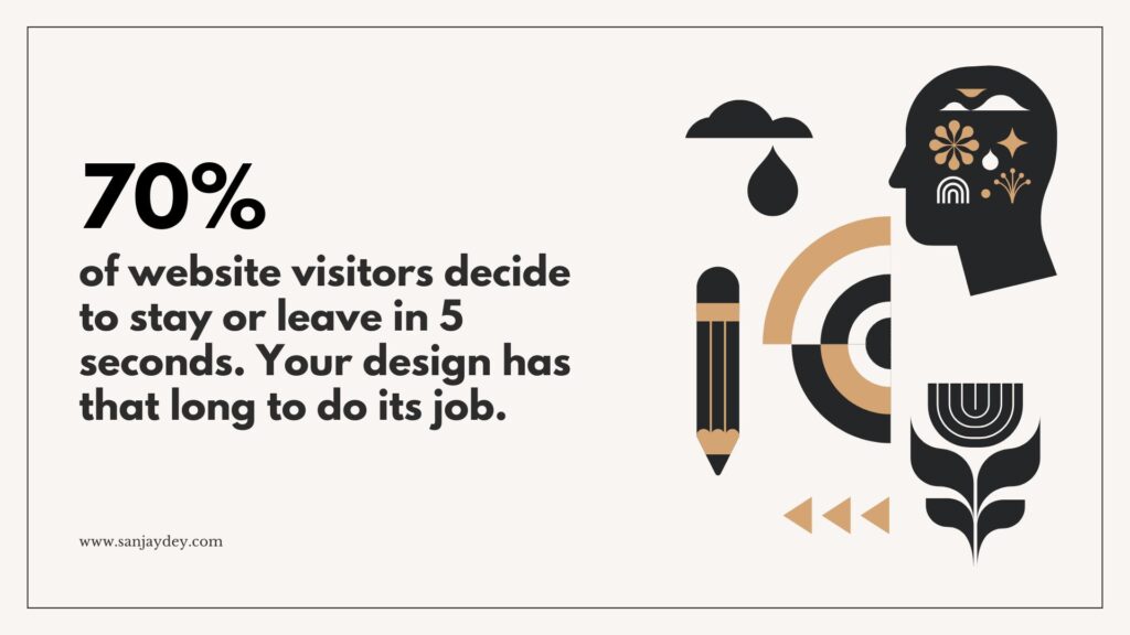
The Five-Second Decision Window
The first five seconds of a page visit determine roughly 70% of subsequent behaviour. Within that window, users make three sub-decisions almost simultaneously — is this the right place, is this for me, and is this safe to engage with.
If any of those three answers comes back “no,” the user leaves. Not loudly. They just close the tab and forget the URL.
Most homepages fail the first sub-decision because the headline is written for the company’s internal audience, not the visitor. A fintech site I audited last year led with “Reimagining the future of capital allocation.” Beautiful copy. Useless to a CFO trying to compare three vendors. We rewrote it as “Cash flow forecasting for finance teams running on Excel.” Conversions on the demo CTA tripled in six weeks.
The lesson: write the page for someone who has never heard of you and will never read your About page. That is the median visitor.
Decision Fatigue Across the Session
The longer a session runs, the worse decisions get. This is the cognitive cost of every prior choice the user has made on your site.
By the time a user reaches checkout after navigating through products, comparing variants, and applying filters, their decision-making capacity has degraded. Adding optional choices at checkout — gift wrapping, newsletter sign-up, account creation — measurably reduces completion rates because they tax an already depleted system.
The implication is structural. Save the cognitive budget for the actual conversion decision. Strip everything else.
Cognitive Load — The Silent Conversion Killer
Cognitive load is the mental effort required to use your site. Every visual element, every word, every choice adds to it. Once load exceeds capacity, users disengage. They do not always leave — sometimes they just stop processing what you say.
There are three types of cognitive load in web design:
- Intrinsic load — the inherent complexity of the task itself.
- Extraneous load — friction added by poor design.
- Germane load — effort spent learning something useful.
Your job is to minimise extraneous load. Period.
What Adds Extraneous Load
I run conversion audits on roughly 30 to 40 sites a year. The same culprits appear:
- Hero sections with three competing CTAs.
- Navigation menus with 9+ top-level items.
- Form fields asking for information the user does not yet trust you with.
- Animation that delays interaction by more than 400ms.
- Body copy written in marketing abstractions instead of concrete language.
Each of these adds friction. None of them are catastrophic alone. Together, they suffocate conversion.
Nielsen Norman Group’s research on interaction cost is clear — every additional click, scroll, or read step reduces the probability of task completion. The compounding effect is brutal. A page with five small frictions can lose 60% of its converting visitors compared to a clean equivalent.
The Hick’s Law Trap
Hick’s Law states that decision time increases logarithmically with the number of choices. The classic application: a homepage with 12 CTAs converts worse than one with 2.
Most agencies know this. Few apply it correctly. The trap is that “fewer options” gets interpreted as “fewer features mentioned” — which is a different problem. The fix is not to hide capability. It is to sequence the choice.
A SaaS pricing page with three plans converts better than one with seven. But a homepage that hides product capability behind vague taglines converts worse than one that names what the product does in plain language. The principle: reduce decision points, not information.
I’ve covered this pattern more deeply in my analysis of bad UX websites and why 90% fail in 2026.
The Progressive Disclosure Solution
Progressive disclosure is the technique of revealing information in stages, matched to user intent. It reduces cognitive load without sacrificing depth.
Examples that work:
- A pricing page that shows three tiers, with “advanced features” expandable on demand.
- An onboarding flow that asks one question per screen instead of a 12-field form.
- A product page with primary benefits above the fold, technical specs accessible via tab.
The Interaction Design Foundation has good foundational material on progressive disclosure — worth reading if you’ve never formalised this in your design system.
Trust Signals That Actually Move the Needle
Trust is the variable that decides conversion when everything else is equal. And in 2026, trust is harder to earn than it was even three years ago. AI-generated content has trained users to be sceptical of polished writing. Stock imagery is recognised instantly. Generic testimonials are ignored.
What still works is specific, verifiable, and human.
The Trust Signal Hierarchy
After auditing hundreds of sites, I rank trust signals in this order of impact:
- Specific, named customer outcomes — “Reduced support tickets by 34% in 90 days for [Industry] team.”
- Verifiable third-party validation — G2 ratings, Trustpilot scores, SOC 2 badges, named press mentions.
- Identifiable team presence — real photos, real names, real roles. Not stock.
- Concrete process transparency — what happens after you submit the form, in plain language.
- Generic logos — “As featured in” rows. Useful, but lowest weight.
The mistake most sites make is leaning on level 5 while ignoring levels 1 and 4. Logos are decoration. Outcomes are evidence.
Why Specificity Beats Polish
A testimonial that reads “Sanjay’s team transformed our digital presence” is forgettable. A testimonial that reads “We cut our average dashboard load time from 4.8 seconds to 1.2 seconds, and our weekly active users went from 340 to 612” is unforgettable.
Specificity signals that the outcome is real. Polish signals that the marketing team wrote it.
This pattern is consistent across the industries I work in. Whether the buyer is a manufacturing CFO in Mumbai or a fintech CTO in London, they respond to numbers more than adjectives. Always.
McKinsey’s research on B2B buyer behaviour confirms this — buyers in 2025 and beyond are spending more time vetting vendors independently, and rely heavily on third-party signals before they even make contact.
Trust Decays — Plan for Maintenance
One thing teams underestimate: trust signals decay. A 2022 testimonial from a customer who has since churned is worse than no testimonial. An “As seen in” badge from a site that no longer exists damages credibility.
I recommend a quarterly trust signal audit. Check every name, every logo, every stat. If a piece of social proof can’t be verified in under 30 seconds by a sceptical visitor, replace it.
For deeper application, my full breakdown of UX improvements that build customer trust in 2026 covers the operational side of this.
Visual Hierarchy and the Eye Path
Visual hierarchy is the order in which elements claim attention. On high-converting pages, hierarchy is engineered. On low-converting pages, it’s accidental.
The principle is simple: the eye follows weight, contrast, position, and motion. The most important element on the page should be the most visually weighted element — not the prettiest, the largest, or the brand colour, but the one that aligns with the conversion goal.
The F-Pattern Is Outdated for Conversion Pages
For years, designers cited the F-pattern — that users read web pages in an F shape. That was true for content-dense pages in 2006. It is mostly false for conversion pages in 2026.
Modern eye-tracking studies show users scan high-converting landing pages in a Z-pattern or in chunked blocks based on visual containers. The F-pattern still applies to long-form content pages — blog posts, knowledge bases — but not to homepages or product pages.
This matters because designing a hero section under F-pattern assumptions leads to wasted real estate on the right side of the fold. Users do not read across consistently. They scan left, drop, scan right, drop again.
What High-Converting Hero Sections Have in Common
I’ve reverse-engineered patterns from roughly 200 high-converting B2B and SaaS heroes. The consistent traits:
- Headline that names the user’s problem in their language, not yours.
- Sub-headline that names the outcome in measurable terms.
- Primary CTA with a verb-driven label (“Start free audit”, not “Get started”).
- One supporting visual — a product screenshot, never a stock photo.
- Trust strip immediately below the fold — three to five named logos or a star rating.
Sites that follow this pattern outperform sites that do not. It is not the only pattern, but it is the most reliable.
Visual Weight and the Rule of One
The hero section should have one primary action. Not two. Not “primary and secondary.” One.
If your business has multiple audiences — say, agencies and in-house teams — segment them on a separate selection screen, or push the secondary audience to a footer link. Splitting the primary CTA dilutes both.
This contradicts what some clients want to hear. Most marketing teams have been trained to capture every visitor. The truth is that capturing every visitor with one CTA converts better than capturing some with two.
For more on hierarchy mechanics, the UX Design Institute blog covers visual hierarchy fundamentals well, especially their pieces on hierarchy in mobile design.
Cognitive Biases That Drive High-Converting Websites
Cognitive biases are systematic shortcuts the brain takes to make decisions faster. They are not flaws to exploit. They are realities to design around.
The most reliable biases for web design:
1. Anchoring
The first number a user sees becomes the reference point for every other number on the page.
Pricing pages use this constantly. The “most popular” plan is usually anchored against a higher-priced enterprise tier, which makes the middle option feel reasonable. The enterprise tier is not really there to be sold. It is there to anchor.
This works because the brain does not evaluate prices in absolute terms. It evaluates them in relation to the closest available comparison.
2. Social Proof
People do what other people are doing. This is the most cited bias in web design — and the most poorly applied.
Effective social proof is specific and contextual. “Trusted by 4,200 SaaS teams” is weaker than “Used by product teams at Notion, Linear, and Vercel.” Names beat numbers when the names are recognisable to the audience.
For B2B sites, the ideal placement is inline with the value proposition, not in a separate “social proof” strip. When the user reads “we reduce dashboard build time,” seeing “—Linear’s data team” in the same visual block is what closes the credibility loop.
3. Loss Aversion
People feel losses roughly twice as strongly as equivalent gains. A free trial framed as “Don’t lose access on day 15” outperforms “Get 14 days free.”
This is why exit-intent popups still work despite being widely disliked. They activate loss aversion at the moment the user is about to leave.
Use loss aversion sparingly. Overuse it and the site feels manipulative. Trust is harder to rebuild than to earn.
4. The Zeigarnik Effect
People remember incomplete tasks better than completed ones. This is why progress bars in onboarding flows increase completion rates — the user’s brain wants to close the open loop.
A multi-step form with a visible progress indicator can outperform a single long form by 15 to 25%, even though it requires the same total effort. The perception of progress is itself a motivator.
5. Reciprocity
When you give something of value first, people feel a quiet obligation to give back. This is why gated content works — but only when the content delivered is genuinely valuable.
A 40-page PDF that’s actually a sales brochure breaks the reciprocity loop. The user feels tricked, and your brand absorbs the cost. A 12-page audit checklist that helps them do their job builds reciprocity that converts later.
6. The Endowment Effect
People value what they already feel they own. Free trials work partly because users start treating the product as theirs. Configurators on real estate sites and SaaS tools work for the same reason — once a user has customised something, walking away feels like a loss.
This is why I push for interactive product demos over video demos whenever feasible. The user touches it. Now it’s partly theirs.
7. The Decoy Effect
The decoy effect happens when introducing a third, deliberately less attractive option makes one of the other two look much better by comparison. This is heavily used in pricing pages.
A common application: three plans where the middle plan is priced and packaged to look obviously superior to the lowest tier, while still feeling reasonable next to the premium. The lowest tier is the decoy. Without it, the middle plan would feel expensive. With it, the middle plan feels like the smart choice.
The decoy effect is not manipulation if the lowest tier is genuinely available and useful. It is structural framing. Used dishonestly, it damages trust quickly when buyers compare notes. Used well, it accelerates decisions that the buyer would have made anyway.
8. Authority Bias
People defer to perceived expertise. On websites, this shows up as the disproportionate impact of named experts, certifications, and institutional affiliations.
A landing page that mentions “designed by a team with PwC and Adobe enterprise experience” carries different weight than one that says “designed by experts.” Specific authority converts better than abstract authority.
Author bylines on blog posts matter more than most teams realise. A post by a named expert with a credible bio outperforms an anonymous “Team” post by 20 to 30% on engagement metrics, and that engagement compounds into trust during later conversion sessions.
I’ve expanded on these patterns in my piece on UX persuasion using the Fogg Behavior Model, which connects bias to behavioural triggers in a working framework.
Microcopy and the Psychology of Words
Microcopy is the small, functional text scattered through a website — button labels, form helpers, error messages, tooltips. It is also the most underrated lever in conversion design.
A well-written button label can lift conversions by 5 to 15%. A badly written one can crater them.
Why Microcopy Punches Above Its Weight
Macro copy — headlines, body content — is read consciously. Microcopy is read at the moment of decision. That makes it disproportionately powerful.
When a user is about to click “Submit,” they’re already in commitment mode. The label on that button either closes the loop or breaks it. Generic labels like “Submit” and “Continue” force the brain to re-evaluate. Specific labels like “Get my free audit” or “Reserve my seat” reinforce the decision the user has already made.
Five Microcopy Rules That Work
- Use verbs, not nouns. “Start your trial” beats “Free trial.”
- Speak from the user’s perspective. “Get my report” beats “Send me the report.”
- Name the outcome, not the action. “Book a 15-min audit” beats “Schedule call.”
- Reduce ambiguity at risk points. “We’ll never share your email” near a form field reduces abandonment.
- Acknowledge friction honestly. “This takes about 90 seconds” outperforms hiding the duration.
These are not stylistic preferences. They are tested patterns. Baymard Institute’s checkout research consistently shows that clarifying microcopy at friction points reduces abandonment by 8 to 12%.
Error Messages Are Conversion Moments
The most ignored microcopy in most websites: error messages. A user filling a form, hitting an error, and seeing “Invalid input” is often a user who leaves.
A good error message tells the user what went wrong, why it went wrong, and how to fix it. “Phone number must include country code (e.g. +44)” beats “Invalid phone number.” Every time.
For a deeper read on this, my piece on microcopy, NLP and UX writing psychology breaks down the working patterns.
Emotion, Memory, and the Conversion Decision
Most CRO writing treats conversion as a rational process. It is not. It is overwhelmingly emotional, with rationalisation applied afterwards. Antonio Damasio’s research on decision-making and emotion is foundational here — patients with damaged emotional processing centres in the brain become unable to make even simple choices, despite intact logical reasoning.
The implication for web design is significant. If your page does not generate an emotional response, it does not generate a decision either.
The Three Emotional Modes That Convert
Across the audits I’ve run, three emotional states correlate strongly with conversion:
- Relief — the user finds something they were searching for after frustration. This is the strongest converting state.
- Recognition — the user feels the page understands their specific problem. Common in B2B SaaS.
- Aspiration — the user sees a future state they want. Common in consumer and lifestyle products.
Pages that engineer for relief outperform pages that engineer for excitement. A buyer who has spent two hours comparing analytics dashboards and lands on a page that names their exact struggle — “Tired of dashboards your CFO can’t read?” — feels relief. Relief converts.
Excitement, by contrast, fades quickly. A page heavy on hyperbole produces a small dopamine spike followed by scepticism. The conversion rate suffers.
Memory and the Return Visit
Most B2B conversions happen on the second, third, or fourth visit — not the first. This means your page must be memorable, not just persuasive in the moment.
Memory is encoded through emotion, novelty, and narrative. A homepage with a generic value proposition is forgotten within hours. A homepage with a sharp, specific framing — “We design dashboards that don’t get ignored” — sticks.
The implication: do not design only for the converting visitor on this session. Design for the visitor who will come back next week and need to remember why they bookmarked your site.
The Cost of Negative Emotion
Negative emotion converts very differently than positive emotion. Anger, shame, and fear can all produce short-term action but damage long-term trust.
I see this most often in fitness and finance sites that lead with shame-based copy — “Still struggling with your weight?” or “Are you wasting money on the wrong investments?” These work in narrow contexts and damage everything else. The visitors who convert from shame-based copy churn faster, complain more, and refer fewer people.
Loss aversion is different from negative emotion. Loss aversion frames a real, concrete loss the user is already experiencing or about to experience. Shame attacks the user’s self-perception. The first builds urgency. The second builds resentment.
Use the first sparingly. Avoid the second entirely.
Mobile Conversion Psychology — A Different Game
Mobile users are not desktop users on a smaller screen. They are a different cognitive mode entirely.
Mobile users are usually doing something else. They are commuting, in queues, or watching TV. Their attention is partial. Their patience is shorter. Their thumbs make precise tapping difficult.
Designing for mobile conversion is designing for distraction.
What Changes on Mobile
- Reading speed drops. Users skim more aggressively. Headlines must work harder.
- Forms cost more. Each field on mobile is roughly 1.5x the friction of desktop.
- Trust signals must be visible above the fold. No infinite scrolling for proof.
- CTAs must be thumb-reachable. Bottom-right zone, never top-right.
- Page weight is decisive. Above 3 seconds load time, conversion drops by 32% (Google’s mobile data).
The Mobile Hero Section Pattern
On mobile, the hero section has roughly 600 vertical pixels of attention before the user must scroll. That space carries:
- A short, problem-naming headline (under 8 words ideally).
- A single line sub-headline with the outcome.
- One primary CTA, full width, thumb-reachable.
- A minimal trust strip — three logos or a star rating.
Anything else pushes critical information below the fold, where mobile users may not reach.
The Form Problem
Mobile forms are where conversion goes to die. Every additional field reduces completion by 4 to 8%. Every poorly chosen input type — text instead of telephone, no autocomplete — adds friction.
The fixes are mostly technical:
- Use the right HTML input type (
type="tel",type="email"). - Enable autofill via correct
autocompleteattributes. - Replace dropdowns with segmented controls when there are fewer than five options.
- Validate inline, not after submission.
These are not optional in 2026. Mobile commerce now accounts for over 70% of eCommerce traffic in most markets, and form friction directly translates to revenue loss.
I cover this operationally in mobile commerce UX and reducing cart abandonment on Shopify.
How AI Search Has Reshaped Conversion Psychology in 2026
The biggest shift in conversion behaviour over the last two years has not been a design trend. It has been the rise of AI search engines and answer engines — ChatGPT, Perplexity, Google’s AI Overviews, and Claude — feeding users summarised answers before they ever click through to a website.
This changes the conversion problem at its root.
Pre-Qualified Visitors, Higher Bar
Visitors who arrive at your site after consulting an AI engine are pre-qualified. They have already absorbed a high-level answer. They are clicking through to verify, compare, or take action.
That sounds good. It is also harder. These visitors arrive with sharper expectations. They want specific evidence, not generic positioning. They are deeper in the funnel before they ever land on your page.
The conversion psychology implication: above-the-fold positioning matters more than ever, but in a different way. The hero section must immediately confirm what the AI told them, then add the specificity the AI could not. Generic value propositions waste this opportunity.
Authority Signals Now Carry More Weight
AI engines disproportionately cite sources with strong authority signals — author bylines, dates, citations, named expertise. Sites that look anonymous or undated are filtered out of the AI knowledge layer.
This means trust signals now do double duty. They convert human visitors and they qualify your site for AI citation. A page with a clear author name, role, qualifications, and date is more likely to be summarised and linked by an AI engine, which feeds higher-quality traffic back to your site.
I cover the operational side of this in my breakdown of answer engine optimization — but the conversion principle is simpler. Make your authority unambiguous and your facts citable.
Reduced Tolerance for Filler
AI summarisation has trained users to expect dense, useful content. Long introductions and throat-clearing paragraphs — the “in today’s competitive landscape” opening — now feel especially weak because the AI engine has already given the user a tight summary.
Pages that take 200 words to get to the point lose visitors who have just read a 60-word AI summary of the same topic. Tight, specific, evidence-led writing converts better than ever.
The Trust Re-Verification Pattern
A new behavioural pattern I’ve observed in 2026 audits: visitors arriving from AI search do a quick trust re-verification before engaging. They check the site’s about page, look for author bylines, and scan for dates and credentials. They are not just reading the landing page. They are checking whether the AI’s source is credible.
This means about pages, author bios, and footer credentials matter for conversion in a way they did not three years ago. A weak about page now actively damages conversion on the landing page, because users back-navigate to verify before committing.
The fix is structural. Treat your about page, author pages, and credibility infrastructure as part of the conversion funnel. They are no longer secondary.
The Conversion Audit Framework I Use
When I’m hired to fix a converting page, I run the same audit framework every time. It is not glamorous. It works.
Step 1: Map the Funnel
Before touching the page, I map the funnel. Where do users enter? Where do they drop off? What’s the conversion rate at each step?
This usually means pulling Google Analytics, Hotjar session recordings, and any CRM data the client has. Without this baseline, you are guessing.
The first surprise is almost always that the bottleneck is not where the client thinks. They assume the homepage. It is usually the pricing page or a specific feature page.
Step 2: Identify the Top Three Friction Points
I rank friction points by impact, not visibility. A small friction on a high-traffic page beats a big friction on a low-traffic page.
Common high-impact frictions:
- Form fields asking for phone number too early.
- Unclear value proposition above the fold.
- Pricing not visible without a click.
- Slow load time on mobile.
- Trust signals missing on the conversion page.
Step 3: Test the Hierarchy
I run a 5-second test on the conversion page. Show the page to five users for five seconds. Then ask: “What does this company do? Who is it for? What action does it want you to take?”
If three out of five users cannot answer these questions, the hierarchy is broken. Fix that before anything else.
This test is cheap, fast, and ruthless. It cuts through internal politics about brand and aesthetics. The page either communicates or it does not.
Step 4: Audit the Trust Stack
I list every trust signal on the page and rate it on the trust hierarchy from earlier. Most pages have too many low-impact signals (logos, generic testimonials) and too few high-impact ones (specific outcomes, named customers).
The fix is usually to remove half the trust signals and replace them with two or three specific, verifiable ones.
Step 5: Rewrite the Microcopy
I go through every button, every form helper, every error message. I rewrite them using the rules from earlier — verbs, outcomes, user perspective.
This step alone has lifted conversion by 8 to 14% on multiple projects, with no visual change at all.
Step 6: Test, Don’t Guess
Every change goes through A/B testing where traffic supports it. For lower-traffic pages, I rely on usability testing with five users — Nielsen Norman’s research is clear that five users surface 85% of usability issues.
You can read more about how I structure this in my breakdown of mastering UX audits with a step-by-step guide.
Geographic Relevance — How Conversion Psychology Shifts by Market
Conversion psychology is universal in principle. But it is regional in execution. The same trust signal can work in one market and fall flat in another. Designing for a global audience without regional sensitivity leaves money on the table.
United States
US users respond strongly to outcomes-driven copy and aggressive specificity. Numbers, named customers, and direct comparisons against competitors work well. Trust signals lean towards third-party validation — G2 ratings, Capterra reviews, SOC 2 compliance badges. The expectation of self-service is high. US visitors prefer pricing transparency, free trials, and no forced sales calls. Hero sections that promise a tangible outcome in measurable terms outperform abstract value propositions. Mobile conversion is strong, with mobile users converting at near-desktop rates in many SaaS verticals. Loss aversion framing — “Don’t lose access” — performs particularly well in subscription-based businesses.
United Kingdom
UK users are more sceptical of overt marketing language. Restraint converts better than enthusiasm. Trust signals weighted towards established names — Financial Times mentions, named UK enterprise clients, ICO data protection compliance. Pricing must be clear and free of hidden costs. Reciprocity-based offers (free audits, downloadable benchmarks) outperform time-limited urgency tactics. UK visitors expect clear privacy language and GDPR compliance signals near forms. Microcopy that acknowledges hesitation honestly — “Takes 2 minutes, no card required” — works better than aggressive CTAs. Long-form content performs well; UK B2B buyers tend to read more before making contact.
UAE and Middle East
UAE users respond to premium positioning and named, recognised brand associations. Trust signals carry weight when they reference established regional players or government partnerships. Visual quality matters more here than in most other markets — polish and prestige are conversion drivers. Bilingual considerations are essential, with Arabic-first or dual-language design depending on audience. Mobile traffic dominates, and Apple device usage is high — design must perform on iOS Safari first. Forms should be short and respect cultural norms around personal data. Visa, VAT, and local regulatory compliance signals near checkout improve conversion in eCommerce contexts. Speed and visual fluidity are non-negotiable.
Australia and New Zealand
Australian users prefer plain-spoken, honest copy and react against marketing hyperbole. Specificity and humour both perform well when used appropriately. Trust signals that reference Australian Consumer Law, local payment options (Afterpay, Zip), and Australian-based support build strong credibility. Loading speed expectations are high due to often slower regional bandwidth in some areas. Mobile commerce is strong, with users frequently completing purchases on mobile devices. Pricing transparency is essential — hidden costs at checkout cause sharp abandonment spikes. Sustainability and ethical sourcing signals increasingly drive conversion in consumer markets, particularly with younger Australian buyers.
India
Indian users in 2026 represent a complex, segmented market. Premium B2B SaaS buyers respond similarly to US patterns — outcome-driven copy, specific numbers, named clients. Consumer eCommerce buyers respond strongly to social proof, ratings, and cash-on-delivery options where applicable. Mobile dominates entirely — over 80% of traffic in most consumer verticals. Page weight matters significantly due to network variability across regions. Trust signals weighted towards UPI integration, GST compliance, and recognised Indian payment processors. Vernacular language support increases conversion in tier-2 and tier-3 city audiences. Pricing localisation in INR is essential; USD-only pricing depresses conversion sharply.
Tools and Resources for Conversion Psychology Work
If you want to apply this framework, here are the tools I actually use — not affiliate plugs, just what works.
For analytics and behaviour:
- Google Analytics 4 — funnel and event tracking baseline.
- Hotjar — session recordings and heatmaps.
- Microsoft Clarity — free alternative to Hotjar with good heatmap data.
For usability testing:
- Maze — unmoderated remote testing for prototypes and live pages.
- UserTesting — moderated and unmoderated testing with recruited audiences.
- Lookback — moderated testing with real-time observation.
For page speed:
- Google PageSpeed Insights — Core Web Vitals diagnostics.
- WebPageTest — deeper performance analysis.
- GTmetrix — historical performance tracking.
For A/B testing:
- VWO — full A/B and multivariate testing platform.
- Optimizely — enterprise-grade testing.
- Google Optimize alternatives like AB Tasty — for mid-market.
For trust and validation:
- Trustpilot — customer review collection.
- G2 / Capterra — for B2B SaaS social proof.
- Trust badges — relevant compliance certifications.
For design and prototyping:
- Figma — current industry standard for UX work.
- Maze and ProtoPie — for advanced interactive prototypes.
The research foundations I keep returning to are Nielsen Norman Group’s article archive, the Interaction Design Foundation, Baymard Institute’s eCommerce research, and Neil Patel’s blog for SEO and conversion benchmarks.
For a wider operational view, my full breakdown of conversion rate optimization with UX fixes maps these tools to specific workflow stages.
Watch: The Behavioural Foundation of Conversion Design
If you want a foundational explainer on the psychology behind digital decision-making, the BJ Fogg Behaviour Model talk is the single best entry point. It frames why motivation, ability, and triggers must align for any user action — a principle that sits underneath every conversion design decision.
Watch the BJ Fogg behaviour model overview on YouTube
FAQ
What is website conversion psychology?
Website conversion psychology is the applied study of how human cognition, emotion, and decision-making shape user behaviour on websites. It combines behavioural science, UX research, and persuasion frameworks to design pages that align with how users actually decide rather than how marketers assume they decide. The discipline draws on cognitive biases, mental models, and neurological research to reduce friction and increase the probability of a desired action — a click, a sign-up, or a purchase.
How does psychology improve website conversion rates?
Psychology improves conversion rates by addressing the real reasons users hesitate. To apply it well, you need to map the user’s decision sequence — recognition, relevance, risk, effort, and commitment — and design each page section to support that sequence. Practical applications include reducing cognitive load, placing trust signals at decision points, using anchoring in pricing, and writing microcopy that confirms the user’s intent. Specific implementation lifts conversion by 15 to 40% in most audits I run.
What are the most important psychological triggers for high-converting websites?
The most reliable triggers are anchoring, social proof, loss aversion, the Zeigarnik effect, reciprocity, and the endowment effect. Anchoring shapes price perception. Social proof reduces perceived risk. Loss aversion converts hesitant visitors at exit points. The Zeigarnik effect drives multi-step form completion. Reciprocity builds long-term trust through value-first content. The endowment effect makes free trials and configurators effective. Used together, not in isolation, they form the backbone of high-converting design.
What is the difference between UX design and conversion rate optimisation?
UX design and conversion rate optimisation — the key difference is scope and intent. UX design covers the full experience of using a product or website, including usability, accessibility, and emotional response across every touchpoint. CRO is a narrower discipline focused specifically on improving the percentage of visitors who complete a defined action. Strong CRO depends on solid UX foundations. You cannot optimise conversions on a fundamentally broken experience. UX is the system; CRO is the lever.
How do you reduce cognitive load on a website?
To reduce cognitive load, you need to remove anything that does not serve the user’s current decision step. Start by limiting choices in any single view — Hick’s Law says decision time grows with each option added. Use progressive disclosure to reveal complexity in stages. Keep navigation under 7 top-level items. Use plain language in body copy and microcopy. Eliminate animations longer than 400ms on critical paths. Each of these reduces extraneous load and frees mental capacity for the conversion decision.
Why do most high-converting websites use simple designs?
Simple designs convert because they reduce extraneous cognitive load and focus visual weight on the conversion goal. Complex designs scatter attention across competing elements, forcing users to do work the page should do for them. Simplicity is not minimalism for aesthetic reasons. It is the result of ruthless prioritisation — removing every element that does not directly support recognition, relevance, risk reduction, or commitment. The best converting pages look simple because they have done the hard work of removing what does not earn its place.
How long should a high-converting landing page be?
The right length depends on the buyer’s risk and decision complexity. Low-risk consumer products convert well on short pages — 600 to 900 words. High-risk B2B SaaS or enterprise services often require 2,000+ words because buyers need more evidence, comparison, and reassurance. The rule is not length itself. It is whether the page answers every question the user has at each decision step. Test with five-second tests and usability sessions to find the right depth for your audience.
Does mobile conversion psychology differ from desktop?
Yes. Mobile conversion psychology accounts for divided attention, thumb-based interaction, smaller screens, and shorter session windows. Mobile users typically have less patience, less context, and more competing inputs than desktop users. Designs must prioritise above-the-fold clarity, minimise form fields, ensure thumb-reachable CTAs, and load in under three seconds. Trust signals must be visible without scrolling. Microcopy must be tighter. The same psychological principles apply, but the execution must be tighter and faster than on desktop.
Conclusion
Conversion is a psychology problem before it is a design problem. Every effective fix I’ve made on a client site over the last two decades has come back to the same principle — match the page to the way the user’s mind already works.
The teams that win in 2026 are not the ones with the best brand systems or the most expensive design tools. They are the ones who study how their users decide, then build around that. They reduce cognitive load. They use trust signals that earn weight. They write microcopy that closes loops instead of opening new ones. They acknowledge mobile and regional differences instead of treating every visitor as identical.
If you take one thing from this article, take this — your website’s conversion rate is not a measure of design quality. It is a measure of how well your site respects the user’s mental model. Improve that respect, and the numbers move.
If you want a working audit on your own site, you can book a free UX consultation with me and I’ll walk through the conversion blockers I see most often. Or explore the wider UX strategy framework on sanjaydey.com for the operational side of this work.
The principles do not change. The application has to.
About the Author
Sanjay Kumar Dey is a Senior UX/UI Designer and Digital Strategist with over 20 years of enterprise experience across web, mobile, and analytics dashboards. He has worked with clients including ArcelorMittal, Adobe, NatWest Bank UK, ITC, Adani, Indian Oil, and the Government of India (NSDC). Sanjay writes regularly on UX strategy, conversion psychology, and AI-driven design at sanjaydey.com, where he also offers consulting for SaaS, agency, and enterprise teams across the USA, UK, UAE, Australia, and India.
Leave a Reply