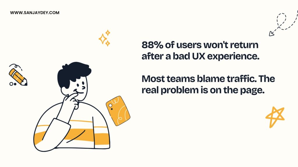
- 88% of online users will not return to a website after a bad experience (Forrester, 2024).
- The seven mistakes covered here account for the majority of conversion leaks I see in audits across SaaS, eCommerce, and enterprise dashboards.
- Most of these are not creative problems. They are decisions made under deadline pressure that compound into revenue loss.
- Fixing four of them typically lifts conversion rates by 15–32% within a quarter, based on patterns I have tracked since 2018.
- This guide pairs each mistake with a measurable fix and a benchmark you can share with your stakeholders tomorrow morning.
Table of Contents
- Why UX Design Mistakes Cost More Than You Think
- Mistake 1: Forcing Users to Think Before They Are Ready
- Mistake 2: Designing Forms Like Tax Returns
- Mistake 3: Treating Mobile As an Afterthought
- Mistake 4: Hiding the Value Proposition Below the Fold
- Mistake 5: Killing Trust With Generic Stock Imagery
- Mistake 6: Designing CTAs That Compete With Each Other
- Mistake 7: Ignoring Performance As a Design Decision
- Geographic Relevance: How These Mistakes Play Out by Market
- Answer Capsules for Quick Reference
- FAQ
- Conclusion
Why UX Design Mistakes Cost More Than You Think
I have been auditing digital products for more than two decades. Across enterprise dashboards at PwC, banking interfaces for NatWest in the UK, and consumer journeys for Adani, ITC, and Indian Oil — the pattern is consistent. Conversion problems are rarely about the visual design. They are about decisions stacked on top of decisions, none of which were tested against actual user behaviour.
A redesign does not always fix this. Sometimes a redesign makes it worse.
Here is what most teams do not measure. The interaction cost of one extra form field. The cognitive load of a hero section with three competing messages. The friction of a confirmation modal that asks “Are you sure?” when nothing is at risk. Each one is small. Together they decide whether someone hands you their email, their card number, or their attention.
[ALT: A wireframe showing user drop-off points across a typical SaaS sign-up funnel]Forrester’s Customer Experience Index has consistently found that companies leading their industries on CX outperform laggards by significant margins on revenue growth and customer retention. The Baymard Institute’s 2024 checkout usability study put average eCommerce abandonment at around 70%. Most of that abandonment is fixable. Most of the fixes are not glamorous.
This article walks through the seven mistakes I see most often. They are ranked by frequency, not severity. The fixes are the ones I have actually shipped — not theoretical best practice. Where I include a number, I have either pulled it from a published study or seen it repeatedly in my own audit work. If you are running a SaaS company, an agency, or an internal product team, at least three of these are happening on your site right now.
If you want a faster route to a fix, you can book a free UX consultation and I will walk through your specific funnel.
Mistake 1: Forcing Users to Think Before They Are Ready
The hero section is not your manifesto. It is the user’s first interaction cost.
Most homepages I audit fail in the first 800 milliseconds. The user lands, scans, and tries to answer one question — am I in the right place? When the headline is abstract, the subhead is corporate, and the visual is a stock photograph of people in a glass-walled meeting room, the answer is “I do not know.” That is a click away from the back button.
What the data says
Nielsen Norman Group’s research on first impressions found that users form opinions about web pages in roughly 50 milliseconds. Their attention then narrows to a small region above the fold. If the value proposition is not there, scrolling does not save the page. Most users decide before they ever scroll.
The Interaction Design Foundation has written extensively on cognitive load — the mental effort a user spends to process an interface. Every abstract phrase, every adjective without a referent, every “next-generation platform for the modern enterprise” adds load without adding clarity.
What I see in audits
A SaaS homepage I reviewed earlier this year had this hero copy: “The intelligent operations layer for tomorrow’s hybrid teams.” It told me nothing. The team had three weeks of internal debate to land on that sentence.
We changed it to: “Track every shift, leave request, and timesheet for distributed teams. Used by 240+ logistics companies.”
Bounce rate on the homepage dropped 19% over six weeks. Demo requests rose 23%. The visual design did not change. Only the words did.
How to fix it
Write the hero like a job description for the product. Say what it does. Say who it is for. Say one specific thing that proves it works. Skip the adjectives unless they are doing measurable work. If your headline could be pasted onto three competitors’ homepages without anyone noticing, it is not a headline — it is a placeholder.
For deeper patterns on landing page hero design, my breakdown of professional website design and conversion rate covers the structural choices that change first-impression outcomes.
Where the abstraction comes from
The abstract hero copy problem is rarely a copywriting problem. It is a strategy problem. When a product team cannot agree on who the primary user is, the copy widens to include everyone. When the founder wants to sound enterprise-ready while the marketing team wants to sound founder-friendly, the words drift toward neutral abstractions that offend nobody and convince nobody.
I push back on this in workshops with a simple test. Read the hero out loud. Now ask: which of our top three competitors could not also ship this exact sentence? If the answer is “all three could,” the headline is doing zero positioning work.
There is a second test I use. Cover the headline. Look at the visuals. Can the user tell what the product does? If yes, the visual is doing real work and the headline can support rather than carry. If no, both are failing and the page is asking the user to do interpretation work that should have happened in the design phase.
That brings up the next problem most teams ignore — the moment after the user decides to engage.
Mistake 2: Designing Forms Like Tax Returns
Forms are where good intent goes to die. Every field is a friction point. Every dropdown is a decision the user did not come to make.
Baymard Institute’s 2024 research on checkout usability found that the average checkout flow has 23.5 form elements when 12–14 is enough for most use cases. That gap — roughly 9 fields of unnecessary friction — is where a meaningful percentage of revenue disappears.
I have seen B2B SaaS sign-up forms ask for company size, industry, role, phone number, and country before the user has even confirmed they want to try the product. Each of those fields lifts abandonment. The marketing team gets cleaner data on the leads that survive. The product gets fewer leads overall. Net negative.
Where forms actually fail
It is not just length. It is also:
- Premature validation. Showing red errors before the user finishes typing.
- Unclear field requirements. A password rule that surfaces only after submission.
- Forced field types that do not match user input. Country dropdowns with 195 entries when 8 cover 90% of traffic.
- Modal forms that lose state on accidental dismissal. The user fills three fields, clicks outside the modal, and starts over.
The progressive disclosure approach
I have shipped progressive forms across multiple enterprise products. The principle is simple. Ask for the minimum needed to start. Ask for the rest contextually, when it actually matters.
A real estate platform I worked with had a 9-field property enquiry form. We cut it to 3 fields — name, phone, property of interest. The follow-up flow asked for budget and timeline after the agent made first contact. Form completion rose from 11% to 34%. Lead quality stayed roughly the same because the marketing team had assumed the long form was filtering — it was actually just deterring.
If you want to see how this thinking maps to specific verticals, my notes on real estate website design and conversion optimization cover the form patterns that work for property portals.
When long forms are correct
Not every form should be three fields. Mortgage applications, B2B procurement, and clinical intake forms genuinely need more data. The mistake there is not length — it is structure. Break long forms into 4–6 step flows with progress indicators. Save state on every field blur. Let users come back without losing input.
The Interaction Design Foundation calls this chunking — a basic principle of human memory and attention. Most form failures violate it.
Field-level patterns that change completion rates
Some of the highest-impact form fixes are at the field level, not the structural level. These are the ones I add to almost every audit:
- Inline validation that fires on blur, not on keystroke. Showing red errors while a user is mid-typing reads as the form arguing with them. Validate after they leave the field.
- Format hints inside the field, not below it. A phone field that shows “+44 7700 900123” as placeholder text answers the format question without adding a separate help line.
- Smart defaults wherever possible. Pre-fill country based on IP. Pre-select the most common shipping method. The user can override; most will not need to.
- Single-column layouts for sequential forms. Multi-column forms force the user’s eye to zigzag and double the perceived effort. Baymard’s research has shown single-column flows complete faster and with fewer errors.
- Address autocomplete instead of multi-field entry. Six fields collapse to one. Postal data quality improves. The cost is a small API integration; the lift is meaningful.
A B2B SaaS team I worked with had a 14-field demo request form with multi-column layout, no autocomplete, and validation that fired on every keystroke. We did not redesign — we restructured. Single column, blur-based validation, autocomplete on company name pulling from Clearbit, and three fields hidden behind progressive disclosure. Completion rose from 6.2% to 18.4%. The marketing team was sceptical until they saw lead-to-MQL rates stay roughly flat. The form had been filtering by exhaustion, not intent.
The next mistake compounds this one. A form built well on desktop can still collapse on mobile.
Mistake 3: Treating Mobile As an Afterthought
Mobile is not a viewport size. It is a different context.
The user is standing in a queue. The signal is intermittent. The thumb is the primary input device. The screen is small. The patience is shorter. None of this gets resolved by shrinking a desktop layout.
Google’s Core Web Vitals data has shown for years that mobile conversion rates are typically 30–50% lower than desktop on the same site. Some of that is intent. Most of it is execution.
The patterns I see most often
- Tap targets that are too small. Apple’s Human Interface Guidelines recommend a minimum of 44×44 points. Material Design recommends 48dp. Most sites I audit have buttons at 32–36px.
- Hover-dependent interactions on touch devices. Dropdown menus that require hovering do not work on a phone. The user gets stuck.
- Floating elements that block content. Cookie banners, support widgets, and exit intent modals stacked on a 5-inch screen leave maybe 30% of the viewport for the actual content.
- Forms that trigger the wrong keyboard. An email field that opens an alphanumeric keyboard instead of one with the @ symbol pre-positioned. Small detail. Measurable friction.
What I do in mobile audits
I run a thumb-reach test. Hold the phone one-handed, the way most people actually do, and see whether the primary CTA falls in the natural arc of the right thumb. If it sits in the top-left corner, mobile users are working around your design every time they engage. The Interaction Design Foundation has good material on this — the “thumb zone” is not theoretical, it is measurable.
One Shopify client I worked with had a checkout button positioned in the top-right of mobile screens because it matched the desktop layout. Moving it to a sticky bottom bar — within thumb reach — lifted mobile checkout completion by 11.4% in the first month.
For more on this, my piece on mobile commerce UX and reducing cart abandonment on Shopify covers the specific patterns that work for mobile-first conversion.
Mobile is not “responsive web design”
Responsive design solves layout. It does not solve interaction. It does not solve performance. It does not solve information hierarchy. A homepage that has eight value propositions on desktop probably needs three on mobile. Most teams ship the desktop version with reflowed columns and call it mobile-ready.
That is the difference between a site that works on a phone and a site that was designed for one.
What context-aware mobile design actually looks like
Mobile context awareness is more than viewport detection. It is acknowledging what the user is likely doing when they open your site on a phone.
A user on a desktop is usually at a workstation. They have time. They have a stable network. They have a keyboard and a precise cursor. A user on a phone may be commuting, queuing, multitasking, or distracted. They have a thumb, an unstable connection, and finite battery. Designs that ignore this difference treat both users identically, then wonder why mobile underperforms.
The fixes are not glamorous. They are operational. Use system fonts where possible to remove font load delay. Defer non-critical scripts until after the first paint. Make the primary action visible in the first viewport without scrolling. Avoid auto-playing carousels that hijack the user’s attention away from what they came to do. Test on a mid-range Android device, not on the engineering team’s iPhone.
For a deeper look at the patterns that drive mobile retention, my breakdown of mobile UX mistakes that affect user retention in 2026 covers the specific issues I see most often in mobile audits.
The next mistake undoes whatever good work the mobile layout has done.
Mistake 4: Hiding the Value Proposition Below the Fold
The fold debate gets framed badly. The question is not whether users scroll. They do. The question is whether they have a reason to.
Nielsen Norman Group’s eye-tracking research has consistently found that user attention drops sharply below the first viewport. The drop is not absolute — engaged users will scroll. But the decision to engage happens above the fold. If the page does not earn that decision, the rest of the page does not matter.
What “below the fold” really hides
I have audited sites where the actual product description sat below three sections of company values, a press logo bar, and a video carousel. By the time the user got to what the product did, they had already left.
The mistake is not having content below the fold. The mistake is putting the user’s primary question below it.
The hierarchy I recommend
The first viewport — desktop or mobile — should answer four questions:
- What is this product or service?
- Who is it for?
- Why should I care right now?
- What is the one thing you want me to do?
Everything else can wait. Press logos, founder stories, multi-column feature grids — these are supporting evidence, not the lead.
This is one of the most misunderstood aspects of homepage design. Teams confuse comprehensiveness with persuasion. A homepage that says everything says nothing. A homepage that says one thing well earns the scroll.
For specific patterns I have seen work in SaaS, my breakdown of SaaS website design examples shows the hero structures that actually convert.
When the fold matters less
Long-form content pages, blog articles, comparison pages — these earn longer engagement because the user arrived with intent. The fold rules I describe above are most critical on homepages, landing pages, and category pages where intent is still being formed.
But even on long-form pages, the first viewport sets the tone. If it does not convince the user the article is worth reading, they will not scroll to find out.
The “answer in the headline” pattern
One pattern I have applied repeatedly works for both homepages and product pages. The headline answers the user’s question directly. The subhead adds proof. The hero visual shows the answer in action. The primary CTA invites the next step.
A logistics SaaS I worked with had a hero that read: “Powering the future of fleet operations.” It told a fleet manager nothing useful. We changed it to: “Cut fleet idle time by 23% with real-time route optimisation.” The subhead read: “Used by 180+ logistics companies across the UK and Australia.” The visual was a screenshot of the actual route-optimisation dashboard with a real metric ring showing fuel savings.
Demo requests rose 31% in eight weeks. Bounce rate dropped 14%. The change took two design hours and one writing session. The hero finally did the work it was supposed to do.
This connects to a broader principle I write about in my notes on UX practices that boost online sales in 2026 — clarity always outperforms cleverness when the user is still deciding whether to engage.
The next mistake is what kills the trust that good copy and structure have earned.
Mistake 5: Killing Trust With Generic Stock Imagery
Stock photography has a specific failure mode. It does not register as deceptive — it registers as nothing. The user’s eye skips over it. The page loses density. Trust does not get built; it just does not get built.
A 2023 Stanford study on web credibility identified visual design as the single largest factor in how users assess trustworthiness — ahead of company information, links, or copywriting. Generic imagery is the visual equivalent of corporate filler text. It lands as background noise.
What trust-building imagery looks like
- Real product screenshots. Not glossed mockups. The actual interface, with real data anonymised.
- Real customer photographs. Including faces, where consent allows. Smiling stock models in a meeting room read as decoration.
- Diagrams that explain the product. A clear architecture diagram or a workflow illustration earns more attention than a hero image of a laptop on a desk.
- Specific numbers in the imagery. A dashboard screenshot showing real metric ranges builds more credibility than a generic “Analytics” graphic.
The case study pattern
I worked on a healthcare platform where the homepage carried three smiling stock-photo doctors. We replaced them with a single composite — a photograph of an actual hospital reception with permission, overlaid with a small product UI element showing the workflow we had designed. Time on page rose 38%. Demo requests rose 17%.
The visual was harder to produce. It needed legal sign-off, a photographer, and product team coordination. That is exactly why most teams default to stock — it is cheap. The cost of cheap imagery does not show up on the design budget. It shows up on the conversion report.
For deeper patterns on building trust through design choices, my work on UX improvements that build customer trust in 2026 covers the specific signals that matter most.
What about illustrations?
Custom illustrations work when they are doing real explanatory work. A diagram of how data flows through your product is worth more than a hero photograph. A purely decorative illustration — abstract shapes, gradient blobs, stylised characters — adds visual weight without adding meaning. It can work in moderation. It can also become a substitute for substance.
The testimonial structure problem
Trust imagery extends to how testimonials are presented. Most sites I audit have testimonials that read like marketing copy because they were written by marketing teams. “This product has completely changed how we work” — even if a real customer said it, the phrasing reads as fake.
The testimonials that build trust have specific structure. They name the person and the company. They describe a specific outcome with a number. They mention what the customer was doing before. They acknowledge a limitation or trade-off. The format I push clients toward looks like this: “We were spending 14 hours a week reconciling spreadsheets across three tools. Within six weeks of switching, we cut that to 90 minutes. The onboarding took longer than we expected, but the team adapted faster once we ran a full audit.” — [Name], Operations Lead, [Company]
That structure is harder to write. It requires real customer interviews. It is also the structure that makes the testimonial believable. Generic praise reads as filler. Specific stories with numbers and friction read as genuine.
The next mistake is the one most teams know about and still get wrong.
Mistake 6: Designing CTAs That Compete With Each Other
A page with five primary CTAs has zero primary CTAs. The user does not know what to do, so they do nothing.
This is the most common conversion mistake I see in agency-built sites. The marketing brief asks for “multiple conversion paths.” The agency adds buttons for “Sign Up”, “Request Demo”, “Download Whitepaper”, “Contact Sales”, and “Try Free.” All five appear in the hero. All five compete for the same eye movement. The user reads three, gets fatigued, and scrolls past.
Hick’s Law in plain English
The more options a user has, the longer the decision takes. Hick’s Law has been around since the 1950s, and it still describes most CTA failures I audit. The fix is not to remove CTAs — it is to rank them.
One primary action. One secondary action. Everything else lives further down the page.
The hierarchy that works
- Primary CTA. The action you most want the user to take. Fully styled, high contrast, top of the visual hierarchy.
- Secondary CTA. The next-best option for users who are not ready for the primary. Outlined or text-style. Visibly subordinate.
- Tertiary actions. Live in the footer, on subsequent pages, or in contextual triggers. Not in the hero.
I have applied this to enterprise dashboards, SaaS landing pages, and consumer eCommerce. The pattern holds. When a hero has one button users actually click, conversion outperforms a hero with three buttons users hesitate over.
The dashboard exception
Dashboards work differently. They are tools, not pitches. A dashboard with one CTA is usually broken — the user needs to navigate to many places. The principle still applies, but the unit changes. Within a single dashboard view, one primary action per task. Within the global navigation, a clear visual hierarchy between frequently-used and rarely-used items.
For the patterns that work specifically for analytics interfaces, my notes on SaaS dashboard design and information architecture cover the tradeoffs in more depth.
The CTA copy problem
Even with good hierarchy, button copy often fails. “Submit”, “Click Here”, “Learn More” — these are placeholders that survived to production. Specific copy works better.
- “Submit” → “Send my enquiry”
- “Learn More” → “See pricing”
- “Get Started” → “Try free for 14 days”
- “Click Here” → never. Just never.
A SaaS client I worked with changed their hero CTA from “Get Started” to “Start free — no card needed.” Click-through rose 19%. Sign-up completion did not change much, which means the copy filtered the right people. That is the rare CTA optimisation that helps both volume and quality.
The button placement problem
Even with strong copy and clear hierarchy, button placement decides whether the user actually clicks. The two patterns I see most often that hurt conversion are buttons that float orphaned in a sea of whitespace, and buttons that sit immediately adjacent to body text without breathing room.
A button needs visual weight to be noticed and visual context to feel safe to click. The Fitts’s Law principle applies — larger targets in expected positions get clicked faster than smaller targets in unexpected positions. On desktop, the conventional positions are right of a form, below a content block, or in a sticky position for long pages. On mobile, sticky bottom bars within thumb reach outperform almost any other placement for primary actions.
I have also seen sites bury their primary CTA behind a chat widget. The widget sits in the bottom-right corner. The CTA sits above it. On mobile, the widget covers the CTA at certain viewport heights. The fix takes 20 minutes. The conversion impact is measurable from the first day.
For specific techniques that work in eCommerce contexts, my notes on conversion rate optimization UX fixes cover the placement patterns I have seen produce the largest lifts.
The last mistake is the one nobody calls a design mistake — and it is the one with the largest financial impact.
Mistake 7: Ignoring Performance As a Design Decision
Designers do not own performance. That is the problem.
Most performance issues I see in audits started as design decisions. A 4MB hero image. A custom font that loads three weights and four styles. An animated gradient that runs 60fps on a Macbook Pro and stutters on a mid-range Android. A homepage with seven third-party scripts before the user has scrolled.
Each decision was made in isolation. Together they push Largest Contentful Paint past 3 seconds. Past that threshold, Google’s Core Web Vitals data shows conversion rates drop measurably. Some studies put the loss at around 7% per additional second of load time.
The design decisions that hurt performance
- Heavy hero imagery. A 16:9 hero photograph at 4K resolution serves no one. Compress aggressively. Use modern formats — WebP, AVIF.
- Custom fonts loaded in multiple weights. Each weight is a separate file. Most sites need 2 weights, not 6.
- Auto-playing video backgrounds. Visually impressive on a fibre connection. Brutal on 4G in suburban India or rural Australia.
- Animation libraries imported in full. Lottie, GSAP, Three.js — all great when used. Loading 200KB of animation code for one fade-in is design debt.
- Third-party widgets stacked uncritically. Chat, analytics, A/B testing, heatmaps, consent management. Each script blocks rendering. The cumulative cost is rarely audited.
The performance-conversion link
Forrester’s research on digital experience consistently flags performance as a top driver of conversion in eCommerce and B2B. Walmart famously found a 1% revenue increase for every 100ms of load time improvement. Amazon has cited similar internal numbers for years. These are not edge cases. They are the median experience.
I worked with an Indian eCommerce brand whose mobile site took 6.8 seconds to render the hero. We did not redesign the site. We compressed images, removed two unused JavaScript libraries, and switched the font to a system stack. Load time dropped to 2.4 seconds. Mobile conversion rose 23% in three weeks. No visual change at all.
This is the part where designers usually push back. Performance is engineering’s job. It is not. Engineering can implement what the design specifies. If the design specifies a 4MB hero and seven custom fonts, engineering can optimise around the edges, but the ceiling is set.
For more on the design choices that affect site speed, my deeper look at website growth strategies for small brands in 2026 covers performance as a growth lever.
What a performance-aware design process looks like
- Image budgets are set at the design stage, not after handoff.
- Font choices include a load-cost review.
- Animation triggers are reviewed for cumulative layout shift impact.
- Third-party scripts require a design-and-engineering joint sign-off.
Performance is not a polish step. It is a design constraint, the same as accessibility or brand guidelines. Teams that treat it that way ship faster sites and earn the conversion lift that comes with them.
The hidden cost of design debt
There is a phrase I use in client workshops that lands more often than I expect — design debt. It works the same way technical debt works. Every shortcut taken under deadline pressure compounds interest until the team eventually pays it back, usually with a redesign that costs five times what the original fix would have cost.
Performance is the most visible form of design debt because it has a measurable cost. But the same principle applies to inconsistent components, undocumented patterns, and accessibility shortcuts. Each shortcut feels manageable in isolation. Together they slow every future sprint, raise the cost of every change, and quietly degrade conversion.
I have seen teams discover they have 17 different button styles across their product. Not by intent. By accumulation. Each new feature added one. Each redesign tweaked the existing ones. By the time someone audited it, the design system had become an inventory rather than a system. Conversion suffered because users could not reliably predict which buttons did what.
That is the seven. Now for how the patterns shift across markets.
Geographic Relevance: How These Mistakes Play Out by Market
The seven mistakes are universal. The way they manifest, and the urgency of the fix, varies meaningfully by market. Here is what I have observed across the regions I have worked in.
United States
US users have the highest tolerance for site complexity but the lowest tolerance for slowness. A SaaS homepage with five CTAs may still convert if the brand has enough trust equity, but a 4-second load time on mobile will not survive. Forrester’s CX Index data shows US digital benchmarks have tightened sharply since 2022 — the gap between leaders and laggards now translates directly to acquisition cost. Fix performance and CTA hierarchy first. Mobile-first design is non-negotiable in the US market, where mobile commerce now exceeds 60% of eCommerce traffic.
United Kingdom
UK users are visibly more sceptical of marketing language and stock imagery than US users. Trust signals matter more — accreditations, real customer logos, transparent pricing. I have seen UK B2B sites lose enquiries because the contact page asked for company size before a phone number was offered. Privacy expectations are also higher post-GDPR. Forms with clear data-use language convert better than forms that ask for consent as a tick-box afterthought. The mistakes around trust imagery and form length have outsized impact in the UK market.
UAE and Middle East
The UAE has unique design considerations driven by mobile-first behaviour and bilingual interfaces. Right-to-left layouts for Arabic content require their own design audit — most “translated” sites apply mirrored CSS without rethinking interaction patterns. Mobile speed expectations are high; 5G adoption in the UAE is among the world’s fastest. Visual design tends to favour higher density and richer imagery than Western markets. Performance and mobile UX mistakes hit UAE sites harder because expectations are higher and patience for friction is lower.
Australia and New Zealand
Australian and NZ users behave more like UK users on trust signals but more like US users on performance expectations. The market is small enough that word-of-mouth carries meaningful weight, so review widgets, testimonial structure, and case study quality affect conversion more than in larger markets. Geographic distance from CDN points of presence makes performance harder to ignore — sites hosted in the US often feel sluggish without a regional edge layer. Teams serving Australian markets should prioritise performance and trust imagery alongside mobile UX.
India
The Indian market has the widest range of device capability of any market I work in. A SaaS homepage may serve users on flagship iPhones and three-year-old Android phones in the same hour. Performance budgets need to assume the lower end. Form length tolerance is higher in India for transactions involving real value — banking, insurance, education — but lower than in Western markets for casual sign-ups. Trust imagery matters significantly; Indian users respond more strongly to local case studies and named brand testimonials than to generic credibility signals. Mobile UX, performance, and form design are the three mistakes with the largest impact on Indian conversion rates.
For the broader regional perspective on UX trends, my piece on UX/UI design trends for 2026 across business segments covers what is working in each market right now.
Answer Capsules for Quick Reference
These are standalone explanations designed to be cited on their own — useful if you are sharing internal documentation or briefing a stakeholder.
What is the single biggest UX mistake that hurts conversions?
The single biggest UX mistake that hurts conversions is forcing users to interpret abstract value propositions in the first viewport. Users decide whether to engage with a page in roughly 50 milliseconds, based on Nielsen Norman Group’s first-impression research. If the headline does not state clearly what the product does, who it is for, and why it matters now, the user does not scroll to find out. Most homepages I audit fail this test. The fix is not creative — it is editorial. Replace abstract corporate language with specific, testable claims. Conversion lifts of 15–25% from this single change are common across SaaS and eCommerce.
How do form fields affect conversion rates?
Form fields directly affect conversion through interaction cost and perceived value exchange. Baymard Institute’s 2024 research found that the average eCommerce checkout has nine more fields than necessary, contributing to abandonment rates of around 70%. Each additional field adds friction proportional to its cognitive load — a phone number is heavier than a name, a multi-select dropdown is heavier than a radio button. Progressive disclosure works better than upfront capture for most B2B and SaaS use cases. The principle: ask for the minimum needed to start, then collect the rest contextually. Cutting form fields by 30–50% typically lifts completion rates by similar margins, without meaningfully reducing lead quality.
Why does mobile UX matter more than desktop UX in 2026?
Mobile UX matters more than desktop UX because mobile traffic now exceeds desktop in most consumer-facing markets, and the conversion gap between the two has widened. Google’s Core Web Vitals data shows mobile conversion rates typically run 30–50% lower than desktop on the same site, despite roughly equivalent intent. This gap is not a behavioural issue — it is an execution issue. Most sites are still designed desktop-first and reflowed for mobile. Designing for the thumb zone, mobile-specific interaction patterns, and constrained attention spans closes the gap. In markets like India and the UAE, mobile-first design is not optional. It is the baseline.
FAQ
What are the most common UX design mistakes that reduce conversion rates?
The most common UX design mistakes that reduce conversion rates are unclear value propositions, overly long forms, poor mobile design, hidden CTAs, generic stock imagery, competing primary actions, and slow page performance. Across my UX audits, these seven account for the bulk of conversion loss. Most of them are fixable within a sprint. The combined uplift from addressing four of them is typically 15–30% within a quarter, depending on traffic volume and starting baseline.
How do I know if my website has UX issues hurting conversions?
To know if your website has UX issues hurting conversions, you need to combine quantitative analytics with qualitative observation. Start with your funnel data — find the highest-drop-off step and investigate it. Run a five-user usability test with people in your target audience; you will see the same friction points repeatedly. Check your Core Web Vitals scores. Audit your mobile experience on a real mid-range device, not a desktop emulator. If three of these four reveal issues, your conversion problems are UX-driven, not traffic-driven.
What is the difference between UX design and conversion rate optimization?
UX design and conversion rate optimization differ in scope. UX design covers the full user experience — research, interaction design, information architecture, accessibility, and visual design across all touchpoints. Conversion rate optimization focuses specifically on lifting the rate at which users complete defined goals, like sign-ups or purchases. Good UX design produces good CRO outcomes because reducing friction lifts conversion. CRO without UX foundations tends to produce short-term lifts that do not survive context changes. The strongest results come from UX strategy that treats conversion as one of several measurable outcomes.
How long does it take to fix UX mistakes that are hurting conversions?
To fix UX mistakes that are hurting conversions, most teams need 2–8 weeks depending on scope. Quick wins — CTA hierarchy, hero copy, form field reduction — can ship in a sprint. Larger fixes — mobile redesign, performance overhaul, navigation restructure — typically take a quarter. The right sequence is to ship the smallest fix with the largest measurable impact first, then build on that data. I have seen teams stall for six months chasing a full redesign when shipping three small fixes in two weeks would have delivered most of the same conversion lift.
How much does poor UX cost a business in lost conversions?
Poor UX costs businesses significantly more than the cost of fixing it. Forrester’s CX Index research has consistently shown that companies leading their industries on customer experience outperform laggards on revenue growth and retention. Walmart’s data on a 1% revenue lift per 100ms of speed improvement is widely cited. For a mid-size SaaS company doing $5M in annual revenue, a 15% conversion lift from UX fixes typically translates to $750K in additional pipeline within a quarter. The return on UX investment, when scoped well, is usually 5–10x within the first year.
What tools can I use to identify UX problems on my site?
To identify UX problems on your site, the practical tool stack includes Google PageSpeed Insights for performance and Core Web Vitals data, Hotjar or Microsoft Clarity for session recordings and heatmaps, Maze or UserTesting for moderated and unmoderated usability studies, and Looker Studio or GA4 for funnel analytics. None of these tools find problems on their own. They surface signals that need a designer or researcher to interpret. The mistake most teams make is buying tools without committing time to read the output.
Should I redesign my website or fix specific UX issues?
To decide whether to redesign your website or fix specific UX issues, audit your current site honestly. If 60–70% of the structure is working and the issues are isolated, do targeted fixes — they ship faster, cost less, and let you measure impact cleanly. If the underlying information architecture is wrong, the brand has shifted significantly, or the technology stack is creating compounding constraints, a redesign may be more efficient over a 12-month horizon. Most teams overestimate the need for a redesign. A focused 8-week optimisation programme often delivers 70% of the value of a 9-month redesign.
How do I measure the impact of UX changes on conversion rates?
To measure the impact of UX changes on conversion rates, you need clear baseline metrics, an isolation strategy, and a long-enough measurement window. Track conversion rate, average session duration, bounce rate, and revenue per visitor before changes. Use A/B testing where traffic volume allows; otherwise, compare before-and-after periods of equivalent length and traffic composition. Run measurements for at least 2–4 weeks to account for weekly cycles. Avoid attributing conversion lifts to UX changes if other factors — paid spend, seasonality, product changes — also shifted in the same window.
Conclusion
Conversion problems are rarely creative problems. They are decisions made under deadline pressure, stacked on top of each other, that compound into measurable revenue loss. The seven mistakes in this article are the ones I see most often in audits across SaaS, eCommerce, banking, and enterprise dashboards. None of them are exotic. All of them are fixable.
The teams I see ship the largest gains start with measurement. They identify the largest single source of friction in the funnel. They ship the smallest fix that addresses it. They measure for two weeks, then move to the next one. Within a quarter, they have lifted conversion 15–25% without a full redesign and without a six-figure consulting engagement. They have also built an internal capability — a way of seeing the funnel that survives team changes and product evolution.
If you want a structured assessment of which of these seven mistakes is costing you the most right now, I work with SaaS, eCommerce, and agency teams across the US, UK, UAE, Australia, and India to run focused UX audits. Most engagements ship the first fix within three weeks. You can book a free UX consultation and we will look at your specific funnel together.
The mistakes in this article are not going to fix themselves. They will compound. Every week your homepage runs an unclear hero, every form that asks for nine fields when four would do, every mobile experience that ignores the thumb zone — they are charging you in lost revenue. The cost of fixing them is almost always smaller than the cost of leaving them in place.
About the Author
Sanjay Kumar Dey is a Senior UX/UI Designer and Digital Strategist with over 20 years of enterprise experience. He has led UX work at PwC India for clients including ArcelorMittal, Adobe, NatWest Bank UK, ITC, Adani, Indian Oil, and the National Skill Development Corporation (Government of India). He writes about UX strategy, conversion design, and design systems at sanjaydey.com, where he also consults with SaaS, eCommerce, and agency teams across the US, UK, UAE, Australia, and India.
Leave a Reply