Executive Summary
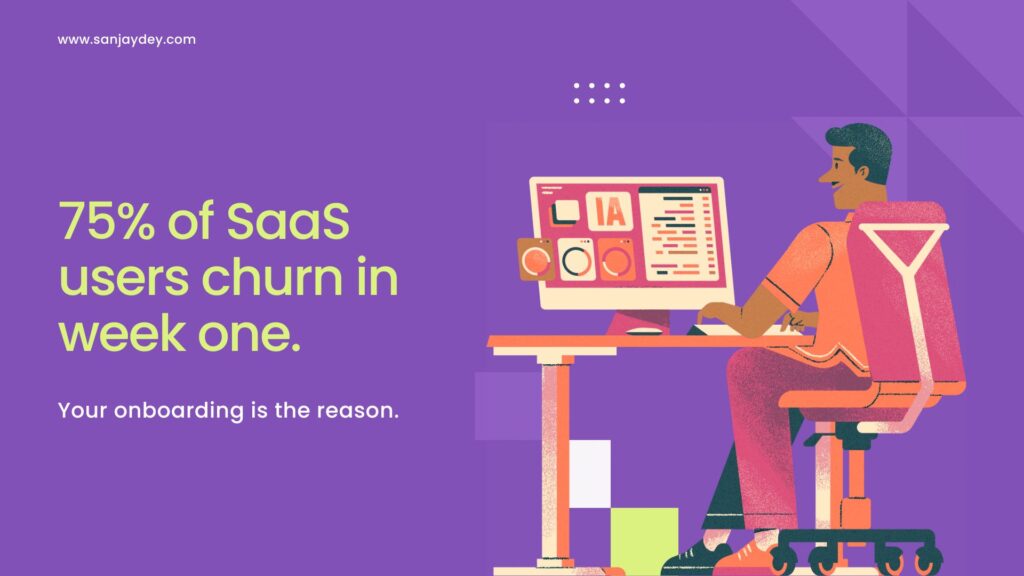
- 75% of new SaaS users churn within the first week if onboarding fails to deliver perceived value.
- The “aha moment” — first measurable value — should be reachable in under 3 minutes for B2B SaaS.
- Checklist-based onboarding lifts feature adoption by 32% (Userpilot data, 2024).
- Personalised onboarding paths outperform single-flow paths in activation by 22–48%.
- The 15 examples below — Slack, Notion, Loom, Figma, Canva, HubSpot, Calendly, Linear, Webflow, Duolingo, Airtable, Miro, Tally, Pitch, Superhuman — each solve a different activation problem, not the same one.
Table of Contents
- Why SaaS Onboarding UX Decides Your Revenue Curve
- The Activation Equation: What Onboarding Actually Has to Do
- 15 SaaS Onboarding UX Examples That Convert
- The 7-Step SaaS Onboarding Flow That Works
- SaaS Onboarding Best Practices: What I Insist On in Every Project
- Tools, Patterns, and Metrics That Matter
- Geographic Relevance: USA, UK, UAE, Australia, India
- FAQ: SaaS Onboarding UX
- Conclusion
- About the Author
Why SaaS Onboarding UX Decides Your Revenue Curve
Most SaaS founders I speak with treat onboarding as a tour. A welcome modal. A few tooltips. A checklist with five generic items. That is not onboarding. That is throat-clearing before the product gets a chance to prove itself.
Real onboarding gets a user to a moment of value before they have time to second-guess the signup. Slack calls this the activation point. Reforge calls it the aha moment. The metric does not matter — the principle does.
[ALT: Diagram showing a user journey from signup to activation with drop-off points marked at each step]The reason this matters is brutal. According to Profitwell research cited by Userpilot, around 40–60% of SaaS users who sign up never log in a second time. Mixpanel’s 2024 product benchmarks show day-1 retention for B2B SaaS sits at a median of 33%. By day 7, the median drops below 20%.
I have audited onboarding flows for enterprise dashboards, SaaS analytics platforms, and consumer apps. The pattern repeats. Teams pour budget into acquisition — paid search, content, partnerships — and then hand new users a flow that asks them to configure 14 settings before they see a single chart populated with their own data.
That is a design failure with a financial cost. If your customer acquisition cost is $400 and your day-7 activation rate is 18%, you are paying $2,222 per activated user. Fix activation to 35% and the same CAC produces a $1,143 cost per activated user. Same spend. Different outcome.
This is why I argue with founders that conversion rate optimisation starts at onboarding, not at checkout.
The Activation Equation: What Onboarding Actually Has to Do
Onboarding has three jobs. Most flows attempt one. A few do two. Almost none get all three right.
Job 1 — Reduce time-to-value. The user must reach a perceived first benefit before their attention budget runs out. For a project management tool, this might be seeing a populated board. For a writing tool, it is the first published draft.
Job 2 — Teach the mental model. Every SaaS product has an underlying logic. Notion has blocks. Airtable has bases, tables, and views. Linear has issues, projects, and cycles. If the user does not internalise this model in the first session, they cannot return on day 3 and pick up where they left off.
Job 3 — Establish a habit loop. Activation without retention is vanity. Onboarding has to plant a reason to return — a notification, a saved state, a teammate invite, a scheduled action.
Now look at most onboarding flows. They show a product tour. That serves none of the three jobs.
I covered the same principle from a different angle in my piece on getting SaaS users to the aha moment in 3 minutes. The constraint is not artificial. Three minutes is roughly the median attention window before a new SaaS user opens another tab.
That is the equation. Reduce time-to-value, teach the model, plant the habit. The 15 examples below each solve at least one part of this equation in a way worth stealing.
15 SaaS Onboarding UX Examples That Convert
1. Slack — Empty State With Real Conversation
Slack’s onboarding does something most B2B tools refuse to do. It shows a populated workspace before the user invites anyone.
Slackbot sends real messages. The general channel has a welcome thread. The user can reply, react, send a file, and feel the product before any teammate joins.
Most teams skip this. They show an empty channel and a “Invite teammates” CTA. The new user sees nothing happening, assumes the product is dead, and leaves.
What to steal: Populate the empty state with system-generated content that simulates real use. Build the muscle memory before the team arrives.
2. Notion — Template-First Onboarding
Notion does not start with a tutorial. It starts with a template gallery.
The new user picks a template — meeting notes, product roadmap, personal CRM — and lands inside a populated document. The blocks model is taught implicitly through interaction, not through a tooltip tour.
This is progressive disclosure done well. The complexity of Notion’s data model is hidden until the user needs it. By the time they need it, they have already published their first page.
[ALT: Screenshot of Notion’s template gallery with categorised templates for personal, team, and education use]What to steal: Templates are not a marketing asset. They are an onboarding asset. Place them at the entry point, not three clicks deep in a settings menu.
3. Loom — Record Before Account Setup
Loom inverted the standard SaaS onboarding sequence. New users record a video before they finish creating an account.
The browser extension prompts a recording. The user records 30 seconds. The recording is saved. Then — and only then — Loom asks for an email to claim the video.
This is a textbook case of the value-first signup. The user has already experienced the core action before they hit a friction point. Asking for an email feels like saving work, not signing up.
What to steal: If your product has a single core action, let users perform it before authentication. Tie the signup to saving their output, not to gating access.
4. Figma — Multi-Player by Default
Figma’s onboarding teaches the cursor before it teaches anything else. The first time a user opens a file, a sample document loads with elements already present. If they have invited anyone, those cursors appear in real time.
The product’s defining capability — multiplayer design — is the first thing the user experiences. Not the tools panel. Not the layers panel. The cursors.
This is what Don Norman would call signifier-first design. The signifier of multiplayer is the cursor. By making it visible immediately, the mental model lands without explanation.
5. Canva — Search-Driven Start
Canva does not show a blank canvas. It shows a search bar with the prompt “What will you design today?”
The user types “Instagram post” or “resume” and lands inside a template gallery filtered by intent. Within two clicks, they are editing a real design.
The interaction cost of starting from blank is huge. Most users do not know what they want to build until they see something to react to. Canva removes the blank-page problem entirely.
I have applied this principle in eCommerce design work where the same problem appears — a user who lands on a homepage without a clear next action will leave.
6. HubSpot — Role-Based Personalisation
HubSpot asks two questions during signup: company size and primary role. Based on the answers, the dashboard, the onboarding checklist, and the first email sequence change.
A marketing manager at a 50-person company sees a different first screen than a sales rep at a 500-person company. This is not cosmetic. The features highlighted, the tutorials surfaced, and the suggested next steps are all routed off those two answers.
What to steal: Two questions, well-chosen, can route a user into the right experience. More than three questions and abandonment climbs sharply. Baymard Institute’s form-friction research shows abandonment rises non-linearly past the third field. Personalisation also pairs well with UX improvements that build customer trust — users who feel the product knows them are more likely to share data needed for activation.
7. Calendly — Single-Goal Onboarding
Calendly has one job during onboarding: get the user to share their first booking link. Everything else is deferred.
The signup screen asks for a name, a username, and basic availability. The next screen is the booking link, ready to share. There is no tutorial, no feature tour, no upsell.
This works because Calendly’s value is binary. Either the user has a working link to send, or they do not. Onboarding optimises for the binary outcome.
[ALT: Calendly onboarding screen showing a personalised booking URL ready to copy]What to steal: Identify the single output your product produces on first use. Strip onboarding to the path that produces that output. Defer everything else.
8. Linear — Keyboard-First Discovery
Linear teaches its keyboard shortcuts as part of onboarding, not as a hidden settings page.
The first time a user creates an issue, the shortcut is shown next to the action. The shortcut for assigning, labelling, and closing is taught in the moment of use. Within the first session, a user has touched five or six shortcuts.
This is contextual help done with restraint. No modal explaining 30 shortcuts at once. Each shortcut appears at the moment it is relevant, then disappears.
The result is a product that feels fast within the first 10 minutes — which is exactly what Linear’s positioning depends on.
9. Webflow — Guided Project, Not a Tour
Webflow’s onboarding is a guided project. The user builds a single landing page section by section, with the panel hints active throughout.
This is the opposite of the standard “click here, now click here” tour. The user produces an artefact they could publish. The interface elements are taught as a side-effect of building.
For complex tools, this is the only pattern that scales. A 30-screen tutorial cannot teach Webflow. A 15-minute guided build can.
I cover this in more depth in my Webflow design tips for high-converting sites.
10. Duolingo — Streak as the Primary Loop
Duolingo does not optimise for first-session value alone. It optimises for second-session return.
The first session ends with a streak counter showing “1”. The notification permission is requested at the moment of highest motivation — right after the user completes their first lesson and feels good about it. The next-day push notification carries the streak number, creating loss aversion.
This is the habit loop made visible. The streak is not a vanity metric. It is the retention engine.
What to steal: Onboarding does not end at first activation. Plant a reason to return. The reason should be visible, countable, and easy to lose.
11. Airtable — Spreadsheet Familiarity, Database Power
Airtable’s onboarding leans on the user’s existing mental model — the spreadsheet — and gradually introduces what makes it different.
The first view is a grid that looks identical to a Google Sheet. The user adds a row, edits a cell, and feels at home. Then the field-type selector appears, offering a single new option: a checkbox. One click later, the user has discovered structured data.
Each subsequent feature — linked records, views, automations — is introduced one at a time, anchored to the spreadsheet metaphor.
This is mental-model-bridge design. Take what the user already knows. Build a bridge to what they do not. Never ask them to leap.
12. Miro — Empty Whiteboard With Templates Floating In
Miro’s onboarding solves the blank-canvas problem differently. The whiteboard opens empty, but a template panel slides in from the right with options pre-filtered by use case.
The user can ignore the panel and start drawing, or they can drag a template onto the canvas and edit it. Two valid paths, no forced choice.
This respects the spectrum of user intent. Some users come to Miro to brainstorm freely. Others come to run a specific workshop. The interface accommodates both without splitting the onboarding into separate flows.
13. Tally — Form Builder With Zero Setup
Tally signs users up and drops them straight into form-building. No tour, no template selection, no settings. The first thing the user sees is a typing prompt: “Start typing your form question.”
The user types a question. Tally adds a field. They type another. Another field appears. The product is being demonstrated by being used.
This is what I call invisible onboarding. The product teaches itself through its primary interaction. There is no separate onboarding state.
For SaaS conversion design, this pattern is the gold standard — but only for products simple enough to support it.
14. Pitch — Collaborative From the First Click
Pitch’s onboarding treats collaboration as a first-class feature, not a paid add-on.
The first time a user creates a deck, the share button is highlighted. Inviting a teammate is part of the onboarding checklist, not a settings task. Within five minutes, most new users have at least one collaborator on their first deck.
This matters because Pitch’s retention curve depends on multi-user accounts. A solo user is statistically more likely to churn than a two-user team. Onboarding pushes users into the higher-retention cohort by design.
15. Superhuman — Concierge Onboarding for High-Value SaaS
Superhuman charges $30 a month for an email client. To justify the price, they offer a 30-minute one-on-one onboarding call with every new user.
This is the polar opposite of self-serve onboarding. A real person walks the user through inbox setup, keyboard shortcuts, and personalised configuration.
The economics work because Superhuman’s lifetime value is high enough to absorb the labour cost. For high-ACV B2B SaaS, this pattern is underused. Most enterprise tools could benefit from a 20-minute concierge call during the trial — and most do not offer one.
[ALT: Comparison chart showing self-serve onboarding cost vs concierge onboarding LTV impact]What to steal: If your ACV is above $200/month, calculate the LTV impact of a concierge onboarding call. The maths usually works.
The 7-Step SaaS Onboarding Flow That Works
Here is the structure I use when designing SaaS onboarding from scratch. It is not a template. It is a sequence of decisions.
Step 1 — Define the activation event. Not the signup. Not the email confirmation. The specific user action that proves first value. For Slack, it is sending the first message. For Calendly, it is sharing the first link. Pick yours and write it down.
Step 2 — Map the shortest path to that event. From signup to activation, count the steps. If it is more than five, you have work to do. Cut, defer, or auto-fill.
Step 3 — Choose your starting state. Empty workspace, populated workspace, template gallery, or guided project. Pick one based on the user’s likely intent at signup.
Step 4 — Decide what to teach in-session vs after-session. Critical actions get taught in-session. Power features get deferred to email or contextual hints later.
Step 5 — Build the personalisation routing. Two questions, maximum. Use the answers to route the user into the correct first experience.
Step 6 — Plant the return hook. A streak, a saved draft, a teammate invitation, a scheduled action. Something that gives the user a reason to come back tomorrow.
Step 7 — Instrument every step. Funnel from signup to activation. Identify the drop-off step. Fix it. Repeat.
The seventh step is the one most teams skip. Without instrumentation, every onboarding redesign is a guess. With instrumentation, you know which screen is killing your activation rate within a week.
That brings up a related problem — the screen with the highest drop-off is rarely the one teams expect. Instrumentation surfaces the truth that intuition hides.
SaaS Onboarding Best Practices: What I Insist On in Every Project
Cut the welcome modal
A welcome modal that says “Welcome! Let us show you around” is a tax on the user’s attention. Either replace it with the first real action, or delete it.
Defer authentication where possible
If the user can experience value before authentication, let them. Loom, Figma’s preview links, and Tally’s draft mode all use this principle.
Show, don’t tell
A populated example beats a tooltip explanation every time. If you must explain a feature, explain it inline, at the moment of use.
Limit onboarding form fields
Three fields maximum. Anything beyond that, defer to in-app settings. Baymard’s research on form abandonment is unambiguous on this.
Use progressive disclosure with intent
Not every feature should be hidden. Hide complexity that depends on context. Surface complexity that the user is asking for.
Design the empty state as if it were the homepage
The empty state is the first impression of every section. Spend design time on it. A consistent empty state pattern, governed by a design system with proper component libraries, saves engineering time across an entire product surface.
Make the activation event measurable
If you cannot put a SQL query around your activation event, you cannot improve it.
Treat onboarding as a feature
It needs a designer, an engineer, an analyst, and a roadmap. It is not a one-time launch task.
I cover related principles in UX practices that boost online sales and in my analysis of why most websites fail in 2026.
Tools, Patterns, and Metrics That Matter
Tools I use for onboarding design
- Figma — for flow design, prototyping, and stakeholder review
- Maze — for unmoderated usability testing of onboarding flows
- Hotjar / FullStory — for session recording and drop-off analysis
- Mixpanel / Amplitude — for funnel analytics and cohort retention
- Userpilot / Appcues — for in-app onboarding without engineering rebuilds
- Pendo — for product analytics combined with in-app guidance
Patterns worth knowing
- Progressive disclosure
- Empty state populated
- Template-first
- Value-first signup
- Concierge onboarding
- Streak-based retention loops
- Two-question personalisation routing
- Inline contextual help
- Guided project completion
- Multi-player default
Metrics to instrument
| Metric | What it measures | Healthy benchmark |
|---|---|---|
| Signup-to-activation rate | % of signups completing the activation event | 30–55% (B2B SaaS median) |
| Time-to-activation | Median minutes from signup to activation event | Under 10 minutes |
| Day-1 retention | % returning the next day | 30%+ |
| Day-7 retention | % returning after 7 days | 20%+ |
| Onboarding completion rate | % completing all onboarding steps | 60%+ |
| Drop-off step | The screen with the largest abandonment | Identified within 14 days |
These benchmarks are aggregated from Mixpanel’s product benchmarks, Reforge growth research, and my own work on SaaS dashboard design.
Geographic Relevance: USA, UK, UAE, Australia, India
United States
US SaaS buyers expect self-serve onboarding with optional concierge support for higher-ACV products. The cultural expectation is speed — most US users will abandon a product if first value takes more than five minutes. PLG (product-led growth) is the dominant motion, with companies like Slack, Notion, and Figma setting the bar. SOC 2 and CCPA compliance signals matter during onboarding for B2B tools — security badges, data residency notes, and clear privacy statements should appear in trust-sensitive flows.
United Kingdom
UK SaaS onboarding tends to be more conservative, particularly in financial services and healthcare. GDPR consent flows must be explicit and granular, not bundled. From my work with UK enterprise clients, I have observed that British users are slower to commit but stickier once activated. Build that into the funnel — expect lower day-1 conversion and higher day-30 retention. ICO compliance signals during onboarding raise trust significantly for fintech and healthtech products.
UAE / Middle East
UAE SaaS users skew mobile-first more than most markets. Onboarding must work on mid-range Android devices on patchy connections. Arabic right-to-left layouts need first-class support — not a translation layer. Trust signals from regional banks, telecom partners, or government endorsements carry significant weight. Pricing in AED with VAT clearly shown reduces friction at conversion. The market values relationship-based selling — concierge onboarding for B2B works well here.
Australia and New Zealand
Australian SaaS buyers are pragmatic and time-sensitive. Plain-language onboarding outperforms feature-heavy flows. The market is small but high-value — average revenue per user runs above the global median for B2B tools. Onboarding should account for time zones — most ANZ users will sign up during US-Australian overlap hours, and they expect support availability that matches. Local case studies on the onboarding screen carry more weight than US logos.
India
India is the world’s largest SaaS development market and one of the fastest-growing buyer markets. Onboarding for Indian SMBs must handle scale (large user lists), price sensitivity (free tier expectations are high), and mobile-first usage. WhatsApp integration during onboarding — for support or for product use — is a meaningful differentiator. UPI payment integration removes friction at the point of conversion. From my work with Indian enterprise clients at PwC, I see that onboarding flows that include vernacular language options outperform English-only flows in tier-2 and tier-3 cities.
Answer Capsules
What is SaaS onboarding UX?
SaaS onboarding UX is the designed sequence of screens, interactions, and prompts that take a new user from signup to first measurable value within a software product. It includes the welcome flow, account setup, feature introduction, activation event, and the first habit-forming return prompt. Strong SaaS onboarding UX reduces time-to-value, teaches the product’s mental model, and plants a reason for the user to return. It is measured by activation rate, time-to-activation, and day-7 retention. Onboarding UX is distinct from marketing and sales — it begins after signup and ends when the user has independently completed the activation event.
How long should SaaS onboarding take?
For most B2B SaaS products, the user should reach the activation event within three to ten minutes of signup. The activation event is the specific action that proves first value — sending a message, sharing a link, publishing a draft, or populating a dashboard. Anything longer than ten minutes correlates with a sharp drop in completion. For complex enterprise tools, onboarding extends across multiple sessions, but the first session must still produce visible progress. Tracked across SaaS products, the median time-to-activation for healthy products sits at six to eight minutes.
What is the difference between user onboarding and a product tour?
A product tour is a sequence of tooltips that explains where features live in the interface. User onboarding is the broader process of getting a new user to first value, habit formation, and retention. A product tour is a tactic that may or may not appear inside an onboarding flow. Strong onboarding rarely relies on tours alone — it uses populated empty states, guided projects, contextual hints, and personalisation. Tours are widely overused. They satisfy the team’s desire to explain the product, not the user’s desire to use it.
FAQ: SaaS Onboarding UX
1. What is SaaS user onboarding?
SaaS user onboarding is the structured experience a new user goes through immediately after signing up for a software-as-a-service product. It guides the user from account creation to first meaningful action — the activation event — and lays the foundation for repeat use. Effective onboarding combines welcome flows, feature introductions, contextual help, and habit-forming prompts. Its goal is to reduce time-to-value and improve activation, retention, and lifetime value.
2. How do you design a SaaS onboarding flow that converts?
To design a converting SaaS onboarding flow, you need to define a single activation event, map the shortest path to that event, choose a starting state — populated, template-based, or guided — and personalise the path using two well-chosen signup questions. Defer non-essential setup. Use empty states that demonstrate value. Plant a reason for the user to return on day two. Instrument the entire funnel and iterate on the drop-off step every two weeks.
3. What is the aha moment in SaaS onboarding?
The aha moment is the point at which a new user first perceives the value of your SaaS product clearly enough to want to use it again. For Slack, it is sending the first message in a populated channel. For Loom, it is recording and sharing the first video. The aha moment is product-specific and must be defined before onboarding can be designed. It should be reachable within three to ten minutes of signup for most B2B SaaS products.
4. SaaS onboarding vs product tour — what is the key difference?
SaaS onboarding vs product tour — the key difference is scope. A product tour is a tactic — a sequence of tooltips that explains where features are. SaaS onboarding is the full experience that gets a user from signup to repeated use. Tours can appear inside onboarding flows, but onboarding is much more — empty states, guided projects, personalisation, and retention hooks. Strong onboarding rarely relies on tours alone, because tours describe the interface without producing user value.
5. What are the most common SaaS onboarding UX mistakes?
Most SaaS onboarding flows fail because they confuse explanation with experience. Common mistakes include welcome modals that block the first screen, excessive form fields during signup, generic checklists with no personalisation, product tours that explain without producing output, and the absence of a clear activation event. Many teams also fail to instrument the funnel properly, which makes iteration impossible. Fixing these issues typically lifts activation rates by 20–40% within a single design cycle.
6. How do you measure SaaS onboarding success?
To measure SaaS onboarding success, you need to track the funnel from signup to activation, the median time-to-activation, the day-1 and day-7 retention rates, the onboarding completion rate, and the largest drop-off step. Healthy B2B SaaS products typically see 30–55% activation, day-7 retention above 20%, and onboarding completion above 60%. Use product analytics tools like Mixpanel or Amplitude to instrument these. Without this data, every onboarding change is a guess rather than an informed iteration.
7. Should SaaS onboarding be self-serve or concierge?
It depends on the product’s annual contract value. For self-serve SaaS under $50 per month, a well-designed in-app flow is sufficient and concierge onboarding rarely pays for itself. For products above $200 per month per user, a concierge onboarding call with each new customer often produces a measurable lift in retention and expansion revenue. Superhuman and Linear are well-known examples of high-ACV products that use concierge onboarding to justify their pricing and reduce churn.
8. What role does personalisation play in SaaS onboarding?
Personalisation in SaaS onboarding routes new users into the experience most likely to produce activation for their specific role, company size, or use case. Two well-chosen questions during signup — for example, role and team size — can route users into different first dashboards, checklists, and email sequences. HubSpot is a textbook example. Personalised onboarding paths typically outperform single-flow onboarding by 22–48% in activation, but more than three signup questions begin to hurt completion rates significantly.
Conclusion
SaaS onboarding is not a polishing task. It is the single highest-leverage point in your funnel between acquisition and revenue. Every percentage point of activation lift compounds across cohorts, expansion revenue, and retention.
The 15 examples here — from Slack’s populated empty state to Superhuman’s concierge calls — each solve a different part of the activation equation. Pick the one that matches your product’s complexity, ACV, and user intent. Then instrument, iterate, and protect it as a roadmap priority.
If you are running a SaaS product and your day-7 retention sits below 20%, your onboarding is the first place to look — not your pricing page, not your homepage, not your ad copy.
I help SaaS founders, product leaders, and design teams audit and rebuild onboarding flows that convert. If your activation rate is below benchmark or your team is shipping a new flow this quarter, book a free UX consultation and I will share what I have seen work across enterprise dashboards, B2B platforms, and consumer SaaS over the last 20 years.
You can also explore my UX/UI design services and read related work on UX design for SaaS revenue and UX design for customer retention.
About the Author
Sanjay Kumar Dey is a Senior UX/UI Designer and Digital Strategist with 20+ years of experience designing enterprise dashboards, SaaS platforms, and consumer applications. Most recently at PwC India, he has delivered UX work for ArcelorMittal, Adobe, NatWest Bank UK, ITC, Adani, Indian Oil, and Government of India initiatives including NSDC. He writes on practitioner UX, design strategy, and conversion-focused product design at sanjaydey.com and consults with US, UK, UAE, Australian, and Indian product teams.
Leave a Reply