Executive Summary
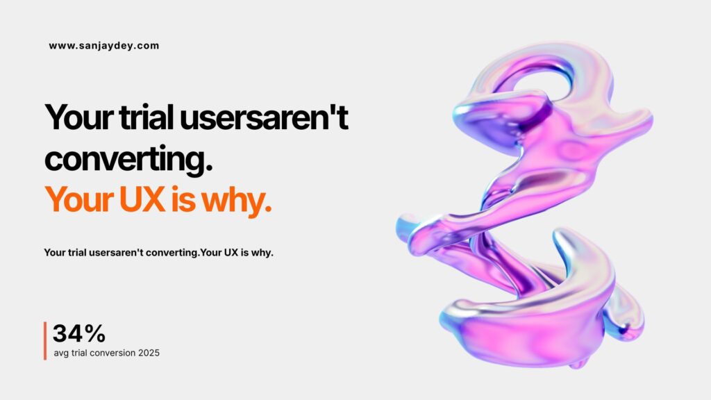
- Median free-to-paid SaaS conversion rates dropped to 34% in 2025, down from 50% in 2023. Poor UX is a primary driver of that decline.
- A well-designed UI can increase conversion rates by up to 200%. Improved UX can lift them by up to 400% (Forrester Research).
- The biggest conversion killers in SaaS: weak onboarding, high cognitive load, unclear value propositions, and friction-heavy signup flows.
- Seven strategies in this guide are grounded in practitioner experience and evidence — not generic design theory.
- Every $1 invested in UX returns up to $100 in revenue — a 9,900% ROI documented across enterprise and SaaS contexts.
Table of Contents
- Why SaaS Conversions Are Falling — and What UX Has to Do With It
- Strategy 1: Design for the Aha Moment, Not the Feature List
- Strategy 2: Reduce Interaction Cost at Every Touchpoint
- Strategy 3: Use Progressive Disclosure to Manage Cognitive Load
- Strategy 4: Build Trust Into the UI — Not Just the Copy
- Strategy 5: Optimise the Trial-to-Paid Flow End to End
- Strategy 6: Design CTAs With Intent, Not Instinct
- Strategy 7: Fix the Mobile Experience Before It Fixes Your Churn Rate
- Geographic Market Context: SaaS UX by Region
- Answer Capsules
- Tools Designers Use to Optimise SaaS UX
- FAQ: UX Design for SaaS Conversions
- Conclusion
- About the Author
Why SaaS Conversions Are Falling — and What UX Has to Do With It {#why-saas-conversions-are-falling}
The SaaS market is saturated. Buyers are more careful. And free trials — the traditional growth lever — are converting worse than they did two years ago.
Median free-to-paid conversion rates dropped to 34% by 2025, down from 50% in 2023. Opt-in trials with no credit card required average just 18.2%. That is not a marketing problem. That is a UX problem.
I have spent over 20 years designing digital products for global enterprises — from NatWest Bank in the UK to NSDC for the Government of India. I have watched SaaS teams pour budget into paid acquisition and ignore the product experience that greets users on day one. The result is predictable: traffic goes up, conversions stay flat.
The gap between average SaaS companies and top performers is striking. Top-tier SaaS products convert visitors at nearly six times the rate of average players. That gap does not come from better marketing. It comes from better UX — specifically, from UX design decisions that reduce friction, build trust, and deliver value fast.
This guide covers seven UX design strategies that directly affect SaaS conversion. Each one is grounded in research from Nielsen Norman Group, Forrester, and the Interaction Design Foundation — and tested against real product contexts.
[ALT: Bar chart showing SaaS trial conversion rates from 2023 to 2025 — declining from 50% to 34%]Strategy 1: Design for the Aha Moment, Not the Feature List
What the Aha Moment Actually Is
Most SaaS onboarding flows try to show users everything. The UI walks them through settings, notifications, integrations, and profile configuration before they have experienced a single moment of value.
That is backwards.
The aha moment is the point at which a user first understands why your product matters to them personally. It is not a tooltip. It is not a welcome email. It is a specific interaction — usually within the product — where the benefit clicks.
Slack’s aha moment is sending a message and getting a fast reply. Trello’s is dragging a card across a board and seeing a task move. These are not features. They are outcomes. And UX teams that design toward outcomes — not feature exposure — consistently see better SaaS onboarding metrics and trial activation rates.
How to Design Toward It
First, map your user journey. Identify which action correlates most strongly with free-to-paid conversion. This is usually your activation event — the first time a user completes a core task.
Then strip everything from the onboarding flow that does not lead to that event. Every extra step is an exit ramp.
Interactive product tours boost feature adoption by 42% (UserGuiding, 2026). But the tours that convert are narrow and purposeful — not comprehensive walkthroughs. One task. One outcome. One moment of value.
If you are unsure what your aha moment is, run a cohort analysis. Users who converted to paid in 30 days — what did they do in the first session that churned users did not? That action is your target.
From the Field
Working with enterprise B2B tools, I have seen onboarding flows with 14-step product tours that users exit by step three. We cut one flow to five steps focused entirely on creating a live data view. Trial-to-activation rates went from 22% to 41% over eight weeks.
The instinct to show users everything is understandable. The product team worked hard on those features. But users do not owe you their attention. You earn it by getting them to value — fast.
[ALT: User journey diagram showing a linear path from signup to aha moment, with dropped steps highlighted]Strategy 2: Reduce Interaction Cost at Every Touchpoint
What Interaction Cost Means
Interaction cost is the sum of physical and cognitive effort required to complete a task. Nielsen Norman Group defines it as one of the primary drivers of user dissatisfaction.
Every form field you add has a cost. Every modal that interrupts a flow has a cost. Every ambiguous label in your navigation has a cost. These costs compound — and in SaaS, they compound precisely at the moment you most need users to commit: during signup, onboarding, and the upgrade decision.
SaaS signup forms that ask for company size, industry, role, and phone number before a user has seen anything about the product are a classic example. Each field drops your signup rate. One study found that reducing a form from 11 fields to 4 increased completions by 120%.
How to Audit and Fix It
Run a heuristic evaluation of your signup and onboarding flow. Ask: can a user reach their first core action in under three minutes? If not, measure where they drop off.
Use session recording tools like Hotjar or FullStory to identify hesitation points. Users who pause, scroll back, or abandon mid-form are telling you something specific — the UI is generating doubt.
Then apply three fixes:
Remove optional fields from required positions. If you do not need a phone number to activate an account, do not ask for it at signup. Collect it later, in context, when it has purpose.
Replace text menus with visual cues. For multi-step flows, show users where they are and how much is left. Progress indicators reduce abandonment by clarifying the end point.
Use smart defaults. Pre-fill fields where possible. Pre-select the most common plan option. Every decision you make for the user — when that decision is correct — reduces cognitive load.
This is one of the most misunderstood aspects of SaaS UX design strategy. Most teams focus on visual polish. Interaction cost reduction is where conversion actually moves.
Strategy 3: Use Progressive Disclosure to Manage Cognitive Load
The Problem With Showing Everything at Once
SaaS dashboards are dense. They have to be — the products are complex, the use cases are varied, and teams expect full functionality from day one.
But showing a new user a full enterprise dashboard on their first login is not helpful. It is overwhelming. And overwhelmed users do not convert — they leave.
Progressive disclosure is the design pattern that solves this. You reveal interface complexity gradually, as the user needs it. You do not hide features — you sequence them.
Think of it this way: a spreadsheet application could show every formula, formatting option, and data validation tool when you open a new file. But Excel and Google Sheets both show a clean grid first. The advanced tools are there — they are just not in your face.
How to Apply It in SaaS
Start with a role-based onboarding branch. Ask one question at signup: what do you want to accomplish first? Route the user to a simplified version of the UI that shows only what is relevant to that goal.
As users complete tasks, reveal more. Show advanced settings after a user has completed a baseline setup. Surface integrations after a user has saved their first project. Trigger contextual tooltips for features adjacent to what a user just did — not features they have not touched at all.
This approach connects directly to designing for cognitive load — a principle that applies across web, mobile, and analytics dashboard contexts. The goal is never to simplify the product. The goal is to simplify the path.
Boosting UX budgets by 10% drives 83% higher conversions, according to the Interaction Design Foundation. Progressive disclosure is one of the highest-leverage ways to spend that investment — because it solves for the specific moment where most SaaS users abandon.
What This Approach Does Not Do
It does not reduce functionality. Users who need advanced features can still find them. The difference is that those features do not compete for attention during a new user’s first session.
This approach works — but only when paired with clear navigation that lets power users bypass the simplified flow. If you lock advanced users into a beginner path, you create a different kind of friction.
Strategy 4: Build Trust Into the UI — Not Just the Copy
Why UX Copy Alone Is Not Enough
“Your data is secure.” “Trusted by 10,000 teams.” “No credit card required.”
These are trust signals in copy. They matter. But PwC’s global survey of 15,000 consumers found that 80% prioritise speed and efficiency in their digital experiences. Trust is felt through the product — not just read in a headline.
A slow-loading page, a broken form validation, a UI element that does not respond as expected — these signal unreliability. They contradict every trust statement in your marketing copy.
Trust Signals That Live in the UI
System status visibility. Nielsen Norman Group identifies this as heuristic #1 for a reason. When a user takes an action — submitting a form, saving a file, triggering a workflow — the UI must confirm that the action was received. A spinner with no timeout, a silent save, a submit button that goes dark — these create doubt.
Error messages that explain and help. “Something went wrong” is not an error message. It is a trust-breaker. Write error states that name what happened and tell the user what to do next. This is where UX writing and microcopy have direct business value.
Social proof placed in context. A customer logo wall on the homepage is standard. But a testimonial placed next to the upgrade CTA — from a company similar to the user’s profile — converts better than one placed generically. Context is the variable most teams miss.
Security signals near friction points. Adding a short testimonial and an encryption badge near payment fields demonstrably reduces abandonment. The user’s trust is lowest at the moment they are being asked to spend money. That is exactly where the UI needs to earn it.
Design-led companies outperformed the S&P 500 by 228% over a 10-year period. That is not coincidental. Trust built through design is a compounding asset.
Strategy 5: Optimise the Trial-to-Paid Flow End to End
The Trial Flow Is a Funnel. Treat It Like One.
Most SaaS teams optimise for acquisition — the landing page, the ads, the signup form. The trial period itself gets treated as a holding space.
That is where conversions die.
The trial-to-paid flow has multiple stages, each with its own drop-off risk:
- Activation — Does the user complete a core task in the first session?
- Engagement — Does the user return in days 2–7?
- Value realisation — Does the user see measurable benefit within the trial window?
- Upgrade decision — Is the user presented with the right offer at the right moment?
Each stage requires a specific UX intervention. Treating the trial as a passive period and hoping users figure out the value is not a strategy — it is an abdication.
Specific Interventions by Stage
Activation: Design a single-action first session. Remove every element that does not lead to the user completing one meaningful task. Time-to-value is the metric here.
Engagement: Use behavioural triggers — not day-1 email sequences. A user who has not logged back in after 48 hours needs a different message than one who logged in four times but never completed setup. Behavioural design and emotionally intelligent UX can dramatically improve this re-engagement rate.
Value realisation: Build a progress indicator into the product itself. Show users what they have accomplished and what is next. This is not gamification for its own sake. It is closing the gap between effort and perceived value.
Upgrade decision: Present the upgrade offer when usage signals readiness — not on a fixed calendar. A user who has hit a feature limit, saved five projects, or shared a link is primed. That is the moment. Do not interrupt them before it arrives.
14-day trials with structured check-ins on Day 3 and Day 7 push conversion rates to 44.1%, compared to the baseline median of 34%. The structure is the variable — not the trial length alone.
[ALT: Funnel diagram showing four trial stages with UX intervention points at each stage]Strategy 6: Design CTAs With Intent, Not Instinct
What Most Teams Get Wrong
A call-to-action is not just a button. It is the culmination of everything the UI has done to bring the user to a decision point. The copy, the placement, the contrast, the surrounding context — all of it feeds into whether the user clicks or pauses.
Most SaaS teams design CTAs by instinct. They pick a colour that looks good on the brand palette. They write “Get Started” because everyone else does. They put it above the fold because a consultant said to.
None of that is wrong. But none of it is strategy either.
Using a specific, clear CTA can increase conversion rates by 161% (UserGuiding, 2026). The specificity is the variable. “Start My Free Trial” converts better than “Get Started” because it confirms what happens next and who it is for.
CTA Design That Converts
Make the next step explicit. The CTA copy should answer the question: what happens when I click this? “Start 14-Day Free Trial” beats “Sign Up”. “See It In Action” beats “Learn More”.
Place CTAs at decision moments. After a product benefit has been demonstrated. After social proof. After a use case the user recognises. Not just at the top of the page, and not just at the bottom.
Test colour with purpose. Red CTAs deliver conversion gains of up to 32-40% in high-urgency contexts. In trust-sensitive SaaS contexts — fintech, healthcare, legal — red signals alarm. Use contrast, not convention.
Avoid competing CTAs. Two equally prominent buttons on the same screen split attention. One primary CTA. One secondary, visually subdued. Any more than that and you have created a decision problem, not a design solution.
Explore how UX persuasion and the Fogg Behavior Model apply to conversion design — motivation, ability, and trigger must align for any CTA to work.
Strategy 7: Fix the Mobile Experience Before It Fixes Your Churn Rate
The Mobile Gap in SaaS
B2B SaaS has historically been a desktop product category. Decision-makers evaluate tools on laptops. Teams use dashboards on large screens.
That was true in 2018. It is less true now.
90% of smartphone users are willing to continue shopping when the mobile experience is good. For SaaS, this extends to trial evaluations, upgrade decisions, and feature exploration that now happens on mobile — during commutes, between meetings, on the go.
For every 1-second delay in mobile page loading, conversions can drop by up to 20%. SaaS products that treat mobile as a reduced-functionality afterthought are leaving conversion on the table — and creating a churn risk the moment a competitor ships a better mobile experience.
How to Approach Mobile UX in SaaS
Do not try to recreate the desktop experience on a phone. Map the mobile-specific tasks your users actually perform. For most SaaS products, these are: checking status, reviewing notifications, approving actions, and sharing data.
Design those flows as first-class experiences. Not compressed desktop screens. Not hidden behind a “best viewed on desktop” message.
Apply mobile UX principles that have measurable impact: thumb-friendly tap targets (minimum 44px), bottom navigation for primary actions, reduced form fields on mobile-specific flows, and offline-first caching where users might have connectivity issues.
Review mobile UX mistakes that hurt retention — many of them appear in SaaS products that were designed desktop-first and mobile-adapted as an afterthought.
98% of mobile UX rules that apply to native apps also apply to mobile web. Users do not distinguish between the two — they experience the product, and they form an opinion fast.
Geographic Market Context: SaaS UX by Region
United States
US SaaS buyers expect immediate value from trials — and they expect it to be obvious. The dominant user behaviour is task-completion testing: sign up, try the core feature, and decide. US enterprise buyers also have a high tolerance for sales-assisted trials but a low tolerance for slow activation. Conversion optimisation in the US market rewards clean onboarding, direct CTAs, and frictionless upgrade flows. Product-led growth models — where UX drives the conversion without a sales call — are more developed here than in any other market.
United Kingdom
UK SaaS users are methodical evaluators. They read documentation, compare plans, and are slower to activate but more likely to convert when they do. Trust signals matter significantly — privacy compliance (UK GDPR), data residency clarity, and visible security certifications are UX requirements, not nice-to-haves. UK enterprise buyers often run multi-stakeholder evaluations, which means the UX must support sharing, collaboration, and team-based trials. Ofcom data shows that 92% of UK adults use the internet daily, making the digital expectation high and the tolerance for poor UX low.
UAE and Middle East
The UAE SaaS market is growing fast, driven by government digitalisation programs and a high smartphone penetration rate. Mobile-first UX is not optional here — it is the primary access point. Arabic language support and RTL layout compatibility are often overlooked by SaaS teams targeting this region. User trust in digital products is strongly tied to visible brand authority and peer recommendations. Conversion flows that include localized trust signals — regional enterprise logos, case studies from Gulf-based clients — consistently outperform generic global messaging.
Australia and New Zealand
Australian SaaS buyers prioritise usability evidence — case studies, trial depth, and clear documentation. They are early adopters in the Asia-Pacific region but have a strong preference for local support and time-zone-appropriate response windows. Mobile usage rates are among the highest in the developed world. Australia’s Consumer Data Right (CDR) regulation shapes expectations around data transparency, which means your privacy UX — how you communicate data use — must be explicit, not buried in fine print.
India
India is the fastest-growing SaaS market by user volume, but conversion economics differ significantly from Western markets. Price sensitivity is high, freemium-to-paid conversion rates are lower, and the purchasing journey involves more stakeholders. UX that communicates clear ROI — specific time savings, cost reductions, productivity gains — converts better than UX built around feature showcase. Mobile performance is critical: a large portion of Indian SaaS users access products on mid-range Android devices with variable connectivity. Lightweight, fast-loading UI is not aesthetic minimalism — it is market fit.
Answer Capsules
What is the biggest UX reason SaaS free trials fail to convert?
The most common cause is a gap between what the trial promises and what users experience in their first session. Users sign up expecting to reach value quickly. If onboarding is long, the UI is dense, or the core feature requires significant setup before it works, most users abandon within the first 48 hours. The problem is not the product — it is the distance between signup and first meaningful outcome. Reducing that distance is the primary UX lever for improving trial-to-paid conversion rates. Research from UserGuiding shows that interactive product tours boost feature adoption by 42%, but only when they lead directly to an activation moment rather than a product overview.
How does reducing cognitive load improve SaaS conversion rates?
Cognitive load refers to the mental effort required to use an interface. When SaaS UIs present too many options, unclear labels, or multi-step flows with no visible progress, users experience decision fatigue — and fatigue leads to exit. Reducing cognitive load through progressive disclosure, smart defaults, and simplified navigation directly reduces the interaction cost of completing key actions like signup, first project creation, and plan upgrade. Nielsen Norman Group reports that enhancing usability can increase conversion rates by 200%. That gain comes primarily from reducing the effort users expend to reach a positive outcome, not from adding more features or more guidance.
What UX changes have the highest ROI for early-stage SaaS companies?
The three highest-ROI UX changes for early-stage SaaS are: (1) simplifying the signup and onboarding flow to reduce time-to-first-value, (2) adding contextual trust signals at the upgrade decision point, and (3) fixing mobile performance if more than 30% of your traffic is mobile. These changes require no platform rebuild — they require research, prioritisation, and iteration. A 10% increase in UX budget drives 83% higher conversions according to the Interaction Design Foundation. For early-stage companies where every conversion counts, those three areas produce the most measurable return per design hour invested.
Tools Designers Use to Optimise SaaS UX {#tools-designers-use}
These are tools with documented impact on SaaS UX performance — not a product catalogue.
Figma — Dominates wireframing and prototyping with 72% usage among product design teams. The collaborative review features are particularly useful for SaaS teams running multi-stakeholder design sign-offs.
Hotjar — Session recordings and heatmaps for identifying where users drop off and where they hesitate. Essential for interaction cost audits.
FullStory — More granular than Hotjar for SaaS-specific behavioural analytics. Good for tracking rage clicks and dead-end navigation.
Maze — Unmoderated usability testing at scale. Useful for validating onboarding flows before shipping.
Mixpanel / Amplitude — Product analytics for tracking activation events, retention cohorts, and feature adoption. This is where you confirm whether your UX changes actually moved the conversion needle.
Optimal Workshop — Card sorting and tree testing for information architecture. Especially useful if users consistently struggle to find features in your navigation.
Also worth running: a UX audit using established heuristics before spending budget on new tooling. A structured audit often surfaces the highest-impact fixes with the lowest implementation cost.
FAQ: UX Design for SaaS Conversions
What is UX design for SaaS conversions?
UX design for SaaS conversions is the discipline of designing product interfaces, onboarding flows, and user journeys to increase the rate at which visitors and trial users become paying customers. It goes beyond visual design — it covers information architecture, task flow design, interaction cost reduction, and trust signal placement. The goal is to close the gap between a user’s first contact with the product and their first experience of meaningful value, because that gap is where most SaaS conversions are lost.
How does UX design affect free-trial-to-paid conversion rates?
UX design directly determines how quickly a user reaches value during a trial, how much effort they expend navigating the product, and how confident they feel about upgrading. Poor onboarding, dense dashboards, and unclear upgrade paths are UX failures — and they show up in your conversion data. Trials with structured UX-led check-ins on Day 3 and Day 7 convert at 44.1% compared to the median of 34%. The structure of the experience inside the trial period, designed intentionally, is the variable that shifts those numbers.
What are the most common UX mistakes that hurt SaaS conversions?
The most common mistakes are: forcing new users through excessive onboarding steps before they reach value; using ambiguous labels in navigation that increase interaction cost; placing upgrade CTAs at arbitrary points instead of at moments of demonstrated value; ignoring mobile performance for products where mobile usage is growing; and omitting contextual trust signals near the upgrade and payment steps. These mistakes are documented in detail in UX mistakes that kill conversion rates — each one has a measurable effect on trial dropout and plan upgrade reluctance.
How to improve SaaS signups with better UX design?
To improve SaaS signups, you need to reduce the friction in your signup flow, remove optional fields, and communicate value before asking for user data. Show the product — a screenshot, an interactive demo, or a short video — before the signup form. Use social proof near the form, not just above the fold. Make your error states helpful — tell users what went wrong and how to fix it. Test your signup flow on mobile with a 3G connection, because a significant portion of SaaS signups now happen on mobile networks. These are not design aesthetics — they are conversion mechanics.
What is the difference between UX for SaaS and UX for eCommerce conversions?
UX for SaaS vs eCommerce — the key difference is that SaaS conversions depend on value realisation over time, while eCommerce conversions happen in a single session. SaaS UX must sustain engagement across multiple sessions, guide users through a learning curve, and build cumulative trust before an upgrade decision. eCommerce UX optimises a single transaction path — from product page to checkout. The trust signals, CTA strategies, and onboarding requirements are structurally different. SaaS UX also has to account for multi-user trials, team-based evaluation, and enterprise procurement processes that have no equivalent in direct eCommerce.
How long does it take to see results from SaaS UX improvements?
Most SaaS UX improvements produce measurable results within 4–8 weeks of implementation, depending on your traffic volume and trial length. Quick wins — fixing form field count, rewriting error states, adding trust signals to the upgrade flow — can show conversion movement in 2–3 weeks. Structural changes — redesigning onboarding, restructuring information architecture, rebuilding the mobile experience — require 60–90 days before cohort data becomes reliable. Run A/B tests on the high-traffic pages first. Prioritise by impact and traffic volume, not by design preference.
Should SaaS companies invest in UX research before redesigning their product?
Yes — always. Redesigning without research is the most expensive UX mistake a SaaS team can make. Without research, teams optimise for assumptions instead of actual user behaviour. A moderated usability test with eight to ten participants surfaces the majority of high-severity UX issues. Card sorting reveals navigation failures before you rebuild your information architecture. Session recordings show you where users actually struggle — not where you think they struggle. The research does not need to be expensive or lengthy. It needs to happen before the redesign, not after it.
What UX strategies work best for SaaS product-led growth?
Product-led growth depends on the product itself driving acquisition, activation, and expansion. The UX strategies that support this model are: designing a clear activation event that delivers value in the first session; building viral mechanics into the UX — share flows, collaboration invites, public outputs; surfacing upgrade prompts at feature-limit moments rather than on a fixed schedule; and creating a visible progress arc that shows users how much value they have already received. These strategies are covered in depth in UX design for SaaS revenue and connect directly to how design thinking applies to digital product development.
Conclusion
SaaS conversions are a UX problem. The data is consistent across multiple research bodies — Forrester, Nielsen Norman Group, the Interaction Design Foundation — and the pattern is the same: teams that treat UX as a design tax pay for it in churn and flat conversion rates. Teams that treat UX as a revenue function see measurable returns.
The seven strategies in this guide are not theoretical. They are drawn from practitioner experience across enterprise clients in the UK, USA, and India, and grounded in research that has held up across product categories and market contexts.
Start with one strategy. Map your current onboarding flow and measure time-to-first-value. Or run a heuristic evaluation on your trial-to-paid upgrade path. You do not need to redesign the product to see movement — you need to identify the specific friction point that is costing you conversions and fix it with intention.
If you want a structured review of your SaaS product’s UX, I work with founding teams, product leads, and marketing managers to identify and fix conversion blockers. Book a free UX consultation or explore the full range of UX strategy work I do at sanjaydey.com — and see what a practitioner-led UX review can do for your trial conversion numbers.
About the Author
Sanjay Kumar Dey is a Senior UX/UI Designer and Digital Strategist with 20+ years of experience designing web, mobile, and enterprise analytics dashboard solutions for global clients. His portfolio includes projects for NatWest Bank UK, ArcelorMittal, Adobe, Adani, and the Government of India. Certified by Google and the Interaction Design Foundation in UX research, mobile design, and usability testing, Sanjay runs sanjaydey.com as a practitioner-led thought leadership platform serving clients across the USA, UK, UAE, Australia, and India.
Leave a Reply