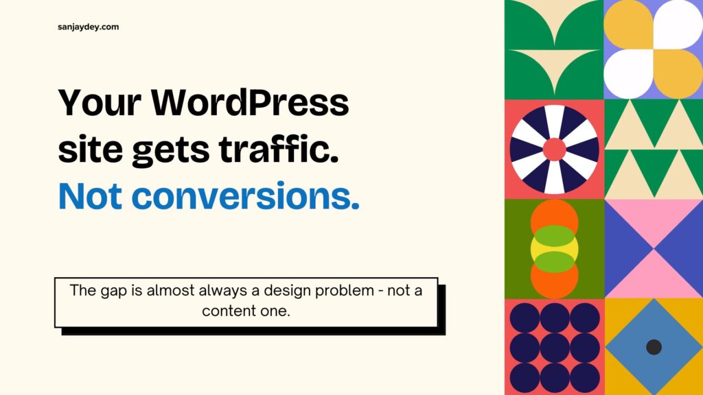
- Most WordPress sites lose conversions not because of bad content — but because of poor interaction design, slow load times, and broken trust signals.
- These 10 tips come from 20+ years of UX work across enterprise clients, eCommerce brands, and SaaS products.
- Each tip connects a specific design decision to a measurable business outcome — not just an aesthetic preference.
- Priority areas: page speed, CTA hierarchy, mobile UX, form design, and trust architecture.
- If your WordPress site gets traffic but not conversions, the problem is almost always structural.
Table of Contents
- Why Most WordPress Sites Convert Poorly
- Tip 1: Fix Your Visual Hierarchy Before You Touch Anything Else
- Tip 2: Design CTAs That Earn Clicks — Not Just Decorate Pages
- Tip 3: Reduce Cognitive Load on Landing Pages
- Tip 4: Speed Is a Design Decision — Treat It Like One
- Tip 5: Build Trust Signals Into the Layout — Not as an Afterthought
- Tip 6: Fix Your Mobile Experience Before Optimising Desktop
- Tip 7: Design Forms That People Actually Complete
- Tip 8: Use White Space as a Conversion Tool
- Tip 9: Apply Progressive Disclosure on Complex Pages
- Tip 10: Test Your Assumptions — Then Test Them Again
- Geographic Context: How These Tips Apply Across Markets
- Answer Capsules
- FAQ
- Conclusion
- About the Author
Key Statistics
- A 1-second delay in page load time reduces conversions by 7% (Google/Deloitte, 2024).
- 88% of users are less likely to return to a site after a poor experience (Sweor).
- Reducing form fields from 11 to 4 increases form completions by 120% (Baymard Institute).
- Websites with clear visual hierarchy outperform cluttered designs by up to 35% in task completion (Nielsen Norman Group).
- 61% of users say they are unlikely to return to a mobile site they had trouble accessing (Google Think).
Why Most WordPress Sites Convert Poorly
I’ve reviewed hundreds of WordPress sites over the past two decades. The conversion problem almost always comes down to one thing: design decisions made in isolation from user behaviour.
A business owner picks a theme they like. A developer installs a page builder and copies a template. Someone adds a CTA because “every website needs one.” Nobody asks whether the user can find the CTA, read it on a phone, or trust the brand enough to click it.
WordPress powers 43% of all websites on the internet (W3Techs, 2025). That market dominance is also its weakness — generic themes and plugin-heavy builds create sites that look complete but perform poorly.
The WordPress design tips for conversions in this guide are not about aesthetics. They are about interaction design decisions that have a direct impact on your revenue. Each one comes from either published UX research or from patterns I have seen fail repeatedly in real client work — across enterprise banking dashboards, government digital platforms, and mid-market eCommerce brands.
Read these as design principles, not a checklist. Applying three well is more valuable than skimming all ten.
Tip 1: Fix Your Visual Hierarchy Before You Touch Anything Else
Visual hierarchy is the design system that tells your user where to look and in what order. When it breaks, users scan randomly. They miss your value proposition. They can’t find the button they need.
Most WordPress themes ship with flat visual hierarchies. Every element competes for the same level of attention. Headings and body copy are similar in weight. CTAs blend into the page.
Nielsen Norman Group research shows that users follow an F-pattern or Z-pattern when scanning pages. Your most critical content — your headline, sub-headline, and primary CTA — must sit inside those natural scan paths.
What to fix in WordPress:
- H1 font size should be at least 2.5× the body text size. Most themes default to ratios that are too small.
- Your primary CTA must have the highest contrast ratio on the visible screen area.
- Supporting information (testimonials, features, secondary CTAs) should have visually lower weight — smaller type, muted colour, less prominence.
- Use size, contrast, and spatial positioning to create a reading order. Don’t rely on the user to figure it out.
This is the foundation of conversion-focused web design. Every other tip on this list builds on it.
That said, visual hierarchy is not just about headings. Navigation placement, button position, and image scale all contribute to the hierarchy. A full-width hero image with a small CTA sitting in the bottom corner is a hierarchy problem — not a content problem.
A hierarchy audit you can run in 10 minutes:
Take a screenshot of your WordPress homepage. Open it in any image editor and blur the image by 50%. Now look at what remains visible. The elements that still stand out at 50% blur — those are your dominant visual elements. If your brand name or logo dominates instead of your value proposition, you have a hierarchy problem. If no single element stands out, you have a hierarchy problem. If your CTA button is not one of the first three things you can identify through the blur, it is not prominent enough.
I have run this blur test on client sites during design reviews for years. It is one of the fastest ways to show a stakeholder that their “beautiful” homepage has no conversion structure at all.
The other tool worth using here is a first-click test. Show five users your homepage for five seconds, then hide it. Ask them: “What is the first thing you would click to find out how much this service costs?” The answers will reveal whether your hierarchy is working or whether users are guessing. Heuristic evaluation methods like these take less than a day to run and produce actionable data.
Fix the hierarchy first. Then look at colour, copy, and CTA design.
Tip 2: Design CTAs That Earn Clicks — Not Just Decorate Pages
A call-to-action is not a button. It is a decision moment. The design of that moment — what surrounds it, what precedes it, what it says — determines whether the user clicks or bounces.
Most WordPress sites have CTAs that are technically present but functionally invisible. They use vague labels like “Submit,” “Learn More,” or “Get Started.” They are placed at arbitrary positions. They do not reflect where the user is in the decision journey.
The four factors that determine CTA performance:
1. Specificity of language. “Book a free 30-minute UX consultation” converts better than “Contact us.” The user knows exactly what they are getting. There is no ambiguity, no perceived risk.
2. Contextual placement. A CTA placed immediately after a benefit statement performs better than one floating in the header or footer. The user needs a reason to click before they will click. Give them the reason, then give them the button.
3. Visual contrast. Your primary CTA must visually stand apart from everything around it. WCAG 2.2 requires a contrast ratio of at least 4.5:1 for text against background. High-contrast CTAs outperform low-contrast ones by 32% in A/B tests (HubSpot Research, 2024).
4. Friction reduction. If clicking the CTA opens a lengthy form or requires account creation, many users will abandon. Where possible, the first CTA should require minimal commitment — an email, a date selection, a single question.
In my experience designing digital platforms for NatWest Bank UK and similar financial services clients, the highest-performing CTAs were those placed directly after a resolved user anxiety. The user had a concern. The copy addressed it. Then the CTA appeared. That sequence matters.
For deeper reading on UX practices that connect directly to sales outcomes, the pattern holds across sectors.
Avoid having more than one primary CTA per screen viewport. Multiple competing CTAs split user attention and reduce total clicks on any single action. This is a well-documented finding from Baymard Institute’s usability research on eCommerce checkout flows — and it applies equally to service pages and landing pages.
Tip 3: Reduce Cognitive Load on Landing Pages
Cognitive load is the mental effort required to process a page. High cognitive load causes users to abandon — not because they are not interested, but because the effort outweighs the perceived reward.
WordPress landing pages are particularly vulnerable to this. Page builders make it easy to add sections, columns, widgets, and popups. Every addition increases cognitive load. Most teams never subtract.
A McKinsey study on digital CX found that simplifying user journeys can increase conversion rates by 20–30%. That is not about removing content that matters — it is about removing content that competes.
Practical cognitive load reduction for WordPress:
- One goal per page. Landing pages should have one conversion objective. If a page is trying to generate leads, sell a product, and build brand awareness simultaneously, it will do all three poorly.
- Limit navigation on landing pages. Full navigation menus on landing pages give users 10–15 exit paths. Remove the main nav on high-intent landing pages, or replace it with a logo-only header.
- Chunk information. Break dense copy into three-to-four line paragraphs with clear sub-headings. Users scan before they read. Give them landmarks.
- Progressive disclosure over information dumps. Show the essential information first. Let users expand or click through to access detail. This reduces the perceived weight of the page.
I’ve applied this pattern on SaaS onboarding flows and enterprise dashboard designs. The principle is consistent: every element on screen costs the user something. Charge only for what earns its place.
The connection between cognitive load and UX design for SaaS revenue is direct and measurable. Teams that audit their pages for cognitive load — not just aesthetics — see compounding improvements in both engagement and conversion.
Tip 4: Speed Is a Design Decision — Treat It Like One
Page speed is not a developer problem. It is a design problem that developers often inherit.
Unoptimised hero images. Fifteen Google Fonts loaded simultaneously. A page builder that generates 200KB of unused CSS. These are design decisions that have technical consequences. A 1-second delay in mobile load time reduces conversions by 7% (Google/Deloitte, 2024). A 3-second delay loses 53% of mobile visitors before the page even renders (Google Think with Google).
WordPress is particularly prone to speed degradation because its plugin ecosystem makes it easy to add functionality without understanding the performance cost. A standard WordPress install with a premium theme and 20+ plugins can generate a page weight of 4MB+. That is not a performance problem. That is a design problem.
Speed improvements that belong in the design process:
- Hero image compression. Design hero images at 1440px max width. Export at 80% quality JPEG or WebP. Use
srcsetfor responsive delivery. A 300KB hero image loads 4× faster than a 1.2MB one with no visible quality difference to the user. - Font reduction. Each additional web font adds 50–150ms of render time. Limit your WordPress site to two font families. If your brand requires three, load the third as a system font fallback.
- Above-the-fold prioritisation. Design critical content — headline, sub-head, CTA — to load within the first render. Defer below-the-fold imagery. This is the Core Web Vitals LCP metric. It directly affects both ranking and perceived performance.
- Plugin audit as a design review step. Before launching any page, audit active plugins for render-blocking behaviour. Plugins that add scripts to every page, regardless of whether that page uses their feature, are a design constraint — not just a technical one.
I worked on a dashboard project for an enterprise client where the initial build was loading 14 different font weights. Nobody had made an intentional decision to do that — it had accumulated through multiple design iterations. Cutting to four weights reduced the Time to Interactive by 2.1 seconds.
For context on WordPress web design trends and performance best practices, these principles hold regardless of which theme or page builder you use.
The Core Web Vitals that matter most for conversion:
Google’s Core Web Vitals are not just SEO signals. They are measurable proxies for user experience quality — and they correlate with conversion rates.
- LCP (Largest Contentful Paint): Measures how fast the main content of a page loads. Target: under 2.5 seconds. This is almost always your hero image or headline text. Optimise these two elements first.
- CLS (Cumulative Layout Shift): Measures visual instability — elements jumping around as the page loads. WordPress pages with lazy-loaded images that have no defined dimensions score poorly here. Set explicit width and height attributes on all images.
- INP (Interaction to Next Paint): Replaced FID in 2024. Measures responsiveness to user inputs. Heavy JavaScript from page builders is the most common cause of poor INP scores on WordPress.
A poorly scoring Core Web Vitals report is a design brief. It tells you exactly where the user experience breaks down. Treat it as input, not as a technical scorecard for developers to deal with separately from the design process.
The WordPress mistakes that damage business websites most severely are almost always speed and performance related — and almost always preventable at the design stage.
Tip 5: Build Trust Signals Into the Layout – Not as an Afterthought
Users need reasons to trust before they will convert. Trust is not built by a testimonials section at the bottom of the page. It is built through the cumulative weight of signals distributed across the entire user experience.
A Forrester Research report on B2B digital trust found that 77% of business buyers require at least three trust signals before making a purchase decision or submitting a lead form. Those signals need to appear early — not after the user has already decided whether to stay or leave.
Trust signals and where they belong in the layout:
- Social proof near the fold. Client logos, review counts, or a single strong testimonial should appear within the first two screen heights. Not buried below five feature sections.
- Security indicators on forms. SSL indicators, GDPR compliance notes, and “We never share your data” microcopy reduce form abandonment. Baymard Institute found that trust seals near form submission buttons increase completions by up to 42% in eCommerce contexts.
- Author authority on long-form content. If your blog posts are authored by someone with genuine expertise, put the byline and credentials at the top. Not at the bottom where most users never scroll.
- Specific claims over vague ones. “Trusted by 1,200 businesses in the UK and Australia” converts better than “Trusted by businesses worldwide.” Specificity is a trust signal.
- Responsive design as a trust signal. A site that breaks on mobile signals to users that the business is not paying attention. 57% of users say they would not recommend a business with a poorly designed mobile site (Sweor, 2024).
On the professional website design and conversion rate relationship — trust architecture is one of the most underestimated variables. Most conversion rate audits focus on CTA copy and page speed. Trust signal placement often delivers faster wins.
[ALT: WordPress page layout annotated to show strategic placement of trust signals — logos, testimonials, security icons – above the fold]Tip 6: Fix Your Mobile Experience Before Optimising Desktop
Mobile traffic accounts for 58.67% of global web traffic as of early 2025 (Statista). For most WordPress sites in consumer categories, that number is higher — often 65–75%.
Yet most WordPress design work still starts on desktop. Themes are selected based on how they look on a 1920px screen. Layouts are built in a desktop browser. Mobile is treated as a responsive afterthought.
This is backward. A mobile responsive design strategy should start with mobile constraints — then expand to larger screens.
What mobile-first WordPress design actually looks like:
- Touch target sizing. Buttons, links, and interactive elements must be at least 44×44px per Apple HIG guidelines and WCAG 2.2. Most WordPress themes default to smaller link sizes that are technically tappable but functionally frustrating.
- Thumb zone design. The natural thumb range on a mobile device covers the bottom 60–70% of the screen. Primary CTAs should sit in this zone. Navigation menus that open from the top-right corner require hand repositioning — this increases interaction cost and reduces tap rates.
- Single-column layouts over squeezed multi-column. A three-column desktop layout compressed to a single narrow mobile column with 8px margins is not responsive design. It is desktop design on a small screen. Redesign the mobile layout intentionally.
- Font sizing for reading distance. Body text on mobile should be a minimum of 16px. Users hold phones 25–30cm from their eyes. Smaller text increases cognitive load and reduces reading time on page.
- Eliminate hover-dependent interactions. Any interaction that requires a hover state — dropdown menus, tooltip reveals, image overlays — does not work on touch screens. Every hover-only interaction on your WordPress site is a broken experience for mobile users.
The mobile UX mistakes that damage user retention most often start in the design process – not in development.
How to audit your WordPress mobile experience properly:
Most designers test mobile by resizing a desktop browser window. This is not a mobile test. Real mobile devices render fonts differently, handle touch events differently, and expose layout problems that never appear in browser emulation.
Test on at least two physical devices – one high-end smartphone and one mid-range device with a smaller screen. Use Chrome DevTools’ mobile emulator as a first pass, but always validate on hardware before signing off.
Check these specifically on mobile:
- Sticky headers. A sticky header that takes up 80px of a 667px mobile screen leaves 587px for content. On pages where users need to see price, features, and a CTA simultaneously, that lost space matters. Make sticky headers smaller on scroll, or eliminate them on landing pages.
- Interstitials and popups. Google penalises mobile pages where interstitials block content immediately on load. A popup that appears within 3 seconds of landing on a mobile page also destroys conversion intent — the user came to find something and was interrupted before they found it. If you use popups, trigger them on exit intent or after 60% scroll depth.
- Accordion behaviour. Content accordions that work smoothly on desktop often have animation timing issues on lower-spec Android devices. Test on a mid-range Android, not just a flagship iPhone.
- Image loading on slower connections. Use Chrome DevTools to throttle your connection to “Slow 3G” and load your site. What the user sees in the first 3 seconds is what a significant portion of your India and Southeast Asia mobile audience sees on a typical connection.
The mobile UI trends shaping 2026 are accelerating — but the fundamentals of mobile UX have not changed. Speed, touch ergonomics, and legible typography remain the decisive factors.
Tip 7: Design Forms That People Actually Complete
Forms are the most direct conversion mechanism on most WordPress sites. They are also the most frequently abandoned.
Baymard Institute’s 2024 research on form usability found that 68% of users have abandoned an online form due to its length or complexity. That is not a content problem. It is a design problem.
High-converting form design principles for WordPress:
- One field per line. Multi-column form layouts look compact in a design file. In practice, they increase error rates and completion time. Single-column forms are faster to complete and easier to scan.
- Inline validation — not end-of-form error messages. If a user enters an invalid email address, tell them immediately — not after they click Submit and lose their other completed fields. Inline validation reduces form errors by 22% (Baymard Institute).
- Label above the field. Placeholder text used as labels disappears when the user starts typing. They then cannot remember what the field required. This is one of the most persistent form UX mistakes in WordPress sites.
- Reduce field count ruthlessly. Every additional field reduces completion rate. Asking for phone number alongside email on a first-touch lead form reduces submissions by 37% (HubSpot Research, 2024). If you do not need it immediately, do not ask for it.
- Logical field grouping. Group related fields visually. Billing information together. Contact information together. Users should be able to predict what comes next. Unexpected field types mid-form cause abandonment.
- Multi-step forms for complex captures. If you need 10+ fields, use a multi-step form that breaks the process into 3–4 stages. Show a progress indicator. Completion rates for multi-step forms outperform single-page equivalents by 86% (Formstack, 2024).
WordPress form plugins like Gravity Forms, WPForms, and Fluent Forms all support these patterns. The technical capability is not the constraint — the design knowledge is.
For context on how UI features can improve the customer experience at a structural level, form design is one of the highest-ROI areas to address.
Tip 8: Use White Space as a Conversion Tool
White space – also called negative space – is not empty space. It is a design instrument.
When used deliberately, white space reduces cognitive load, improves reading comprehension, and makes your conversion elements stand out. A study by Human Factors International found that proper use of white space in text and layout increases comprehension by 20%.
Most WordPress templates are over-crowded. Marketing teams want to “use every pixel.” This instinct is wrong. Users trust pages that breathe. Pages that pack in information signal desperation — not value.
White space in practice:
- Padding around CTAs. A button surrounded by competing text and imagery is functionally invisible. Add 24–40px of clear space around primary CTAs. The surrounding white space is what makes the button visually prominent.
- Line height in body copy. Line height of 1.5–1.7× the font size dramatically improves reading fluency. Most WordPress theme defaults are 1.2–1.3×. That is uncomfortably tight for extended reading.
- Section spacing. The gap between page sections tells the user that one idea has ended and another has begun. This is a visual full-stop. Sections that run together without breathing room create a wall of content that users will not engage with.
- Paragraph length. Three to four lines per paragraph is the ceiling. A paragraph that runs to 10 lines is not engaging content — it is a reading barrier.
White space is also a mobile conversion tool. On small screens, spacing is even more critical. Elements that sit too close together on mobile cause accidental taps, misread content, and user frustration.
Understanding how UI practices make websites more attractive goes beyond aesthetics — white space directly affects task completion rates and time-on-page.
Tip 9: Apply Progressive Disclosure on Complex Pages
Progressive disclosure is an interaction design pattern that presents only the information the user needs at each stage of a task. Additional information is revealed only when requested or when the user moves to the next stage.
For complex WordPress sites — services pages with multiple offering tiers, eCommerce product pages with variants, or knowledge bases — progressive disclosure is the difference between a usable page and an overwhelming one.
The pattern was documented extensively by Nielsen Norman Group. Their research shows that users consistently prefer interfaces that manage complexity through staged disclosure over ones that present all options simultaneously.
Where to apply progressive disclosure in WordPress:
- Pricing pages. Show core pricing tiers first. Put feature comparisons behind a “View full comparison” expand. Show annual/monthly toggle at the top. Do not force the user to parse a 40-feature comparison table before they can see the price.
- Product pages. Show primary variant (most popular size, colour, or configuration) by default. Reveal alternatives on selection. This reduces the perceived complexity of choice and improves add-to-cart rates.
- FAQ sections. Use accordions. An FAQ page with 20 expanded questions is 2,000 words of visual noise. An accordion FAQ shows the questions first — the user selects what is relevant to them.
- Service descriptions. Present the problem you solve and the outcome first. The process, the tools, the methodology — that comes after the user has already decided they are interested.
- Navigation. Mega-menus that expose 40 navigation links simultaneously increase cognitive load and reduce the likelihood of any click. Hierarchical menus that reveal sub-items on selection perform better for conversion.
In the design of enterprise dashboards and SaaS information architecture, progressive disclosure is one of the most consistently effective patterns I have applied. The principle scales from a five-page WordPress site to a 200-screen enterprise product.
Tip 10: Test Your Assumptions – Then Test Them Again
Every design decision in this article is backed by research or practitioner experience. But your site is not a controlled study. Your audience, your offer, your traffic source, and your competitive context are specific to you.
The only way to know which of these WordPress design tips for conversions actually moves your numbers is to test.
What testing looks like in a WordPress context:
- Heatmaps before A/B tests. Tools like Hotjar or Microsoft Clarity show you where users are clicking, how far they are scrolling, and where they are abandoning. This qualitative data tells you where the problem is. A/B testing tells you what to do about it.
- Session recordings. Watch real user sessions on your site. Five recorded sessions will reveal more friction than five hours of analytics review. Look for rage-clicks, scroll reversals, and form abandonment points.
- A/B testing CTAs. Test one variable at a time: label text, button colour, placement, size. Running multi-variable tests on small traffic volumes produces statistically invalid results. Wait for at least 1,000 sessions per variant before drawing conclusions.
- Usability testing. Recruit five representative users. Give them a task: “Find the service you’d use to redesign your website and submit an enquiry.” Watch what happens. Five usability test participants will uncover 85% of major usability issues (Nielsen Norman Group research on usability testing sample sizes).
- Form analytics. Track field-by-field completion rates on your WordPress forms. If 80% of users reach the phone number field and then abandon, you know the problem. Remove the field, or make it optional.
Testing is not a one-time event. It is an ongoing process. Seasonality, traffic source changes, and product evolution all affect conversion behaviour. A design that converted at 4.2% in Q1 may perform at 2.8% in Q4 for reasons unrelated to the design.
The relationship between UX improvements and customer trust compounds over time — but only if you are measuring and iterating.
Building a testing culture into your WordPress workflow:
Most businesses treat conversion testing as a project — something done once during a redesign, then forgotten. High-converting WordPress sites treat it as an ongoing operational function.
A practical testing rhythm for a small to medium business:
- Monthly: Review Google Analytics 4 data for page-level drop-off. Identify the three pages with the highest bounce rates and the lowest time-on-page. These are your next test candidates.
- Quarterly: Run a full heatmap review across your top 10 pages using Hotjar or Clarity. Look for scroll drop-off patterns and click clustering on non-interactive elements (this tells you users are expecting something to be clickable that is not).
- Bi-annually: Commission or run a moderated usability test with five to eight users from your target audience. Give them a specific task — not “explore the website,” but “find a service that would help you with [specific problem] and take the first step.” Record everything.
The results of these activities feed directly into design decisions. They are not reporting exercises. They are research sessions that produce hypotheses — and hypotheses that produce design changes.
What good hypothesis formation looks like:
“Our hero CTA is not converting because users don’t understand the offer” is a hypothesis. “Users are not clicking the CTA” is an observation. Observations tell you there is a problem. Hypotheses tell you what to test.
A structured hypothesis has three parts: “We believe [changing X] for [user group] will [produce outcome] because [rationale from research].”
Example: “We believe changing the CTA label from ‘Get Started’ to ‘Book a free 30-minute consultation’ for first-time visitors will increase click-through rate because our heatmap data shows users are hovering over the CTA area but not clicking, suggesting hesitation about what happens next.”
That hypothesis is testable. The alternative — “let’s try a different button colour” — is guessing.
The UX design principles that actually work in 2026 are built on this same foundation: evidence first, design decisions second.
Bonus: Two More Factors That Most Guides Skip
Colour Psychology and Conversion
Colour is not decoration. It is a communication system.
The colours you choose for your WordPress CTA buttons, hero sections, and trust badges carry meaning — and that meaning affects user behaviour. Research from the Interaction Design Foundation and various CRO studies consistently shows that colour contrast is more important than colour choice. A high-contrast button in any colour will outperform a low-contrast button in a “proven” colour.
That said, colour does carry cultural meaning that affects trust and readiness to convert:
- Blue signals trust and stability. It is the most common CTA colour in financial services, healthcare, and professional services WordPress sites — for good reason.
- Green signals safety, permission, and positive action. It works particularly well on “proceed” and “confirm” actions in multi-step flows.
- Orange and red create urgency. They perform well on limited-offer CTAs, but overuse signals a low-budget brand. Use selectively.
- White space with minimal colour signals premium positioning. If your target audience is enterprise or luxury, a colour-heavy WordPress theme actively works against conversion.
For a deep read on how colour psychology applies to marketing and design decisions, the research base is robust and directly applicable to WordPress CTA and layout decisions.
The mistake most WordPress site owners make is choosing CTA colour based on brand guidelines alone. Brand consistency matters — but it should never override contrast and legibility. A brand-blue button on a brand-navy background is not recognisably a button at all.
Microcopy: The Small Words That Close the Gap
Microcopy is the small text surrounding your conversion actions — the helper text below a form field, the note next to a submit button, the error message that appears when a user makes a mistake.
Most WordPress sites treat microcopy as an afterthought. The default “Submit” button. The generic “Invalid email” error. The unhelpful “This field is required” message.
These tiny decisions have measurable conversion impact.
Examples of high-converting microcopy:
- Next to a phone number field: “Optional — we’ll only call if you request it.” Removes the anxiety about unsolicited sales calls. Increases completions on that field by an average of 25% (Baymard Institute, 2024).
- Below an email capture: “No spam. One email per week. Unsubscribe anytime.” Reduces friction around email submission on lead magnets.
- On a pricing page below the primary CTA: “No credit card required. Setup in 10 minutes.” Addresses the two most common objections to trial signups in SaaS.
- On an error message: “That email address doesn’t look right — try name@example.com” rather than “Invalid input.” Specific error messages reduce re-entry errors by 31% compared to generic ones (Baymard Institute).
The discipline of microcopy, NLP, and UX writing is a full specialism — and one that most WordPress site owners have never heard of. But every word in your interface is a design decision. Treat it as one.
Geographic Context: How These Tips Apply Across Markets
United States
US users have the highest expectations for page speed and mobile experience. Google’s Core Web Vitals directly influence search ranking in this market. SaaS founders and eCommerce brands targeting US audiences should prioritise LCP under 2.5 seconds and CLS under 0.1. Trust signals including BBB ratings, TrustPilot reviews, and American Express/Visa payment indicators perform well with US buyers. Multi-step forms outperform single-page forms in B2B lead generation for US professional services sectors.
United Kingdom
UK users are particularly sensitive to GDPR compliance signals. Cookie consent design matters here — confusing or obstructive consent flows reduce trust and increase immediate bounce. WCAG 2.2 accessibility compliance has direct legal implications under the UK Equality Act. Financial services clients — including NatWest and similar institutions — require security trust signals (FCA registration mentions, SSL indicators) positioned near conversion actions. British users respond to understatement over hyperbole in CTA copy.
UAE / Middle East
The UAE market skews heavily mobile-first. With smartphone penetration above 90%, a poor mobile WordPress experience will lose this audience immediately. Arabic language support requires RTL (right-to-left) layout consideration — not just translation. Trust signals in this market emphasise brand prestige and client names over review counts. Luxury positioning and white-space-rich design perform better than information-dense layouts in UAE professional services contexts.
Australia / New Zealand
Australian eCommerce and professional services users respond strongly to local social proof — Australian client testimonials, Australian phone numbers, and ABN-registered business indicators. Page speed standards here are demanding, partly because of users’ awareness of variable connection quality in regional areas. The AU market has a strong preference for plain-English copy over technical or corporate language — this aligns with the practitioner-voice writing principles in this article.
India
India represents both a large domestic opportunity and a technically diverse user base. Screen sizes, connection speeds, and device capabilities vary dramatically between Tier 1 cities and regional markets. Lightweight WordPress builds — under 1MB total page weight — are not optional for this market. Trust signals emphasising qualifications, institutional affiliations, and media mentions carry more weight than testimonials. For B2B and enterprise buyers, case study depth and named client references are the primary conversion drivers.
Answer Capsules
What is a conversion-focused WordPress design?
A conversion-focused WordPress design is a layout and interaction system built with a specific user action as its primary goal — whether that is form submission, purchase, or enquiry. It prioritises visual hierarchy, clear call-to-action placement, fast load times, and trust signals over aesthetic preference. Every design decision is evaluated against its effect on the probability that a visitor will complete the target action. This approach contrasts with template-driven design that optimises for visual appearance without reference to user behaviour data.
How does page speed affect WordPress conversion rates?
Page speed is a direct conversion variable. Google and Deloitte research across 900 global brands found that a 1-second reduction in mobile load time improved conversions by up to 27% for retail and travel sites. For WordPress sites specifically, the primary speed culprits are unoptimised images, render-blocking scripts, excessive plugins, and heavy Google Fonts loads. Improving Time to First Byte (TTFB) and Largest Contentful Paint (LCP) — the two Core Web Vitals most directly tied to user perception of speed — should be treated as design requirements, not technical maintenance.
What is the difference between a CTA and a conversion action?
A CTA (call-to-action) is the design element — the button, link, or prompt — that invites a user to take a specific action. A conversion action is the completed behaviour — the form submitted, the product purchased, the appointment booked. A well-designed CTA reduces the gap between intent and action by removing ambiguity, reducing friction, and appearing at the right moment in the user journey. Most WordPress sites have CTAs. Fewer have CTAs designed around the user’s readiness to act at each stage of the funnel.
FAQ
What are the most important WordPress design tips to improve conversions?
The highest-impact areas are visual hierarchy, CTA design, and page speed. Visual hierarchy ensures users find the right content in the right order. CTA design ensures the action is clear, specific, and placed after the user has received a reason to act. Page speed ensures the user reaches that moment before abandoning. After these three, focus on mobile UX, form design, and trust signal placement. These six areas account for the majority of conversion losses on WordPress sites that are otherwise functional.
How many CTAs should a WordPress landing page have?
One primary CTA per viewport, with a maximum of two to three per full page. Each CTA should relate to the same conversion goal. Multiple competing CTAs — “Buy now,” “Book a call,” and “Download the guide” on the same landing page — split user attention and reduce total completions on any single action. If you have multiple conversion goals, build separate landing pages for each. The Baymard Institute and Nielsen Norman Group both document this attention-splitting effect in their landing page and checkout usability research.
How do I reduce bounce rate on a WordPress site?
Bounce rate is a symptom — not a root cause. High bounce rates indicate a mismatch between what users expected when they clicked through and what they found on the page. To reduce it: ensure your page headline matches your ad or search listing copy, load your first contentful paint in under 2.5 seconds, and place your highest-value content above the fold. Bounce rate improvements follow from fixing the expectation mismatch and the interaction cost of staying on the page — not from adding more content or animations.
What trust signals work best on WordPress websites?
The most effective trust signals are specific and proximate to conversion actions. Client logos near the hero section. Star ratings and review counts near CTAs. Security badges near form submissions. For B2B WordPress sites, named client testimonials with company names outperform anonymous quotes by a significant margin. LinkedIn profile links for individual practitioners add credibility. Specific numbers — “127 projects completed across 14 countries” — outperform vague claims like “trusted by hundreds of businesses.” Place trust signals where users are making decisions — not at the bottom of the page after they have already left.
How do I improve WordPress mobile conversion rates?
Start by auditing your site on an actual mobile device — not a browser emulator. Check tap target sizes (minimum 44×44px), body font size (minimum 16px), and whether your primary CTA is in the thumb zone of a standard phone screen. Then check your mobile page weight and load time using Google PageSpeed Insights — aim for under 1.5 seconds on mobile. Remove navigation menus from landing pages. Switch from multi-column form layouts to single-column. Eliminate any interaction that depends on hover states. These changes alone typically produce 15–30% improvement in mobile conversion rates.
What is progressive disclosure and how does it improve conversions on WordPress?
Progressive disclosure is a UX design pattern where only the information immediately relevant to the user’s current task is shown. Additional detail is revealed on request or as the user moves forward in a flow. On WordPress sites, this means using accordion FAQs instead of expanded text blocks, multi-step lead forms instead of 10-field single-page forms, and “Read more” sections on service pages instead of displaying all information simultaneously. Progressive disclosure reduces cognitive load, increases the perceived simplicity of a page, and improves completion rates on complex actions by managing the user’s mental effort at each stage.
How does white space affect conversion rates?
White space reduces visual competition between page elements. When a CTA button has 32px of clear space around it, that space is part of the button’s visual prominence. When the same button is surrounded by competing text, imagery, and other links, the user’s eye has no reason to land on it. Human Factors International research found a 20% comprehension improvement from optimised use of white space in body text and layout. Higher comprehension means users understand the offer better — and users who understand offers convert at higher rates than users who are confused.
Is A/B testing worth doing for a small WordPress site?
A/B testing on low-traffic sites produces statistically unreliable results. If your WordPress site gets under 500 sessions per month, focus on qualitative testing first. Run five moderated usability sessions with real users from your target audience. Watch where they struggle, where they hesitate, and where they abandon. Fix those problems. Then use heatmaps (Hotjar or Microsoft Clarity — both have free tiers) to validate your fixes. A/B testing becomes valuable once you have at least 2,000 sessions per month and a specific hypothesis to test. Until then, qualitative UX research will move your conversion rate faster.
Conclusion
Every WordPress site that converts well has one thing in common: the design was built around user behaviour — not around what looked good in a theme preview.
The WordPress design tips for conversions in this guide are not experimental. They are drawn from published UX research, platform data, and two decades of applied design work across enterprise, SaaS, eCommerce, and professional services. The principles work because they are grounded in how people actually read, scan, decide, and act online.
Start with the non-negotiables: visual hierarchy, CTA clarity, and page speed. These three account for a disproportionate share of conversion loss on most WordPress sites. Layer in trust signals, form design, and mobile UX. Then test — not to confirm what you already believe, but to find what you have missed.
If your WordPress site is getting traffic but not conversions, the gap is almost certainly structural. That gap is fixable.
If you want an independent UX audit of your WordPress site — including a prioritised conversion improvement plan — book a free consultation with me at sanjaydey.com. I review the design, the interaction patterns, and the user journey from first click to conversion action. You get a clear picture of where the drop-off is happening and what to do about it.
[ALT: Clean WordPress website design showing all 10 conversion design principles applied — hierarchy, CTA, speed, trust signals, mobile layout, form, white space, progressive disclosure]About the Author
Sanjay Kumar Dey is a Senior UX/UI Designer and Digital Strategist with 20+ years of experience designing web, mobile, and enterprise analytics products for global clients. He has led UX strategy and interaction design for organisations including ArcelorMittal, Adobe, NatWest Bank UK, Adani, Indian Oil, and Government of India initiatives. Certified in UX Design (Google/Coursera), Mobile UX, and Usability Testing through the Interaction Design Foundation, Sanjay writes about design, conversion, and digital strategy at sanjaydey.com. To discuss your project, visit sanjaydey.com/contact-sanjay.
Leave a Reply