Executive Summary
- Professional website design directly drives revenue. A well-executed UX can increase conversion rates by up to 400% (Forrester Research).
- Users form a first impression of your site in 50 milliseconds. Design is the deciding factor in 94% of those judgments.
- A one-second page load delay costs 7% in conversions — for a $100K/day store, that’s $2.5 million in annual losses.
- Trust signals — security badges, social proof, clear CTAs — increase conversions by 34–42% when placed correctly.
- This guide covers the specific design decisions that separate high-converting sites from average ones, with data, examples, and a 10-step implementation framework.
Table of Contents
- Why Website Design Is a Revenue Decision, Not an Aesthetic One
- The First 50 Milliseconds: What Users Actually Judge
- The 10 Design Principles That Drive Conversion Rate Increases
- Page Speed as a Conversion Lever
- Navigation Architecture and Conversion Flow
- CTA Design: The Most Misunderstood Element
- Trust Signals and Social Proof Placement
- Mobile UX and Its Direct Impact on Revenue
- Landing Page Design for Lead Generation
- Checkout and Form UX — Where Conversions Die
- A Step-by-Step Redesign Framework for Higher Conversions
- Geographic Market Context
- Answer Capsules
- FAQ
- Conclusion
- About the Author
Key Statistics
94% of users form their first opinion based on website design.
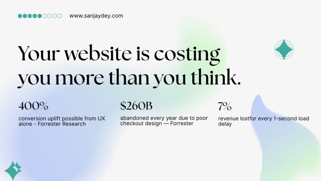
400% — maximum conversion uplift from seamless UX (Forrester Research).
$260 billion in annual purchases abandoned due to poor checkout design in the US and EU.
7% drop in conversions from a single second of page load delay.
35.26% — average conversion rate increase from checkout redesign alone (Baymard Institute, 2025).
Why Website Design Is a Revenue Decision, Not an Aesthetic One
Most business owners think of website design as a branding exercise. It is not. It is a revenue instrument.
Your website is the only sales asset that works around the clock, in every timezone, without a sales team. The way it is designed — structurally, visually, and functionally — determines whether visitors convert into leads, customers, or lost opportunities.
The numbers make this hard to ignore. A seamless UX has the potential to increase conversion rates by up to 400%, according to Forrester Research. Allocating just 10% of a development budget to UX improvements produces an 83% increase in conversions on average. Meanwhile, 88% of users who have a bad experience on a website are unlikely to return. And 89% of shoppers will switch to a competitor after a single negative interaction.
That is not a UX problem. That is a business problem.
I have been designing digital products for 20 years — enterprise dashboards, transactional platforms, SaaS interfaces, and marketing sites. One pattern holds across every sector: companies that treat design as decoration consistently underperform companies that treat design as strategy. The gap between those two groups is measurable in conversion rate, lead quality, and customer lifetime value.
This article breaks down exactly which design decisions create that gap. Not in theory. In specifics.
If you want a direct assessment of how your current site performs against conversion-focused design standards, visit my web design consulting page — I work with SaaS founders, agency owners, and eCommerce brands across the US, UK, UAE, and Australia.
The First 50 Milliseconds: What Users Actually Judge
A visitor lands on your site. They have already formed a judgment about it.
Research consistently confirms that users form opinions about a website’s design in approximately 50 milliseconds — 0.05 seconds. That judgment drives whether they scroll, engage, or immediately leave. In 94% of cases, that initial opinion is based entirely on design, not content.
What are they actually evaluating in that half-blink?
Visual hierarchy. Is it clear where to look first? Is there a focal point? Or is the page visually flat, competing for attention across ten elements simultaneously?
Perceived credibility. Does this look like a company that knows what it is doing? Seventy-five percent of users judge a business’s credibility based on its website design. Forty-eight percent say design is the top factor in evaluating trustworthiness.
Cognitive load. How much mental effort does it take to understand this page? A high cognitive load — too many choices, unclear categories, competing CTAs — triggers an exit response.
Consistency with expectation. Users arrive from ads, organic search, or referrals with a pre-formed expectation. If the visual language on the site does not match the message that brought them there, trust erodes in seconds.
The design decisions that govern that 50-millisecond impression are not about colour preferences. They are about contrast ratios, typographic hierarchy, whitespace, element placement, and loading behaviour. These are engineering decisions with business consequences.
Working with enterprise clients at the level of NatWest Bank UK and ArcelorMittal, I have seen first-hand how a homepage redesign that addresses only visual hierarchy — without touching a single pixel of content — can drop bounce rates by 20–30% within weeks of launch.
The 10 Design Principles That Drive Conversion Rate Increases
These are not opinions. Each principle below has a documented conversion impact.
1. Clear Visual Hierarchy
Users scan before they read. The F-pattern and Z-pattern scanning behaviours documented by Nielsen Norman Group show that attention clusters around the top-left, headings, and the first few words of each line.
Design the page so the most critical information — the value proposition, the primary CTA, the proof point — sits in the natural scan path. If a new visitor cannot identify what your product does in seven seconds, you have a hierarchy problem.
A clear hierarchy reduces cognitive load and increases the probability of the visitor taking the intended action. The conversion impact is direct and measurable.
2. Consistent Design System
An inconsistent visual language — buttons that change colour between pages, heading styles that vary, spacing that shifts without reason — erodes trust subconsciously. Users may not articulate why something feels wrong. They just leave.
A coherent design system communicates professionalism, attention to detail, and organisational competence. For B2B buyers who are evaluating a vendor over multiple pages and sessions, this matters significantly.
3. Above-the-Fold Value Proposition
Your above-the-fold space is the most valuable real estate on your site. It costs the same regardless of what you put there. Most sites waste it.
The above-the-fold section should answer three questions without requiring any scrolling:
- What do you do?
- Who is it for?
- What should I do next?
If your homepage headline is aspirational and vague — “We help businesses grow” — you are burning the highest-attention space on your site. Replace it with specificity. “UX design that increases SaaS trial-to-paid conversions” is not as poetic. It converts better.
4. Load Speed as a Design Decision
Page speed is a design problem, not just a development one. Images that are too large, animations that block rendering, fonts loaded from multiple sources, unnecessarily complex layouts — these are design-originated performance killers.
A one-second delay in page load time leads to a 7% drop in conversions. For eCommerce stores doing $100,000/day, that equals $2.5 million in annual revenue lost to a single second of latency. Forty percent of visitors abandon a page that takes more than three seconds to load.
Speed is not a nice-to-have. It is a conversion variable.
5. Mobile-First Layout Logic
As of 2025, mobile devices account for 80% of global digital traffic during peak periods like Cyber Week (Salesforce, 2025). The average mobile bounce rate is 49.1%. If a mobile page takes more than three seconds to load, 53% of visitors exit.
Mobile-first design means more than making a desktop site responsive. It means designing the interaction hierarchy, tap target sizes, scroll depth, and content density specifically for small-screen, touch-first behaviour. Desktop and mobile users have different task completion patterns. The design should account for both.
6. Friction-Reduced Navigation
Navigation is where interaction cost accumulates. Every extra click, every ambiguous label, every hidden menu adds to the cognitive effort required to find something. Interaction cost directly correlates with abandonment rate.
The best navigation is navigation that disappears — meaning users move through the site without noticing the navigation because it behaves exactly as expected. Thirty-eight percent of users look at navigational links immediately upon arriving at a site. That first navigation interaction sets the expectation for the rest of the session.
Use progressive disclosure. Expose the most common paths prominently. Bury edge cases. Never use internal jargon as navigation labels.
7. Form Design That Does Not Create Abandonment
Forms are where more conversions die than anywhere else on most sites. The Baymard Institute’s 2025 research shows that the average large eCommerce site can gain a 35.26% increase in conversion rate solely through better checkout design — without changing the product or price.
The principles apply beyond checkout: lead gen forms, contact forms, signup flows. Reduce field count. Use inline validation. Explain why you need each field. Break long forms into steps. Show progress.
An 8-field form converted at 11% in a test I observed on a financial services platform. Removing 3 non-essential fields brought that to 17.3% — a 57% improvement in lead volume with no change to the page.
8. CTA Placement and Design
The call to action is the hinge on which conversions turn. Most sites get it wrong in at least one of three ways: the CTA is buried below the fold, the language is generic (“Submit”, “Click Here”), or the surrounding design gives it no visual priority.
Adding a red button to a web page — as a simple contrast change — has been documented to increase conversions by 34% in certain contexts. The colour is not the variable. The contrast and visual salience are.
CTA language should use the visitor’s perspective. “Get My Free Audit” outperforms “Submit Form” because it states the outcome, not the action.
9. Trust Signal Architecture
Trust signals — client logos, testimonials, certifications, security badges — are not decorative. They perform a specific conversion function: reducing the uncertainty that prevents action.
Security badges increase conversions by 42%. Reviews placed near CTAs increase conversions by 34%. Sixty-one percent of users will not complete a purchase without visible trust seals.
Placement matters as much as presence. A testimonial buried in a footer does less work than a specific, results-focused testimonial placed immediately beneath a pricing table.
10. Whitespace and Readability
Whitespace is not empty space. It is a design element that controls attention, breathing room, and perceived quality. Dense pages feel cheap and overwhelming. Overly sparse pages feel unfinished.
The right balance is not aesthetic — it is functional. Whitespace directs the eye to what matters. It separates sections clearly enough that users understand where one idea ends and another begins. And it directly affects reading comprehension, which determines whether users understand your value proposition well enough to act on it.
Page Speed as a Conversion Lever
Page speed is the most overlooked conversion variable in most website redesign projects. It is also one of the most high-impact.
The data is unambiguous. A one-second delay in load time drops conversions by 7%. Every 10-second delay in page loading results in a 123% increase in bounce rate. Websites that load in one second can triple conversion rates compared to sites that load in three or more seconds.
Google’s Core Web Vitals have made this more than a UX consideration — they are a ranking signal. In 2025, only 48% of mobile websites achieved a “Good” score on Core Web Vitals (HTTP Archive, 2025). That means the majority of sites are penalised in both user experience and search visibility simultaneously.
The design decisions that most affect load speed are:
Image weight. Uncompressed images are the most common cause of slow load times. Every image should be sized to its display dimensions and compressed appropriately. Use next-gen formats (WebP, AVIF) instead of PNG or JPEG for hero images and product photos.
Font loading strategy. Loading five typefaces from two external sources adds 400–800ms of render-blocking time on mobile. Limit font weights. Use font-display: swap. Host critical fonts locally where possible.
Animation complexity. CSS animations are significantly lighter than JavaScript-driven ones. Entrance animations that block layout rendering — even visually appealing ones — cost conversion every time they run on a slow connection.
Third-party scripts. Analytics tags, chat widgets, ad pixels, and retargeting scripts each add load time. Audit them regularly. Load non-critical scripts asynchronously or defer them until after first meaningful paint.
If your Core Web Vitals scores are in the red, no amount of redesign will compensate. Speed is infrastructure for everything else.
Navigation Architecture and Conversion Flow
Navigation design is a discipline distinct from visual design. Most agencies treat it as an afterthought. It is not.
The navigational structure of a website determines whether users can find what they came for. If they cannot find it in a reasonable number of steps, they leave. The interaction cost model — developed and validated by Nielsen Norman Group — shows that users have a finite tolerance for effort. Every unnecessary click, every confusing label, every dead end reduces the probability of conversion.
Card sorting studies consistently show a gap between how businesses categorise their services and how users think about what they need. A professional services firm might organise by offering type (“Strategy”, “Implementation”, “Support”). Their users are searching by outcome (“Reduce churn”, “Fix my checkout flow”, “Improve onboarding”).
If the navigation labels do not match the visitor’s mental model, they bounce — even if the product they need is actually there.
Three navigation patterns that consistently increase conversion rates:
Sticky headers. A navigation bar that remains visible during scroll reduces the effort required to take an action at any point in the page. This is especially important for long-form landing pages and service pages.
Mega-menus with contextual grouping. For sites with large product or service catalogues, mega-menus reduce the depth of navigation required. Users scan horizontally across grouped options rather than drilling down through nested dropdowns.
Breadcrumb trails. For multi-level sites — eCommerce, documentation, multi-service firms — breadcrumbs reduce the cognitive effort of knowing “where am I?” They also improve internal linking for SEO as a secondary benefit.
The test for navigation quality is simple: give someone unfamiliar with your business five tasks to complete on your site. Time them. Count errors. If task completion time exceeds 60 seconds for common journeys, your navigation has an interaction cost problem.
CTA Design: The Most Misunderstood Element
Almost every website has calls to action. Almost no websites have calls to action that are properly designed.
The common failures are predictable. The button colour does not contrast with the background. The label says “Submit” instead of stating an outcome. The CTA appears once at the bottom of a long page, after the visitor has already decided to leave. Or — the most painful failure — there are three competing CTAs on the same screen, splitting attention and converting nothing well.
A CTA is a directional signal. It should tell the user: this is what to do next, and here is why it is worth doing.
Language principles for high-converting CTAs:
- Use first-person language: “Get My Free Audit” not “Get a Free Audit”
- State the outcome, not the action: “Start Saving Time” not “Sign Up”
- Reduce perceived commitment: “See How It Works” over “Buy Now” for cold traffic
- Create urgency without fakery: deadline-based CTAs work when the deadline is real
Placement principles:
- Above the fold on every key landing page — not just the homepage
- After a significant value statement or proof point — not at the start of a section
- At natural scroll-stop points — the end of a key argument, immediately after a testimonial
- In the sticky navigation for long-form pages — always visible as the user scrolls
Design principles:
- The CTA button must have the highest contrast ratio of any interactive element on the page
- Size matters: the minimum comfortable tap target for mobile is 44×44px (Apple HIG standard)
- Whitespace around the button increases perceived importance
The Delaware-Harvard Business Service changed only navigation bar structure and CTA text on a single page. The result was a 15.68% increase in completed orders. No new traffic. No price change. Just better CTA design.
Trust Signals and Social Proof Placement
Every conversion involves a moment of uncertainty. The visitor is about to give you something — money, contact details, time — and they are not sure it is worth it.
Trust signals exist to resolve that uncertainty. The challenge is that most sites have the right signals in the wrong places.
Client logos belong at the top of the page — ideally in the hero or immediately below it. Seeing a recognisable brand name validates your credibility before the user has had to evaluate anything else. A logo bar that sits below three paragraphs of copy has already lost most of the visitors who would have been influenced by it.
Testimonials work hardest when they are specific and results-focused. “Great service!” does nothing. “After redesigning our checkout with Sanjay’s guidance, our trial-to-paid conversion improved from 4.2% to 7.8% in six weeks” is a data point that converts. The name, title, and company of the reviewer should be visible. A photograph increases conversion by an additional 10–15% in A/B tests.
Case studies are the highest-trust content format for B2B and professional services. They demonstrate proven outcomes in a format that mirrors the reader’s own situation. A well-structured case study — problem, approach, measurable result — on a consulting or agency site typically outperforms any generic “About Us” content for conversion.
Security badges and certifications should appear at points of maximum hesitation — immediately adjacent to forms, above checkout buttons, and in pricing page headers. Sixty-one percent of users will not complete a purchase without visible trust seals.
The placement rule is simple: put the trust signal at the point where doubt is highest. That is usually directly before an ask.
Mobile UX and Its Direct Impact on Revenue
Mobile is not a secondary channel. During Cyber Week 2025, mobile devices accounted for 80% of all digital traffic and 70% of all orders globally (Salesforce, 2025). On Christmas Day 2025, 66.5% of all online sales were made via mobile — the highest share recorded all year (HTTP Archive, 2026).
And yet: 81% of websites still perform poorly on mobile UX (Loopex Digital, 2026). The gap between traffic share and design quality is enormous — and that gap is conversion opportunity.
Mobile-first design is not about shrinking a desktop layout. It is about rebuilding the experience for touch-first interaction, variable network conditions, and interrupted attention.
The specific mobile design failures that cost conversions most consistently:
Unoptimised tap targets. Buttons that are too small to tap accurately frustrate users. Rage clicks — rapid repeated taps out of frustration — increased 15.6% in 2025 (FullStory, 2025). Many of those rage clicks are on buttons that are physically too small for reliable interaction.
Font sizes below 16px. Text that requires pinch-zooming to read is not being read. Users skip it. If the content has conversion value — a key benefit, a CTA — it is being lost.
Horizontal scrolling at the element level. Images or content containers that overflow the viewport width create an experience of broken design. Users infer poor quality from broken layouts. Forty-five percent of users have poor experiences on non-mobile-optimised sites, resulting in a 60% bounce rate.
Forms optimised for desktop, not mobile. A form with ten fields, small input boxes, and no keyboard-type specification (tel, email, number) on mobile is significantly harder to complete. This directly suppresses lead volume.
Mobile-friendly websites see up to 40% higher conversion rates than non-optimised alternatives. Mobile users are 67% more likely to make a purchase from a mobile-friendly site. The investment required to close the mobile UX gap is typically modest. The conversion upside is not.
Landing Page Design for Lead Generation
A landing page is not a website page. It is a conversion instrument with a single job: move the visitor toward one specific action.
The most common landing page design mistakes are ones I see repeatedly — across SaaS, professional services, and eCommerce alike:
Multiple competing CTAs. One landing page, one goal. Two CTAs create a choice. Choice creates hesitation. Hesitation reduces conversion. Pick one action and design the entire page to move toward it.
Hero sections that lead with features, not outcomes. Visitors do not care about what your product does. They care about what changes for them. “AI-powered analytics dashboard” is a feature. “See exactly where your users drop off — and fix it before tomorrow’s standup” is an outcome. The second version converts better because it maps directly to a problem the visitor is already experiencing.
No visual hierarchy in the content flow. A landing page should have a narrative arc: hook → problem → solution → proof → action. When sections are designed independently, without a coherent visual thread, that arc breaks. Users cannot follow the argument. They leave before reaching the CTA.
Social proof positioned too late. The visitor’s doubt peaks before the CTA, not after it. Place a specific, credible testimonial or result immediately before the conversion ask — not below it.
Video absent from the hero. Websites that use video content average a 4.8% conversion rate, compared to 2.9% for sites without video (VWO, 2025). A 60-second explainer in the hero section does more conversion work than three paragraphs of copy.
Landing page design for B2B lead generation is one of the areas I focus on specifically as part of my web design and UX consulting work. The patterns that work for a SaaS trial page are different from what works for a professional services lead form — but the underlying conversion principles are the same.
Checkout and Form UX – Where Conversions Die
Every year, approximately $260 billion in purchases are abandoned in the US and EU due to unsatisfactory checkout flow and design (Forrester Research). This is not a product problem. It is a design problem that is entirely solvable.
The Baymard Institute’s 2025 research is the definitive reference here. Their large-scale usability testing across eCommerce checkout flows identifies 24 categories of checkout design issues. The average site has 8.5 of them. The top issues, by abandonment impact, are:
Forced account creation. Requiring users to create an account before purchasing adds friction at the highest-commitment point in the journey. Guest checkout is not optional for high-converting eCommerce. It is baseline.
Unexpected costs at checkout. Shipping costs, taxes, and fees that appear only at the payment step cause abandonment rates above 55% in tested scenarios. Display total cost context as early as possible — ideally on the product page.
Unclear error messaging. Form validation that says “Invalid input” tells the user nothing actionable. Error messages must identify the exact field and explain what the correct format is.
Too many form fields. The Baymard Institute’s research shows that the typical checkout form asks for 14.88 fields — more than twice the 6.5 that are actually necessary for order processing. Every unnecessary field reduces completion probability.
No progress indication. Multi-step checkout flows without a visible progress indicator increase abandonment because users do not know how much effort remains. A three-step progress bar reduces the perceived cognitive load of the same number of steps.
The same principles apply to lead generation forms. If your contact form asks for company size, annual revenue, phone number, and “how did you hear about us?” before submitting an enquiry, your form is acting as a filter — not a funnel.
Book a free consultation if you want a direct audit of where your checkout or contact form is losing conversions.
A Step-by-Step Redesign Framework for Higher Conversions
Sixty-one-and-a-half percent of website redesign projects are undertaken specifically to fix UX issues (Tenet, 2026). Most of them fail to achieve their conversion goals because they start with visual design rather than behavioural data.
The sequence matters.
Step 1: Baseline Measurement
Before changing anything, establish current conversion rates for each primary action — lead form submission, trial signup, purchase, enquiry. Segment by device (mobile vs. desktop) and traffic source. This is your benchmark. Without it, you cannot attribute improvements to specific changes.
Step 2: Qualitative Research
Run session recordings (Hotjar, FullStory, or Microsoft Clarity) on your five highest-traffic pages. Watch where users hesitate, where they scroll past critical content, where they click on non-clickable elements. This is behavioural evidence. It shows you where the design is failing to communicate.
Complement recordings with a moderated usability test — five users, representative tasks, talk-aloud protocol. The Nielsen Norman Group’s research confirms that five participants uncover 85% of major usability issues. You do not need a large sample. You need the right protocol.
Step 3: Heuristic Evaluation
Evaluate your site against Nielsen Norman Group’s 10 usability heuristics and Jakob Nielsen’s established principles. Specifically focus on: error prevention, recognition over recall, aesthetic and minimalist design, help users recognise and recover from errors.
Document each violation, its severity, and its potential conversion impact. Prioritise by the intersection of severity and traffic volume on the affected page.
Step 4: Conversion Audit
Map every conversion path — from traffic source to confirmation page. Identify where drop-off occurs at each step. A funnel with 60% drop-off at the pricing page has a different problem than one with 80% drop-off on the checkout form.
Common drop-off causes by stage:
- Homepage → Product page: unclear navigation or weak headline
- Product page → Cart: price-value uncertainty, missing social proof
- Cart → Checkout: forced account creation, unexpected costs
- Checkout → Confirmation: form complexity, payment trust signals
Step 5: Prioritised Design Hypotheses
Convert each identified problem into a testable hypothesis. “We believe that adding a testimonial adjacent to the primary CTA will increase form submissions by 15–25%, because it resolves trust hesitation at the point of decision.”
Each hypothesis should have a defined metric, a confidence threshold, and a proposed change. This structure forces rigour and makes A/B test results interpretable.
Step 6: Design and Prototype
Build redesigned versions of the highest-impact pages — typically homepage, key landing page, and checkout or contact form. Use Figma for high-fidelity prototyping. Test the prototype with users before development.
The cost of fixing a usability error in design is 10x lower than fixing it post-development. Testing prototypes is not optional — it is financial prudence.
Step 7: A/B Testing and Iteration
Deploy changes using an A/B testing framework (VWO, Optimizely, Google Optimize successor). Run tests until statistical significance is reached — typically 95% confidence. Do not call tests early on the basis of a positive trend. Let the data complete.
Each validated improvement becomes the new baseline. The process repeats.
Step 8: Performance Monitoring
Track Core Web Vitals continuously. Monitor conversion rates weekly, by device and source. Set alerts for anomalies. A sudden drop in mobile conversion rate is often caused by a third-party script added by marketing, not a design change — but you only know this if you are monitoring.
Step 9: Design System Codification
Document all validated design decisions — spacing, typography, component variants, colour usage — in a design system. This prevents design debt from accumulating across updates and ensures that new pages maintain the conversion-optimised patterns already validated.
Step 10: Regular Review Cycle
Conversion optimisation is not a project. It is a practice. A quarterly review of analytics, usability findings, and design hypothesis backlog maintains the cycle of improvement. Companies that invest in continuous UX improvement are 1.9x more likely to report improved customer satisfaction scores (Maze, 2025).
Geographic Market Context
United States
The US web design services market reached $43.5 billion in 2024. US digital consumers are highly conversion-mature — they have been exposed to high-quality digital experiences from Amazon, Stripe, and Shopify. This creates a high baseline expectation. SaaS companies targeting US enterprise buyers need professional-grade design with clear ROI framing, case study-heavy social proof, and seamless mobile performance.
United Kingdom
UK digital consumers rank design credibility among the highest trust factors for B2B purchasing decisions. NatWest, HSBC, and major UK retailers have set a high design standard. GDPR compliance messaging and transparent data use signals are particularly important in the UK market — privacy-related trust signals convert differently here than in the US.
United Arab Emirates and Middle East
The UAE has one of the highest smartphone penetration rates globally. Mobile-first design is not negotiable. Multilingual support — Arabic and English — is increasingly expected for regional credibility. The luxury positioning of many UAE markets means visual quality and brand polish carry a higher conversion weight than discount signals.
Australia and New Zealand
Australian eCommerce conversion rates average around 2.8–3.2%. Australian consumers show high sensitivity to page speed — mobile networks in regional areas are more variable than urban areas. Local social proof and AU-specific trust signals (local payment methods, AU/NZ testimonials) improve conversion meaningfully.
India
India’s digital commerce sector is growing at pace. With 820 million internet users and a mobile-first majority, performance optimisation for 3G-range connections remains critical. UX for Indian users must account for multi-language navigation, local payment integration (UPI, Paytm), and price-sensitivity framing that differs from Western markets.
Answer Capsules
Does website design directly affect conversion rates?
Yes. Website design is one of the primary drivers of conversion rate performance. Forrester Research documents that a seamless UX can increase conversion rates by up to 400%. Baymard Institute shows that checkout redesign alone produces a 35.26% average increase for large eCommerce sites. Visual hierarchy, load speed, CTA placement, form design, and mobile responsiveness each carry measurable, documented conversion impact. Design decisions are business decisions — they determine whether visitors complete the intended action or exit without converting.
What is the most important design element for website conversion rate?
There is no single most important element — but if forced to rank, page speed and CTA design have the broadest impact across all conversion types. A one-second delay in load time reduces conversions by 7%. A CTA with appropriate contrast, outcome-focused language, and correct page placement can increase form submissions by 30–50% without any other change. For eCommerce, checkout flow design — specifically removing forced account creation and reducing form fields — consistently produces the largest single-intervention conversion improvements.
How long does it take to see conversion improvements after a website redesign?
Significant design changes to high-traffic pages can produce measurable conversion shifts within two to four weeks — enough time for statistically significant A/B test data to accumulate. Full redesigns require longer validation cycles. Changes to load speed and Core Web Vitals typically show impact in Google Search Console within 28 days. The full attribution picture — including the effect on organic traffic from improved UX signals — usually requires three to six months of post-launch monitoring.
FAQ
What is website design conversion rate optimisation?
Website design conversion rate optimisation (CRO) is the discipline of improving the design, layout, and user experience of a website to increase the percentage of visitors who complete a desired action — such as submitting a form, making a purchase, or signing up for a trial. It combines UX research, behaviour analysis, A/B testing, and iterative design improvement. To implement CRO, you need baseline conversion data, qualitative research from session recordings or usability tests, and a structured hypothesis-testing process.
How much can professional web design improve conversion rates?
Documented improvements range from 15% to 400%, depending on the quality of the baseline design and the scope of changes made. A single checkout redesign can yield 35.26% more conversions (Baymard Institute, 2025). Fixing a form that asks unnecessary fields can increase lead volume by 50% or more. Full site redesigns with a conversion-first approach — addressing speed, hierarchy, CTAs, and trust signals simultaneously — regularly achieve 100–200% conversion improvements over the original.
What is the difference between UX design and conversion rate optimisation?
UX design and CRO are related but distinct. UX design focuses on the end-to-end quality of the user experience — ease of use, task completion, satisfaction. CRO focuses specifically on the percentage of users who complete a defined business goal. The key difference is measurement focus: UX evaluation uses task completion rates, error rates, and satisfaction scores; CRO uses conversion rate, revenue per visitor, and cost per acquisition. The best website design practices combine both — a site should be easy to use and effective at converting.
How does mobile design affect website conversion rates?
Mobile design has a direct and significant impact on conversion rates. Mobile-friendly websites see up to 40% higher conversion rates than non-optimised alternatives. Mobile users are 67% more likely to purchase from a mobile-friendly site. Poor mobile UX — including slow load times, small tap targets, and non-responsive layouts — drives a 60% bounce rate on affected sites. During major commerce events like Cyber Week 2025, mobile drove 70% of all orders globally. Ignoring mobile UX means losing the majority of potential conversions.
How do you improve website conversion rate without a full redesign?
To improve conversion rate without a full redesign, focus on: (1) improving page load speed by compressing images and reducing render-blocking scripts; (2) revising CTA language from generic verbs to outcome-focused statements; (3) adding social proof — client logos, specific testimonials with data — adjacent to conversion points; (4) simplifying forms by removing unnecessary fields; (5) adding a sticky navigation header with a persistent CTA. These changes can be implemented incrementally and A/B tested individually to isolate the impact of each.
What page load speed is required for optimal conversion rates?
Pages loading in under one second achieve the highest conversion rates. Pages loading in one to three seconds see progressively declining performance. At three seconds, 40% of visitors abandon. At seven seconds, bounce rate increases by 113% compared to a one-second baseline. Google’s Core Web Vitals threshold for a “Good” Largest Contentful Paint score is 2.5 seconds. This is the minimum standard for competitive conversion performance, not an optimised target.
How do trust signals improve website conversion rates?
Trust signals reduce the uncertainty that prevents visitors from taking action. Security badges increase conversions by 42%; EV SSL certificates by 30%. Reviews placed near CTAs increase conversions by 34%. Sixty-one percent of users will not purchase without visible trust seals. The placement rule: position trust signals at the exact point in the user journey where doubt is highest — immediately before a payment field, above a form submit button, or adjacent to a pricing table. Trust signals placed in the footer convert at a fraction of the rate of contextually placed ones.
What is a good conversion rate for a professional services website?
For professional services (consulting, design, legal, financial), a good conversion rate for contact form submissions ranges from 2% to 5% of total site visitors. For high-intent landing pages receiving qualified traffic — from paid search or referrals — rates of 8–15% are achievable with well-designed conversion journeys. Context matters: B2B professional services sites receive lower-volume, higher-intent traffic than eCommerce. A 3% conversion rate on 500 monthly visitors producing 15 qualified leads may represent stronger business performance than a 1% rate on 50,000 eCommerce visitors.
Conclusion
The case for professional website design has never been easier to make with data. A 400% potential conversion uplift from UX investment. A 35.26% average conversion gain from checkout redesign alone. A 7% revenue drop from a one-second load delay. These are business numbers, not design portfolio numbers.
But data alone does not change websites. Decisions do.
Most of the organisations I have worked with — from enterprise banking clients in the UK to government digital platforms in India — did not have design problems. They had decision-making problems. Design was treated as the last step, budget-constrained and scope-squeezed, rather than the strategic instrument it is.
The 10 principles in this article are a starting point. The redesign framework gives you the sequence. The FAQ section gives you the answers to the common objections.
What it does not do is audit your specific site, identify your highest-impact conversion levers, or tell you which of these principles applies most urgently to your situation.
That is the work I do.
If you are a SaaS founder, agency owner, or eCommerce manager who wants a direct, experienced view of where your website is losing conversions — book a free consultation. No pitch deck. No discovery call theatre. A direct conversation about what the data says and what to do about it.
Or explore my web design and UX strategy work to understand the approach before reaching out.
About the Author
Sanjay Kumar Dey is a Senior UX/UI Designer and Digital Strategist with over 20 years of experience designing enterprise web, mobile, and analytics dashboard products. His clients include ArcelorMittal, NatWest Bank UK, Adobe, Adani, and Government of India initiatives through NSDC. Most recently at PwC India, Sanjay now works independently as a UX consultant and thought leader, helping SaaS founders, agencies, and eCommerce brands in the USA, UK, UAE, and Australia build websites that convert. He is certified in UX Design, Mobile UX, and Psychology of Online Sales through Google and the Interaction Design Foundation. Connect with him at sanjaydey.com.
Leave a Reply