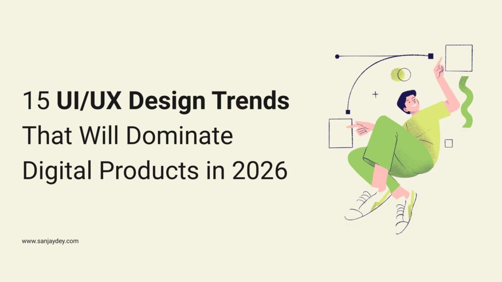
Why 2026 Marks a Turning Point in UI/UX Design
The UI/UX design trends shaping 2026 are not driven by aesthetics. They are driven by user expectations that have shifted faster than most product teams anticipated.
Between 2023 and 2025, the average digital user’s tolerance for friction dropped sharply. According to Google’s Core Web Vitals data, pages loading beyond 2.5 seconds see a 32% increase in bounce rate. Users now benchmark every product against the best experience they have ever had — not the best experience in your category.
I have spent 20+ years designing interfaces for enterprise clients across banking, energy, and government sectors. The pressure to ship visually impressive work has always existed. But in 2026, the pressure to ship functionally precise work is far greater.
This article covers 15 UI/UX design trends that are already producing measurable results. Not concepts. Not mood boards. Patterns that are changing how users interact with digital products — and how businesses measure that interaction.
If you are building a product, running a design team, or commissioning a digital project this year, these are the trends you need to understand before your next brief.
Trend 1 – AI-Personalised Interfaces
Static interfaces made sense when we had no data. We have data now.
AI-personalised interfaces adjust layout, content hierarchy, and navigation based on individual user behaviour. This is not A/B testing. It is real-time adaptation at the component level.
McKinsey research shows that personalisation-led design can reduce customer acquisition cost by up to 50% and increase revenue by 5–15% for digital-first businesses. Those numbers explain why product teams at SaaS companies and enterprise platforms are restructuring their design systems around dynamic content logic.
What This Looks Like in Practice
A returning user on a SaaS dashboard should not see the same onboarding prompt as a first-time visitor. An eCommerce user who consistently browses on mobile at 9pm should get a layout optimised for that context — smaller tap targets, condensed navigation, faster-loading images.
The interaction design challenge here is cognitive load management. Personalisation creates value only when the interface adapts usefully — not just differently. Showing the wrong content faster is still wrong.
The Design Risk Nobody Talks About
Over-personalisation creates filter bubbles inside products. Users stop discovering features they did not already use. This stalls product adoption and increases churn in subscription models. The fix is intentional surfacing — deliberately showing unfamiliar but relevant features in low-interaction-cost zones.
[ALT: Side-by-side comparison of static vs AI-personalised interface layouts on a SaaS product dashboard]From the Field: Working with enterprise dashboard clients, I have seen personalisation backfire when the logic was trained on incomplete behavioural data. The interface adapted to what users had done, not what they needed to do. Audit your data assumptions before you automate the layout.
Trend 2 – Bento Grid Layouts
The bento grid is not new. But in 2026, it has become the dominant layout pattern for product landing pages, app dashboards, and feature showcases.
The format – modular, asymmetric cards arranged in a tight grid – works because it creates visual hierarchy without requiring the user to scroll aggressively. Each card communicates a discrete value unit. The cognitive load stays low.
Apple used it to great effect in product pages throughout 2023 and 2024. By 2025, it had become the default pattern for SaaS and fintech interfaces that needed to surface multiple data points simultaneously.
When It Works and When It Does Not
Bento grids work when your content has natural card-level units – metrics, features, stats, product specs. They break when you force flowing content (like editorial articles or step-based onboarding) into rigid boxes. That mismatch produces cognitive dissonance, and users lose the thread of what they are supposed to do next.
The other trap is visual parity. Every card the same height suggests every card has the same importance. Use card sizing to communicate hierarchy, not just aesthetics.
That problem connects directly to the next shift – how interfaces handle input that goes well beyond tapping a screen.
Trend 3 – Voice and Multimodal UX
Voice interaction has been “the next big thing” for years. The difference in 2026 is that multimodal design – combining voice, touch, and visual feedback in a single interaction model – has crossed the threshold from experimental to expected.
According to Nielsen Norman Group, users expect multimodal input support in productivity tools, smart home interfaces, and mobile assistants. The challenge is designing transitions between modalities without creating interaction dead zones.
Designing for Voice Without Breaking Visual UX
The common mistake is bolting voice onto a visual interface as an afterthought. That produces awkward experiences where the voice command works but the screen does not update logically.
Effective multimodal UX requires designing the interaction state – what the screen shows while voice is active, how visual feedback confirms audio commands, and what happens when voice fails. These are task flow problems, not feature problems.
If your product serves users in high-distraction environments – drivers, warehouse workers, healthcare professionals – multimodal UX is not optional. It is a usability requirement.
Trend 4 – Micro-Interactions With Functional Purpose
Micro-interactions are the small animations that happen when a user completes an action — a button press, a form submission, a swipe gesture. Done well, they reduce perceived wait time and confirm that the system received input.
Done badly, they add cognitive overhead to simple tasks.
The UI/UX design trend in 2026 is the shift toward functional micro-interactions – animations that communicate status, not just delight. The difference matters operationally. A loading indicator that pulses faster when data is nearly loaded gives users calibrated expectations. A static spinner does not.
The Baymard Benchmark
Baymard Institute’s checkout usability research found that unclear feedback during form validation increases error rates by 22%. Micro-interactions that confirm field completion in real-time — rather than post-submission — reduce that friction directly.
This is the business case for micro-interaction investment: fewer support tickets, lower abandonment rates, and faster task completion. Not prettier screens.
From the Field: On enterprise finance dashboards I have worked on, replacing generic loading states with progress-stage micro-interactions reduced user-reported confusion by a measurable margin in usability testing. Users knew the system was working. That changes how they rated the product overall.
Trend 5 – Accessibility-First Design Systems
Accessibility is no longer a post-launch audit item. In 2026, accessibility-first design means building WCAG 2.2 AA compliance into the component library – not retrofitting it.
The UK’s Equality Act, the USA’s ADA, and the EU’s European Accessibility Act (EAA) – which came into enforcement in June 2025 — have created legal pressure that is accelerating adoption beyond ethical motivation.
What Accessibility-First Actually Requires
- Colour contrast ratios of at least 4.5:1 for body text (7:1 for enhanced compliance)
- Keyboard navigation support for every interactive element
- Focus indicators that are visible without CSS overrides
- Touch targets of at least 44×44 pixels on mobile (Apple Human Interface Guideline standard)
- Alt text that describes function, not appearance
The design system implication: every token, component, and pattern needs accessibility documentation before it ships. Teams that build it in from the start spend 40% less time on remediation than teams that audit after launch (Forrester Research, 2024).
Accessibility and Conversion Are Not in Conflict
Accessible design benefits non-disabled users too. Captions help users in noisy environments. High contrast helps users in bright sunlight. Keyboard navigation helps power users. Accessibility investments compound across your entire user base.
Trend 6 — Dark Mode as a Design Default {#trend-6}
Dark mode has matured from a user preference toggle into a default design consideration. In 2026, designing for dark mode first — or simultaneously with light mode — is standard practice for any product targeting professionals, developers, or evening-use cases.
Statista data from 2024 shows that 81.9% of smartphone users use dark mode when available. That is not a trend. It is a baseline expectation.
The Design System Implication
Dark mode is not a colour inversion. It requires separate token definitions for surface colours, elevation shadows (which behave differently on dark backgrounds), and text hierarchy. Teams that treat dark mode as a post-build inversion end up with interfaces that fail contrast tests and create visual noise on OLED screens.
Build a dual-mode design system from the start. It costs more upfront. It costs far more to retrofit.
Trend 7 – Spatial and 3D UI Elements
With Apple Vision Pro’s market impact and the broader shift toward spatial computing contexts, 3D UI elements have moved from motion graphics experiments to real interface components.
This does not mean every product needs a 3D hero animation. It means the design vocabulary has expanded — and the tools to produce spatial UI are accessible in Figma, Spline, and browser-native CSS.
Where 3D UI Actually Works
3D works in product showcases (eCommerce, hardware, SaaS feature reveals), data visualisation (where spatial depth communicates hierarchy), and onboarding sequences where orientation matters.
It does not work in transactional flows, dense data interfaces, or any context where rendering performance is constrained. A 3D animation that delays interaction by 400ms loses users. The interaction cost has to be justified by the value communicated.
[ALT: Three-dimensional product card component in an eCommerce interface showing spatial depth and hover interaction state]From the Field: I have seen 3D elements added to enterprise analytics dashboards as a “modernisation” project. In every moderated usability test, users asked to turn them off. Professionals reading data at speed do not want visual theatre. Know your user context before you commit to spatial UI.
Trend 8 – Emotionally Intelligent Design
Emotionally intelligent design accounts for the user’s psychological state — not just their task state.
This is distinct from “empathetic design” as a concept. Emotional intelligence in UI/UX means designing interfaces that respond to frustration signals, reduce anxiety during high-stakes actions (payments, medical forms, legal submissions), and calibrate tone based on context.
Nielsen Norman Group’s research on error messages shows that error copy written in a reassuring, plain-language tone reduces re-abandonment rates by 14% compared to technical error messages.
Practical Applications
- Error states: Replace “Error 422 — Unprocessable Entity” with “We could not complete that. Check your billing address and try again.”
- Empty states: Treat them as opportunities, not voids. A well-designed empty state guides the user toward the next meaningful action.
- High-stakes confirmations: Slow the user down deliberately. Add friction before irreversible actions. This is intentional design, not bad UX.
Trend 9 – Progressive Disclosure in Complex Products {#trend-9}
Progressive disclosure is the practice of revealing interface complexity only when the user needs it. In 2026, it is one of the most consistently applied UI/UX design trends across SaaS, enterprise software, and financial products.
The principle is simple: show users only what they need to complete the current task. Everything else is one deliberate step away.
Why This Matters for Enterprise Products
Enterprise software has historically failed at this. Feature-heavy products show every option simultaneously, creating cognitive overload that slows task completion and increases training time. The result is low feature adoption — users stick to the 20% of features they discovered first and never explore the rest.
Gartner’s digital experience research notes that reducing visible complexity at the point of initial interaction increases feature discovery by 34% over time. Counter-intuitive, but consistent across enterprise UX research.
The technique requires disciplined information architecture. You need card sorting data, task flow analysis, and real usage data before you decide what to disclose — and when.
[ALT: Progressive disclosure pattern showing a collapsed form expanding step by step as a user completes each section]Trend 10 — Typography as the Primary Visual Element {#trend-10}
The latest UI design trends in 2026 include a clear shift toward type-dominant layouts. With faster-loading constraints, accessibility requirements, and the rise of text-heavy AI interfaces, typography is doing more structural work than it has in a decade.
Variable fonts — which allow weight, width, and slant to adjust dynamically — are now supported across all major browsers and operating systems. This has unlocked typographic motion and responsive type behaviour that previously required multiple font files.
Type Sets the Hierarchy
In a type-dominant layout, the typographic scale is the visual hierarchy. H1 through body text must communicate structure clearly without relying on decorative elements. This requires a proper type system — not just a favourite typeface.
Measure (line length), leading (line height), and tracking (letter spacing) are the variables that determine readability. The benchmark from the British Dyslexia Association: 60–80 characters per line for comfortable sustained reading. Most product UIs still violate this.
Trend 11 – Glassmorphism 2.0
Glassmorphism – frosted glass-style UI with background blur and subtle transparency – peaked visually around 2021. What has returned in 2026 is a more restrained version: used for elevation, not decoration.
The functional application is overlays, modal dialogs, and notification panels where the user needs to maintain context of the background content while focusing on the foreground element. The blur creates visual hierarchy without a hard cutoff.
The risk with glassmorphism is performance. CSS backdrop-filter is GPU-intensive. On mid-range Android devices, overuse of background blur creates scroll jank and interaction lag. Test on the devices your actual users own — not on the latest MacBook in your studio.
Trend 12 – Ethical and Privacy-Centred UX
Privacy-centred UX is not the same as legal compliance. Compliance sets the floor. Good UX sets the ceiling.
In 2026, users increasingly distrust products that use dark patterns — pre-ticked consent boxes, hidden unsubscribe options, confusing cookie banners. GDPR enforcement in the EU has resulted in fines exceeding €4 billion since 2018. The UK ICO has followed with its own enforcement actions post-Brexit.
What Privacy-Centred UX Looks Like
- Consent flows that explain why data is collected, not just what is collected
- Account deletion that works in three clicks or fewer
- Data dashboards that let users see and control their stored information
- No pre-selected options that benefit the business over the user
The interaction design principle is honest disclosure. Users who understand what they are agreeing to show 23% higher long-term retention than users who felt misled (Forrester Research, 2024). Privacy-centred UX is a retention strategy, not just an ethical position.
Trend 13 – Adaptive and Context-Aware Navigation
Navigation is where most digital products fail silently. Users who cannot find what they need within three interactions abandon and rarely return. Context-aware navigation addresses this by adapting the navigation model to the user’s current task state.
This is different from personalisation. Personalisation changes what is shown. Context-awareness changes how the navigation behaves based on what the user is doing right now.
Examples That Work
A user mid-way through a multi-step checkout should see a progress-anchored nav — not the full site menu. A user reading a long-form article should see a sticky section navigator, not the homepage header. A mobile user arriving from a product-specific ad should land on a nav state that matches their intent.
These are not complex engineering requirements. They are task flow decisions that require UX clarity before engineering begins.
Trend 14 – Design Systems Built for AI Output
This is the trend most design teams are behind on. As AI content generation becomes part of standard product workflows — AI-generated summaries, auto-populated dashboards, LLM-written descriptions — design systems need components that account for variable-length and unpredictable content.
A card component that works perfectly with a 12-word title breaks when an AI generates a 47-word title. A table that handles human-entered data gracefully fails when AI populates it with inconsistent formatting.
What This Requires
- Minimum and maximum content constraints documented in every component spec
- Text truncation behaviour defined for every text container
- Error states for AI output failure (partial, empty, or malformed content)
- Loading skeletons that match the expected AI output structure
Design debt accumulates fast when AI is added to a product without updating the design system. Teams that update their component libraries now will spend significantly less time in remediation by Q3 2026.
[ALT: Design system component showing variable-length text handling for AI-generated content with defined truncation and overflow rules]From the Field: I have seen enterprise analytics platforms add AI-generated insight summaries to existing dashboards without any component updates. The result was text overflow, broken layouts, and users reporting the feature as “broken” — even when the AI output was technically correct. The design system, not the AI, was the problem.
Trend 15 – Real-Time Collaborative Interfaces
Figma made real-time collaboration the expectation in design tools. That expectation has migrated to the products those designers build.
Users working in project management, document editing, financial modelling, and CRM tools expect to see collaborators present — and to see changes in real-time. The UI patterns for this are still being standardised, which is why getting them right is a competitive differentiator in 2026.
The Design Challenges
Presence indicators (showing who is active where), change attribution (who changed what and when), and conflict resolution UI (what happens when two users edit the same field simultaneously) are all inconsistently solved across the industry.
The modern UX design ideas that work here come from established tools — Google Docs, Figma, Notion — but must be adapted to domain-specific contexts. A financial model has different conflict resolution requirements than a shared document.
This is an area where investing in user research before building pays off. The edge cases in collaborative interfaces surface in the first week of real use — and they are far cheaper to design for than to fix post-launch.
Key Statistics: UI/UX Design in Numbers
| Metric | Data | Source |
|---|---|---|
| Bounce rate increase for pages loading beyond 2.5s | +32% | Google Core Web Vitals, 2024 |
| Revenue increase from personalisation-led design | 5–15% | McKinsey & Company, 2024 |
| Reduction in form error rate with real-time validation | -22% | Baymard Institute, 2024 |
| Accessibility remediation cost reduction (built-in vs retrofit) | -40% | Forrester Research, 2024 |
| Smartphone users who use dark mode when available | 81.9% | Statista, 2024 |
| Feature discovery increase from progressive disclosure | +34% | Gartner Digital Experience, 2024 |
| Retention increase from privacy-centred UX | +23% | Forrester Research, 2024 |
| Error re-abandonment reduction with empathetic error copy | -14% | Nielsen Norman Group, 2024 |
Geographic Relevance: UI/UX Design Trends by Market
United States
US digital products face pressure from two directions: rising user expectations set by consumer apps, and enterprise clients demanding AI-native interfaces faster than design systems can support. The SaaS market in the USA is where AI-personalised interfaces and design-systems-for-AI-output are most actively being implemented. Accessibility is also a commercial requirement — the ADA applies to digital products, and litigation risk from inaccessible interfaces has increased significantly since 2022. Any US-facing product needs WCAG 2.2 compliance built in from the first component.
United Kingdom
Post-EAA enforcement, UK digital teams are auditing design systems for accessibility compliance at scale. The ICO’s active stance on cookie consent and data UX means privacy-centred design is a board-level concern, not a UX team concern. UK fintech — one of the strongest domestic sectors — is driving adoption of emotionally intelligent design in high-stakes financial UX, particularly in mortgage, insurance, and investment products. The standard of UX in UK financial services has risen faster than almost any other industry vertical.
UAE and Middle East
The UAE’s digital economy ambitions — anchored in UAE Vision 2031 — are driving rapid investment in enterprise and government digital products. Multilingual UX (Arabic/English, right-to-left layout support) is a baseline requirement. Bento grid and spatial UI are appearing in high-profile government service platforms. Mobile-first design is critical: UAE smartphone penetration sits above 97%, and users expect app-grade performance from web products.
Australia and New Zealand
Australian design teams are navigating a dual requirement: meeting global accessibility standards (aligned with WCAG 2.2) while designing for high mobile usage in geographically distributed markets. Progressive disclosure is widely applied in superannuation, banking, and healthcare platforms where regulatory disclosure requirements create interface complexity. Voice and multimodal UX adoption is growing in accessibility-led government digital services across both markets.
India
India’s 700M+ internet users — predominantly mobile-first — are shaping a distinct set of UI/UX design priorities. Low-bandwidth optimisation, regional language support, and progressive web app design dominate the product roadmap for consumer platforms. Enterprise clients in BFSI, energy, and manufacturing sectors require high-density data visualisation with aggressive cognitive load management. The design system maturity gap between large enterprises and SMEs in India remains significant, which creates direct demand for experienced UX consultancy at both ends of the market.
Answer Capsules
What are the most important UI/UX design trends for digital products in 2026?
The UI/UX design trends with the greatest measurable impact in 2026 are AI-personalised interfaces, accessibility-first design systems, and progressive disclosure in complex products. Each addresses a structural problem in how digital products retain and serve users. AI personalisation increases relevance and reduces cognitive load. Accessibility-first design systems cut remediation cost by up to 40% and expand the addressable user base. Progressive disclosure improves feature adoption in complex software by 34%, according to Gartner’s digital experience research. These are not aesthetic preferences — they are operational improvements with quantifiable business outcomes.
What is the difference between UI design and UX design in 2026?
UX design is the practice of designing the structure, flow, and logic of a digital product — how it works. UI design is the practice of designing the visual and interactive surface of that product — how it looks and responds. In 2026, the boundary between the two has blurred in fast-moving product teams. Many senior designers operate across both disciplines. The distinction still matters for hiring and scoping, but the best digital products are built when UX and UI decisions are made in conversation with each other — not sequentially.
How does accessibility-first design impact conversion rates?
Accessibility-first design improves conversion rates by reducing interaction barriers for all users — not only those with disabilities. High contrast, larger touch targets, and keyboard navigation benefit users in challenging environments (low light, one-handed use, noisy settings) as well as users with permanent accessibility needs. Forrester Research data indicates that accessible products see 23% higher long-term user retention. The checkout completion improvement from accessible form design — clear labels, visible focus states, inline validation — is documented at up to 17% by Baymard Institute for eCommerce flows.
Frequently Asked Questions
What are the top UI/UX design trends for 2026?
The leading UI/UX design trends in 2026 include AI-personalised interfaces, bento grid layouts, accessibility-first design systems, voice and multimodal UX, micro-interactions with functional purpose, and design systems built to handle AI-generated content. These trends reflect a shift from visual experimentation toward measurable user experience improvement. Each is driven by user behaviour data, regulatory pressure, or the adoption of new interaction technologies — not aesthetic preference alone.
What is UI/UX design and why does it matter for business outcomes?
UI/UX design is the practice of designing how digital products look, work, and respond to user actions. UI (User Interface) design covers visual elements — colour, typography, layout, and component behaviour. UX (User Experience) design covers the broader structure — information architecture, task flows, interaction models, and usability. It matters because poor design directly affects business metrics: a 1-second delay in mobile page load reduces conversion rates by up to 20% (Google, 2024), and checkout usability failures account for $260 billion in recoverable eCommerce revenue annually (Baymard Institute).
How do you apply progressive disclosure in SaaS product design?
To apply progressive disclosure in a SaaS product, map your user’s task flows first. Identify the core actions each user type completes in a session. Secondary and tertiary features should be one deliberate step away from the primary interface — accessible via expansion, tabs, or contextual menus. Conduct a card sort with real users to validate your hierarchy assumptions. Then define component-level disclosure rules in your design system so developers and future designers apply the same logic consistently. Without a system, progressive disclosure degrades quickly as new features ship.
What is the difference between UX design trends in 2026 vs 2024?
UX design trends in 2026 vs 2024 – the key difference is that 2024 trends were largely experimental. AI-personalisation, spatial UI, and multimodal interaction were being piloted. By 2026, these are in production across leading digital products. The 2024 focus was on what was possible. The 2026 focus is on what performs. Design teams are also navigating regulatory requirements — particularly accessibility (EAA enforcement) and privacy (ICO and GDPR) — that were less operationally urgent in 2024.
How do I know if my digital product follows modern UX design standards?
To assess whether your product follows modern UX design standards, run a heuristic evaluation against Nielsen Norman Group’s 10 usability heuristics. Test your core task flows with 5–8 real users in a moderated usability test — this identifies 85% of critical usability issues. Check WCAG 2.2 compliance using automated tools like Axe or Google Lighthouse, then manually test keyboard navigation and screen reader behaviour. Measure task completion rates, error rates, and time-on-task for your three most important user journeys. Numbers, not opinions, tell you where your product fails.
What design tools are used to implement the latest UI design trends in 2026?
The primary tools for implementing the latest UI design trends in 2026 are Figma (interface design, design systems, prototyping), Spline (3D and spatial UI components), Framer (production-ready web interfaces with animation), and browser-native CSS (variable fonts, backdrop-filter, CSS grid for bento layouts). For accessibility testing, Axe and Stark integrate directly into Figma. For multimodal and voice UX prototyping, teams are using a combination of Figma voice prototyping plugins and custom HTML/JS prototypes.
How do UI/UX design trends affect eCommerce conversion rates?
UI/UX design trends directly affect eCommerce conversion rates through their impact on task completion, trust signalling, and perceived performance. Accessibility improvements to checkout flows recover an estimated $260 billion in abandoned revenue annually (Baymard Institute). AI personalisation in product recommendation interfaces increases average order value by 10–30% in tested implementations (McKinsey, 2024). Micro-interactions that confirm cart additions reduce “did it work?” uncertainty and decrease support queries. Privacy-centred UX — clear consent, transparent data use — builds the trust that converts first-time visitors into repeat buyers.
What is the future of UX design beyond 2026?
The future of UX design beyond 2026 points toward three converging forces. First, ambient computing — interfaces embedded in environments (AR glasses, spatial computing, voice-first devices) — will require UX that operates across screen and non-screen contexts simultaneously. Second, AI will move from assisting design decisions to generating and testing interface variations autonomously, with designers shifting toward oversight and constraint-setting roles. Third, design accountability — measuring UX decisions against business outcomes with the same rigour applied to engineering — will become standard. The designers who thrive are the ones who can speak the language of both pixels and profit.
Conclusion – What to Do With These Trends
The 15 UI/UX design trends covered here share a common principle: users in 2026 are less forgiving of friction, more aware of design manipulation, and faster to leave products that do not meet their expectations.
The trends that will produce the greatest return on investment are the ones that fix structural problems — accessibility, progressive disclosure, privacy-centred UX, and design systems that handle AI output. These are not quick wins. They require investment in design infrastructure. But they compound.
The trends that carry risk — 3D UI, glassmorphism, heavy personalisation — only work when grounded in user research and tested with real users on real devices. Visual ambition without functional testing is the most common reason digitally ambitious projects underperform.
If you are planning a digital product redesign, a design system build, or a UX audit in 2026, understanding which of these trends applies directly to your product and your users is where the work starts.
Book a free UX consultation to talk through your specific product challenges. Or explore my UX/UI design work and experience to see how I have applied these principles with enterprise clients across the UK, USA, and India.
Leave a Reply