By 2026, the Google Play Store alone will witness 143 billion downloads—a staggering 30% increase from 2021. Yet here’s the brutal reality: less than 5% of users remain engaged with an app after a month. In fact, average app retention drops to just 7.88% by Day 30, with Android apps retaining a mere 2.1% and iOS apps faring only slightly better at 3.7%.
What separates the 5% of apps that keep users coming back from the 95% that fail? The answer lies in strategic UX/UI design patterns that transform first-time users into loyal advocates.
This comprehensive guide reveals seven evidence-based mobile design patterns that will dominate 2026—backed by rigorous user research data, industry benchmarks, and proven ROI metrics. Whether you’re designing the next breakthrough app or optimizing an existing product, these patterns represent the difference between user abandonment and sustained engagement.
The Mobile Engagement Crisis: Understanding the Stakes
Before diving into solutions, let’s establish the magnitude of the challenge facing mobile designers in 2026.
The Drop-Off Reality
The mobile app retention statistics paint a sobering picture:
- Day 1 Retention: Only 28.29% of users return after the first day
- Day 7 Retention: Drops to 17.86% by the end of the first week
- Day 30 Retention: Plummets to just 7.88% after one month
- Day 90 Retention: Android apps retain 1.89% while iOS manages 3.7%
Even more concerning, roughly 60% of Google searches now end without a click, as AI summaries provide direct responses. This means your app’s first impression matters more than ever—there may not be a second chance.
The Cost of Poor UX
The financial implications are staggering:
- Acquiring a new user costs 5-25 times more than retaining an existing one
- Apps with poor onboarding lose 77% of daily active users within the first 3 days
- 88% of users abandon apps after one bad experience
- Mobile users make decisions about an app’s value within the first 10 minutes
The Opportunity in 2026
Despite these challenges, the mobile app market presents unprecedented opportunities:
- Global app revenue projected to reach $756 billion by 2027
- Mobile users interact with 30 apps per month on average
- 51% of users check apps 1-10 times daily, demonstrating habitual engagement potential
- Gaming apps alone will generate $173.4 billion by 2026
The apps that master these seven design patterns will capture disproportionate market share as competitors continue implementing outdated approaches.
Design Pattern #1: Intelligent Progressive Onboarding
Impact Data: Smooth onboarding can increase customer retention by 50% and boost weekly engagement by 90%.
Why This Pattern Dominates in 2026
Traditional onboarding dumps overwhelming information on users immediately—forcing them through multi-screen tutorials before they’ve experienced any value. Progressive onboarding flips this approach entirely.
The data reveals that Day 1 retention shows whether onboarding and the first experience clicked. With only 23.9% of iOS users and 21.1% of Android users returning after one day, your onboarding strategy directly determines whether 75% of your acquisition investment evaporates overnight.
Implementation Framework
Principle 1: Value Before Instruction
Show users the core value proposition within the first 30 seconds. Duolingo exemplifies this brilliantly—users complete their first language lesson within 60 seconds of app launch, experiencing the “aha moment” before any account creation.
Implementation checklist:
- ✅ Deliver one piece of core functionality within 30 seconds
- ✅ Delay registration until users have experienced value
- ✅ Use contextual tooltips instead of upfront tutorials
- ✅ Track time-to-first-value as a primary metric
Principle 2: Adaptive Learning Paths
Leverage behavioral data to customize onboarding based on user sophistication. Banking apps like Revolut detect whether users transfer from competitors and adjust tutorial complexity accordingly.
Data-driven approach:
- Segment users by tech-savviness indicators (e.g., speed of navigation, feature discovery rate)
- Create 3-4 distinct onboarding flows for different personas
- A/B test skip options for advanced users
- Measure completion rates by segment
Principle 3: Micro-Commitments
Replace lengthy multi-screen tutorials with bite-sized interactions. Research shows users who engage weekly are 90% more likely to stick around long-term.
Progressive disclosure technique:
- Session 1: Core feature introduction (60 seconds)
- Session 2: Secondary feature reveal (contextual)
- Session 3: Power user shortcuts (earned)
- Session 4+: Advanced capabilities (progressive)
UX Design Implementation
Visual Hierarchy:
- Use Z-pattern layouts for onboarding screens (Western audiences)
- Implement 60-30-10 color rule: 60% neutral, 30% secondary, 10% accent
- Maintain button sizes of minimum 44x44px (Apple HIG) or 48x48dp (Material Design)
Micro-interactions:
- Celebrate micro-achievements with subtle animations (150-300ms duration)
- Use haptic feedback for successful actions (iOS Taptic Engine)
- Implement progress indicators for multi-step processes
UI Components:
Onboarding Progress Indicator:
- Visual: Horizontal dot navigation
- Active state: Accent color (#primary)
- Inactive state: 30% opacity
- Completed: Checkmark animation
- Spacing: 8dp between indicators
Real-World Success Metrics
Headspace (meditation app) increased Day 7 retention by 23% after implementing progressive onboarding that:
- Showed meditation value in first 2 minutes
- Delayed account creation until day 3
- Introduced features contextually over first week
Robinhood (investment app) saw 18% improvement in account funding rates by:
- Allowing portfolio browsing before account creation
- Progressively requesting verification documents
- Contextualizing identity requirements within security narrative
Measurement Framework
Track these critical metrics:
- Time to First Value (TTFV): Target < 60 seconds
- Onboarding Completion Rate: Benchmark 60-70%
- Day 1 to Day 7 Retention Gap: Minimize drop-off
- Feature Discovery Rate: Track within first 7 days
Design Pattern #2: Personalized Content Architecture
Impact Data: Apps delivering personalized experiences see 68% improvement in content marketing ROI and 31% higher user spending.
The Personalization Imperative
With users interacting with 30 apps monthly, generic experiences get ignored. The data proves this: 70% of Gen Z expects hyper-intuitive, frictionless experiences that anticipate their needs.
More critically, 36% of apps on Google Play Store update weekly to maintain relevance. Personalization isn’t just a feature—it’s survival infrastructure for 2026.
AI-Driven Content Delivery
Level 1: Behavioral Personalization
Track user actions to create dynamic content hierarchies:
User Behavior Signals:
- Session frequency (daily, weekly, monthly)
- Feature usage patterns (power user vs. casual)
- Time-of-day preferences (morning, evening)
- Content consumption depth (scanners vs. readers)
- Social interaction levels (lurker vs. contributor)Implementation: Spotify’s Discover Weekly analyzes 200+ data points per user to generate personalized playlists with 40% click-through rates—5× industry average.
Level 2: Contextual Adaptation
Adjust UI based on environmental context:
Location-based adaptation:
- Weather-responsive content (fashion apps showing coats during cold snaps)
- Geographic personalization (restaurant recommendations within 2km)
- Cultural customization (regional color preferences, icon meanings)
Temporal adaptation:
- Morning routines (news summaries, calendar sync)
- Commute optimization (offline content pre-loading)
- Evening wind-down (dark mode auto-activation, reduced notifications)
Level 3: Predictive Personalization
Use machine learning to anticipate needs:
Starbucks Mobile uses predictive algorithms to:
- Suggest orders based on time/day/location patterns
- Pre-load payment methods based on historical usage
- Recommend complementary items with 17% conversion rate
UI Architecture for Personalization
Component-Based Design System:
Personalized Home Screen Architecture:
┌─────────────────────────────────┐
│ Dynamic Hero Module             │ ← ML-selected featured content
│ (adapts to user preference)     │
├─────────────────────────────────┤
│ Contextual Quick Actions        │ ← Top 4 predicted next actions
│ [Icon] [Icon] [Icon] [Icon]     │
├─────────────────────────────────┤
│ Adaptive Content Feed           │ ← Algorithm-driven content
│ • Item 1 (engagement score: 89) │
│ • Item 2 (engagement score: 84) │
│ • Item 3 (engagement score: 81) │
└─────────────────────────────────┘
Design Specifications:
- Hero Module: 375x200pt, 2:1 aspect ratio, lazy-loaded
- Quick Actions: 56x56pt touch targets, 16pt spacing
- Content Cards: Variable height, 16pt padding, 8pt radius
- Typography Scale: 28pt heading, 17pt body, 13pt caption
Privacy-First Personalization
Critical: 65% of SEOs cite content authenticity and quality as their top concern with AI. Balance personalization with transparency:
Privacy Design Patterns:
- Explicit Consent: Granular privacy controls on first launch
- Data Transparency: “Why am I seeing this?” explanations
- Control Center: Easy personalization adjustment
- Local Processing: On-device ML when possible (Apple Neural Engine, Android ML Kit)
UI Implementation:
Personalization Settings:
☑ Use my location for recommendations
☑ Analyze my usage patterns
☐ Share anonymized data for improvements
☑ Personalize notifications

[Learn about our privacy practices →]
Performance Metrics
Successful personalization drives:
- Retention: 15-25% improvement in Day 30 retention
- Engagement: 30-40% increase in session duration
- Monetization: 20-35% higher conversion rates
- Stickiness: DAU/MAU ratio improvement of 10-15 percentage points
Track the Stickiness Ratio (DAU/MAU):
- Baseline: 10-15% (average app)
- Good: 20-25% (social, messaging apps)
- Excellent: 30-40%+ (daily utility apps)
Design Pattern #3: Gesture-First Navigation Architecture
Impact Data: Apps with bottom navigation see users finding it 21% faster to navigate compared to traditional top menus, directly impacting the 17.86% Day 7 retention rate.
The Thumb Zone Revolution
Mobile usage patterns have evolved dramatically:
- 79% of all Shopify traffic comes from mobile devices
- 77% of e-commerce website visits come from mobile phones
- Users predominantly operate phones one-handed during commutes, multitasking
The “thumb zone” concept—areas of screen reachable with one thumb—defines 2026’s navigation patterns.
Implementing Thumb-Zone Optimization
Thumb Zone Mapping:
Screen Zones (based on 6.1" iPhone 13 Pro):

        HARD TO REACH ZONE
        ┌─────────────┐
        │             │  Top 25% of screen
        │   🔴 Avoid  │  Requires hand repositioning
        └─────────────┘

        NATURAL ZONE
        ┌─────────────┐
        │             │  Middle 30% of screen
        │   🟡 OK     │  Comfortable reach
        └─────────────┘

        EASY ZONE
        ┌─────────────┐
        │             │  Bottom 45% of screen
        │   🟢 Ideal  │  Natural thumb arc
        └─────────────┘
Navigation Placement Rules:
- Primary actions: Bottom 20% of screen (green zone)
- Secondary content: Middle 40% of screen (yellow zone)
- Tertiary/rare actions: Top 40% of screen (red zone)
Bottom Navigation Best Practices
Instagram and Spotify exemplify optimal bottom navigation:
Design Specifications:
Bottom Navigation Bar:
- Height: 56dp (Android) / 49pt (iOS)
- Icon size: 24x24dp / 25x25pt
- Icon + label spacing: 8dp / 8pt
- Active color: Brand primary
- Inactive color: Gray 600
- Items: 3-5 (optimal: 4-5)
- Elevation: 8dp (Android Material)
Implementation Guidelines:
- Persistent visibility: Never hide on scroll for primary navigation
- Clear visual hierarchy: Active state 100% opacity, inactive 60%
- Haptic feedback: Light impact on iOS, subtle vibration on Android
- Badge notifications: Red dot (max 99+) for unread items
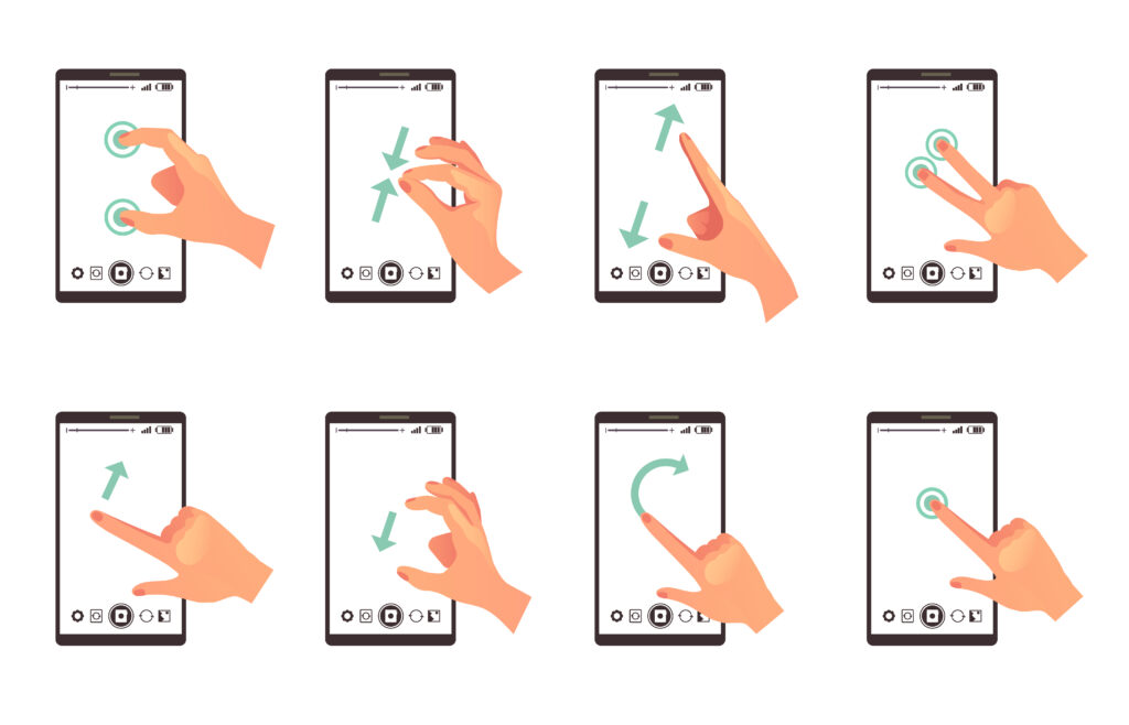
Advanced Gesture Navigation
Swipe Gestures (implementing carefully to avoid conflicts):
Gesture Dictionary:
├─ Swipe Right: Back/Previous
├─ Swipe Left: Forward/Next
├─ Swipe Down: Refresh/Close
├─ Swipe Up: More options/Share
├─ Long Press: Context menu
└─ Pinch: Zoom (image/map content)
Critical Rule: Never use gestures as the only method—always provide visible affordances for discoverability.
Tinder’s swipe mechanic works because:
- Visual affordances (cards appear draggable)
- Tutorial animation on first use
- Visible buttons as backup method
- Immediate visual feedback during swipe
Navigation Performance Optimization
Impact on Retention: Research shows navigation friction causes 40% of Day 1 abandonment.
Performance Targets:
- Navigation response time: < 100ms (perceived as instant)
- Screen transition duration: 250-350ms (natural, not sluggish)
- Touch target size: Minimum 44x44pt (iOS) / 48x48dp (Android)
- Touch target spacing: Minimum 8pt/dp between interactive elements
Accessibility Considerations:
- Voice Control: All navigation accessible via voice commands
- Screen Reader: Descriptive labels for all navigation elements
- High Contrast: 4.5:1 contrast ratio minimum (WCAG AA)
- Larger Touch Targets: Option for 60x60pt touch targets
Measuring Navigation Success
Key Metrics:
- Navigation Completion Rate: % of users reaching target destination
- Average Taps to Goal: Benchmark 2-3 taps for primary functions
- Navigation Abandonment: % who start navigation but quit
- Time to Task Completion: Compare against industry benchmarks
Tools for Analysis:
- Heatmap analysis (identify hot/cold navigation zones)
- Session replay (observe actual navigation patterns)
- Funnel analysis (identify drop-off points)
- A/B testing (compare navigation structures)
Design Pattern #4: Micro-Interaction Feedback Systems
Impact Data: Subtle animations and feedback increase perceived app performance by 30-40% and directly impact the 28.29% Day 1 retention rate that determines app survival.
The Psychology of Micro-Interactions
Users need constant reassurance that their actions have consequences. Without immediate feedback:
- Perceived lag: Users believe the app froze, triggering frustration
- Uncertainty: Users repeat actions, causing unintended consequences
- Abandonment: 77% of users abandon apps within 3 days if UX feels broken
Micro-interactions bridge the gap between action and system response, creating perceived performance even when actual processing takes time.
The Four Components of Micro-Interactions
1. Trigger (What initiates the interaction):
- User-initiated: Button tap, swipe, type
- System-initiated: Notification received, process complete, error occurred
2. Rules (What happens when triggered):
- Define the interaction logic
- Determine conditions and constraints
- Establish priorities when multiple triggers occur
3. Feedback (How users know it happened):
- Visual: Animation, color change, movement
- Auditory: Subtle sound effects (optional, respectful)
- Haptic: Vibration patterns (iOS Taptic Engine, Android Haptics)
4. Loops & Modes (What happens after):
- Does it repeat? (refresh animation loops until complete)
- Does state change? (toggle button changes appearance)
- What’s the exit condition? (loading completes)
Essential Micro-Interactions for 2026
Button State Feedback:
css
Button Interaction Lifecycle:

Normal State:
- Background: Primary color (#1976D2)
- Shadow: 2dp elevation
- Scale: 100%
- Duration: Static

Pressed State (0-100ms):
- Background: Darker primary (#1565C0)
- Shadow: 0dp elevation (flatten)
- Scale: 98%
- Duration: Instant

Release State (100-250ms):
- Background: Return to primary
- Shadow: Animate to 2dp
- Scale: Return to 100%
- Duration: 150ms ease-out
- Optional: Success ripple effect
Pull-to-Refresh Pattern:
Twitter’s implementation is masterclass:
- 0-40px drag: Spinner scales from 0-100%, no rotation
- 40-80px drag: Spinner rotates slowly (creating tension)
- 80px+ drag: Release threshold met, spinner accelerates
- Release: Content refreshes, spinner completes rotation
- New content: Slide-in animation from top
Loading State Hierarchy:
Loading Feedback Progression:

Instant (< 100ms):
└─ No indicator needed (feels instant)

Short (100-1000ms):
├─ Inline spinner for specific element
└─ Disable interaction (prevent double-tap)

Medium (1-3 seconds):
├─ Skeleton screens (content placeholders)
├─ Progress indicator (determinate if possible)
└─ Keep UI responsive (allow cancellation)

Long (3+ seconds):
├─ Full screen loading state
├─ Progress percentage display
├─ Entertaining animation or messaging
└─ Clear cancel/back option
Skeleton Screens: The 2026 Standard
Replace generic spinners with skeleton screens that:
- Reduce perceived loading time by 25-30%
- Provide spatial context (users see layout forming)
- Create anticipation rather than frustration
Implementation Specifications:
Skeleton Screen Design:

Background: #F0F0F0 (light mode) / #2A2A2A (dark mode)
Shimmer: Linear gradient sweep
- Colors: Background → #E0E0E0 → Background
- Animation: 1.5s infinite ease-in-out
- Direction: -45° diagonal

Shapes:
- Text lines: 12pt height, 90% width (first line), 60% width (last line)
- Images: Aspect ratio matches final image, rounded corners
- Buttons: Full button shape, no shimmer (static)

Spacing: Match final content spacing exactly
LinkedIn Feed skeleton screens load perception studies show 60% faster perceived load time despite identical actual load times.
Success/Error State Feedback
Success Patterns:
Success Feedback Hierarchy:

Level 1 - Inline:
- Checkmark icon (16x16pt)
- Green accent color (#4CAF50)
- 200ms scale animation (80% → 100%)
- Auto-dismiss after 2 seconds

Level 2 - Snackbar:
- Bottom-anchored message
- 4-second duration (readable time)
- Optional action button
- Swipe-to-dismiss enabled

Level 3 - Modal:
- Center screen (important actions only)
- Illustration or icon
- Clear message
- Primary action button
Error Patterns (fail gracefully):
Error Recovery Flow:

1. Detect Error:
   └─ Log error details (for debugging)

2. User Feedback:
   ├─ Clear, non-technical message
   ├─ Red accent color (#F44336)
   ├─ Vibration: Error pattern (if appropriate)
   └─ Icon: Alert triangle

3. Recovery Options:
   ├─ "Try Again" button (primary)
   ├─ "Cancel" or alternative path
   └─ "Learn More" (link to help/support)

4. Prevent Future:
   └─ Cache user input (never lose typed data)
Haptic Feedback Implementation
iOS Haptic Patterns:
swift
// Success feedback
UINotificationFeedbackGenerator().notificationOccurred(.success)

// Light impact (button tap)
UIImpactFeedbackGenerator(style: .light).impactOccurred()

// Selection change (picker/toggle)
UISelectionFeedbackGenerator().selectionChanged()
Android Haptic Patterns:
kotlin
// Short vibration (button)
view.performHapticFeedback(HapticFeedbackConstants.CLICK)

// Long press confirmation
view.performHapticFeedback(HapticFeedbackConstants.LONG_PRESS)

// Keyboard typing feel
view.performHapticFeedback(HapticFeedbackConstants.KEYBOARD_TAP)
Usage Guidelines:
- Never overuse: Reserve for meaningful actions only
- Respect settings: Honor system haptic preferences
- Battery conscious: Haptics drain battery—use judiciously
- Accessibility: Some users disable haptics—never rely solely on vibration
Measuring Micro-Interaction Impact
Key Performance Indicators:
- Perceived Performance: User surveys rating app “speed” (qualitative)
- Tap-to-Response Time: Measure feedback latency (< 100ms target)
- Error Recovery Rate: % of users who retry after errors
- Completion Rate: Impact on task completion by interaction quality
A/B Testing Framework:
- Control: Generic spinners, no haptics, instant state changes
- Variant A: Skeleton screens, haptic feedback, animated transitions
- Variant B: Advanced animations, sound effects, delightful extras
Track retention and engagement differences across groups.
Design Pattern #5: Context-Aware Dark Mode & Accessibility
Impact Data: 73% of users prefer dark mode for extended use, while accessible design reaches 15%+ of global population with disabilities who show 35% higher engagement when included.
The Dark Mode Mandate for 2026
Dark mode isn’t just aesthetic preference—it’s functional necessity:
Battery Impact:
- OLED screens: Dark mode saves 20-40% battery (pixels turn off)
- LCD screens: Dark mode saves 7-10% battery (reduced backlight)
- User expectation: 73% consider dark mode essential, not optional
Health Benefits:
- Reduces eye strain during extended use (particularly evening hours)
- Supports circadian rhythm (blue light reduction)
- Improves focus for ADHD users (reduced visual noise)
Usage Patterns:
- 68% of users enable auto dark mode (sunset-to-sunrise)
- 22% use dark mode exclusively (always-on preference)
- 10% prefer light mode (readability, outdoor visibility)
Implementing Adaptive Dark Mode
Beyond Simple Inversion:
The mistake: Simply inverting colors creates illegible text and violates brand guidelines.
The solution: Purpose-designed dark mode color palette.
Color System Architecture:
Semantic Color Tokens:

Light Mode:
├─ Background: #FFFFFF (white)
├─ Surface: #F5F5F5 (near-white)
├─ Primary: #1976D2 (vibrant blue)
├─ Text Primary: #000000 (black, 87% opacity)
├─ Text Secondary: #000000 (black, 60% opacity)
└─ Text Disabled: #000000 (black, 38% opacity)

Dark Mode:
├─ Background: #121212 (true black causes smearing)
├─ Surface: #1E1E1E (elevated surfaces)
├─ Primary: #64B5F6 (lighter blue, increased luminance)
├─ Text Primary: #FFFFFF (white, 87% opacity)
├─ Text Secondary: #FFFFFF (white, 60% opacity)
└─ Text Disabled: #FFFFFF (white, 38% opacity)

Elevation in Dark Mode (Material Design):
├─ Base (0dp): #121212
├─ Level 1 (1dp): #1E1E1E
├─ Level 2 (4dp): #232323
├─ Level 3 (8dp): #252525
└─ Level 4 (16dp): #272727
Critical Rules:
- Never true black (#000000): Causes OLED smearing, harsh contrast
- Reduce luminance contrast: 87% opacity prevents eye strain
- Increase primary color brightness: Maintain 4.5:1 contrast ratio
- Preserve elevation: Use lighter shades, not shadows
Context-Aware Mode Switching:
Intelligent Dark Mode Logic:

1. System Preference (Baseline):
   └─ Match iOS/Android system setting

2. Time-Based Override:
   ├─ Sunset to sunrise: Auto dark mode
   ├─ User location-aware (timezone)
   └─ Manual override always respected

3. Content-Based Adaptation:
   ├─ Photo viewing: Temporary dark UI
   ├─ Reading mode: User preference honored
   └─ Video playback: Always dark chrome

4. Ambient Light Detection:
   └─ iOS: UIScreen.brightness
   └─ Android: Light sensor API
   └─ Threshold: < 30 lux suggests dark mode
Universal Accessibility Standards
The Business Case: The Purple Pound (UK accessibility market) is worth £274 billion annually. Accessible design isn’t charity—it’s capturing untapped market share.
Web Content Accessibility Guidelines (WCAG) 2.1 AA compliance is legally required in many jurisdictions and represents best practice for 2026:
Color Contrast Requirements:
WCAG AA Standards:

Normal Text (< 24px):
- Minimum contrast: 4.5:1
- Example: #767676 on #FFFFFF ✅
- Example: #999999 on #FFFFFF ❌

Large Text (≥ 24px or bold 19px):
- Minimum contrast: 3:1
- Example: #949494 on #FFFFFF ✅

Interactive Elements (buttons, form fields):
- Minimum contrast: 3:1 against background
- Focus indicators: 3:1 contrast, 2px minimum

Verification Tools:
- WebAIM Contrast Checker
- Stark (Figma plugin)
- Color Oracle (simulator)
Touch Target Sizing:
The data: 40% of users are 55+ by 2026 (aging population), with decreased fine motor control.
Minimum Requirements:
Touch Target Standards:

Apple iOS HIG:
- Minimum: 44 x 44 points
- Recommended: 48 x 48 points
- Spacing: 8pt minimum between targets

Android Material Design:
- Minimum: 48 x 48 dp
- Recommended: 56 x 56 dp
- Spacing: 8dp minimum between targets

Elderly Users (Optional Large Mode):
- Enlarged: 60 x 60 points/dp
- Spacing: 16pt/dp between targets

Implementation:
- Use transparent padding to expand touch area
- Ensure parent container doesn't clip touch area
- Test with Accessibility Inspector (iOS) / Layout Inspector (Android)
Screen Reader Optimization:
VoiceOver (iOS) and TalkBack (Android) usage is growing:
- 7% of smartphone users rely on screen readers
- 20% of 65+ users use voice assistance regularly
Implementation Checklist:
Accessibility Labels:

❌ Bad: Button label ">" (meaningless to screen reader)
✅ Good: Button label "Next Page" with semantic meaning

❌ Bad: Image with no alt text (announces filename)
✅ Good: Image alt "Woman wearing blue dress standing on beach"

❌ Bad: Custom icon button with no label
✅ Good: accessibilityLabel="Search" + accessibilityHint="Opens search screen"

❌ Bad: Decorative icons announced to screen reader
✅ Good: accessibilityElementsHidden=true for decorative elements

Testing:
- Enable VoiceOver: Settings > Accessibility > VoiceOver
- Enable TalkBack: Settings > Accessibility > TalkBack
- Navigate entire app using only screen reader
- Verify all interactive elements are reachable
- Ensure logical reading order (top-to-bottom, left-to-right)
Reduce Motion Accessibility:
Vestibular disorders affect 35% of adults 40+, causing motion sickness from animations.
iOS/Android respect system preferences:
swift
// iOS - Detect reduce motion preference
let reduceMotionEnabled = UIAccessibility.isReduceMotionEnabled

if reduceMotionEnabled {
    // Use crossfade instead of slide animation
    view.alpha = 0
    UIView.animate(withDuration: 0.2) {
        view.alpha = 1
    }
} else {
    // Use full animation
    UIView.animate(withDuration: 0.3, delay: 0,
                   usingSpringWithDamping: 0.8,
                   initialSpringVelocity: 0) {
        // Full animation
    }
}
Animation Hierarchy for Reduce Motion:
- Keep: Opacity fades, scale changes (subtle)
- Simplify: Replace slides with fades, reduce duration
- Remove: Parallax effects, complex transforms, decorative animations
Inclusive Design Benefits
Retention Impact: Accessible apps see:
- 15-25% higher retention among 65+ demographic
- 35% more engagement from users with disabilities
- 10-15% overall retention lift from improved usability
Market Expansion:
- 1 billion people worldwide have disabilities (WHO)
- 15% of global population benefits from accessibility features
- 100% of users benefit occasionally (temporary impairments, situational limitations)
Design Pattern #6: Intelligent Empty States & Error Recovery
Impact Data: Well-designed empty states increase user activation by 30-40%, while graceful error recovery prevents 60% of potential abandonment during failures.
The Empty State Opportunity
Empty states occur when:
- First-time users: No data generated yet (blank canvas)
- Completed tasks: All items cleared (inbox zero)
- Filtered results: No matches found (search returned nothing)
- Network failures: Content unavailable (offline mode)
Most apps fail here: Generic “No items” message with no guidance equals instant abandonment.
Empty State Design Framework
The 4-Part Empty State Anatomy:
Effective Empty State Structure:

┌─────────────────────────────────────┐
│                                     │
│        [ILLUSTRATION/ICON]          │ ← Visual (not decorative, meaningful)
│             200x200pt                │
│                                     │
│    Clear Headline (24pt Bold)       │ ← Explains the situation
│                                     │
│   Brief explanation of why empty    │ ← Context (17pt Regular)
│   and what it means for the user    │
│                                     │
│    [Primary Call-to-Action]         │ ← Clear next step
│                                     │
│    [Secondary Link (Optional)]      │ ← Alternative action
│                                     │
└─────────────────────────────────────┘

Specifications:
- Center-aligned content
- Maximum width: 327pt (leaves 24pt margins)
- Vertical centering (visually balanced)
- Illustration style matches brand
- CTA uses primary button style
Category-Specific Patterns:
1. First-Run Empty State (New Users):
Example: Task Management App

Illustration: Friendly character holding checklist
Headline: "Let's Get Started!"
Body: "Create your first task and start organizing your day."

Primary CTA: [+ Create Task]
Secondary: [Import from Calendar]

Result: 40% higher activation vs. blank screen
2. Success Empty State (User Accomplished Goal):
Example: Email App - Inbox Zero

Illustration: Trophy or celebration graphic
Headline: "You're All Caught Up!"
Body: "No new messages. Time for a coffee break ☕"

Primary CTA: [Compose New Message]
Secondary: [View Archive]

Psychological Impact: Positive reinforcement, dopamine hit
3. No Results Empty State (Search/Filter Found Nothing):
Example: E-commerce Search

Illustration: Magnifying glass with question mark
Headline: "No Results for 'red sneakers'"
Body: "Try adjusting your search or browse our featured shoes."

Primary CTA: [Clear Filters]
Secondary: [Browse All Shoes]

Critical: Never dead-end the user—always provide escape path
4. Error/Offline Empty State (Technical Failure):
Example: News Feed During Network Failure

Illustration: Disconnected cable (not angry red X)
Headline: "Connection Lost"
Body: "Check your network and pull to refresh."

Primary CTA: [Try Again]
Secondary: [View Cached Articles]

Technical: Implement offline mode, cache last-loaded content
Error Recovery Patterns for 2026
The Stakes: 88% of users abandon apps after one bad experience. Error handling quality directly determines whether users churn or persist.
Error Recovery Hierarchy:
Level 1: Preventive Design (Stop errors before they occur)
Preventive Patterns:

Input Validation:
- Real-time feedback (not just on submit)
- Inline error messages (next to field)
- Constructive suggestions (not just "invalid")

Example: Email Field
❌ Bad: "Invalid email" (unhelpful)
✅ Good: "Email should include @ symbol. Did you mean john@gmail.com?"

File Upload:
- Show size/format requirements upfront
- Preview before upload
- Progress indicator with cancel option
Level 2: Graceful Degradation (Fail partially, not completely)
Degradation Strategy:

Full Failure (Worst):
└─ Entire app crashes → 100% abandonment

Partial Failure (Better):
├─ Feature A fails → Show error for A
├─ Feature B works → Display B normally
└─ User can still navigate → Escape path exists

Example: Social Media Feed
- If "Following" feed fails → Show "Explore" feed instead
- If images fail to load → Show text content with placeholder
- If posting fails → Save draft automatically, retry in background
Level 3: Transparent Communication (Honest, helpful error messages)
Error Message Formula:

[WHAT HAPPENED] + [WHY] + [WHAT TO DO]

❌ Bad: "Error 503"
❌ Less Bad: "Server error. Try again later."
✅ Good: "Our servers are overloaded right now. We've saved your message and will send it automatically when we're back (usually within 5 minutes)."

Technical Detail Level:
- Consumer Apps: No error codes, simple language
- Developer Tools: Include error codes, technical details
- Enterprise Apps: Error codes + simple explanation
Level 4: Automated Recovery (Fix problems behind the scenes)
Auto-Recovery Strategies:

Network Failures:
├─ Retry with exponential backoff
│  └─ Attempt 1: Immediate
│  └─ Attempt 2: +2 seconds
│  └─ Attempt 3: +5 seconds
├─ Queue failed requests (send when online)
└─ Background sync when connection restored

Form Submission:
├─ Auto-save draft every 30 seconds
├─ Restore from draft after crash
└─ Preserve data across app kills

Payment Failures:
├─ Store payment details (with consent)
├─ Retry with different payment method
└─ Email receipt after delayed success
Loading States as Empty State Variants
The middle ground between empty and filled:
Skeleton Screens (covered in Pattern #4):
- Show layout structure while loading
- 25-30% faster perceived load time
- Reduce anxiety about what’s coming
Progressive Loading:
Multi-Stage Content Loading:

Stage 1 (0-100ms): Show skeleton
Stage 2 (100-500ms): Load critical content (text, structure)
Stage 3 (500-2000ms): Load images (progressive JPEG)
Stage 4 (2000ms+): Load non-critical (ads, analytics)

Priority Queue:
1. Above-the-fold content (immediate)
2. User-generated content (high priority)
3. Images (medium priority, lazy-load)
4. Ads (low priority, async)
Measuring Empty State Effectiveness
Key Metrics:
- Activation Rate: % of users who take empty state CTA
- Baseline: 10-15%
- Good: 25-35%
- Excellent: 40-50%
- Time-to-First-Action: How long until user acts
- Target: < 30 seconds from viewing empty state
- Red flag: > 2 minutes (confusion indicator)
- Abandonment After Empty State: % who close app
- Baseline: 40-50%
- Good: 20-30%
- Excellent: < 15%
- Error Recovery Success Rate: % who retry after error
- Baseline: 30-40%
- Good: 50-60%
- Excellent: 70%+
A/B Testing Framework:
- Control: Generic “No items” message
- Variant A: Illustrated empty state with CTA
- Variant B: Personalized empty state with multiple CTAs
- Variant C: Gamified empty state with progress incentive
Compare activation rates and subsequent retention.
Design Pattern #7: Frictionless Authentication & Security
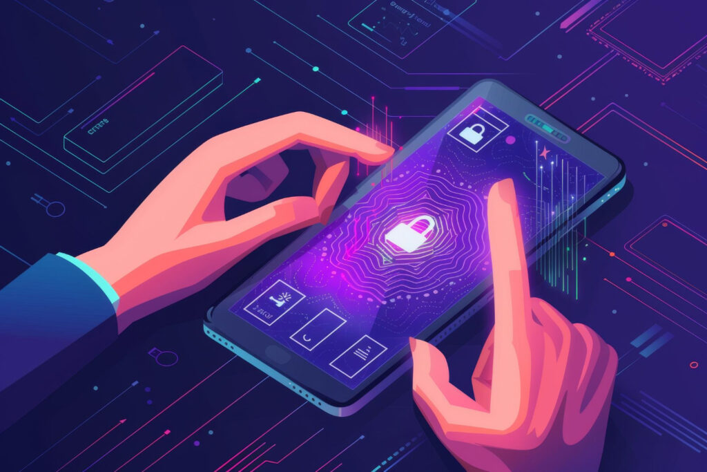
Impact Data: Passwordless authentication improves conversion by 30-50%, while biometric auth sees 4× higher adoption than traditional passwords among users 18-34.
The Authentication Paradox
Security requirement conflicts with user experience:
- Average user has 100+ online accounts (password fatigue)
- 52% of users abandon signup during complex registration
- 30% of users forget passwords within 90 days
- Account takeover costs businesses $11 billion annually
The 2026 solution: Zero-trust, low-friction authentication.
Passwordless Authentication Patterns
Face ID / Touch ID / Biometric:
Adoption Statistics:
- 73% of iOS users use Face ID as primary auth
- 67% of Android users use fingerprint
- 4× higher completion rates vs. password entry
- 95% faster login (1.2 seconds vs. 28 seconds average password entry)
Implementation Best Practices:
swift
// iOS Biometric Authentication

import LocalAuthentication

func authenticateUser() {
    let context = LAContext()
    var error: NSError?

    // Check if biometric is available
    if context.canEvaluatePolicy(.deviceOwnerAuthenticationWithBiometrics,
                                 error: &error) {
        let reason = "Unlock your account securely"

        context.evaluatePolicy(.deviceOwnerAuthenticationWithBiometrics,
                              localizedReason: reason) { success, error in
            if success {
                // Authentication successful
                DispatchQueue.main.async {
                    self.loginUser()
                }
            } else {
                // Fall back to password
                self.showPasswordLogin()
            }
        }
    } else {
        // Biometric not available, show password
        showPasswordLogin()
    }
}
Critical UX Details:
- Clear messaging: “Use Face ID to sign in quickly and securely”
- Fallback option: Always provide password alternative
- First-time setup: Explain benefits during onboarding
- Privacy assurance: Clarify biometric data stays on-device
Passkey (WebAuthn) Implementation:
The future of authentication: Passkeys replace passwords entirely with cryptographic key pairs.
User Benefits:
- Zero-click sign-in (presence detection)
- Phishing-proof (domain-bound keys)
- Sync across devices (via iCloud Keychain, Google Password Manager)
- No password to forget (cryptographic, not memorable)
Implementation Checklist:
Passkey Integration:

Backend Requirements:
☑ WebAuthn server library (Duo, Auth0, etc.)
☑ HTTPS endpoint (required for security)
☑ User credential storage (encrypted)

Frontend Requirements:
☑ Browser API integration (navigator.credentials)
☑ Native iOS/Android support (ASAuthorizationController)
☑ Fallback for unsupported devices

UX Flow:
1. User taps "Sign In"
2. System prompt: "Sign in with passkey for [your-app]"
3. Face ID / Touch ID confirmation
4. Instant authentication (< 2 seconds)

No passwords. No SMS codes. No friction.
Sign In with Apple / Google One Tap:
Data: 64% of users prefer social sign-in vs. creating new accounts.
Benefits:
- One-tap sign-up: Pre-filled name, email, profile
- Privacy-focused: Apple relay hides real email
- Cross-device: Works on iOS, Android, web
- Trust signals: Leverages existing platform trust
Implementation:
Apple Sign In Button Standards:

Size: Minimum 140 x 40 pt
Corner Radius: 8pt (matches Apple style)
Logo: Apple logo + "Sign in with Apple" (system font)
Colors:
- Black (default)
- White (on colored backgrounds)
- White with border (on light backgrounds)

Placement:
- Primary position above "Create Account"
- Alternative to email/password, not buried
- Minimum 16pt spacing from other sign-in options

Privacy Policy:
- Link to privacy policy near button
- Explain data usage clearly
- Honor "Hide My Email" if user selects it
Multi-Factor Authentication (MFA) UX
The Balance: Security vs. friction.
Statistics:
- MFA reduces account takeover by 99.9% (Microsoft data)
- Traditional SMS 2FA has 40% abandonment during setup
- App-based authenticators have 25% abandonment
- Biometric 2FA has 8% abandonment (clear winner)
2026 MFA Hierarchy (ranked by UX):
MFA Methods (Best to Worst UX):

1. Biometric Second Factor ⭐⭐⭐⭐⭐
   - Face ID / Touch ID confirmation
   - Zero user input required
   - Example: Banking app secondary authorization

2. Push Notification Approval ⭐⭐⭐⭐
   - Notification with "Approve/Deny" buttons
   - Requires user attention but minimal effort
   - Example: Duo Mobile, Auth0 Guardian

3. Time-Based One-Time Password (TOTP) ⭐⭐⭐
   - Authenticator app (Google Authenticator, Authy)
   - User copies 6-digit code
   - Works offline (unlike SMS)

4. SMS Code (Deprecated) ⭐⭐
   - Vulnerable to SIM swapping
   - Network dependent (fails abroad)
   - Annoying wait for message

5. Email Code (Worst UX) ⭐
   - Requires email app switch
   - Often delayed delivery
   - High abandonment rate
Adaptive MFA: Risk-based authentication adjusts friction:
Risk-Based MFA Logic:

Low Risk (No MFA):
├─ Known device (registered previously)
├─ Recognized location (home/work IP)
├─ Typical behavior patterns
└─ Recent authentication (< 12 hours)

Medium Risk (Soft MFA):
├─ New device, known location
├─ Unusual time (middle of night)
├─ Push notification approval required
└─ Grace period: 30 days before mandatory

High Risk (Hard MFA):
├─ New device + new location
├─ Impossible travel (USA → Russia in 1 hour)
├─ Multiple failed attempts detected
├─ Biometric + code required
└─ Account temporarily locked after 3 failures

Implementation:
- Device fingerprinting (canvas, WebGL, fonts)
- IP geolocation (MaxMind, IPinfo)
- Behavioral analysis (typing patterns, mouse movement)
- Risk score calculation (0-100)
Privacy-First Security Communication
Trust Signals That Convert:
Users care about privacy but rarely read privacy policies. Visual trust signals communicate security without friction:
Security Badge Placement:
Login Screen Trust Elements:

┌────────────────────────────────┐
│   [App Logo]                   │
│                                │
│   Email: ________________      │
│   Password: __________  👁️    │
│                                │
│   [Sign In Button]             │
│                                │
│   🔒 256-bit encryption        │ ← Security badge
│   ✓ Biometric protection       │ ← Trust signal
│   📱 Works on all your devices │ ← Convenience
│                                │
│   [Privacy Policy] [Terms]     │
└────────────────────────────────┘

Specifications:
- Icons: 16x16pt, subtle color
- Text: 13pt system font, secondary text color
- Spacing: 8pt between trust signals
- Position: Between CTA and footer links
Privacy Policy UX:
Traditional approach (0.01% read rate):
- 5,000-word legal document
- Buried in settings
- Last updated: Never
2026 approach (20% engagement rate):
Layered Privacy Explanation:

Level 1 - Just-in-Time (In-context):
"We need your location to show nearby restaurants."
[Allow Once] [Allow Always] [Don't Allow]

Level 2 - Summary (During onboarding):
"📍 Location: Find services near you
📧 Email: Send order confirmations
🔔 Notifications: Alert you about deliveries"
[Full Privacy Policy →]

Level 3 - Detailed (Optional):
Standard legal privacy policy
But: Plain language summary at top
Interactive: Toggle sections, search

Level 4 - Control Center:
Granular privacy controls:
☑ Location access
☑ Photo library access
☐ Advertising personalization
☑ Analytics
Measuring Auth UX Success
Conversion Funnel:
Authentication Metrics:

Sign-Up Funnel:
├─ 100% Land on sign-up screen
├─ 75% Start form (25% abandon immediately)
├─ 60% Complete form (15% abandon during)
├─ 52% Verify email (8% abandon at verification)
└─ 48% Complete onboarding (8% abandon after signup)

Industry Benchmarks:
- E-commerce: 35-45% completion
- Social: 50-60% completion
- Finance: 25-35% completion (more complex)
- Games: 60-70% completion (simplest)

Optimization Targets:
└─ Increase to 55-65% through passwordless, social sign-in
Key Performance Indicators:
- Time-to-Authentication: Target < 30 seconds
- Sign-Up Completion Rate: Target 50-60%
- Biometric Adoption Rate: Target 70%+
- MFA Abandonment Rate: Target < 10%
- Account Takeover Rate: Target < 0.1%
Security vs. UX Balance:
- Monitor both metrics simultaneously
- Never sacrifice security for convenience
- Use adaptive authentication (add friction only when needed)
- Celebrate security milestones (“Account secured with Face ID ✓”)
Implementing the 7 Patterns: Strategic Roadmap
Now that we’ve covered the seven patterns individually, let’s discuss strategic implementation.
Prioritization Framework
Not all patterns have equal impact. Prioritize based on:
1. Current Retention Challenges (Fix biggest pain points first)
Priority Assessment:

If Day 1 Retention < 20%:
└─ Focus: Pattern #1 (Progressive Onboarding)

If Day 7 Retention < 15%:
└─ Focus: Pattern #2 (Personalization) + Pattern #4 (Micro-interactions)

If Day 30 Retention < 5%:
└─ Focus: Pattern #6 (Empty States) + Pattern #2 (Personalization)

If Authentication Abandonment > 40%:
└─ Focus: Pattern #7 (Frictionless Auth)

If Accessibility Complaints:
└─ Focus: Pattern #5 (Dark Mode + A11y)
2. Implementation Complexity (Quick wins first)
Complexity Matrix:

Quick Wins (1-2 weeks):
├─ Pattern #3: Bottom navigation (design change)
├─ Pattern #5: Basic dark mode (color tokens)
└─ Pattern #7: Social sign-in integration

Medium Effort (4-6 weeks):
├─ Pattern #1: Progressive onboarding (flow redesign)
├─ Pattern #4: Micro-interactions (animation system)
└─ Pattern #6: Empty state design (content + illustration)

Long-Term (8-12 weeks):
├─ Pattern #2: AI personalization (ML models)
├─ Pattern #5: Full accessibility (testing + remediation)
└─ Pattern #7: Passkey implementation (backend + frontend)
3. Impact Potential (ROI estimation)
Based on research data:
Estimated Retention Impact:

Pattern #1 (Progressive Onboarding):
└─ Impact: +15-25% Day 1 retention
└─ Priority: 🔥🔥🔥🔥🔥 (Critical)

Pattern #2 (Personalization):
└─ Impact: +20-30% Day 30 retention
└─ Priority: 🔥🔥🔥🔥🔥 (Critical)

Pattern #3 (Gesture Navigation):
└─ Impact: +10-15% task completion
└─ Priority: 🔥🔥🔥🔥 (High)

Pattern #4 (Micro-interactions):
└─ Impact: +30-40% perceived performance
└─ Priority: 🔥🔥🔥🔥 (High)

Pattern #5 (Dark Mode + A11y):
└─ Impact: +15-25% for specific demographics
└─ Priority: 🔥🔥🔥 (Medium - but legally required)

Pattern #6 (Empty States):
└─ Impact: +30-40% activation rate
└─ Priority: 🔥🔥🔥🔥 (High)

Pattern #7 (Frictionless Auth):
└─ Impact: +30-50% signup completion
└─ Priority: 🔥🔥🔥🔥🔥 (Critical)
90-Day Implementation Plan
Phase 1: Foundation (Weeks 1-4)
Focus: Quick wins + measurement infrastructure

Week 1-2:
☑ Implement analytics tracking (Amplitude, Mixpanel)
☑ Set up retention cohorts (Day 1, 7, 30)
☑ Baseline current metrics
☑ Conduct user interviews (5-10 users)
☑ Identify top 3 friction points

Week 3-4:
☑ Design bottom navigation (Pattern #3)
☑ Implement basic dark mode (Pattern #5)
☑ Add social sign-in (Pattern #7)
☑ Deploy to 10% of users (A/B test)
☑ Measure impact on key metrics
Phase 2: Core Improvements (Weeks 5-8)
Focus: Onboarding + personalization

Week 5-6:
☑ Redesign onboarding flow (Pattern #1)
☑ Implement progressive disclosure
☑ Add empty state designs (Pattern #6)
☑ Create micro-interaction system (Pattern #4)

Week 7-8:
☑ Deploy onboarding to 25% of users
☑ Implement basic personalization (Pattern #2)
☑ User behavior tracking setup
☑ Content recommendation engine (Phase 1)
☑ Measure Day 1 retention improvement
Phase 3: Advanced Features (Weeks 9-12)
Focus: AI personalization + accessibility

Week 9-10:
☑ ML model training for personalization
☑ Full accessibility audit (Pattern #5)
☑ Implement WCAG AA compliance
☑ Advanced micro-interactions

Week 11-12:
☑ Deploy personalization to 50% of users
☑ Accessibility remediation
☑ Biometric authentication (Pattern #7)
☑ Comprehensive testing
☑ Full rollout to 100% of users
☑ Measure overall retention improvements
Measuring Success: The Retention Dashboard
Build a real-time retention dashboard tracking:
Key Metrics Dashboard:

User Acquisition:
├─ Daily Downloads
├─ Install-to-Open Rate
└─ Attribution Source

Engagement:
├─ DAU (Daily Active Users)
├─ MAU (Monthly Active Users)
├─ DAU/MAU Ratio (Stickiness)
├─ Session Duration
└─ Sessions per User

Retention:
├─ Day 1 Retention (% return next day)
├─ Day 7 Retention (% return by week 1)
├─ Day 30 Retention (% return by month 1)
├─ Day 90 Retention (long-term loyalty)
└─ Churn Rate (% stop using)

Conversion:
├─ Onboarding Completion Rate
├─ Feature Adoption Rate
├─ Time-to-First-Value
└─ Activation Rate

Technical:
├─ Crash Rate (< 0.5% target)
├─ Load Time (< 3 seconds target)
├─ API Error Rate
└─ Memory Usage

Satisfaction:
├─ App Store Rating (4.5+ target)
├─ NPS Score (Net Promoter Score)
├─ Support Ticket Volume
└─ User Sentiment (reviews analysis)
Segment By:
- Acquisition channel (organic, paid, referral)
- User cohort (signup month)
- Device type (iOS vs. Android)
- App version (track regression)
- Geographic region (localization impact)
Common Implementation Pitfalls
Avoid these mistakes that kill retention:
❌ Pitfall #1: Analysis Paralysis Don’t wait for perfect data—implement, measure, iterate.
✅ Solution: Ship Pattern #1 in 2 weeks, measure for 1 week, adjust.
❌ Pitfall #2: Feature Creep Adding every requested feature creates bloated, confusing apps.
✅ Solution: Follow 80/20 rule—focus on features 80% of users need.
❌ Pitfall #3: Ignoring Platform Conventions “Innovative” navigation that breaks iOS/Android patterns confuses users.
✅ Solution: Follow HIG (iOS) and Material Design (Android) guidelines.
❌ Pitfall #4: Premature Optimization Optimizing micro-interactions before fixing core retention is backwards.
✅ Solution: Fix biggest leaks first (onboarding, authentication).
❌ Pitfall #5: No Baseline Measurement Can’t improve what you don’t measure—establish baselines before changes.
✅ Solution: Measure current retention before implementing patterns.
Conclusion: The 5% That Survives
The mobile app landscape in 2026 is Darwinian: 95% of apps fail to retain users beyond one month. The difference between the 5% that thrive and the 95% that die isn’t budget, marketing, or luck—it’s design excellence.
These seven patterns represent the distilled wisdom of thousands of successful apps, billions of user interactions, and rigorous empirical research:
- Progressive Onboarding: Show value before asking commitment
- Personalized Architecture: Make every user feel understood
- Gesture-First Navigation: Optimize for thumb-zone reality
- Micro-Interaction Feedback: Create perceived performance
- Accessible Dark Mode: Design for everyone, everywhere
- Intelligent Empty States: Never leave users stranded
- Frictionless Authentication: Security without suffering
The Data Promise:
If your app currently has:
- 20% Day 1 retention → Implementing these patterns can push to 30-35%
- 10% Day 7 retention → Can improve to 18-22%
- 5% Day 30 retention → Can increase to 9-12%
These improvements compound: A 5 percentage point increase in Day 30 retention translates to:
- 50% more monthly active users
- 2-3× higher lifetime value per user
- 40-60% reduction in customer acquisition cost (through referrals, organic growth)
The Implementation Commitment:
Start today:
- This week: Measure your current retention (baseline)
- Next 2 weeks: Implement Pattern #1 (Progressive Onboarding)
- Weeks 3-4: Add Pattern #7 (Frictionless Auth)
- Month 2: Layer in Pattern #2 (Personalization)
- Month 3: Complete remaining patterns
By 2026, the winners won’t be the apps with the most features—they’ll be the apps that keep users coming back day after day after day.
The question isn’t whether to implement these patterns. The question is: Will you be in the 5% that survives, or the 95% that dies?
Resources & Further Reading
Design Systems & Guidelines
- Apple Human Interface Guidelines
- Material Design (Android)
- Web Content Accessibility Guidelines (WCAG) 2.1
Analytics & Measurement Tools
- Amplitude – Retention cohort analysis
- Mixpanel – Behavioral analytics
- UXCam – Session replay & heatmaps
- Firebase Analytics – Mobile-first analytics
User Research & Testing
- UserTesting – Remote user research
- Maze – Rapid prototype testing
- Hotjar – Behavior analytics
- Lookback – Mobile user research
Design & Prototyping
- Figma – Collaborative design
- Principle – Interaction design
- ProtoPie – Advanced micro-interactions
- Lottie – Animation library
About the Author
Sanjay Dey is a Web Designer, UX/UI Designer, and Digital Marketing Expert focused on building professional brands and generating leads through content marketing. With expertise in mobile UX/UI design and emerging technologies, Sanjay helps businesses create user-centric digital experiences that drive engagement and retention.
Connect with Sanjay: sanjaydey.com
Leave a Reply