Surprising fact: nearly 75% of users judge a brand within seconds based on type and hues, so your first visual choice can win or lose trust fast.
Typography and restrained palettes do more than look nice — they set tone, speed comprehension, and guide action. This guide curates ten proven header/body pairs like Abril Fatface with Lato and Playfair Display with Source Sans Pro, plus palette cues that keep reading comfortable on phones and desktops.
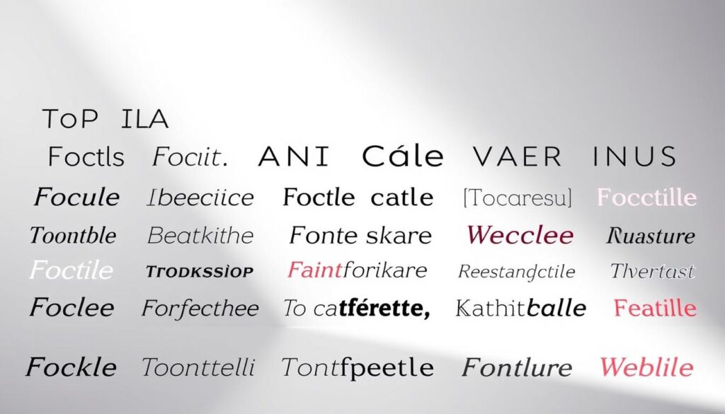
Use no more than three fonts to keep hierarchy clear and performance tight. Favor concord or contrast; avoid conflict. Size, weight, and spacing build hierarchy beyond simple scale changes, and serif or sans-serif can both read well on modern screens.
What you’ll get: tested header/body combos, palette notes, accessibility tips, and simple rules to craft a cohesive brand look that feels confident from the first pixel to the final scroll.
Key Takeaways
- Limit to two core faces and an optional accent to speed decisions and keep consistency.
- Choose pairs available on Google Fonts or Adobe Fonts for easy licensing and setup.
- Apply size, weight, and spacing to build hierarchy, not just font size.
- Prioritize contrast and legibility for comfortable reading on mobile and desktop.
- Use proven combos (e.g., Abril Fatface + Lato) that balance impact with readability.
Hook: First impressions start with typography and color
The moment a visitor lands, type and hue set the stage for everything they expect next. Visual cues work fast. In seconds, users judge tone through type weight, spacing, and color temperature.
Fonts transmit personality and credibility before a single sentence is read. A serif can feel classic; a geometric sans reads crisp and clear. Pair a bold display header with a neutral body font to set hierarchy and voice right away.
Simple, high-contrast palettes boost clarity. Over-styled type or noisy palettes can undercut trust and make text hard to scan.
- Users judge quality in seconds via spacing, weight, and hue.
- Type choices send brand signals that guide reading expectations.
- Strong headlines + quiet body text reduce cognitive load for faster scanning.
- Keep roles clear: headlines attract, subheads organize, body text sustains attention.
What you’ll get next: plug-and-play header/body sets and small rules to adapt to your design goals.
Introduction: Why font and color pairing matters for a professional modern website
Typeface roles and palette restraint work together to guide attention and build trust. Good hierarchy needs distinct roles for headers, subheads, and body text—not just bigger sizes. Serif and sans-serif both read well on high-res screens when spacing and weight are tuned.
Limit your system to two or three faces to keep load times low and the look consistent. Pairing within a superfamily is fine if styles remain clearly distinct.
Why this matters: Typeface and hue choices affect comprehension, brand trust, and conversion. Clear contrast and alignment to brand personality make content easier to scan and act on.
“Clear typographic roles reduce bounce by preventing hard-to-read layouts.”
- Use a strong header for hierarchy, a neutral body for comfort, and one accent for CTAs.
- Keep palettes restrained so rhythm and readability stay consistent across screens.
- Test on mobile and large displays to ensure scale and contrast hold up.
| Role | Suggested traits | Practical tip |
|---|---|---|
| Header | Distinct weight, display presence | Use larger size and tighter tracking for impact |
| Body | Neutral, high legibility | Keep line length and spacing comfortable for reading |
| Accent/CTA | High contrast, vivid accent | Reserve for buttons and links to drive action |
| Palette | Restrained, 2–3 hues | Test contrast with text for accessibility |
Search intent and what you’ll get in this listicle
Here you get concise, actionable sets—each with roles for headlines, subheads, and body text. This section explains what the list offers and how to use it for faster decisions.
Expect ten ready-to-use type and palette pairings that include clear roles, contrast notes, and quick implementation tips. Each example shows why the combo works and when to use it.
Key deliverables:
- Ten curated header/body sets with color cues and role guidance.
- Accessibility notes like contrast checks and the benefits of variable fonts.
- Brand alignment tips so pairings match different personalities and sectors.
- Practical advice to prototype quickly and test on actual devices.
Design rules we follow: use no more than three fonts, favor concord or contrast without conflict, and set sizes and weights to establish hierarchy. These rules make text easier to scan and reduce layout friction.
“Minimal, focused choices beat maximal decoration when your goal is clarity and trust.”
Core principles of great pairing: readability, contrast, and brand alignment
Start by tuning size and spacing—those set real reading comfort, not the face alone. Readability and legibility both matter, but they are not the same.
Readability vs. legibility: sizing, spacing, and comfort on screens
Readability describes how easy it is to scan and understand text as a whole. Legibility refers to how clear individual letters appear.
Line length, line height, and letter spacing drive comfort for body text more than whether you pick a serif or sans. Keep paragraphs short and the measure between 45–75 characters to reduce eye strain.
Concord and contrast, not conflict: building hierarchy without chaos
Use weight and size to create a rhythm: bold headings, medium subheads, and relaxed body weight. This makes headings scan-friendly and paragraphs comfortable.
Contrast can mean mixing a serif header with a sans body or the reverse. Aim for harmony: avoid pairs that compete for attention.
Quick check: avoid decorative faces for long text and confirm minimum contrast ratios for accessibility.
- Map brand needs: classic brands often favor sturdy serifs; cutting-edge brands lean geometric sans with a humanist body.
- Reserve a third accent style sparingly for hero headlines or special promotions.
- Test weights across breakpoints so hierarchy stays consistent on phones and desktops.
| Principle | What to check | Action |
|---|---|---|
| Readability | Line length, line height, paragraph length | Keep 45–75 char measure; 1.4–1.6 line-height for body |
| Contrast | Visual weight and hue contrast | Use distinct weights and check WCAG ratios |
| Brand fit | Voice and sector cues | Match serif/sans tone to branding goals |
| Hierarchy | Size and spacing across breakpoints | Set consistent scales and test responsive weights |
Typography hierarchy that works: establishing roles for headers, subheads, and body
A reliable typographic hierarchy assigns clear roles so readers move from headline to paragraph without friction.
Assign roles. Let headings do the heavy lifting: grab attention and set context. Use subheads to break sections and guide scanning. Reserve body text for sustained reading and longer paragraphs.
Use size, weight, and spacing to establish order. Increase weight for top-level headings, tighten letter spacing slightly for display use, and loosen spacing for body lines so text breathes.
Keep a three-font maximum. Two core fonts cover headings and body. Add an accent display face only when you need drama—hero banners, pull quotes, or a campaign hero. Too many styles dilute clarity.
Superfamilies simplify this. One family can provide condensed headers, wide subheads, and comfortable serifs for body text while staying cohesive.
- Baseline scale: start with a 1.125–1.333 modular scale and test across mobile breakpoints.
- Consistent spacing: set rhythm for headline margins and paragraph blocks to keep flow steady.
- Signal hierarchy with weight and spacing rather than relying on hue alone.
Top 10 font and color pairings with examples and usage tips
Here are ten curated header-and-body sets, each with suggested hues and practical tips. Use these as starting points for headlines, subheads, and body text roles.
Abril Fatface + Lato — charcoal/white base, coral accent
Usage: Abril for bold headlines, Lato for readable body (16px, 400). Great for agencies and creative portfolios.
Micro-tip: Tighten tracking on Abril in all-caps and reserve coral for CTAs.
Playfair Display + Source Sans Pro — navy, ivory, gold
Usage: Display headlines, Source Sans Pro body at 18px for editorial clarity. Suits news and premium brands.
Micro-tip: Use gold sparingly to highlight links and pull quotes.
Montserrat + Merriweather — cool gray with electric blue
Usage: Montserrat headlines, Merriweather body for balance. Works well for SaaS and education sites.
Micro-tip: Use electric blue for buttons; check contrast for accessibility.
Lora + Open Sans — warm neutrals and muted teal
Usage: Lora headlines, Open Sans body. Ideal for blogs and consulting content.
Micro-tip: Lower weight for dense paragraphs to ease long reads.
Merriweather + Roboto — slate, white, emerald CTAs
Usage: Merriweather for headings, Roboto for compact body text. Great for clear, readable websites.
Micro-tip: Use variable weights to tune optical size across breakpoints.
League Spartan + Libre Baskerville — black, alabaster, crimson
Usage: League Spartan headlines, Libre Baskerville body for authority and warmth. Fits agencies and portfolios.
Micro-tip: Add letter spacing on all-caps display for balance.
Bebas Neue + Old Standard TT — monochrome with bronze accents
Usage: Bebas for tall headlines, Old Standard TT for classic body text. Good for advertising and bold promos.
Micro-tip: Reserve bronze for subtle decorative elements.
Oswald + Lato — deep indigo, off-white, tangerine
Usage: Oswald headlines, Lato body. Use this combo for modern authority in product pages.
Micro-tip: Test bold Lato for CTA labels to improve click rates.
PT Serif + Fira Sans — newspaper black, paper white, royal blue
Usage: PT Serif headlines, Fira Sans body for clear reading in news and education.
Micro-tip: Keep line length tight and use royal blue for link emphasis.
Libre Baskerville + Montserrat — graphite, sand, cobalt
Usage: Libre Baskerville headlines, Montserrat body to blend tradition with geometric freshness.
Micro-tip: Use medium weights for body text to avoid high contrast fatigue.
Quick accessibility note: Always verify button and link contrasts with a checker and prefer variable fonts when available to fine-tune weight and optical size across breakpoints.
| Pair | Headline | Body | Industry fit |
|---|---|---|---|
| Abril + Lato | Abril (700) | Lato (16px, 400) | Agencies, portfolios |
| Playfair + Source Sans Pro | Playfair (700) | Source Sans Pro (18px, 400) | Editorial, premium brands |
| Merriweather + Roboto | Merriweather (700) | Roboto (16px, 400) | SaaS, content sites |
Serif and sans serif combos that balance tradition and modernity
A well-chosen serif with a clean sans can signal both authority and approachability at once. Use this mix to combine gravitas and clarity in headings and paragraphs.
When to flip the script: serif for headlines, sans for body
Serif headlines add weight and a formal tone to page headings. They work best when set large and tight, so the shapes read as a statement.
Sans for body keeps long text readable and fast to scan. This setup supports dense paragraphs and long articles without eye strain.
- Choose families with similar x-heights and rhythm to keep proportions steady (example: PT Serif + Fira Sans).
- Use slight letter-spacing for all-caps serif display (0.02–0.04em) to improve legibility in headlines.
- Match optical sizes or use variable families to tune weight across breakpoints.
| Use case | Suggested family example | Tip |
|---|---|---|
| Authority headline + readable body | PT Serif + Fira Sans | Set serif large, sans at 16–18px |
| Warm editorial | Libre Baskerville + Montserrat | Lower body weight for long reads |
| Clean corporate | Merriweather + Roboto | Keep line-height 1.45–1.6 |
Mini checklist: test across mobile sizes, check contrast, scan dense paragraphs, verify headline spacing, and confirm x‑height harmony.
Minimalist palettes with bold accents that enhance typography
A neutral-first palette lets type breathe while a single vivid accent drives action.
Start with muted backgrounds—grays, off-whites, and soft ivories—that spotlight letterforms and keep long blocks of text easy to read.
Map one bold accent (coral, cobalt, or tangerine) to CTAs, key links, and critical UI states. This creates a clear design cue users learn quickly.
Color hierarchy should support typographic hierarchy, not compete with it. Let headlines carry weight with size and weight, and reserve hue for functional emphasis.
Quick accessibility check: test hover and focus states by simulating keyboard navigation and using a contrast checker. Ensure focus outlines remain visible and accents hit WCAG ratios for interactive elements.
Layout rule: use dark-on-light for content-heavy pages for best readability. Flip to light-on-dark only for short hero sections or promos to preserve contrast for long reads.

| Approach | Key use | Quick tip |
|---|---|---|
| Neutral-first | Body text and backgrounds | Use off-white or soft gray to reduce eye strain |
| Single bold accent | CTAs, links, focus states | Limit to one hue and map states consistently |
| Contrast & testing | Hover, focus, and accessibility | Keyboard-test and use a contrast tool before launch |
Monochrome sophistication: grayscale systems that look premium
A grayscale system can read as luxurious when scale, weight, and whitespace do the heavy lifting. Rely on typographic scale to set hierarchy instead of adding hues. Heavier display weights and clear spacing create a refined look without extra accents.
Using weight, size, and spacing to create depth without color
Start with grayscale tokens: use 900 for headings, 700 for subheads, and 800 for body text to keep mood and clarity consistent.
Use bolder headline weights to separate sections and lighter subhead weights to guide scanning. Ample line height (1.45–1.6) and modest letter spacing keep dense text breathable.
- Define a clear display scale so headings carry visual weight without hue.
- Tune underline thickness and focus rings in neutral tones for readable micro-interactions.
- Test on OLED/AMOLED screens to avoid washed-out grays and ensure crisp text edges.
Quick tip: map spacing tokens and weight tokens together so every heading and body text size reads with consistent rhythm across breakpoints.
Psychology of color: choosing hues that support your brand voice
Color choices shape how people feel about your brand in seconds, so pick hues that match your message. The palette you select becomes part of your brand personality and marketing signals.
Map mood to hue: blues suggest trust and dependability, greens signal calm and growth, gold or ivory feel refined, and tangerine conveys energy. Match those tones to the style and voice you want visitors to sense.
Pair hues with complementary fonts and text treatments. For example, Playfair Display works well with gold or ivory for an elegant look. Source Sans Pro pairs cleanly with navy or teal for clear, high-clarity schemes.
- Trust: navy — use for corporate branding and marketing that needs credibility.
- Energy: tangerine — reserve for CTAs and accents to drive action.
- Creativity: teal — good for creative teams and lifestyle sites.
- Calm: muted green — suits wellness and growth-focused brands.
Limit accent hues to preserve typographic hierarchy and reduce visual noise. Always validate contrast ratios for text at all sizes to meet accessibility standards.
| Trait | Hue | Example pairing |
|---|---|---|
| Trust | Navy | Source Sans Pro + navy for clear marketing pages |
| Refinement | Gold/Ivory | Playfair Display + gold for premium editorial style |
| Energy | Tangerine | Sans headline + tangerine accents for lively CTAs |
Choosing fonts for the web: accessibility and responsiveness
Good type choices protect readability and performance across devices. On modern screens, both serif and sans render well when size, weight, and spacing are tuned. Aim for clear text at common reading sizes and avoid tiny headings that force squinting.
WCAG contrast matters. Always verify contrast ratios for body text and headings so people with low vision can read comfortably. Use adequate base sizes (16px+ for body text) and scale up for headings to preserve hierarchy without relying on hue alone.
WCAG contrast, variable fonts, and multilingual character sets
Variable fonts reduce load and increase flexibility. A single variable family can replace multiple static files. That means fewer requests, smoother weight transitions, and easier responsive tuning for weight axes and optical sizes.
Test Open Sans and Source Sans Pro for broad language support. Both families include extended character sets that help UI clarity and multilingual publishing. Subset when needed to trim size and measure LCP and CLS impacts.
“Measure the real cost: test CLS and LCP when adding families and always subset to keep pages fast.”
| Requirement | Recommendation | Why it matters |
|---|---|---|
| Contrast | WCAG AA for body, AAA for large text | Improves readability and inclusion |
| Variable fonts | Use single family with weight axis | Fewer files, responsive weight control |
| Language support | Test Open Sans / Source Sans Pro | Ensures correct glyphs and UI clarity |
| Performance | Subset & preload critical styles | Limits LCP, reduces CLS |
| Responsive scale | 16px body baseline; 45–75 char measure | Comfortable reading on mobile and desktop |
- Set a responsive type scale with clear breakpoints so headings and body text keep consistent rhythm.
- Keep line lengths near 45–75 characters to aid scanning and comprehension.
- Monitor performance and user tests after adding families; tweak subsetting and preload rules as needed.
For practical guidance on broader design rules, see this short primer on core principles: top 10 principles of web design.
Common mistakes to avoid in font pairing and color combination
Common visual errors—low contrast, excessive styles, and tight spacing—break reading flow.
Make sure body text stays readable by keeping contrast high. Low contrast between text and background hurts long reads and link clarity. Run contrast checks for both normal paragraphs and small UI labels.
Avoid loading too many families or weights. Each extra font file slows pages and risks inconsistent rendering. Keep families under three so hierarchy works well and performance stays tight.
Do not mix clashing styles. For example, a rugged gothic and a delicate script will compete. Reserve decorative scripts for accents, not body or long paragraphs.
Keep spacing and weight consistent across headings and body. Under- or over-tight letter spacing reduces legibility. Use size and weight to establish clear roles between headlines and body so readers can scan easily.
- Warn against low contrast for body copy and links.
- Flag overusing weights and styles that dilute hierarchy.
- Caution: reserve decorative scripts for limited accents only.
- Make sure headings and body roles remain distinct and harmonious.
- Watch performance when loading many families and weights.
- Enforce consistent spacing so headlines and paragraphs feel related.

| Mistake | Why it hurts | Fix |
|---|---|---|
| Low contrast | Reduces readability | Use WCAG checks and darker text on light backgrounds |
| Too many styles | Confuses hierarchy | Limit to 2–3 families and subset weights |
| Tight spacing | Harms legibility | Adjust tracking and line-height for body and headings |
Tools and resources to test pairings before launch
Quick checks with live prototypes reveal how sizes, weights, and spacing behave in real use. Build a short prototype with real headlines and paragraphs so typography and scale face real conditions.
Start with a live preview. Use a staging page or a design tool that exports HTML so you can inspect rendering in browsers. Try multiple weights and two or three fonts to find the sweet spot for clarity and tone.
- Rapid prototyping with actual content validates hierarchy and rhythm on desktop and mobile.
- Run color contrast checkers to meet WCAG and to ensure links and buttons read as intended.
- Use screen reader tests and keyboard navigation to confirm text order and focus states.
- Preview across OS and rendering engines to catch subtle family and kerning differences.
- Limit families and subset character ranges to improve load times and performance.
- Gather quick user feedback to confirm headlines are found fast and paragraphs are readable at a glance.
Final pass: iterate on spacing, weight, and scale. Make sure the combo works well across devices and that the selected family renders consistently before you ship.
How to maintain consistency across your ecosystem
Keep brand visuals predictable across touchpoints so users always feel at home.
Establish a single type and token sheet that covers web, email, social, and slide decks. List allowed fonts, sizes, and weights for each role. Document letter spacing defaults and line-height to keep text consistent.
Create a brand kit that includes font files, license notes, and fallback stacks. This makes sure assets load reliably across websites and apps. Store files in a central repo so teams can access approved families and styles.
- Define weights and sizes per role (H1, H2, body, caption).
- Map color and type tokens for UI elements, CTAs, and links.
- Align choices to your brand personality and audience expectations.
- Audit quarterly for drift and remove variants that don’t work well.
Train teams to use the spec. Share examples for social posts, ads, and emails so every channel matches the core design. Regular audits catch accidental changes and keep the identity tight.
| Asset | What to include | Why it matters |
|---|---|---|
| Web pages | Approved families, fallbacks, sizes | Consistent reading experience and load stability |
| Emails & social | Tokenized sizes, allowed weights, image text rules | Maintains recognizability across channels |
| Brand kit | Files, licensing, usage rules | Prevents misuse and legal issues |
| Governance | Audit schedule, owners, change log | Stops drift and keeps updates controlled |
Professional modern website: bringing fonts and colors together in real-world layouts
A clean layout shows how headline style and body text work together on real pages.
Landing page: use a bold display headline (Oswald) for the hero, a tight subhead, and readable body text (Lato or Montserrat) below. Keep paragraphs short and set generous line-height so the message scans fast.
CTA strategy: place a single accent against a neutral canvas. Make sure contrast passes WCAG and the button label reads clearly over the accent.
Blog layout: establish H1 → H2 → H3 scale using the same family system so headings and link styles remain consistent. Body paragraphs should stay near 45–75 characters per line for easy reading.
Components: cards, forms, and footers reuse the same families and weights. This keeps cards legible and footers compact without adding extra families.
Practical tip: tune weights and letter spacing slightly when switching between light and dark sections so the combo continues to work well across styles.
| Layout | Headline | Body | Accent use |
|---|---|---|---|
| Landing hero | Oswald display | Lato / Montserrat | Single bold CTA |
| Article page | Libre Baskerville | Montserrat body | Link underline / small accent |
| Components | Same family system | Consistent weights | Accent for states |
- Design headings to pull attention and let body text carry the detail.
- Keep paragraph blocks short to aid scanning and comprehension.
- Validate contrast and spacing across light and dark sections before launch.
Conclusion
Choose one core pairing and document rules so teams ship consistent pages with no guesswork. Lock two main fonts, allow one accent, and set clear weights and sizes for each role.
Keep palettes minimal and favor concord or measured contrast. This helps readability, preserves contrast, and protects your typography from competing signals.
Record the approved font combinations and font pairings in a simple guide. Note sizes, line-height, and when to use accents so the system scales across email, social, and product pages.
Measure accessibility, responsiveness, and performance before launch. Test contrast ratios, check load times, and gather feedback so the system grows with your brand and personality.
Consistent branding across websites cements recognition. Maintain the rules, run quick audits, and evolve the style only when tests and users support the change.
Leave a Reply