
UX principles determine whether people love or abandon your product. When your interface confuses users or creates friction, they leave—regardless of how well your product solves their problems.
As a designer, you’ve probably watched colleagues chase the latest design trends while overlooking fundamental user needs. I’ve seen this pattern repeatedly: teams invest months perfecting visual details while their users struggle with basic navigation. User experience principles aren’t abstract theories you learn once and forget. They’re practical tools that shape how people interact with what you create.
Here’s what matters: 80% of your users are affected by just 20% of your features. Users expect response times under 400ms when interacting with software. Jakob’s Law tells us that “users prefer your site to work the same way as all the other sites they already know.” These aren’t just statistics—they’re realities that impact every design decision you make.
When you apply effective UX principles consistently, you create products that feel intuitive rather than confusing. When you ignore them, you build barriers between your users and their goals.
This guide covers 10 user experience principles that deliver results. Each principle includes practical implementation steps, real examples, and common mistakes to avoid. No theoretical discussions—just approaches you can apply immediately to improve how users experience your designs.
User-Centered Design
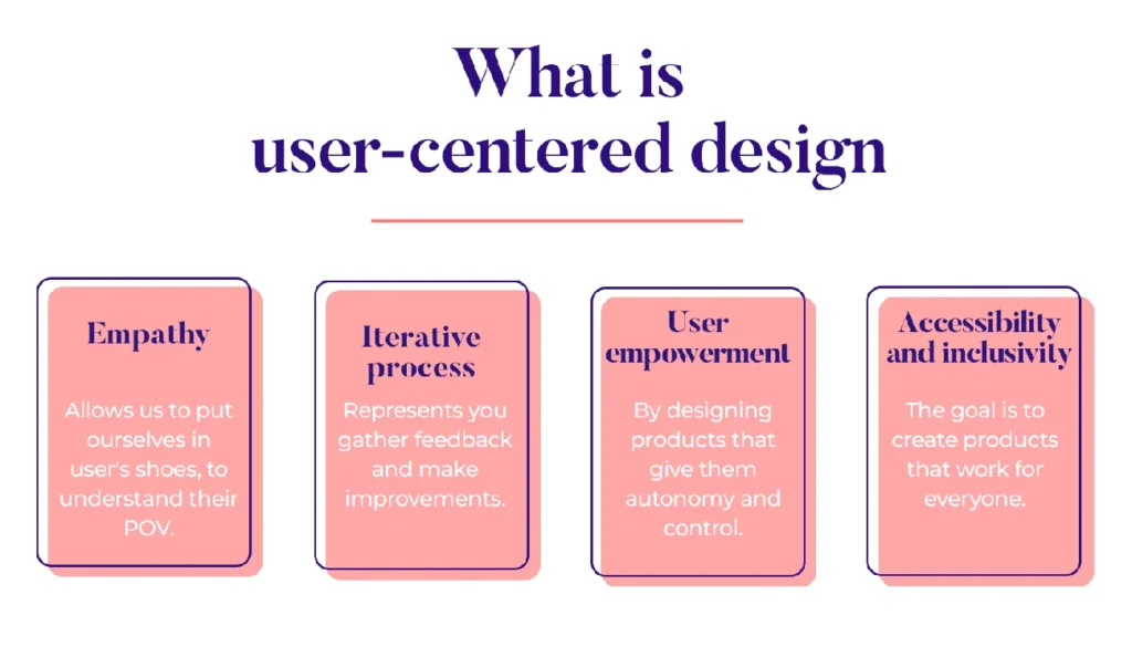
Image Source: Justinmind
User-Centered Design forms the foundation of products that people actually want to use. This iterative design process prioritizes users and their needs throughout every phase of development, from initial concept to final launch.
Most design approaches start with business requirements or technical constraints. User-Centered Design flips this approach: it starts with understanding people and builds solutions around their real needs.
What User-Centered Design Means
User-Centered Design (UCD) is a systematic approach that places users at the heart of every design decision. This framework emerged in the 1980s, developed by cognitive scientist Don Norman, and has since become essential for creating successful digital products.
UCD operates on empathy—understanding what users want, what frustrates them, and how they actually behave with products. This understanding drives every decision, ensuring features solve real problems rather than imagined ones. The process works iteratively, with user feedback continuously collected and integrated, leading to products that improve alongside user expectations.
The process follows four core phases:
- Understanding the context in which users interact with a system
- Identifying and specifying users’ requirements
- Developing design solutions based on these requirements
- Evaluating outcomes against users’ context and needs
Examples of User-Centered Design in Action
Spotify demonstrates UCD through its Discover Weekly playlists. The company continuously gathers user listening data to refine music recommendations, improving user satisfaction with each iteration.
The University of Washington redesigned their student portal after extensive input from students and staff. The result: a platform that now handles approximately two million user sessions monthly.
Apple’s iPhone success stems from placing user needs at the center of design decisions. Their interfaces feel intuitive because they’re built around how people naturally interact with technology, not around technical capabilities.
How to Implement User-Centered Design
Effective UCD implementation requires a structured approach:
Start with user research. Conduct surveys, interviews, and observations to understand user behaviors, needs, and preferences. Create personas and journey maps that visualize how different users will interact with your product across various contexts.
Define clear requirements. Align user needs with business objectives to ensure your product serves both audiences effectively.
Develop solutions iteratively. Begin with broad concepts and add detail through prototyping. Throughout this process, maintain focus on solving real user problems rather than creating features for their own sake.
Test continuously. Evaluate your designs through usability testing with actual users. This feedback loop allows you to make informed refinements before launch.
Common User-Centered Design Mistakes
Many organizations struggle with UCD implementation. Research shows that 17% of information technology startups fail due to inadequate UCD implementation. Fixing usability issues after launch can cost up to 100 times more than addressing them during the design phase.
The most frequent mistakes include:
• Rushing into design without adequate user research, resulting in products that miss user needs • Disregarding user feedback during development, creating misaligned expectations
• Neglecting accessibility considerations, which excludes users with disabilities • Operating in departmental silos, leading to disjointed user experiences • Overemphasizing visual design at the expense of functionality • Failing to consider the context in which people actually use the product
Many designers also underestimate UX complexity, creating oversimplified solutions that fail to address the multifaceted nature of user needs.
To avoid these pitfalls, maintain continuous user involvement throughout the development process. Incorporate regular testing cycles and foster collaboration across disciplines. Remember: user-centered design isn’t a one-time activity—it’s an ongoing commitment to understanding and serving the people who use what you create.
Hierarchy
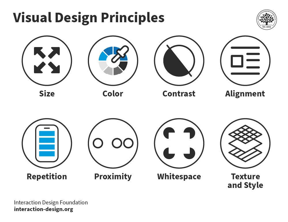
Image Source: The Interaction Design Foundation
Visual hierarchy determines how users process information on your interface. When you organize elements properly, people naturally focus on what matters most without feeling overwhelmed by competing visual elements.
Definition of Hierarchy
Hierarchy in UX design refers to the strategic organization of visual elements to establish clear structure and communicate varying levels of importance. You’re essentially arranging information from most to least important, creating an organized path for users to follow. This principle helps create intuitive experiences by prioritizing and emphasizing key elements.
The purpose of hierarchy is straightforward: guide users through content based on significance while preventing them from feeling overwhelmed. I’ve observed this in user testing sessions repeatedly—when every element on a screen appears equally important, nothing stands out. The interface becomes confusing and difficult to navigate.
Real-world example of Hierarchy
Newspaper layouts demonstrate hierarchy effectively. Headlines use large fonts to grab attention immediately, while supporting information appears in progressively smaller text. Digital interfaces apply this same principle.
E-commerce product pages provide excellent examples. The product name, price, and “Add to Cart” button receive visual emphasis over reviews or technical specifications. Streaming platforms highlight featured content with larger images, brighter colors, or prime screen positions. Mobile apps use clear visual signals to differentiate between primary actions (highlighted buttons) and secondary options (text links or icons).
How to implement Hierarchy
Effective hierarchy implementation relies on several visual techniques:
1. Size and ScaleLarger elements naturally draw attention first. Reserve bigger elements for the most important content or calls-to-action.
2. Color and Contrast Bright colors and high contrast grab attention while muted tones recede. This difference in visual weight helps establish importance.
3. TypographyUse different weights, sizes, and styles to differentiate headers from body text, creating clear reading patterns.
4. Alignment and ProximityPosition related elements closer together and align them along similar paths to indicate relationships.
5. WhitespaceStrategic use of empty space around elements draws attention and improves readability.
Understanding common reading patterns like the F-Pattern (for text-heavy designs) and Z-Pattern (for simpler layouts) helps you structure content accordingly.
Common mistakes with Hierarchy
The most common hierarchy mistake involves weak information structure and poor navigation. When content organization doesn’t align with user expectations, people encounter confusing menus and illogical categorization.
Other frequent errors include:
• Creating visual clutter by emphasizing too many elements simultaneously • Using insufficient contrast between important and secondary content
• Implementing inconsistent typography that confuses rather than clarifies • Neglecting appropriate spacing between element groups • Ignoring accessibility considerations in visual prioritization
To avoid these issues, take a user-centric approach when designing information architecture. Conduct card sorting exercises with users to understand their mental models, then test navigation structures through tree testing.
Effective visual hierarchy isn’t just about aesthetics—it directly impacts usability, improves conversions, and creates experiences that feel natural rather than forced.
Accessibility
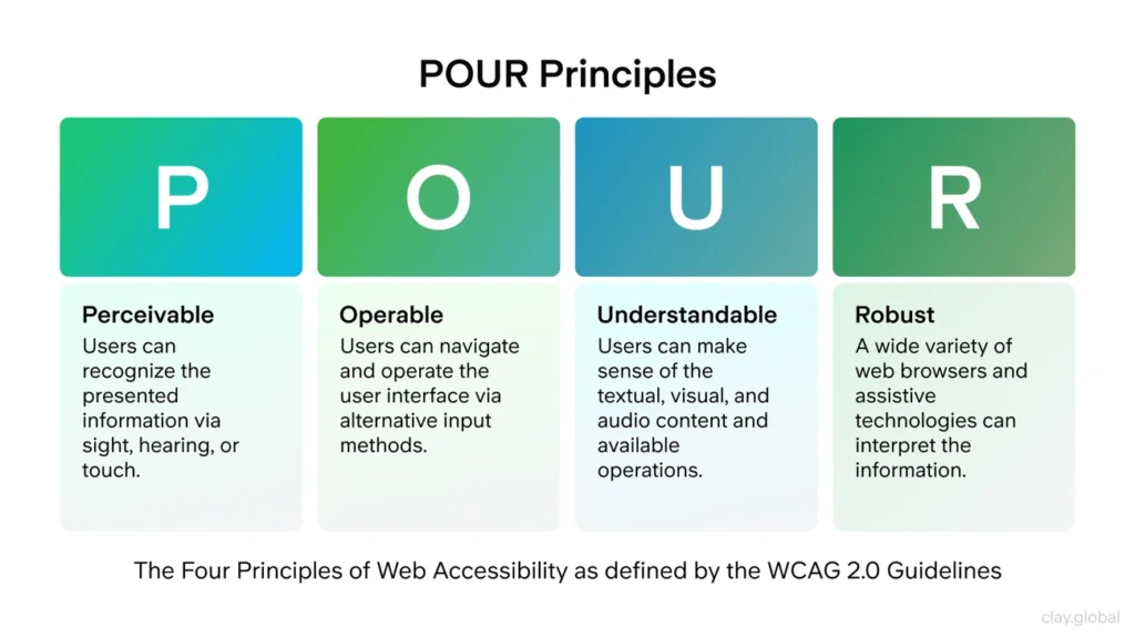
Image Source: Clay | UX Design Agency, Branding & Web Design
Creating designs that work for everyone isn’t optional—it’s essential. Approximately 15% of the global population experiences significant disability, which means accessibility affects millions of potential users of your product.
Definition of Accessibility
Accessibility in UX design means creating digital products that all users can perceive, understand, navigate, and interact with—regardless of their physical or cognitive abilities.
The Web Content Accessibility Guidelines (WCAG) establish global standards organized around four principles: Perceivable, Operable, Understandable, and Robust (POUR). These guidelines offer three conformance levels—A (basic), AA (standard requirement), and AAA (highest level).
Real-world Examples of Accessibility
Apple’s website demonstrates strong accessibility through VoiceOver screen reader compatibility, adjustable text sizes, closed captions, and high-contrast modes. The BBC takes a similar approach with high color contrast, captions and transcripts for audio/video content, and consistent navigation structure.
How to Implement Accessibility
When you design with accessibility in mind from the start, implementation becomes straightforward:
• Provide descriptive alt text for images and meaningful visual content • Ensure sufficient color contrast (minimum 4.5:1 ratio for WCAG AA compliance) • Support keyboard-only navigation throughout your interface • Use proper semantic HTML and ARIA landmarks • Create clear, descriptive labels for form fields • Include captions and transcripts for audio/video content • Maintain consistent, predictable layouts across pages
Common Mistakes with Accessibility
Research by WebAIM found over 50 million distinct accessibility errors across one million homepages—averaging 50 errors per page.
The most frequent mistakes include missing alt text for images, insufficient color contrast between text and backgrounds, poor link descriptions, missing form labels, and inaccessible data tables. Many sites also fail to support keyboard navigation properly.
These errors create barriers for users with disabilities, but fixing them benefits everyone. Accessible websites typically see improved SEO, expanded market reach, reduced legal risks, and better user experience across the board.
User Control and Freedom
When people feel trapped in your interface, they leave. User Control and Freedom gives users the confidence to explore your product because they know they can always get back to where they started.
What User Control and Freedom Means
User Control and Freedom refers to Jakob Nielsen’s third usability heuristic: users need clearly marked “emergency exits” to leave unwanted states without going through extended dialogs. People make mistakes. They click the wrong button, enter the wrong information, or change their minds halfway through a process.
Your interface should forgive these human moments rather than punish them.
Internet usage rose by 222% over a seven-year period, which means more people expect digital products to work like the physical world—where you can turn around, go back, or start over without consequences.
Examples of User Control and Freedom
Several platforms handle this principle well:
- Google Playstore provides a “Cancel” button during app installation, allowing users to abort the process before completion
- Instagram offers an “Unsend” option for accidentally sent messages, preventing potential embarrassment
- WhatsApp gives users control over who can see their profile details, respecting privacy preferences
- Medium includes “Revision History” functionality, allowing writers to recover previous versions of their work
How to Implement User Control and Freedom
Give users multiple ways to recover from mistakes:
- Ensure the browser’s Back button functions properly—never disable it
- Position exit points where users expect them (X in the top right corner of overlays)
- Support keyboard shortcuts for power users alongside visible options
- Provide confirmation dialogs before irreversible actions
- Allow multiple levels of undo/redo for complex tasks
- Make cancel options prominent and easily accessible
Common Mistakes with User Control and Freedom
The most frustrating mistake is disabling the browser’s Back button, which creates trapped users who cannot navigate freely. Missing or poorly positioned exit options cause similar frustration when users cannot find ways to cancel actions.
Timeout messages that lose users’ work when they attempt to go back in forms create another major problem. Overlays without proper Close buttons confuse users, often causing them to exit the entire page instead of just the overlay.
When you build forgiveness into your interface, users feel comfortable exploring and engaging with your product. They know they can always recover from mistakes.
Jakob’s Law

Image Source: Laws of UX
Why do some interfaces feel instantly familiar while others require extensive learning? Jakob’s Law explains this phenomenon and reveals why fighting user expectations often leads to failed products.
Definition of Jakob’s Law
Jakob’s Law states that “users spend most of their time on other sites, so they prefer your site to work the same way as all the other sites they already know.” Jakob Nielsen formulated this principle in 2000, recognizing that people develop mental models through repeated digital experiences.
When you deviate significantly from established patterns, you force users to learn new interaction models. This increases cognitive load and creates friction. Since 88% of users are less likely to return to a website after a bad experience, respecting familiar patterns becomes essential for retention.
The principle doesn’t advocate copying designs blindly. Instead, it encourages designers to build on users’ existing knowledge while introducing meaningful improvements.
Real-world example of Jakob’s Law
Apple demonstrates Jakob’s Law effectively through iOS design decisions. When they introduce new features, they maintain familiar interaction patterns while adding functionality. Their Control Center uses universally recognized icons for brightness, volume, and airplane mode—making it immediately usable without explanation.
E-commerce sites follow consistent conventions: product images appear on the left, descriptions on the right, with prominent “Add to Cart” buttons. Banking apps typically display account balances at the top with transaction lists below. These patterns work because users encounter them repeatedly across different platforms.
How to implement Jakob’s Law
To apply this principle effectively:
- Study competitor interfaces to identify established patterns in your industry
- Use standard UI elements for common functions like search bars and shopping carts
- Keep navigation systems consistent with widespread conventions
- Test designs with users to verify they match expected mental models
- Introduce novel elements gradually while maintaining connections to familiar patterns
When you respect established patterns, users can focus on their goals rather than learning your interface.
Common mistakes with Jakob’s Law
The most frequent mistake involves blindly copying competitors without understanding user needs. This creates generic experiences that lack differentiation.
Another common error is rejecting established patterns entirely in pursuit of “innovation.” This often results in confusing interfaces that frustrate users rather than delight them.
Many designers also apply desktop conventions directly to mobile interfaces, ignoring that these environments have different established patterns. Your interface should feel familiar within its specific context.
The key is balancing familiarity with differentiation. Users need enough familiar elements to navigate confidently, but your product should still feel distinct and valuable.
Usability
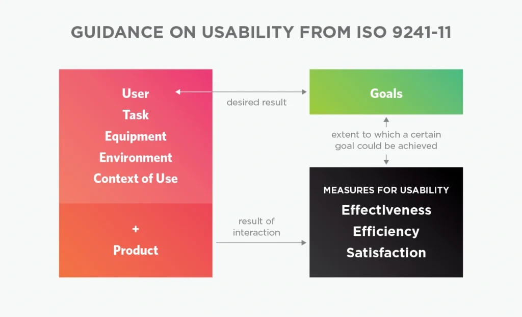
Image Source: UX Booth
How do you know if your design actually works? Usability gives you the answer. This principle measures whether users can accomplish their goals with your product—not whether your interface looks good or follows best practices.
Definition of Usability
Usability measures how well specific users in specific contexts can use a product to achieve defined goals effectively, efficiently, and satisfactorily. According to the Nielsen Norman Group, usability comprises five quality components: learnability, efficiency, memorability, errors, and satisfaction. This concept represents the second level in user experience hierarchy, coming after utility and before desirability and brand experience.
David McQuillen captures the essence perfectly: “Usability is about human behavior. It recognizes that humans are lazy, get emotional, are not interested in putting a lot of effort into…getting a credit card and generally prefer things that are easy to do vs. those that are hard to do”.
Real-world example of Usability
Strong usability shows up in measurable ways. For an e-commerce site, this means users can find products and complete purchases without confusion (effectiveness), finish tasks quickly without excessive navigation (efficiency), and feel satisfied rather than frustrated afterward.
Poor usability creates the opposite experience: confusing navigation, cluttered layouts, slow loading times, and unclear instructions. The BBC demonstrates excellent usability through high contrast, consistent navigation, and accessible media content—everything works as users expect it to.
How to implement Usability
Effective usability implementation requires a systematic approach:
1. Design for the whole experience. Present clear, jargon-free messages with one primary action per screen. Focus on how components work together rather than perfecting individual elements.
2. Maintain consistency. Follow established conventions for function and layout. Use proper font size, color contrast, and whitespace to create clear information hierarchy.
3. Test early and often. Conduct usability testing throughout development—not just at the end. Testing with just five users can identify most major usability problems.
4. Provide helpful navigation. Include search functionality and customizable controls that help users find what they need.
Common mistakes with Usability
The biggest usability errors often seem small but create significant friction. Disabling the browser’s back button traps users in your interface. Creating timeout messages that lose users’ work destroys trust. Designing overlays without proper close buttons forces users to refresh entire pages.
Many designers focus on aesthetics over functionality, then skip proper testing. Confusing navigation, inconsistent design elements, poor layout, and slow response times consistently frustrate users.
Remember: usability problems compound quickly. When users can’t complete basic tasks efficiently, they abandon products regardless of other positive features.
Doherty Threshold

Image Source: Zasya Solutions
Response time determines whether users stay engaged or lose interest in your product. When your interface takes too long to respond, people’s attention wanders and they start questioning whether your product actually works.
Definition of Doherty Threshold
The Doherty Threshold states that “productivity soars when a computer and its users interact at a pace (<400ms) that ensures that neither has to wait on the other”. Walter J. Doherty and Arvind J. Thadani established this principle at IBM in 1982, dropping acceptable response times from 2,000 milliseconds to just 400 milliseconds.
Here’s why this matters: human attention operates in tiny windows. When your interface takes longer than 400 milliseconds to respond, users notice the delay. This disrupts their thought process and creates friction between them and their goals. Keep responses under this threshold, and users enter a state of flow where they become fully absorbed in completing their tasks.
Real-world example of Doherty Threshold
Companies that understand response time build products people love to use:
- Google delivers search results in milliseconds, making information feel instantly accessible
- E-commerce sites with fast-loading product pages see lower cart abandonment rates
- TikTok and Instagram load content rapidly to keep users scrolling and engaged
- Netflix preloads video segments so playback starts immediately when you click
How to implement Doherty Threshold
1. Optimize your technical foundation through efficient code, compressed images, and content delivery networks.
2. Show users that something is happening with skeleton screens or loading indicators during longer processes.
3. Provide immediate feedback with progress bars or status updates so users know their requests are being processed.
4. Streamline your interface by removing unnecessary elements that slow down interactions.
Common mistakes with Doherty Threshold
Technical constraints often prevent teams from achieving optimal response times. Complex applications with multiple interactive features struggle to maintain consistently fast responses.
Budget limitations make performance optimizations challenging. Teams must balance feature richness with speed, which requires careful decisions about what functionality truly serves user needs versus what creates impressive demonstrations.
Less is More
Image Source: Medium
Simplicity cuts through complexity better than any other design approach. The “Less is More” principle challenges designers to strip away everything that doesn’t serve users directly.
Definition of Less is More
Less is More represents a design philosophy that prioritizes simplicity, clarity, and purposeful minimalism. This approach encourages using the fewest elements necessary to communicate effectively—employing simple shapes, clear colors, and readable typography to convey maximum information with minimal cognitive load.
The goal isn’t just visual appeal. Research from a 2016 literature review demonstrated that simplified website designs significantly outperform complex ones in retaining visitor attention and improving engagement. When users encounter fewer elements competing for their attention, they process information faster and complete tasks more efficiently.
Real-world example of Less is More
Apple’s iOS interface demonstrates effective minimalist design through intentional restraint. Rather than overwhelming users with options, iOS presents essential functions clearly, helping people make decisions quickly and navigate intuitively.
Google’s homepage provides another compelling example—a nearly blank page featuring only a search bar. This approach directs complete attention to the primary function without visual distractions. The result feels both powerful and approachable.
How to implement Less is More
Implementing this principle requires strategic decisions about what to include and what to remove:
1. Audit existing elements and identify which ones directly support user goals 2. Embrace whitespace strategically to create visual breathing room around important content 3. Establish a limited color palette using 2-3 primary colors that create harmony and guide attention 4. Choose clean typography with consistent weights and sizes throughout your interface 5. Simplify navigation paths by reducing the number of steps required to complete key tasks
Common mistakes with Less is More
The most frequent error involves removing functionality while pursuing visual simplicity. This happens when designers eliminate elements without understanding their purpose or value to users.
Another common mistake treats minimalism as purely aesthetic rather than functional, creating interfaces that look clean but perform poorly. Some designers also apply minimalism inconsistently, leading to confusion about what’s important.
Effective minimalist design balances simplicity with usability. Every remaining element should serve a clear purpose, and the overall experience should feel effortless rather than restrictive. When done well, this approach improves performance through faster load times while reducing user frustration.
Context-Aware Design
Image Source: Medium
Your interface should understand when someone is walking in bright sunlight versus sitting at a desk in a dimly lit room. Context-Aware Design represents an evolution beyond static interfaces toward systems that adapt intelligently to changing user situations.
Definition of Context-Aware Design
Context-Aware Design refers to creating interfaces that dynamically adapt to the user’s current situation and environment. This approach focuses on systems that perceive and respond to changing contexts through sensor data, thereby simplifying interactions and enhancing technological intuitiveness.
The principle considers multiple dimensions of context:
- Environmental context: Location, lighting, noise levels
- Temporal context: Time of day, seasons, user schedules
- Activity context: Current tasks, motion state, focus level
- Social context: Presence of others, social expectations
- Device context: Network connectivity, battery status
Real-world example of Context-Aware Design
Navigation systems demonstrate this principle effectively, adapting to changes in environment, user location, and time of day to deliver personalized experiences. Mobile apps that automatically switch to dark mode in dim environments or increase button sizes while users are walking show contextual adaptation. Smart homes adjust behaviors based on occupancy and time of day.
How to implement Context-Aware Design
Start by analyzing user behavior through contextual inquiries and behavioral analytics to understand interaction patterns across different scenarios. Map the contextual ecosystem to identify adaptation opportunities and develop clear visual signals showing context awareness.
Build testing frameworks that cover diverse real-world situations:
- Multiple devices and screen sizes
- Varying connectivity conditions
- Different times of day
- Geographic locations
Common mistakes with Context-Aware Design
The biggest mistake involves failing to be transparent about data collection, which erodes user trust. Creating systems that adapt without allowing manual adjustments limits user control and causes frustration.
Many implementations provide insufficient visual feedback about contextual changes, leaving users confused when interfaces transform unexpectedly. Context-aware systems often struggle with balancing automation against user control—either intervening too aggressively or failing to adapt when needed.
Interface Personality
The human element behind interfaces determines whether users form emotional connections with your products. Interface Personality transforms functional designs into experiences that resonate on a deeper level with your audience.
Definition of Interface Personality
Interface Personality refers to the character and emotional essence communicated through design elements that makes users attribute human qualities to digital products. Personality is defined as the set of habitual behaviors, cognitive and emotional patterns that evolve from biological and environmental factors. Research shows personality traits influence how users perceive design efficiency and impact the ways people use and accept technology.
Psychological models like the Five-Factor Model help assess personality traits in technology contexts, enabling designers to create cognitive compatibility between interfaces and users. At its core, personality design aims to facilitate human-to-human communication where “the computer recedes into the background, and personalities rise to the surface”.
Real-world example of Interface Personality
Apple’s ‘Get a Mac’ campaign perfectly illustrates interface personality through contrasting character portrayals. Studies found users performed better when handling interfaces matching their personality type, validating Apple’s approach. MailChimp similarly succeeds with a “familiar, friendly, and—above all—human” voice where the personalities of people behind the brand shine through authentically.
How to implement Interface Personality
Implementing effective interface personality requires:
- Creating personality documents describing traits, tone, and style
- Expressing character through visual esthetics, typography, and interactions
- Considering corner shapes—sharp corners communicate precision while rounded corners evoke friendliness
- Using color psychology intentionally—blues project trustworthiness while reds suggest energy
- Crafting microcopy that guides users with appropriate tone
Common mistakes with Interface Personality
Designers typically stumble by treating personality as purely esthetic rather than functional, creating inconsistent experiences across touchpoints, or developing interfaces without considering user research. Another common error involves excessive personality that interferes with usability—as one expert notes, “don’t let cleverness impede users’ comprehension”.
Understanding your target audience remains critical—without proper research, personality choices may create disconnect rather than connection.
Comparison Table
These ten principles work together to create effective user experiences. Use this table as a quick reference when you need to identify which principle applies to a specific design challenge or when you’re evaluating your current designs.
| UX Principle | Core Concept | Key Implementation Methods | Real-world Examples | Common Mistakes |
|---|---|---|---|---|
| User-Centered Design | Design process that places users at the heart of every decision from concept to completion | – Research users through surveys & interviews – Create personas & journey maps – Define requirements – Develop prototypes – Conduct usability testing | Spotify’s Discover Weekly playlists, University of Washington’s student portal, Apple iPhone | – Rushing design without research – Disregarding user feedback – Neglecting accessibility – Operating in silos |
| Hierarchy | Strategic organization of visual elements to establish clear structure and importance levels | – Use size and scale – Apply color and contrast – Implement typography variations – Consider alignment and proximity – Utilize whitespace | Newspaper layouts, E-commerce product pages, Streaming platform content organization | – Weak information structure – Emphasizing too many elements – Insufficient contrast – Inconsistent typography |
| Accessibility | Creating digital products usable by everyone, including people with disabilities | – Provide alt text for images – Ensure color contrast – Enable keyboard navigation – Use semantic HTML – Include captions/transcripts | Apple’s website, BBC’s accessible content implementation | – Missing alt text – Poor color contrast – Inadequate form labels – Non-accessible data tables |
| User Control & Freedom | Providing users with clearly marked “emergency exits” and ways to undo actions | – Enable browser back button – Position clear exit points – Support keyboard shortcuts – Provide confirmation dialogs – Allow undo/redo | Google Playstore’s cancel button, Instagram’s unsend feature, WhatsApp’s privacy controls | – Disabling back button – Missing exit options – Timeout messages losing work – Poor overlay design |
| Jakob’s Law | Users prefer sites to work the same way as other sites they know | – Study competitor interfaces – Use standard UI elements – Keep navigation consistent – Test designs with users | Apple iOS features, E-commerce layout conventions | – Blindly copying competitors – Rejecting established patterns – Misapplying desktop conventions to mobile |
| Usability | How effectively users can accomplish goals with a product | – Focus on whole design – Maintain consistency – Use proper typography – Incorporate helpful navigation | BBC’s website implementation, E-commerce purchase flows | – Focusing on esthetics over function – Poor navigation – Inconsistent design elements – Slow response times |
| Doherty Threshold | Systems should respond within 400ms to maintain user engagement | – Optimize load times – Use skeleton screens – Implement progress indicators – Streamline interfaces | Google search results, Netflix preloading, TikTok rapid content loading | – Technical constraints – Complex applications – Resource limitations |
| Less is More | Minimalist approach focusing on simplicity and clarity | – Identify core elements – Embrace white space – Limit color palette – Simplify typography | Apple iOS interface, Google’s homepage | – Oversimplifying functionality – Treating minimalism as purely esthetic – Removing essential elements |
| Context-Aware Design | Interfaces that adapt to user’s situation and environment | – Analyze user behavior – Map contextual ecosystem – Build testing frameworks – Develop visual signals | Navigation systems, Mobile apps with dark mode, Smart homes | – Neglecting transparency – Limiting manual adjustments – Insufficient visual feedback |
| Interface Personality | Character and emotional essence communicated through design | – Create personality documents – Express character through visuals – Consider corner shapes – Use color psychology | Apple’s ‘Get a Mac’ campaign, MailChimp’s friendly interface | – Treating personality as purely esthetic – Creating inconsistent experiences – Excessive personality affecting usability |
Conclusion
These ten UX principles work together as a system rather than standalone concepts. User-centered design provides the foundation, while hierarchy and accessibility ensure your designs reach everyone who needs them. User control, Jakob’s Law, and usability create interfaces that feel familiar and forgiving. Speed, simplicity, context awareness, and personality transform functional designs into experiences people actually want to use.
I’ve seen teams try to implement every principle at once and become paralyzed by the complexity. Start with user-centered design—understand who you’re designing for and what problems you’re solving. Then layer in the other principles as your process matures. Small improvements in any of these areas create noticeable results.
Remember that these principles guide decisions rather than dictate solutions. The most effective designs balance established patterns with thoughtful improvements. When you apply these principles consistently, you create products that solve real problems while feeling effortless to use.
Your users don’t care about design theory—they care about accomplishing their goals without frustration. These principles help you build interfaces that get out of the way and let people focus on what matters to them.
Take one principle from this guide and apply it to your current project. Test it with real users. Refine based on what you learn. That’s how you build better experiences—one improvement at a time.
FAQs
Q1. What is the most important UX principle for designers to focus on in 2025?
User-centered design remains the foundation of effective UX. By putting users at the heart of every decision, designers can create products that truly meet people’s needs and expectations.
Q2. How can designers implement accessibility without compromising esthetics?
Accessibility and esthetics are not mutually exclusive. By considering factors like color contrast, clear typography, and proper labeling from the start of the design process, designers can create beautiful interfaces that are usable by everyone.
Q3. What role does minimalism play in modern UX design?
The “Less is More” principle is crucial in 2025, as it helps reduce cognitive load and improve usability. However, it’s important to balance simplicity with functionality to ensure all essential elements are present.
Q4. How can designers create interfaces that adapt to different contexts?
Context-aware design involves creating interfaces that respond to factors like location, time of day, and user activity. This can be achieved through careful user research, mapping of contextual ecosystems, and thorough testing across various scenarios.
Q5. Why is interface personality important in UX design?
Interface personality helps create emotional connections between users and digital products. By infusing designs with consistent character traits expressed through visuals, typography, and interactions, designers can make experiences more engaging and memorable.
Leave a Reply