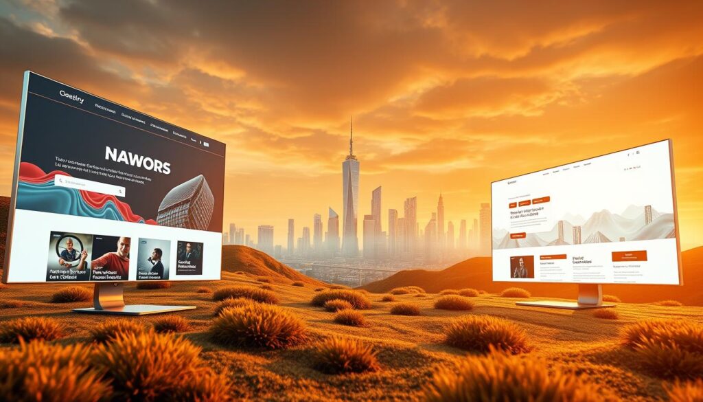
95% of visitors form their first impression of a business based on its site in under a second — a staggering signal that visual choices now shape trust and sales.
The digital handshake a brand offers must do more than look good. It must guide, convert, and reflect clear positioning across devices.
From AI-driven personalization to layered 3D depth, the coming shifts focus on measurable outcomes: faster pages, clearer hierarchy, and interaction that nudges action.
Expect purposeful white space, bold CTAs, responsive layouts like bento grids, and expressive visuals that replace generic stock photos. These elements lift user experience and support marketing goals.
We’ll map seven core areas and show how each trend improves clarity, accessibility, and conversion. For real-world examples and deeper context, see this analysis on UX design trends and site success.
Key Takeaways
- First impressions matter: visual strategy links directly to credibility and sales.
- Adopt trends that serve measurable goals: speed, clarity, and accessibility.
- Use layouts and motion to guide users, not distract them.
- Sequence projects for fast wins, then invest in bigger, ROI-driven upgrades.
- Balance performance budgets and accessibility as guardrails for any new feature.
Why 2026 Web Design Is Your Brand’s Digital Handshake
Before anyone calls or emails, your landing page already speaks for your company. In those first seconds, a clear look and strong hierarchy set trust and invite action.
Purposeful white space, visible CTAs, and mobile-ready layouts help users scan and decide within 3–5 seconds. Small choices like readable type and tidy navigation cut confusion and speed task completion.
Brand identity lives in color, tone, and imagery. A cohesive palette and consistent visual language turn casual visitors into advocates. When home, product, pricing, and support feel the same, users return more often.
Design must pair with evidence. Track task success, time on task, and completion rates to prove that aesthetic choices lift qualified interest and shorten path-to-value.
Start simple: clean labels, higher-quality images, and a hero area with crisp copy and a clear next step. For deeper guidance on aligning user flows and measurable outcomes, see the analysis of the future of UX.
web design trends 2026 that captivate, convert, and keep users coming back
Great interfaces map intent to action so people move from curiosity to conversion. Start with a tight hero: a headline that states value, a short supporting sentence, and one bold CTA. This reduces decision fatigue and guides visitors to the next step.
Structure matters: chunk content into scannable blocks, use white space to focus attention, and hide long details behind progressive disclosure. Keep navigation simple and label links in plain language so users find answers fast.
Align visual choices with brand identity—type scale, spacing, and color tone—so the whole experience feels consistent from arrival to checkout. Favor custom illustrations and on‑brand imagery over generic stock to avoid cognitive dissonance.
Prioritize accessibility and mobile-first functionality: readable text sizes, captions or transcriptions, clear focus states, and resilient forms. Add predictive search and smart filters to help users complete tasks faster.
- Measure results: track task success, micro‑conversions, scroll depth, and form completion time.
- Iterate: use session recordings and analytics to remove friction where users hesitate.
AI‑Driven Layouts and Personalization That Adapt in Real Time
Smart pages learn from signals and rearrange themselves to meet each visitor’s goal.
AI can reorder page elements to surface relevant content and CTAs based on intent signals. This reduces friction so users reach answers faster. Personalizing navigation labels and recommendations helps users interact with high‑value areas quickly.
Replace generic stock with AI-generated images that reflect real scenarios and diverse representation. Use assets that match brand tone and follow ethical guidelines. Watermark synthetic images when needed to keep trust intact.
Keep performance tight: set firm budgets, lazy‑load secondary assets, and compress images so personalization does not slow pages. Maintain accessibility by preserving semantic structure, aria labels, and predictable focus order across devices.
Respect privacy: choose tools that minimize data collection and honor consent. Test personalized CTAs and content to confirm uplift, and build fallback states so the interface stays usable if AI services fail.
- Performance: lazy-load, compress, set budgets.
- Accessibility: semantic HTML, aria, focus order.
- Trust: ethical images, transparency, privacy-safe tools.
Immersive Storytelling with Scroll, Layering, and Motion
Controlled motion gives pages a rhythm that helps readers follow benefits, proof, and action. Use scrolling sequences to reveal content in stages so users absorb one idea at a time.
Parallax and scroll-triggered scenes let backgrounds, illustrations, and copy layer together. They reveal features, social proof, and CTAs without crowding a single screen.
Parallax and scroll‑triggered sequences that guide narrative
Reveal content progressively: lead with a problem, then a solution, then proof, then a clear CTA. Parallax can trigger background video or animations as the user scrolls, but limit each stage to one clear message.
Micro animations that clarify steps and reduce friction
Small animations confirm actions and guide navigation. Use motion to show form success, loading feedback, and hover hints so users know what to do next.
Balancing motion with readability, captions, and reduced motion settings
Offer a “reduce motion” preference that respects system settings and provide static alternatives. Caption videos and include transcripts for any embedded clips to keep content accessible.
| Technique | Purpose | Accessibility | Performance |
|---|---|---|---|
| Parallax sequencing | Guide narrative stages | Keep semantic structure, labels | Lazy-load backgrounds |
| Micro animations | Confirm actions, reduce errors | Offer reduce-motion toggle | Limit to CSS where possible |
| Layered visuals | Build depth and focus | Sufficient contrast, legible type | Compress images, defer heavy scripts |
| Sequenced CTA flow | Move users to conversion | Caption and transcript media | Test across devices |
Measure impact with scroll depth, interaction rate, and assisted conversions. Test narrative versions and link to best practices like dashboard pattern analysis for sequencing and metrics: dashboard patterns.
3D Depth and Realism for Standout Experiences
Use 3D thoughtfully to captivate, convert, and bring users back. Depth should support hierarchy and action, not distract from the core message.
Blend 3D with 2D so depth emphasizes key features and keeps primary messaging readable and actionable. Box 3D modules into clear areas of the page so CTAs and supporting copy remain visible.
- Tooling: use Spline for interactive scenes, Blender for asset creation, and Three.js for in-browser rendering.
- Performance: set GPU budgets, lazy-load segments, compress textures, and provide static fallbacks on slow connections.
- Visuals: add light effects and soft shadows sparingly to increase realism without bloating load times.
- Testing: run A/B tests comparing 3D hero scenes to static imagery to quantify engagement and conversion lift.
- Accessibility: include alt text, keyboard controls, and captions for complex scenes.
Use 3D where it improves understanding—product configurators, onboarding steps, and interactive demos. Limit scenes on mobile or offer simplified versions to reduce battery and thermal impact.
Document results from each project so your team learns when 3D truly adds value. For examples and implementation guides, explore an in-depth guide to 3D site strategies and a retrospective on earlier visual shifts that shaped adoption.
Modern Layout Systems: Bento Grids, Split Screens, and Asymmetry
When information is dense, smart grids make decisions simple. Layout systems in 2026 should compress content into scannable chunks so visitors find value fast.

Designing bento grids and tall cards for scannability across devices
Implement bento grids to break pages into clear modules. Tall cards suit vertical scrolling and highlight a single idea, CTA, or feature without clutter.
Split‑screen storytelling and comparison flows that drive decisions
Use split screens to present two options side‑by‑side. Parallel copy helps users compare plans, features, or benefits and choose with confidence.
CSS Grid and flexible asymmetric compositions for visual energy
CSS Grid enables responsive, asymmetric layouts that add visual rhythm. Define gutters, alignment tokens, and consistent spacing so the system scales across devices.
- Keep navigation persistent or use anchors for complex pages.
- Prototype and test scannability; mark interactive blocks clearly.
- Use component libraries and tools to standardize grid patterns.
| Pattern | Best use | Performance/accessibility tip |
|---|---|---|
| Bento grid | Modular content and curated feeds | Lazy-load cards; include clear headings |
| Tall cards | Vertical storytelling and mobile scanning | Optimize images; keep CTAs above fold |
| Split screen | Comparisons and parallel narratives | Ensure keyboard focus and contrast |
| Asymmetric grid | Brand emphasis and visual energy | Reserve asymmetry for highlights to avoid fatigue |
For a practical pattern example, review the bento box pattern. To align spacing and minimal layouts, see the minimalist UI guide.
Expressive Visuals: Bold Color, Massive Typography, and Masking
Color, scale, and masking work together to make key messages impossible to miss. Use bold palettes and warm gradients to draw attention to CTAs while keeping supporting copy easy to read.
Oversized type in hero areas establishes hierarchy quickly. Large headlines help users scan and decide in seconds. Keep typefaces to a minimum and maintain clear spacing.
Masking images and text creates depth without heavy assets. Apply masks so copy stays legible and contrast ratios meet accessibility standards.
Practical rules for expressive visuals
- Favor line illustrations to simplify complex ideas and pair them with photos sparingly.
- Limit accent colors and stick to color tokens and gradient presets for consistency.
- Test treatments with real users to ensure clarity and comprehension.
| Technique | Benefit | Accessibility Tip |
|---|---|---|
| Vibrant palettes | Directs attention to CTAs | Maintain 4.5:1 contrast for text |
| Massive typography | Instant hierarchy | Use responsive scales for small screens |
| Image/text masking | Adds depth with low weight | Provide alt text and readable overlays |
Dark Mode and Soft Morphism as Usability Standards
Dark themes paired with soft morphism are no longer optional. They serve comfort, legibility, and a calm visual hierarchy across light conditions.
Designers should deliver dual themes that maintain accessible contrast and tone control. Test color pairs in real rooms and on varied displays to confirm readability.
“Avoid pure black; choose nuanced dark tones to reduce halos and improve reading comfort.”
Designing dual themes with accessible contrast and tone control
Provide light and dark modes with clear contrast tokens. Keep navigation, form fields, and feedback states equally legible so no interaction breaks between themes.
Adding subtle texture and depth without sacrificing clarity
Use soft morphism sparingly: gentle shadows and highlights that make controls feel pressable without adding noise.
- Tune elevation tokens so interactive elements look tappable but stay simple.
- Use semantic color roles (success, warning, error) that read well in both themes.
- Offer a user-controlled theme toggle and respect system preferences.
- Document typography, spacing, and surface tokens for consistent handoffs.
- Track dark-mode defects—overbright assets and washed gradients—in QA checks.
In short: treat dark mode and soft morphism as baseline usability. Ship consistent patterns so returning users find familiar navigation and controls, day or night.
Interaction Design That Feels Alive: Cursors, Micro‑Interactions, and Feedback
Small, thoughtful motions can make interfaces feel responsive and alive. When every click, hover, or drag gives clear feedback, users act with confidence. Interactions should guide attention, not steal it.
Reinvent cursors to preview content, mark drag zones, or show contextual hints. Keep cursor effects subtle and informative so they signal functionality without distracting from core tasks.

Micro‑interactions That Confirm and Protect
Use micro‑interactions to acknowledge actions: pressed button states, inline validation, and checklist progress. These signals reduce uncertainty and lower error rates.
Favor consistent hover and tap states across components so users learn patterns quickly. Avoid novelty for novelty’s sake—every motion must clarify state, improve discoverability, or cut perceived wait times.
Accessibility, Performance, and Timing
Ensure keyboard accessibility and ARIA live regions so screen reader users receive the same feedback. Provide undo options, inline hints, and non‑destructive defaults for safer flows.
Balance motion: target 150–250ms for most transitions, defer heavy effects below the fold, and throttle on low‑power devices to keep pages snappy.
- Navigation: explicit affordances and clear focus states.
- Error recovery: inline fixes, undo, and helpful copy.
- Testing: validate with real users to confirm higher task success.
Build Faster in 2026: No‑Code Tools, Component Libraries, and Design Systems
Teams move quicker when prototypes graduate to a shared system of reusable pieces. Start by validating flows in no‑code tools so stakeholders see and test interaction without heavy engineering effort.
Prototype first, then harden patterns. Convert successful experiments into components with tokens for color, type scale, spacing, and motion. This keeps look and behavior consistent across pages and campaigns.
Use content blocks and generous white space to improve scannability. Block‑based layouts and CSS Grid help pages adapt to screens while keeping key messages visible.
Leveraging no‑code for rapid prototyping and iteration
No‑code platforms let teams test variants fast. Validate with real users, then move winners into the component library to avoid duplication and rework.
Systematizing motion, typography, and color for consistency
Encode motion timing, type scales, and color tokens into components. Ship updates centrally so every page keeps parity—dark mode, captions, and focus states included.
Content blocks and white space that boost comprehension
Build content blocks with built‑in accessibility defaults: contrast, ARIA roles, and keyboard focus. Integrate analytics into components so measurement stays reliable.
- Automate image sizes, icons, and theme switching to reduce manual work.
- Document usage rules so designers and engineers apply patterns consistently.
- Review patterns regularly to retire stale pieces and keep systems fresh.
For practical guidance on how interactions affect search and performance, see a primer on the basics of UX that affect SEO.
From Trend to ROI: A 2026 Implementation Roadmap
Start each project with a hypothesis: name the metric you expect to move, how you will measure it, and the target uplift. This keeps experiments focused and helps marketing and product decisions stay data-driven.
Prioritize mobile‑first experiences and performance budgets
Design for the smallest screen first and use progressive enhancement. Set firm performance budgets, optimize media, and defer non‑essential scripts to protect Core Web Vitals.
Measure what matters: engagement, task success, and conversion
Track scroll depth, interaction rate, and task completion per flow. Tie each experiment to funnel outcomes and revenue impact so teams can see real ROI.
Governance: accessibility, captions, transcriptions, and dark mode parity
Build a governance checklist that enforces captions, transcripts, keyboard access, and parity between light and dark themes. Include accessibility audits in every release cycle.
- Sequence by impact: quick wins (contrast, type scale, clearer CTAs) first, deeper work (3D, personalization) later.
- Align with brand identity: keep motion and color consistent as experiments scale.
- Operationalize results: dashboards that link tests to marketing outcomes and sunset criteria for losers.
Revisit this roadmap annually to match new audience behavior and avoid chasing short‑lived trends. The goal is a lean system that raises user engagement and proves value.
Conclusion
When elements align around purpose, users reach goals faster and teams see real impact.
Start with high‑impact fixes: clear CTAs, accessible type, and fast pages before layering advanced effects. Prioritize purposeful visuals over generic images and use illustrations and masking to tell stories without slowing load times.
Adopt modular layouts—bento grids, split screens, and intentional asymmetry—to make dense content scannable. Let motion clarify states: micro interactions, scroll sequences, and feedback should reduce errors and guide action.
Designers must keep patterns consistent across screens and test 3D or advanced visuals against static assets to prove value. Measure continuously and enforce governance: captions, transcripts, accessibility checks, and dual‑theme parity. Small, validated iterations win over flashy rewrites—iterate with intent and track outcomes.
Leave a Reply